Hello, I'm Danny—product designer with a passion for iconography.
I'm now with Open Builders, but I've made my rounds at Mapbox, Yandex, Wednesday, Redstart and more

Product cases







Life before Product Design
Sidethings
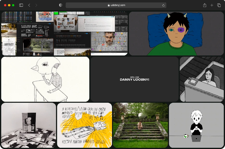
Hello, I'm Danny—product designer with a passion for iconography.
I'm now with Open Builders, but I've made my rounds at Mapbox, Yandex, Wednesday, Redstart and more
The icon system I drew became the foundation of Dodo's redesign and rebrand.
Rebuilding Mapbox's Maki icon set on a strict 15×15 pixel grid — every shape snaps to the same base. Work in progress.
A universal shield system I built at Mapbox — every US state and Canadian province, any route, at any width.
BMW approached us with a request to fill their maps with unique highway shields, aiming to differentiate from the uniform look of Google Maps. I'll start with a spoiler and show the results for all American and Canadian shields for your full enjoyment.
I asked our developers to prepare a document with road data and references we intended to use.
Next, I conducted extensive research comparing current real-life signs with those of competitors and those listed on Wikipedia. Based on this analysis, I created the first set of highway shields.
We tested these on the map and noticed that not all looked perfect—texts were cramped or shifted at different scales, to the left, right, up, or down.
Further iterations were quite meditative. I adjusted incorrectly sized or proportioned shields, uploaded them to the map, scrutinized them closely, took screenshots of the errors, and repeated the process.
Ultimately, I completed the perfect first batch of American signs. BMW was thrilled.
Six months later, BMW returned with a request to expand the unique signage to Canada. Similar work was conducted with Canadian signs.
The result of my work is a map now filled with unique, realistic signs, and a wonderful library for designers where everyone can find what they need.
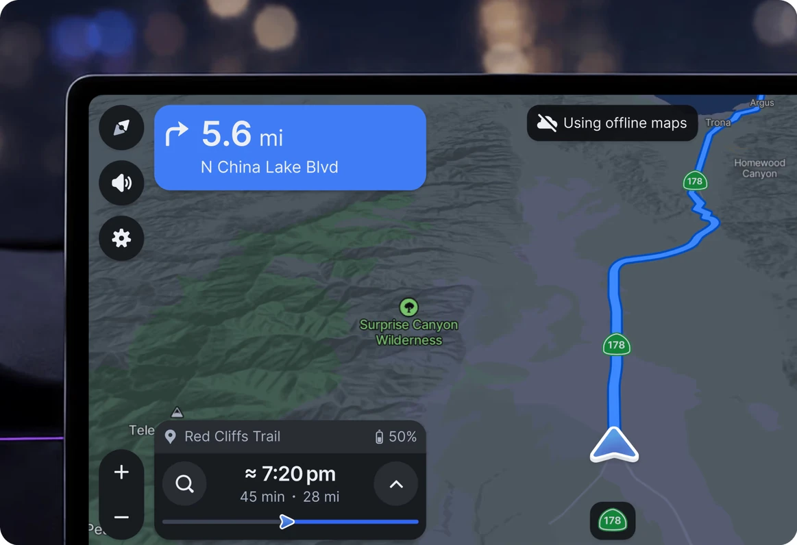
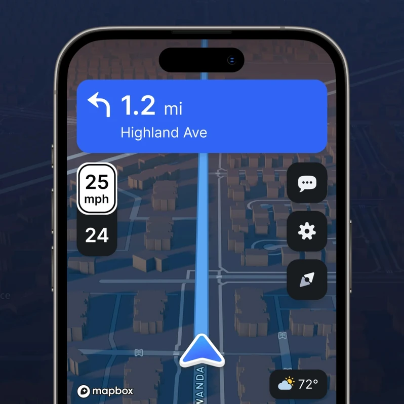
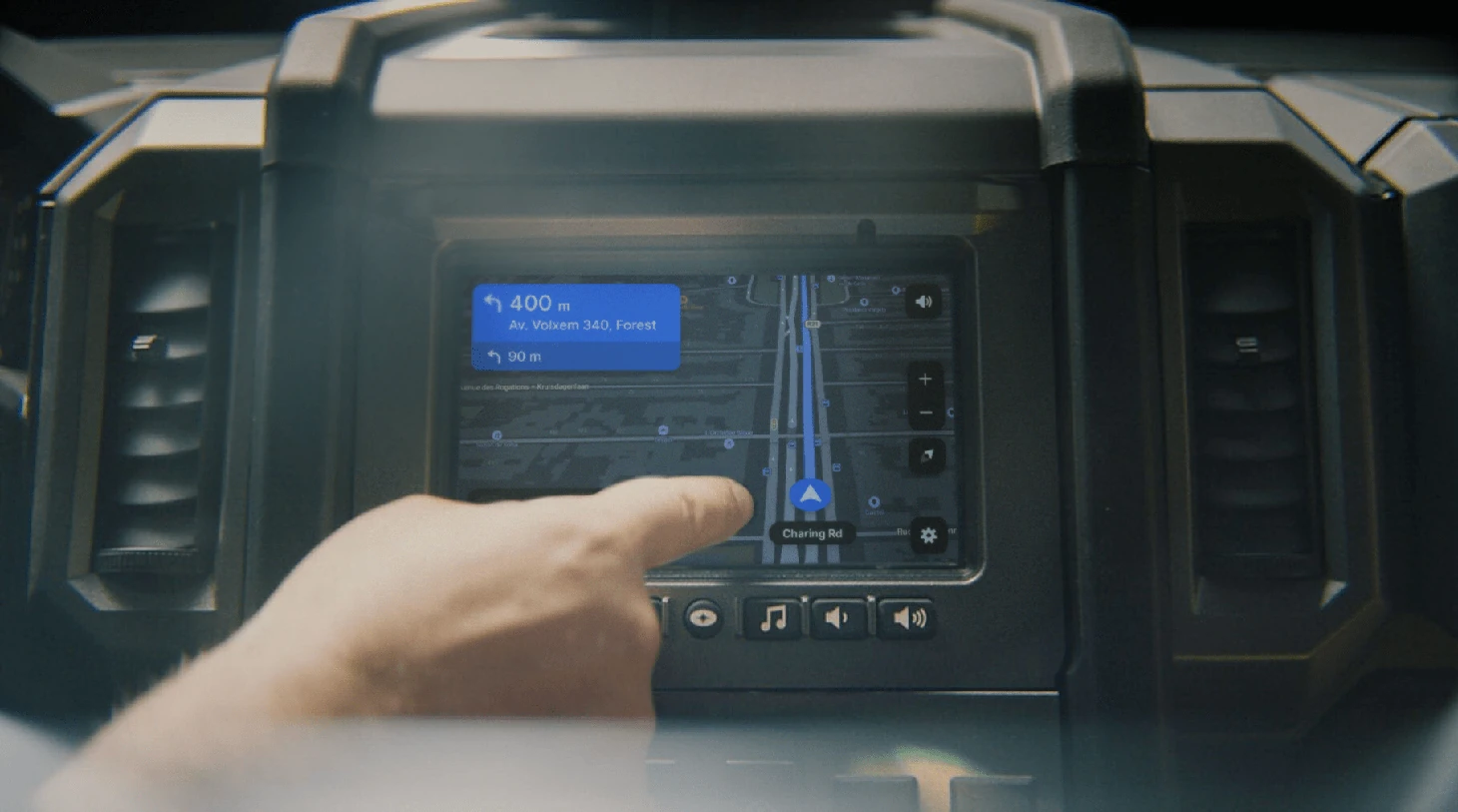
Transitioning from the cartography design team to automotive, I spent six months with the Studio team. I worked on various parts of the interface, some of which are shown below. While some designs were implemented, others remained in the WIP folder. Despite this, I thoroughly enjoyed engaging with a new product and enhancing it.
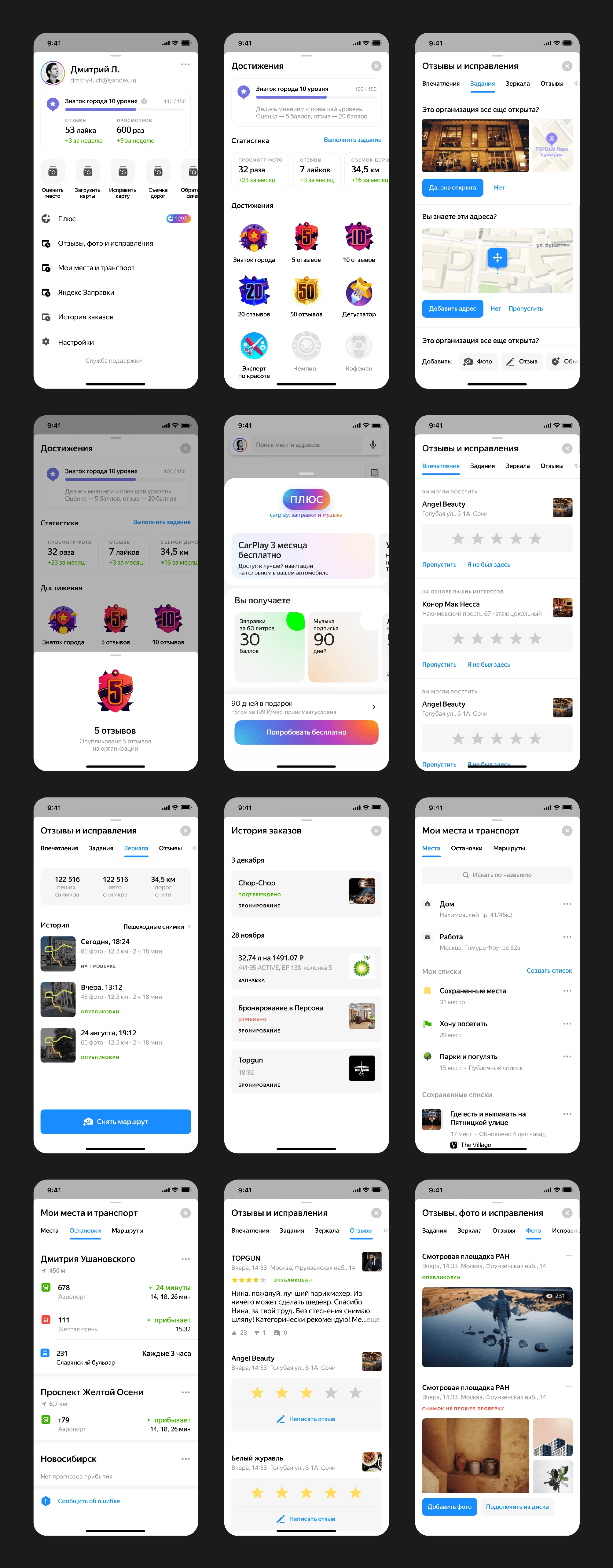
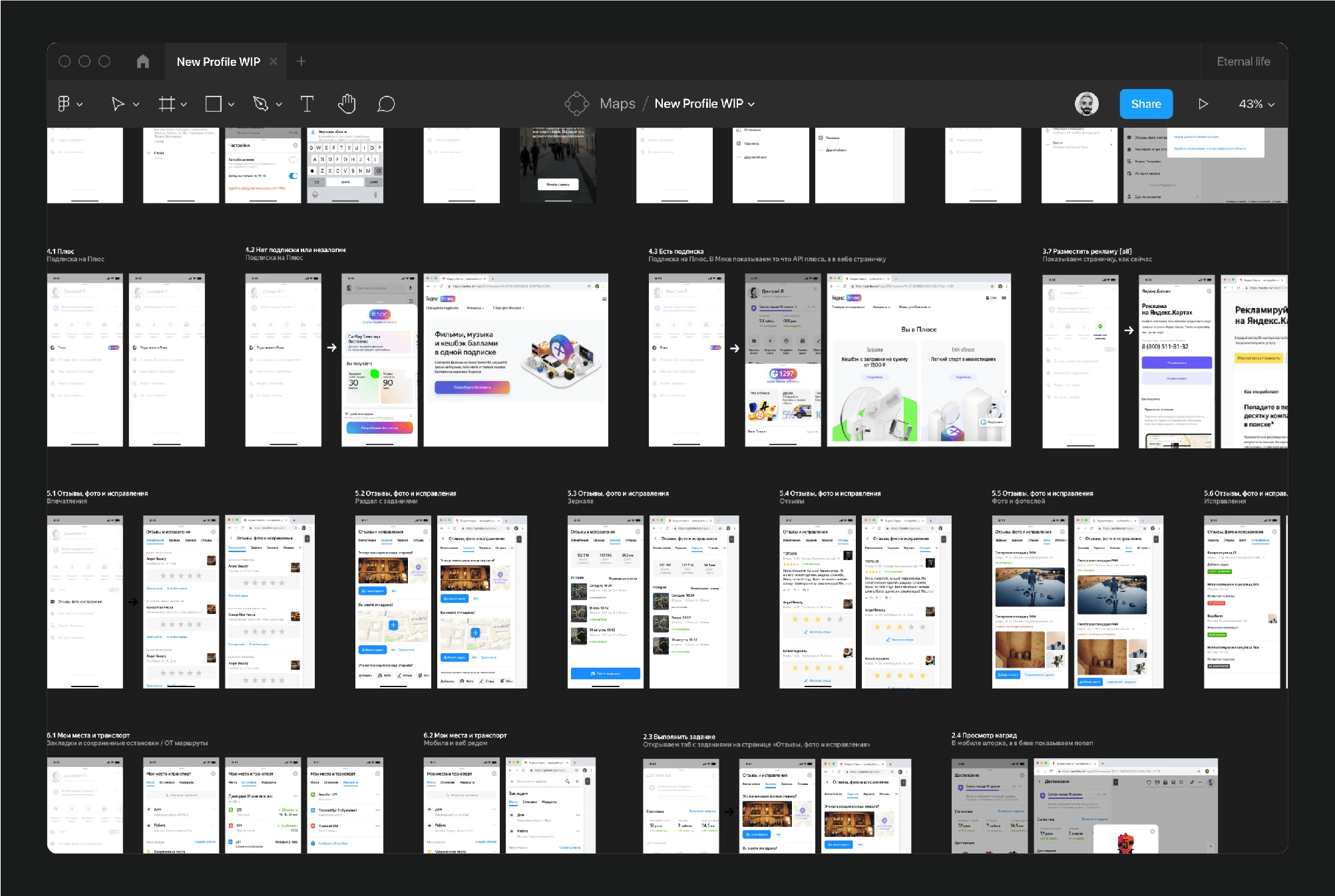
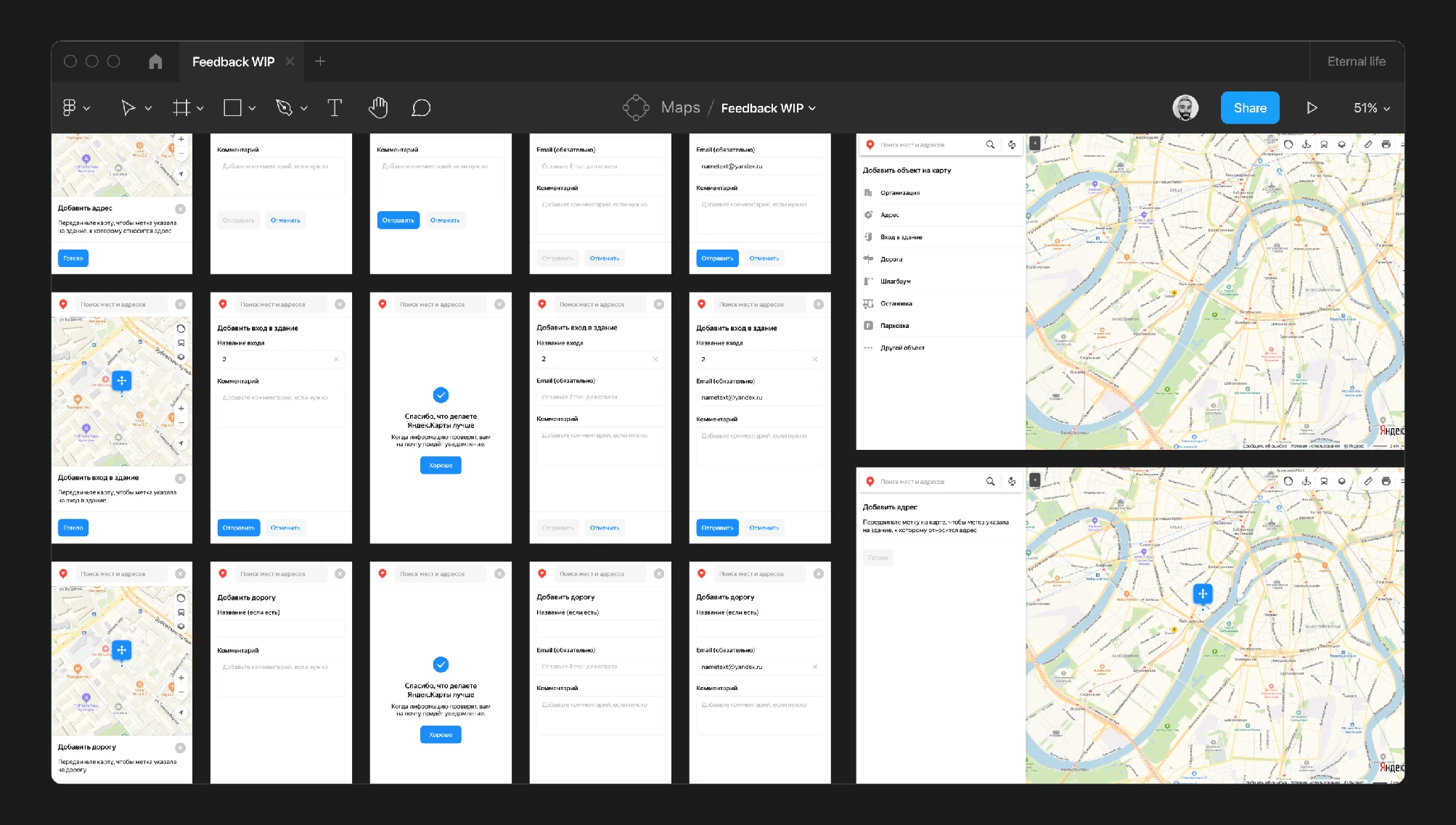
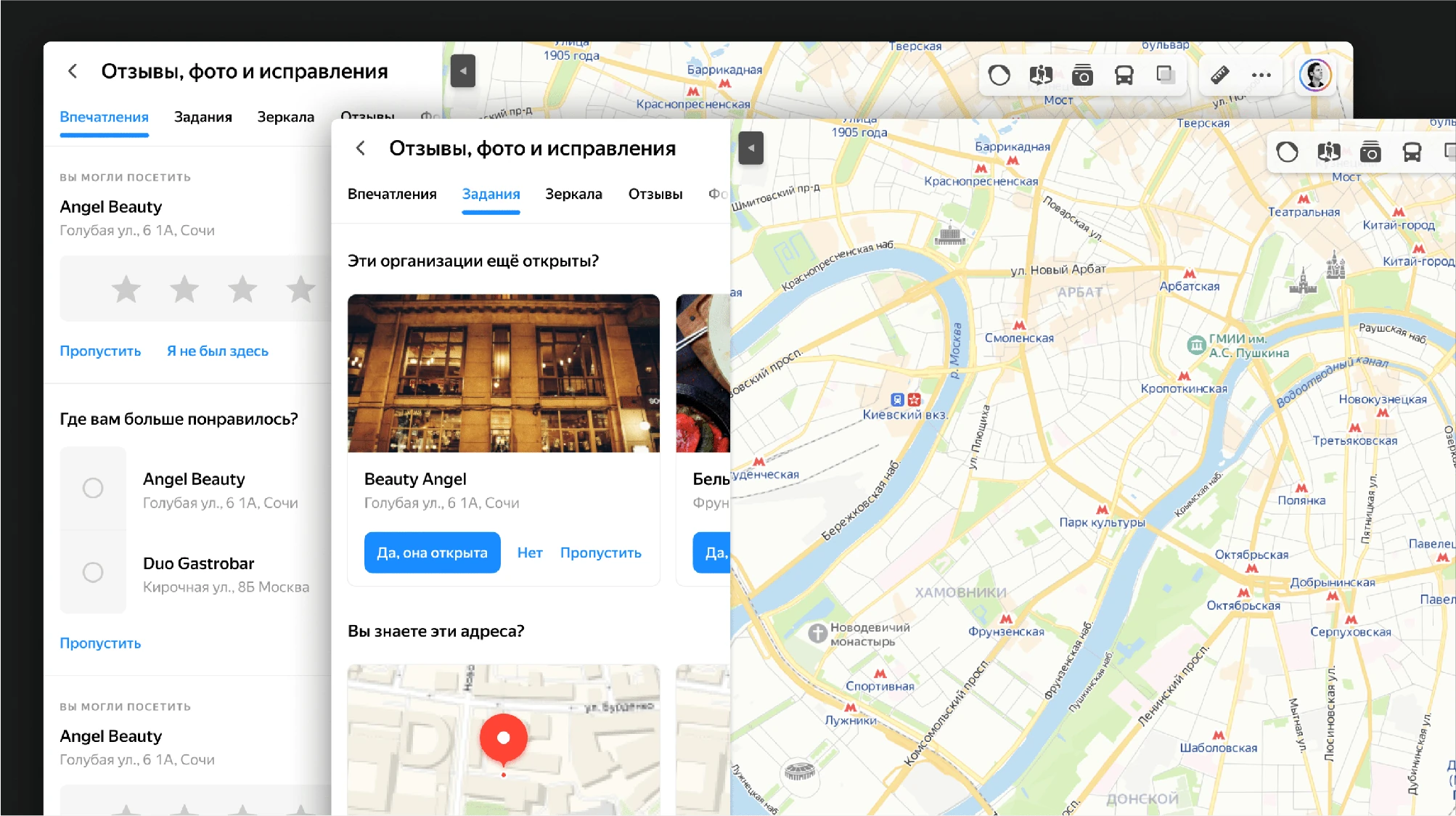
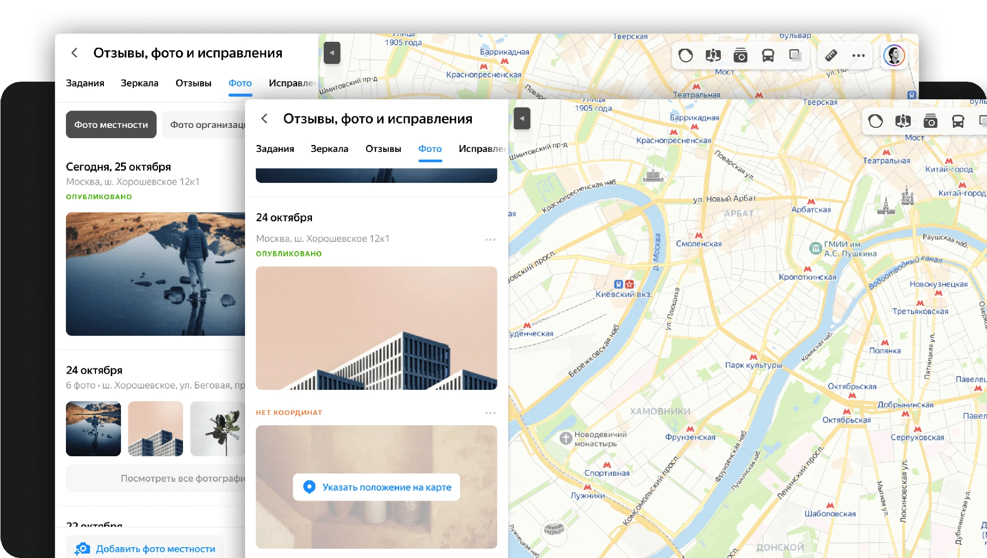
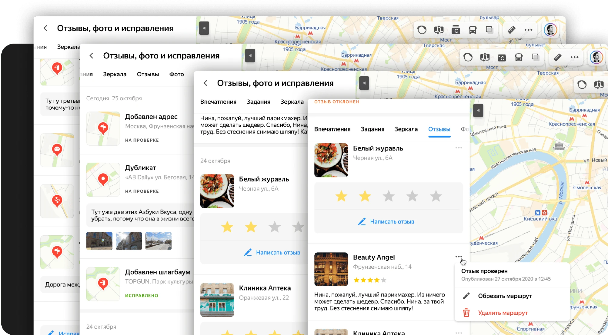
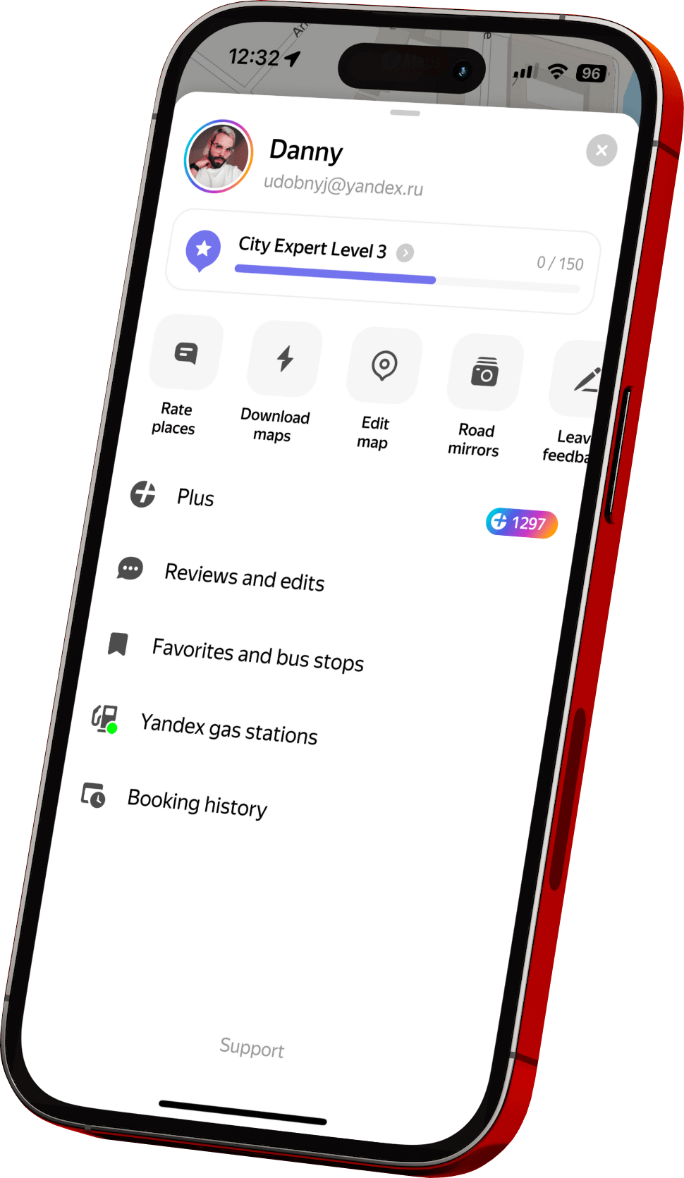
For many years, the personal account in our app was an outdated feature with unclear utility. I was tasked with unifying the mobile and desktop experiences, addressing all use cases, rethinking the logic for collecting feedback (UGC content), and ensuring that all these experiences were user-friendly and intuitive.
My work was divided into two parts: one focused on redesigning the personal account across all platforms, and the other on devising a simple and cost-effective method for feedback collection.
After numerous iterations, coordinating with the development team, and aligning with a common launch timeline, we successfully implemented the first version of the personal account. We created a new account with minimal effort in a very short time, using pre-developed blocks and code.
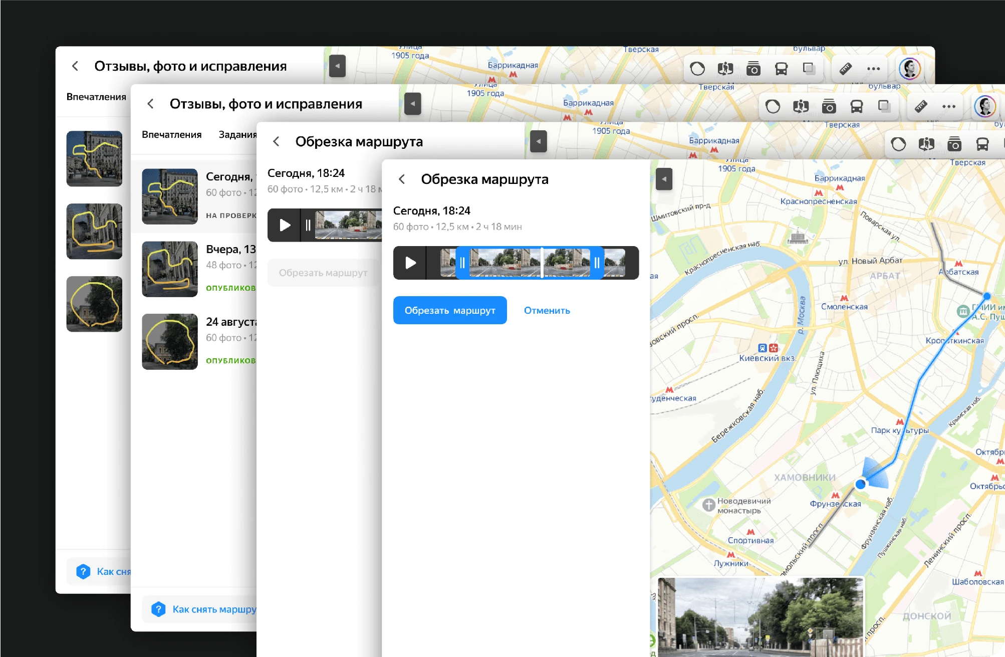
We added a new block for managing images uploaded from car cameras and developed a user-friendly editor.
Additionally, all uploaded photos, reviews, and map corrections are now accessible on your account page.
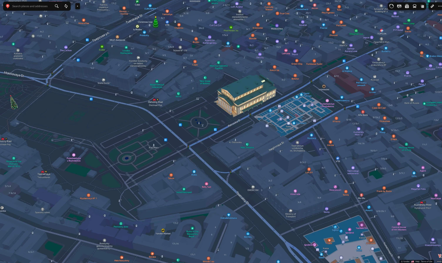
As part of both the product and cartography teams, I fully participated in the massive redesign effort of Yandex Maps. Here, I cover only a portion of this story but aim to highlight various points of my involvement in the process.
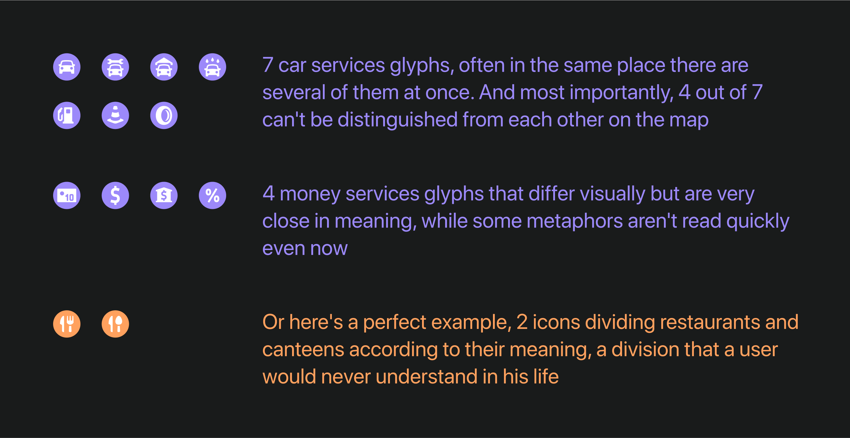
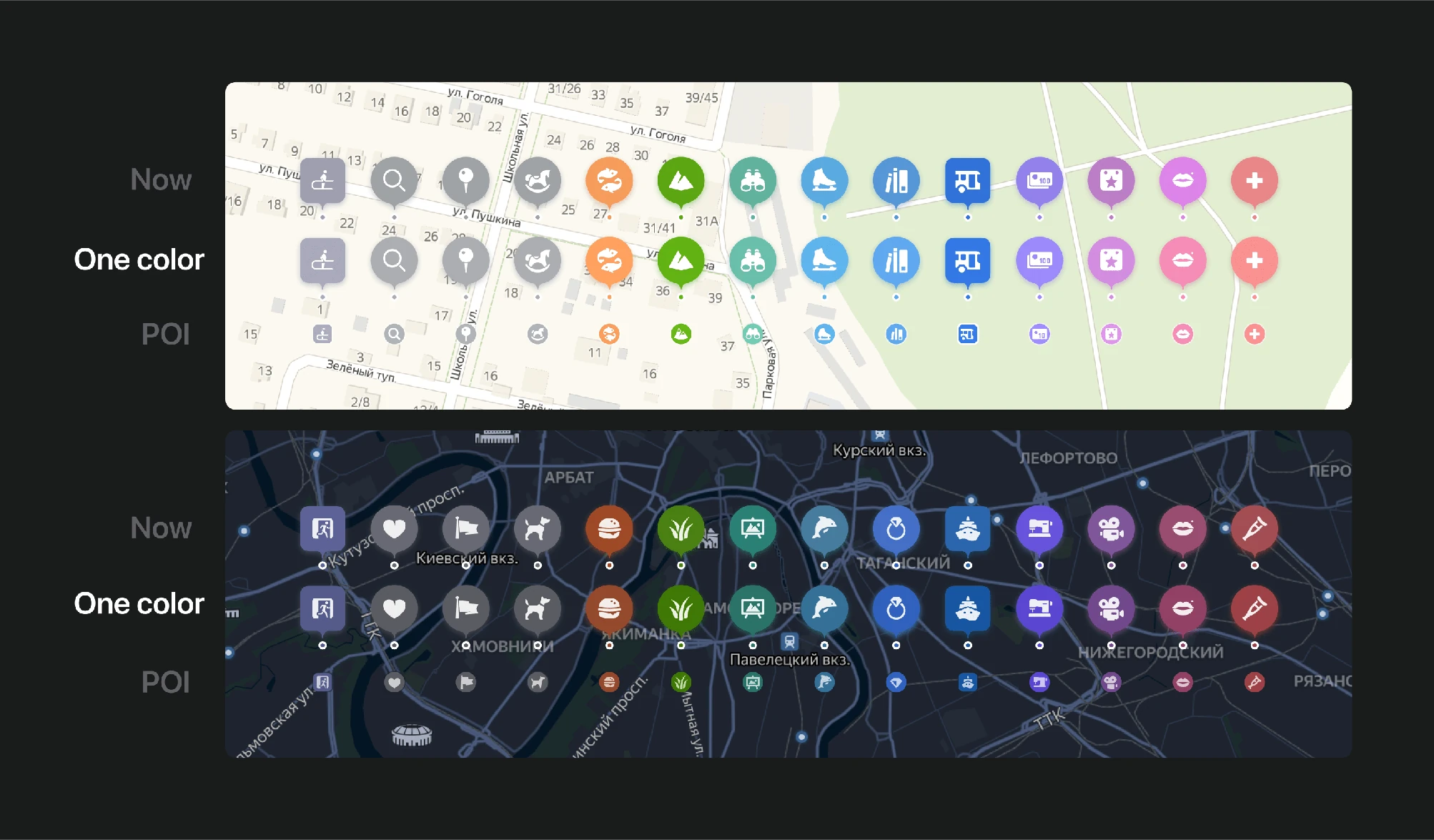
A major focus was the complete overhaul of the POI logic on the map—adjusting their number, colors, and graphic metaphors, which were previously excessive and unclear.
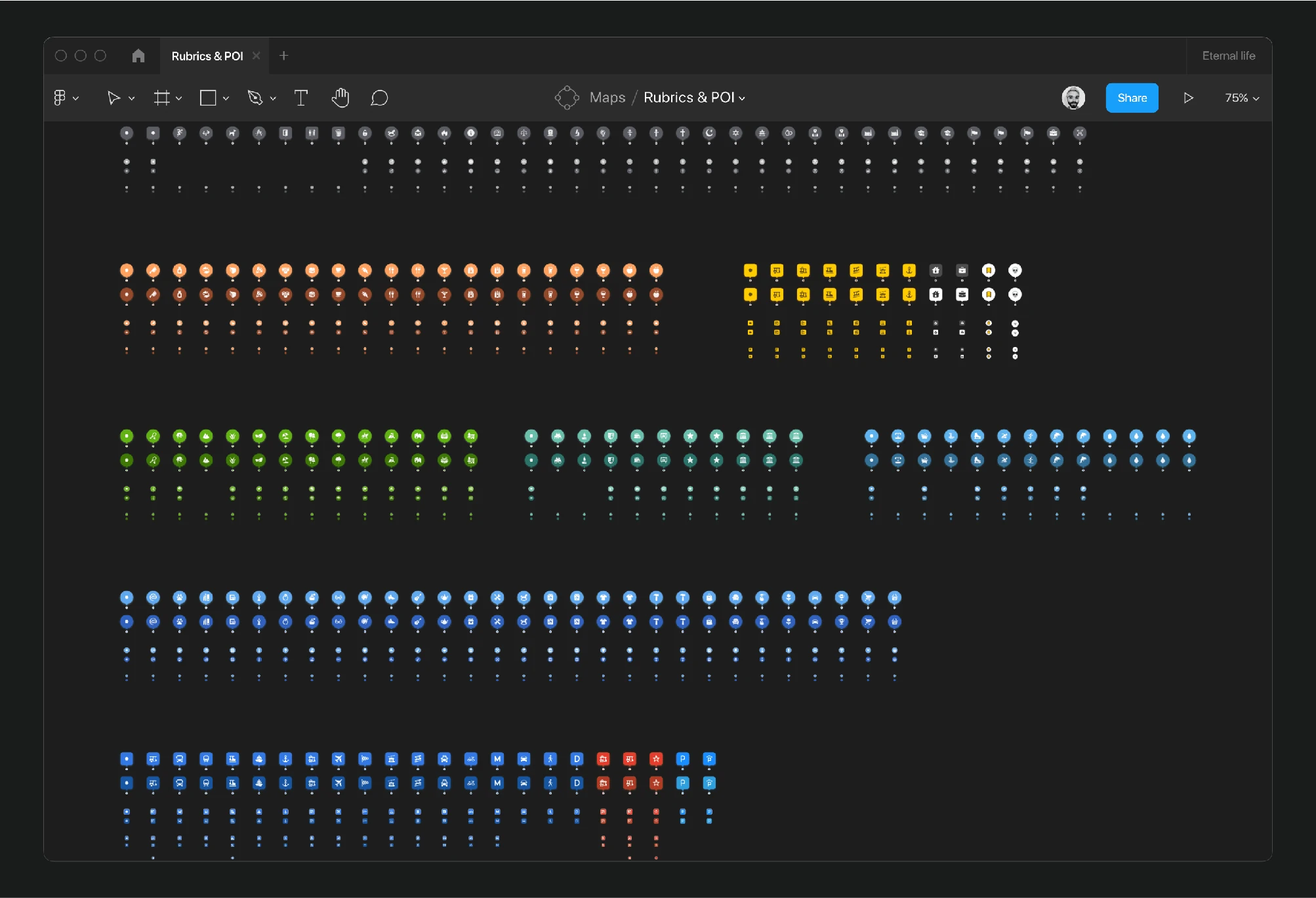
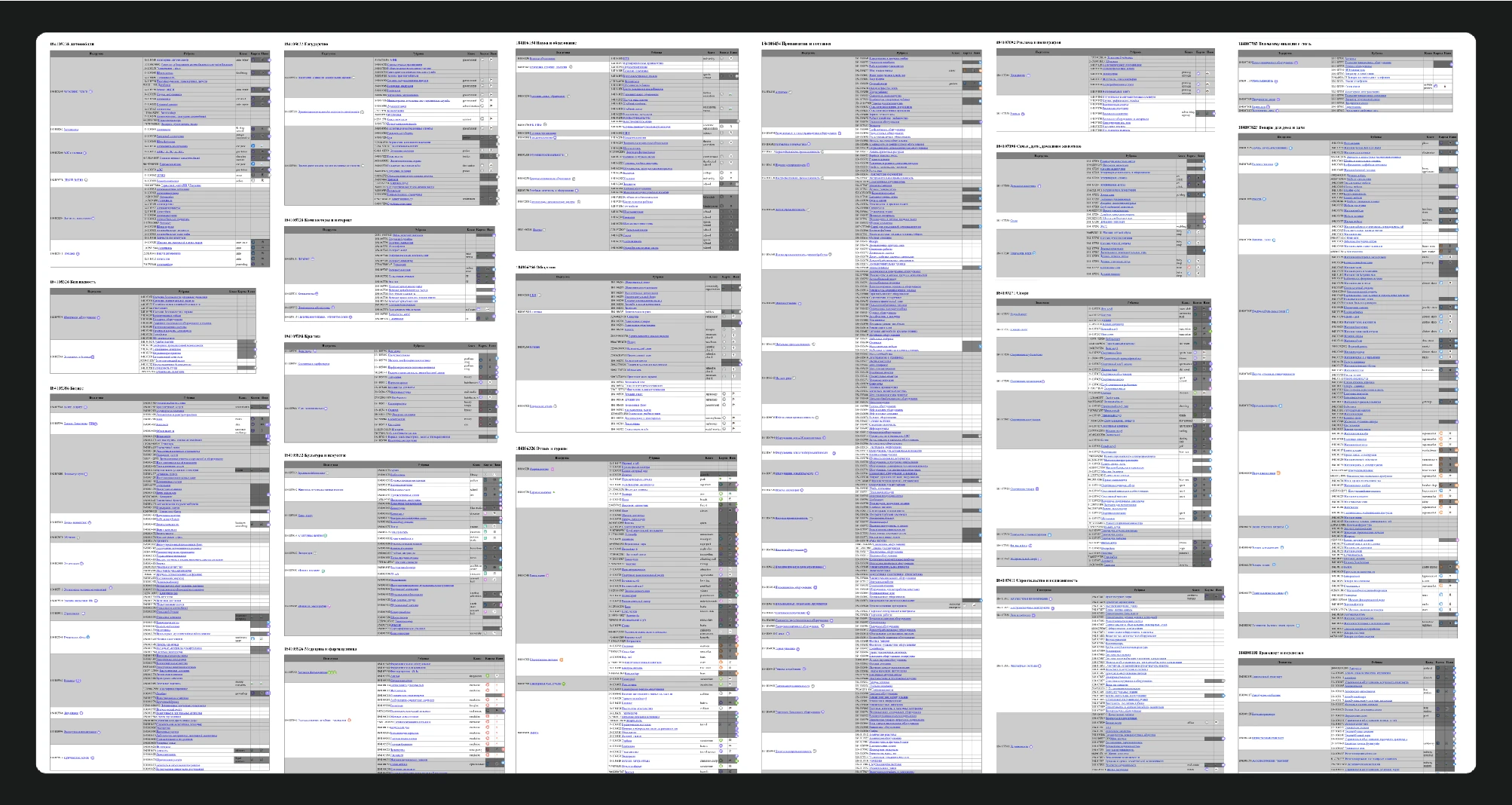
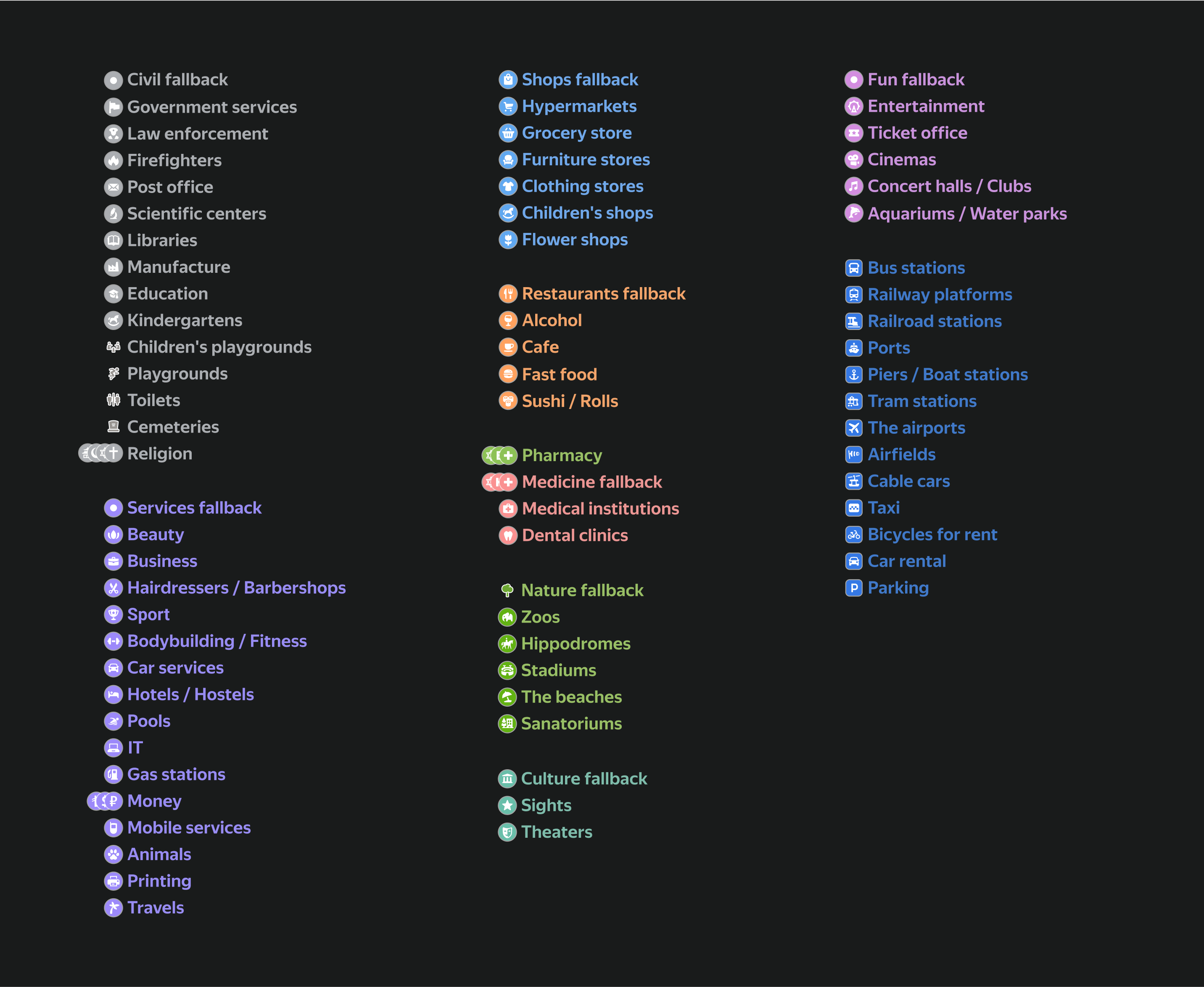
I addressed these issues by performing a detailed analysis of the existing rubrics system. I methodically reviewed thousands of rubrics, assigning appropriate glyphs and fallbacks for each group to ensure a common metaphor if new categories appeared or specific ones failed to load.
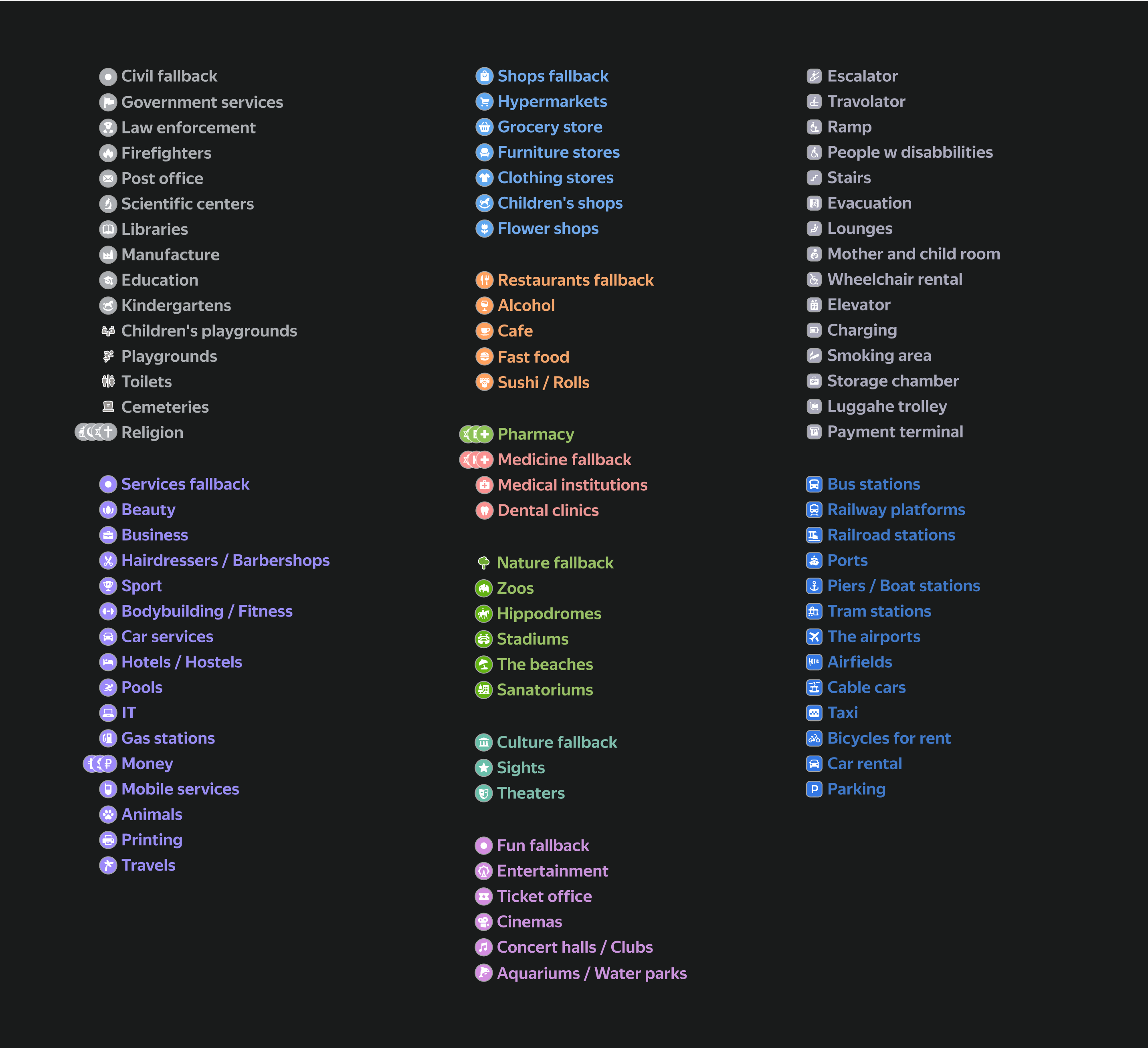
After two stages of simplification, from the initial 224 glyphs, only 75 remained. These included:
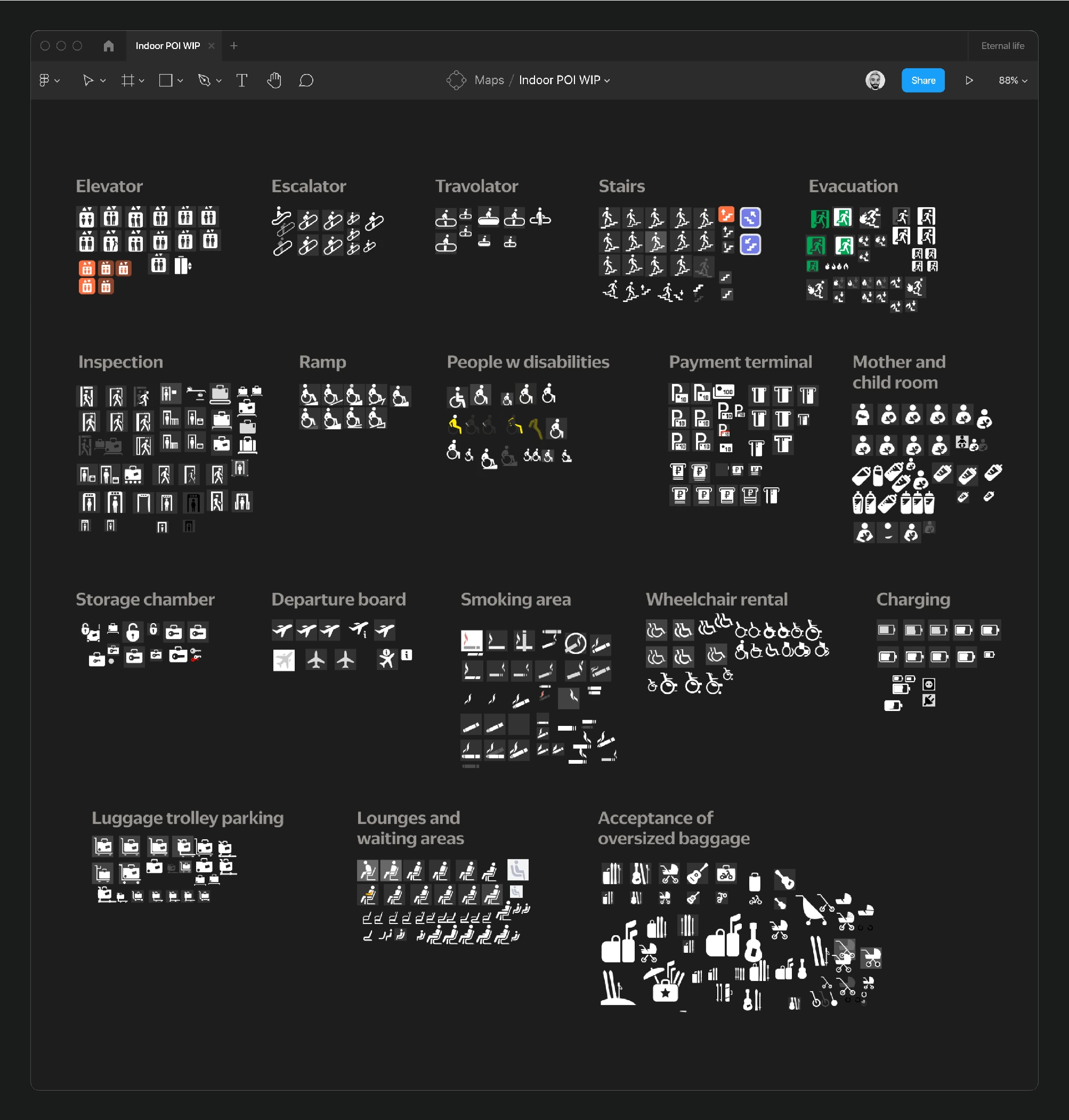
Concurrently, while reducing glyphs, work was also being done on the Indoor layer, introducing 18 new glyphs after extensive research on indoor mapping solutions from neighboring services. However, only 15 of these glyphs were implemented on the map.
The refined selection left only necessary and understandable metaphors: 9 rubrics, 90 POIs. While the system has significantly improved, there’s always room for further enhancement.
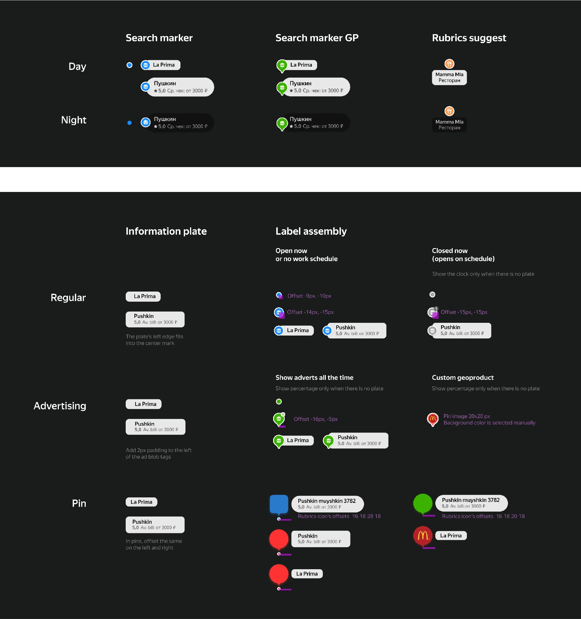
Alongside the POI tasks, I worked on organizing search POIs, including their connections to advertising and their appearance during day and night transitions.
Previously, there was no system for exporting data to the map—everything was manually uploaded by designers with each build. A more convenient and upgradable system was essential.
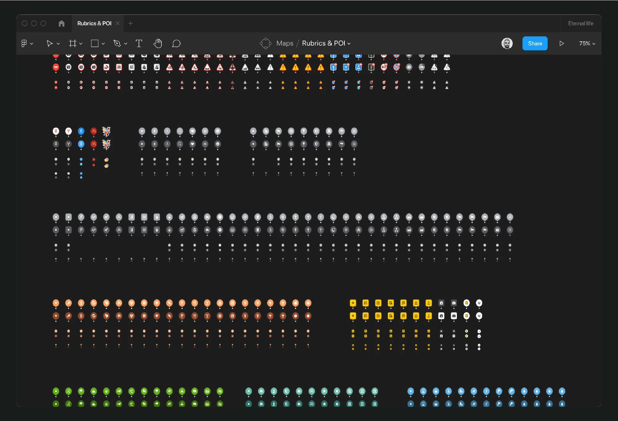
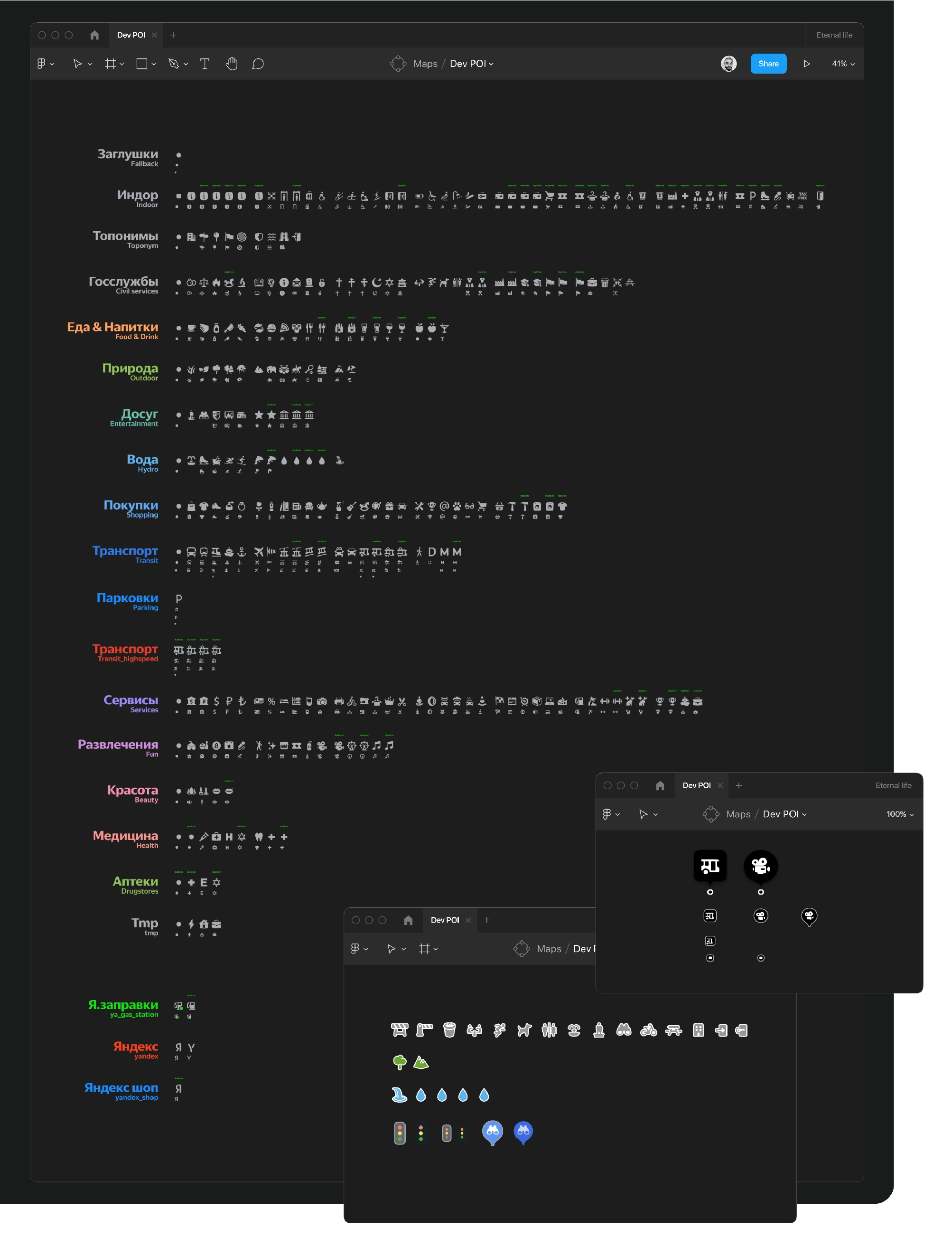
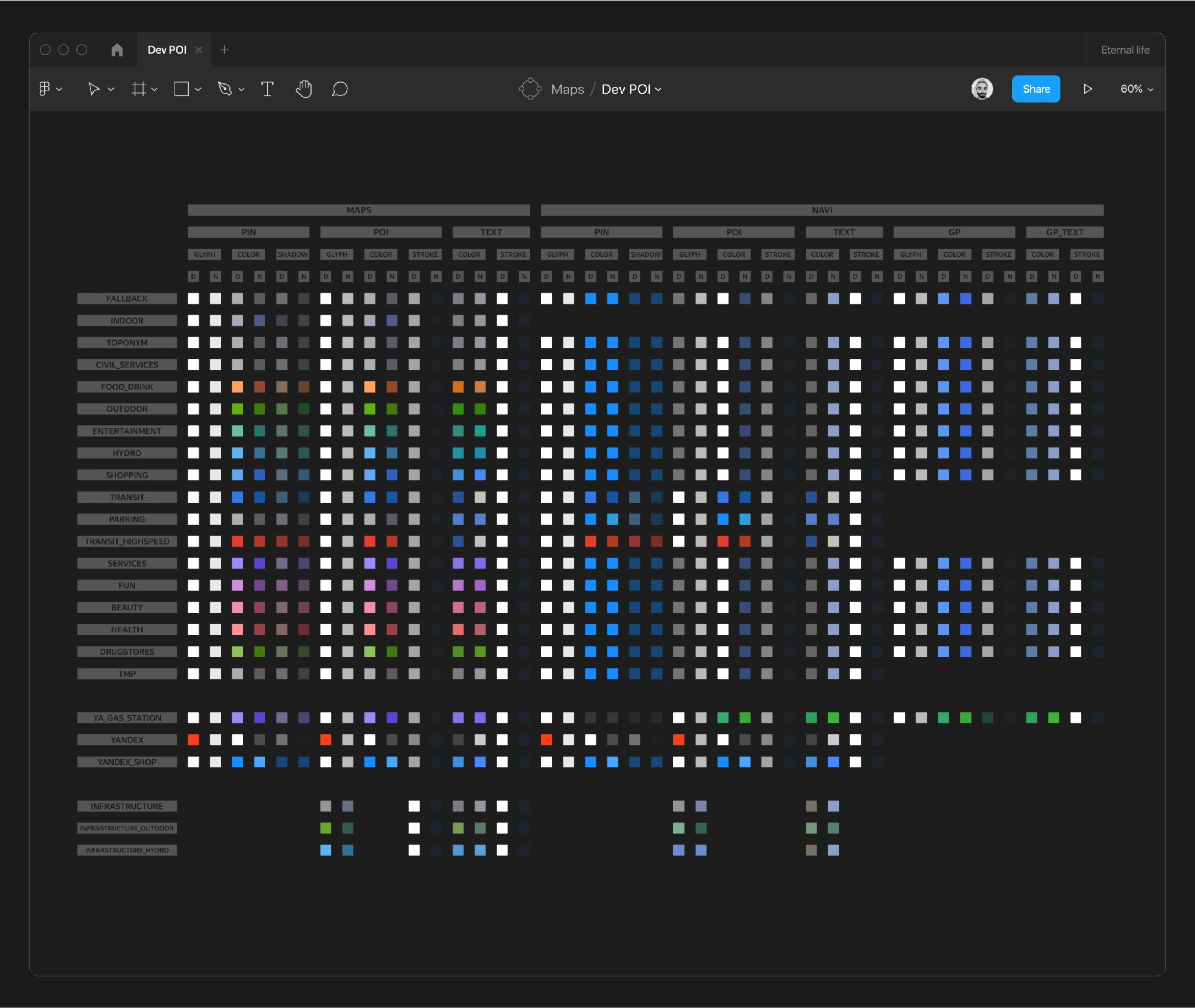
I started by compiling the main file from which all Pins and POIs were uploaded. I organized all glyphs and duplicates by rubrics, aligned them by style and weight, and categorized infrastructure facilities. I broke down Pins and POIs into components for direct export and compiled an extensive color table for maps and the navigator as an additional service.
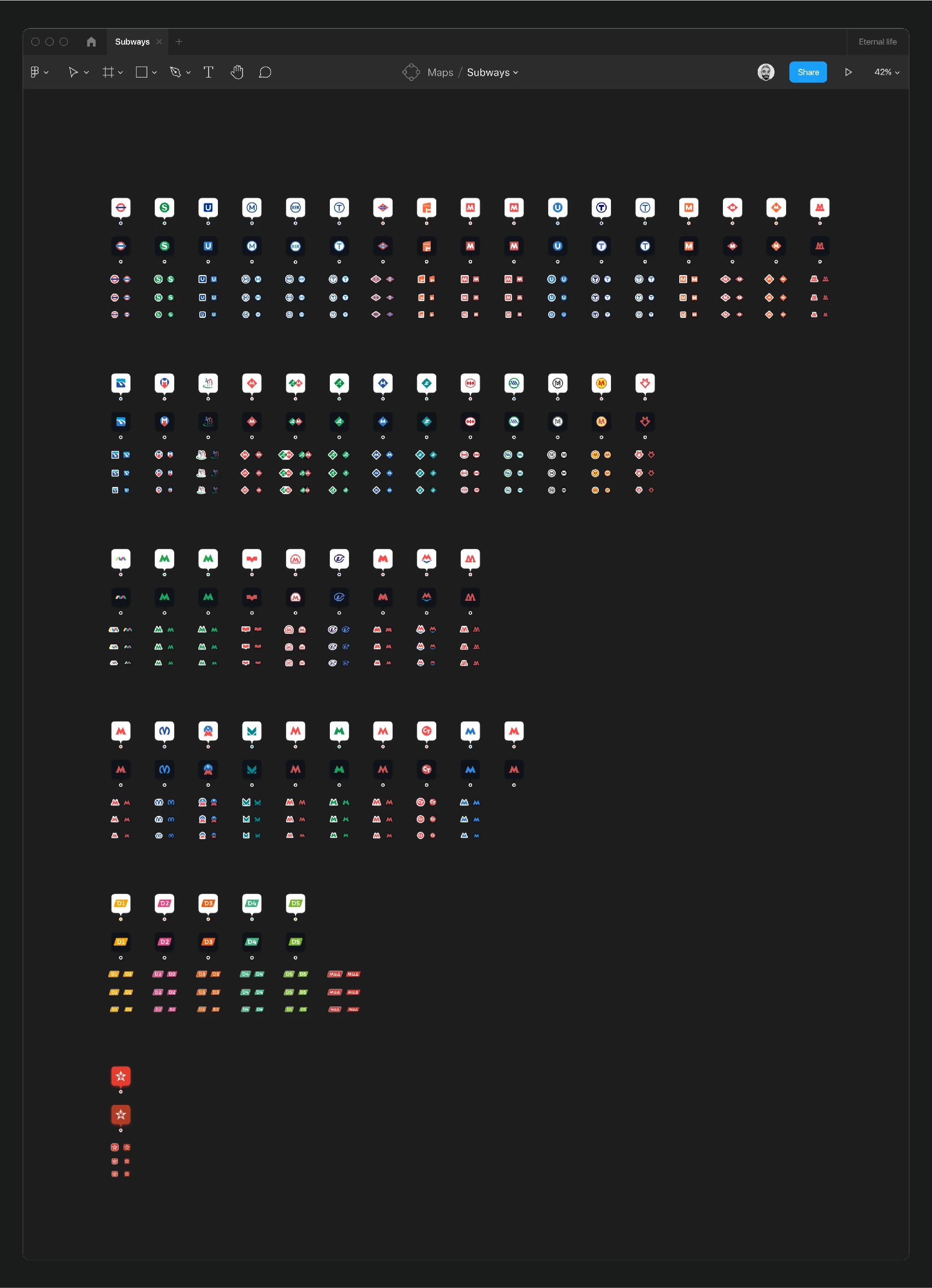
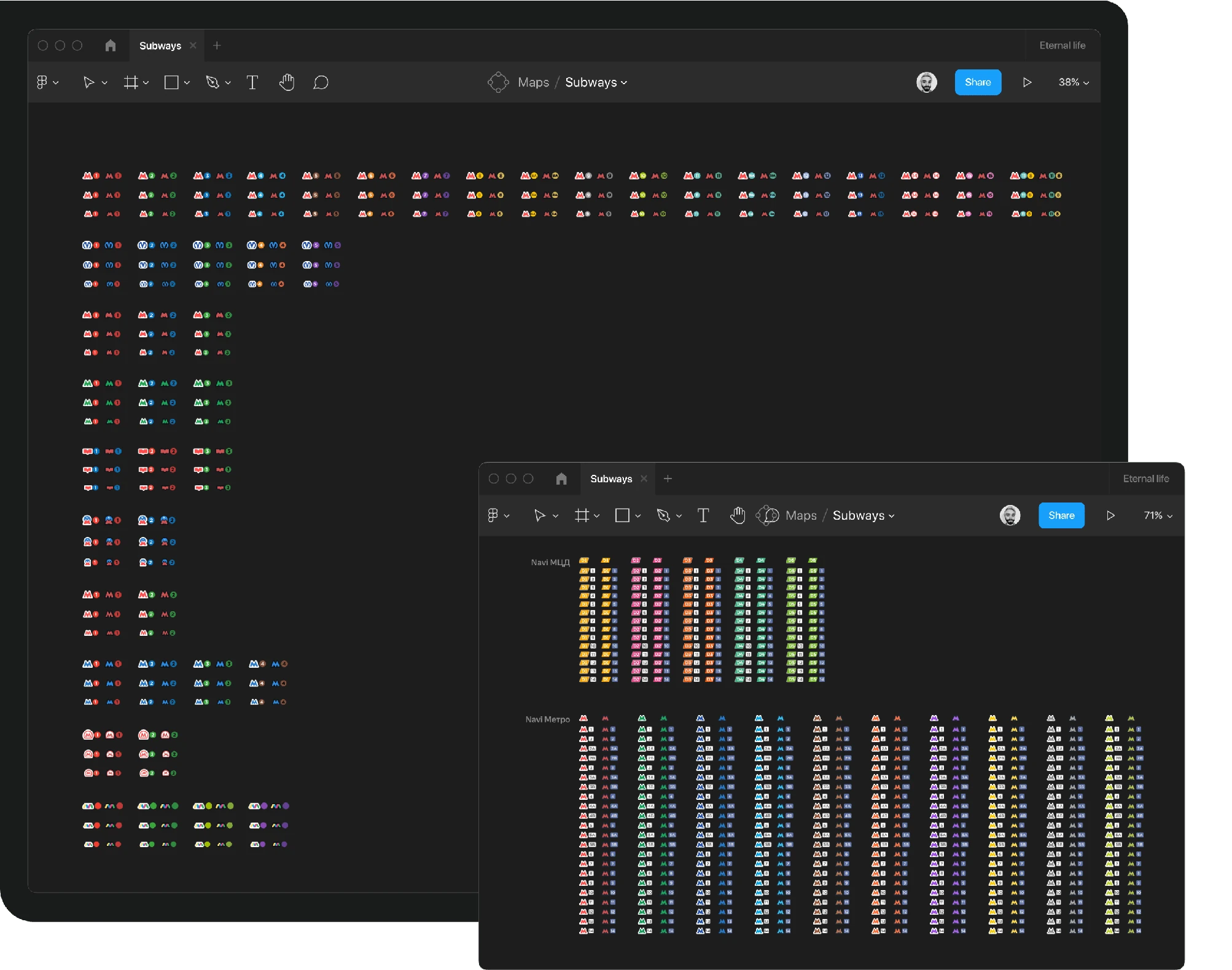
A significant focus was on the metro system, involving unique subway POIs, Pins, exits, pathways, and lines, with optimizations including automatic linking of metro glyphs and entrance numbering.
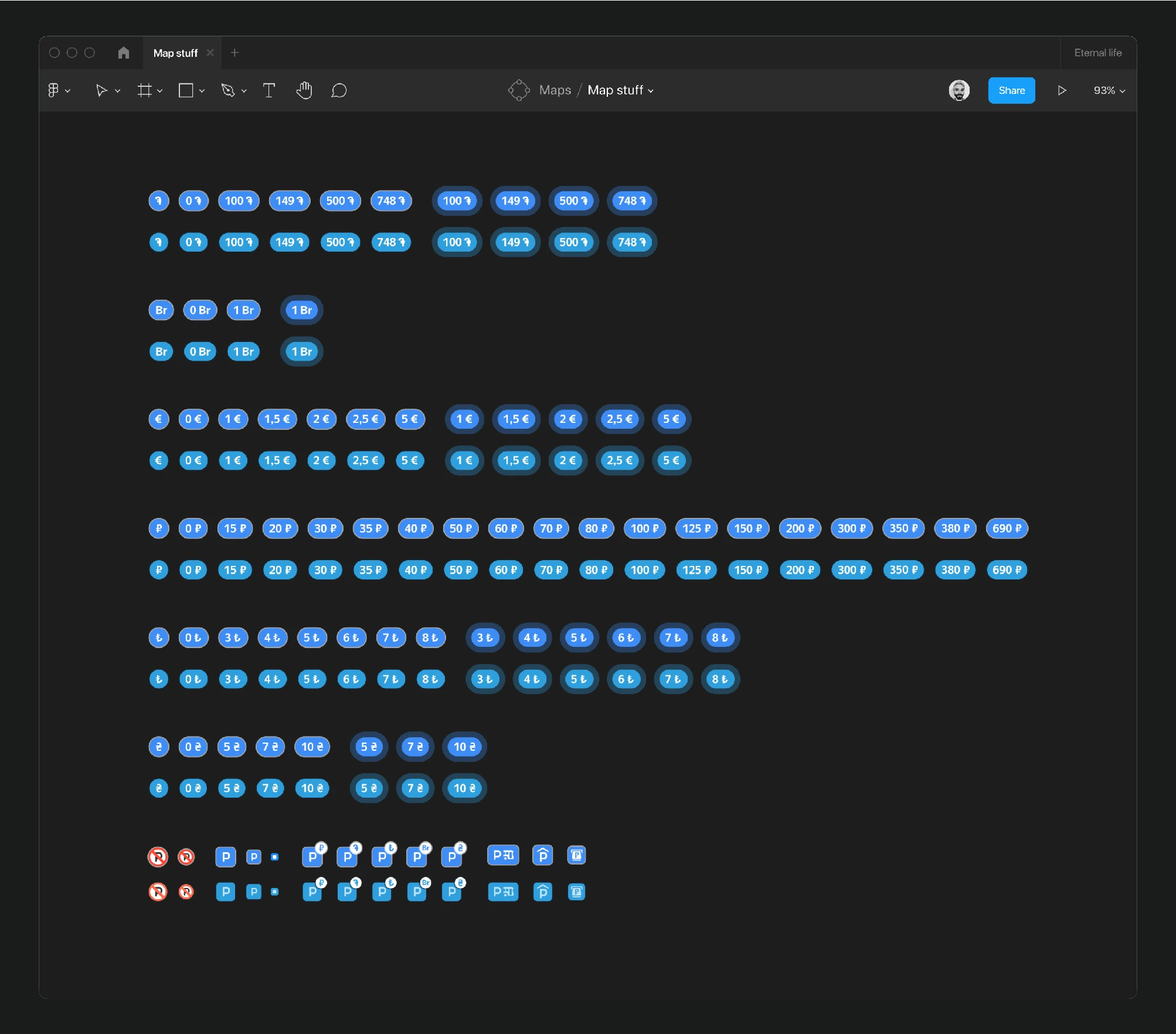
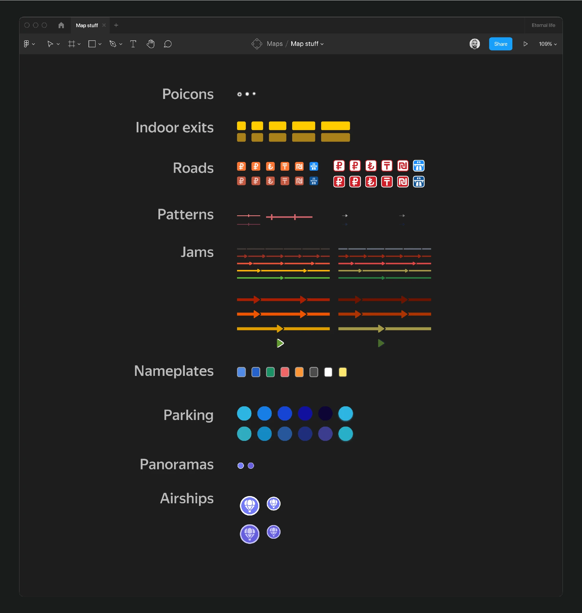
The final export phase included unloading items like parking badges, transport events, and other minor map details.
Numerous small tasks aimed to enhance the map included updating various events, background elements, and traffic styles—each important but not overly time-consuming. Here are some examples:
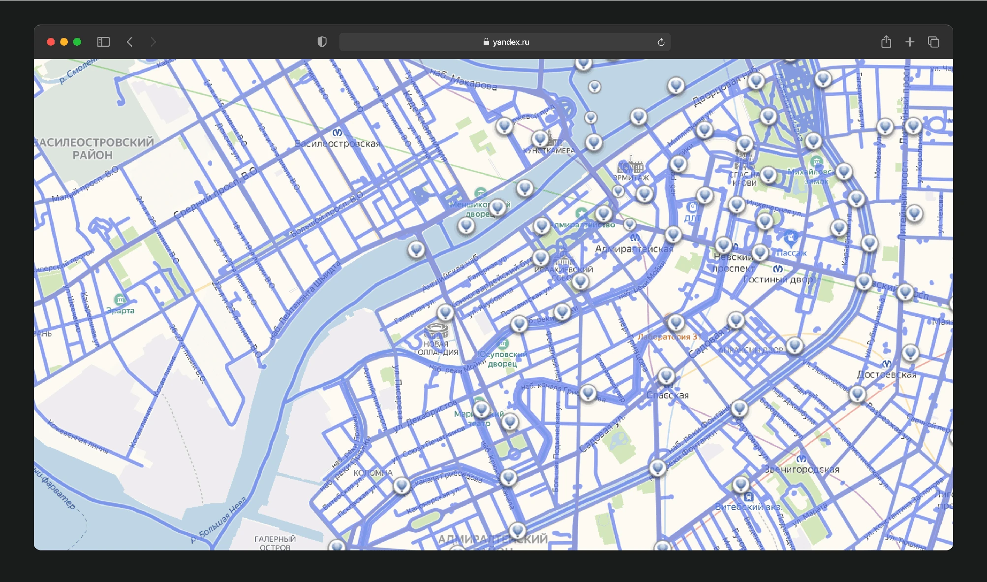
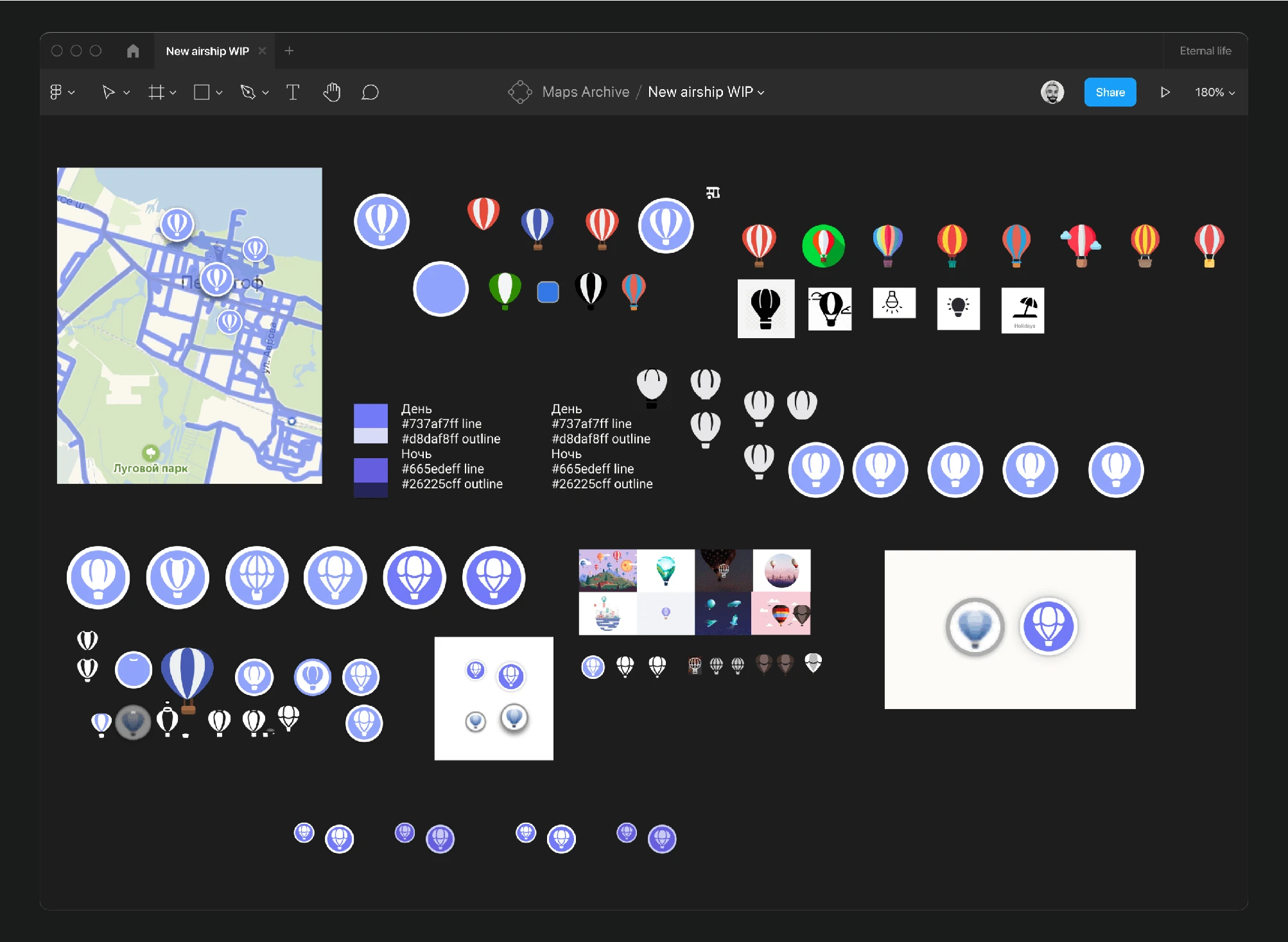
The panoramic layer was topped with an aerial layer that had not been updated for a long time and appeared outdated. I refreshed the glyph myself.
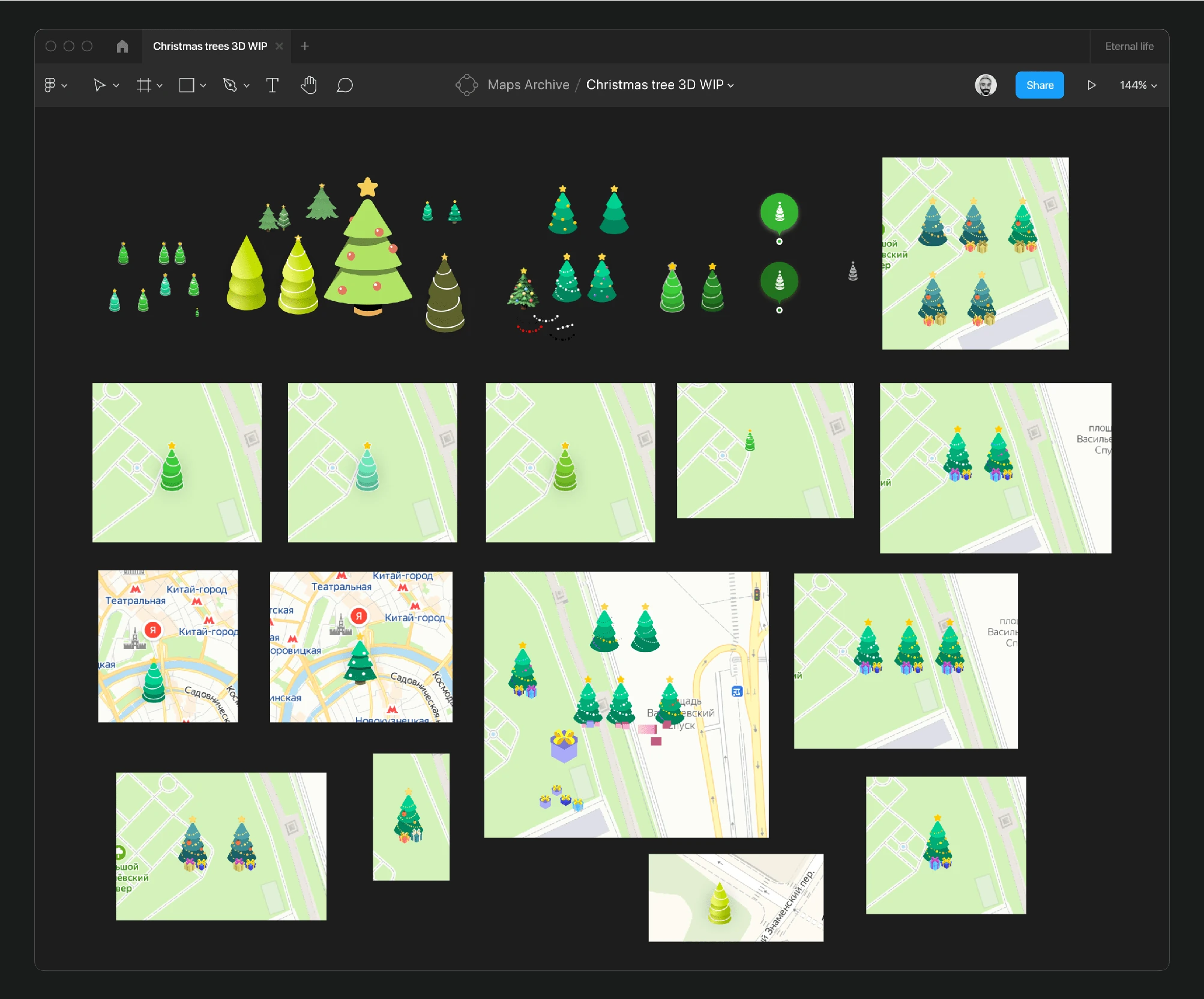
Over two years, we executed two Christmas tree projects. Initially, my team of cartographers and I replaced all park glyphs with Christmas trees during the holidays. Last year, we placed large 3D Christmas trees in city squares.
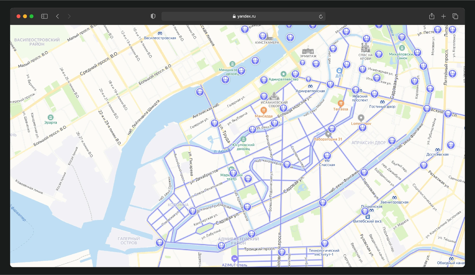
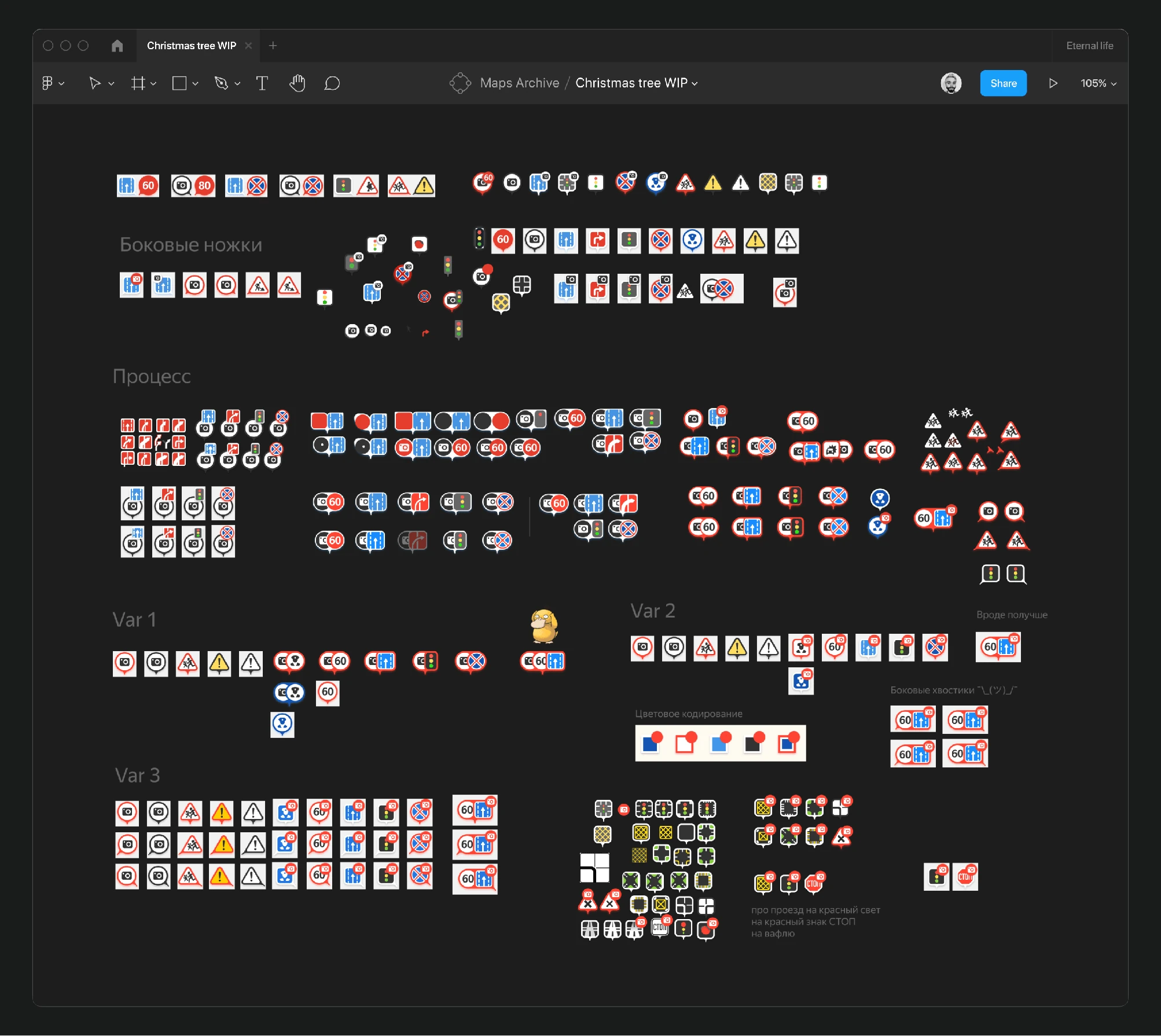
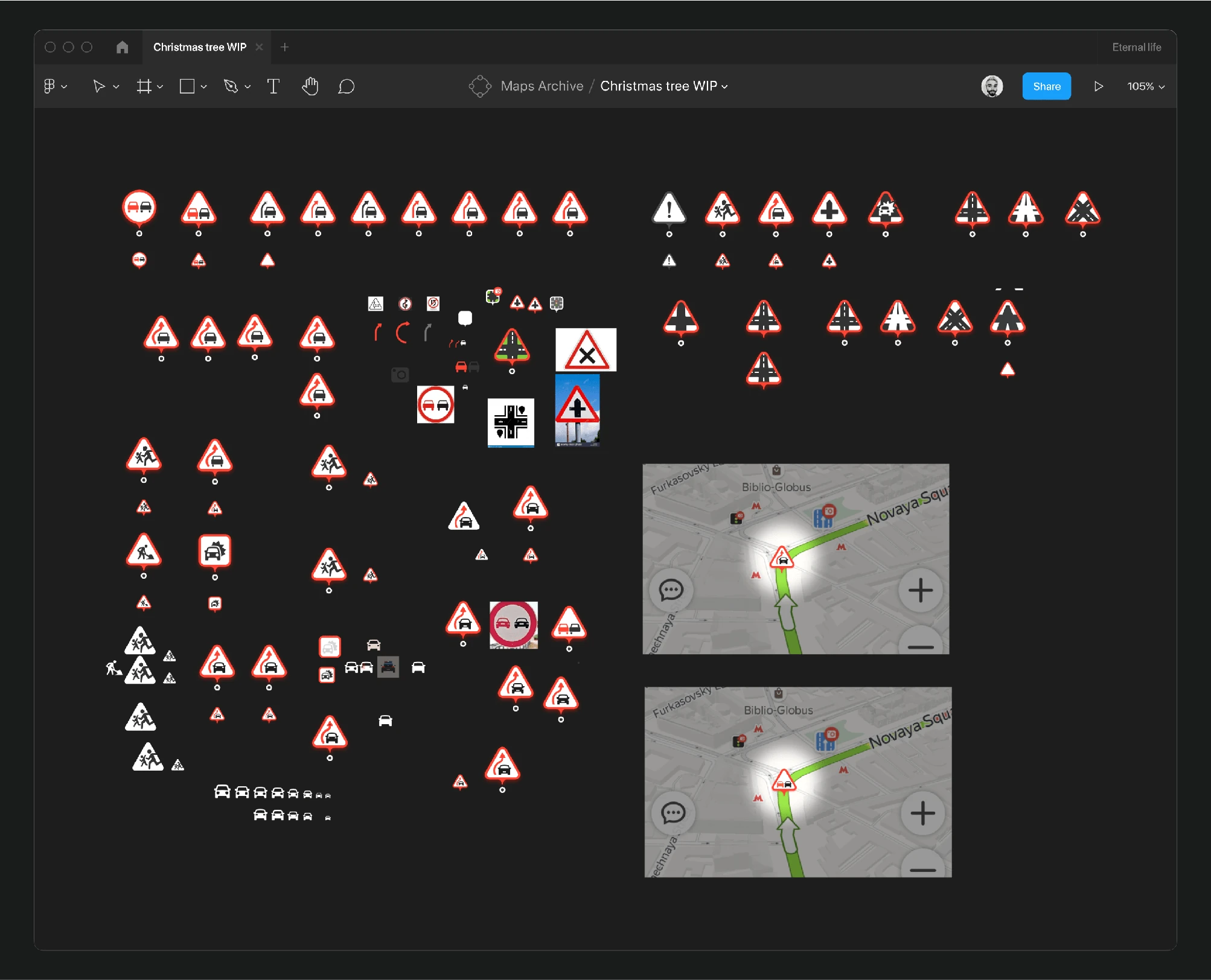
Throughout my tenure, I designed numerous road signs for the map, considering their display logic along routes.
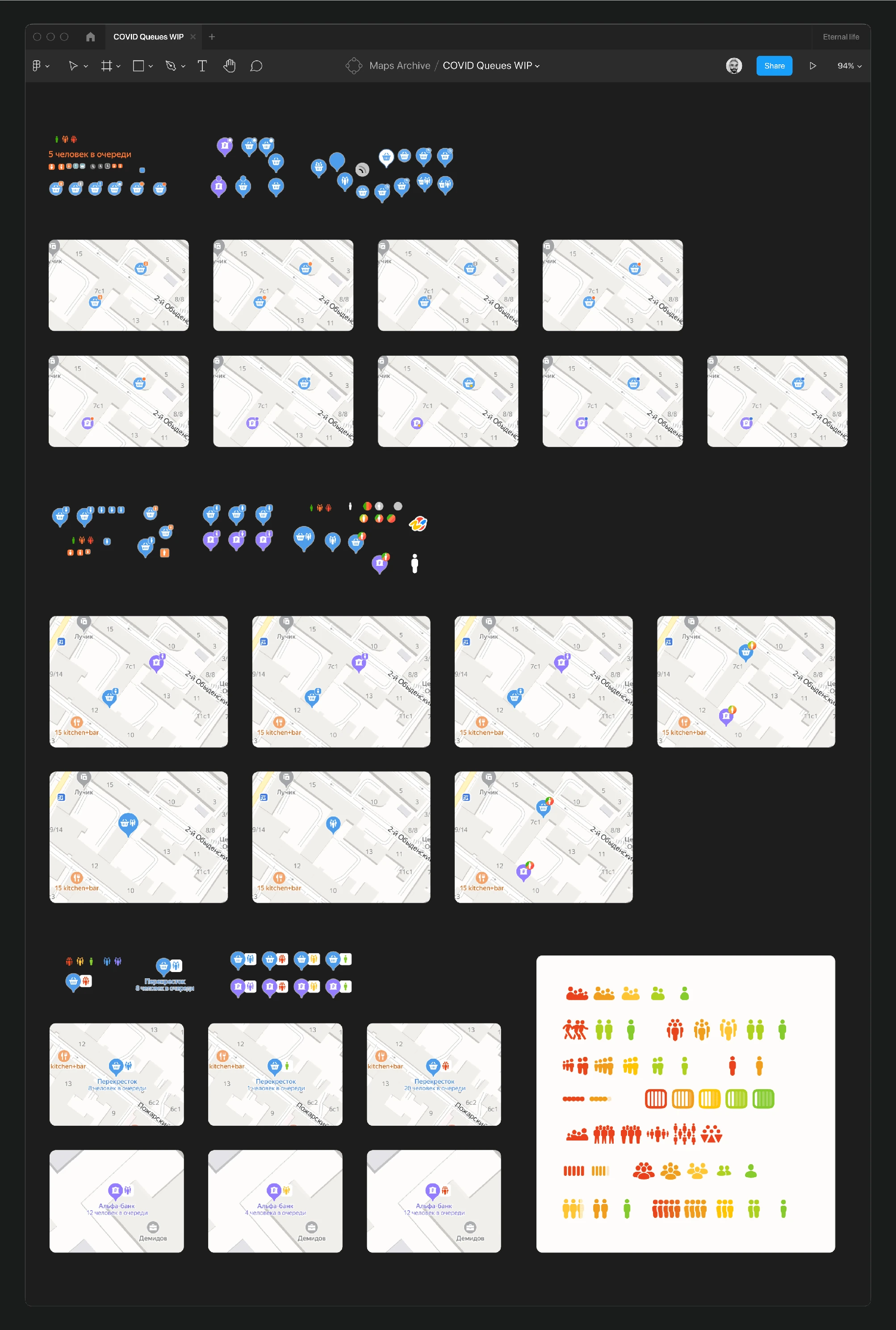
During the coronavirus pandemic, as part of an assistance project, we displayed queues at locations to help users assess the safety of visiting. I devised the visual representation for this.
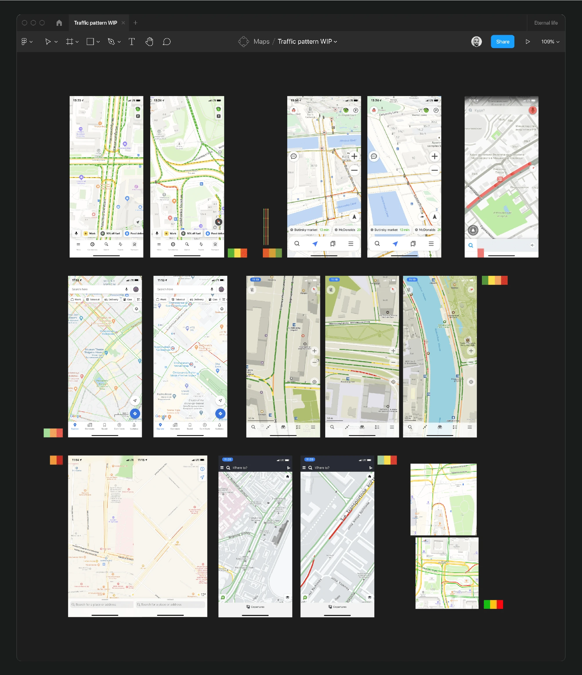
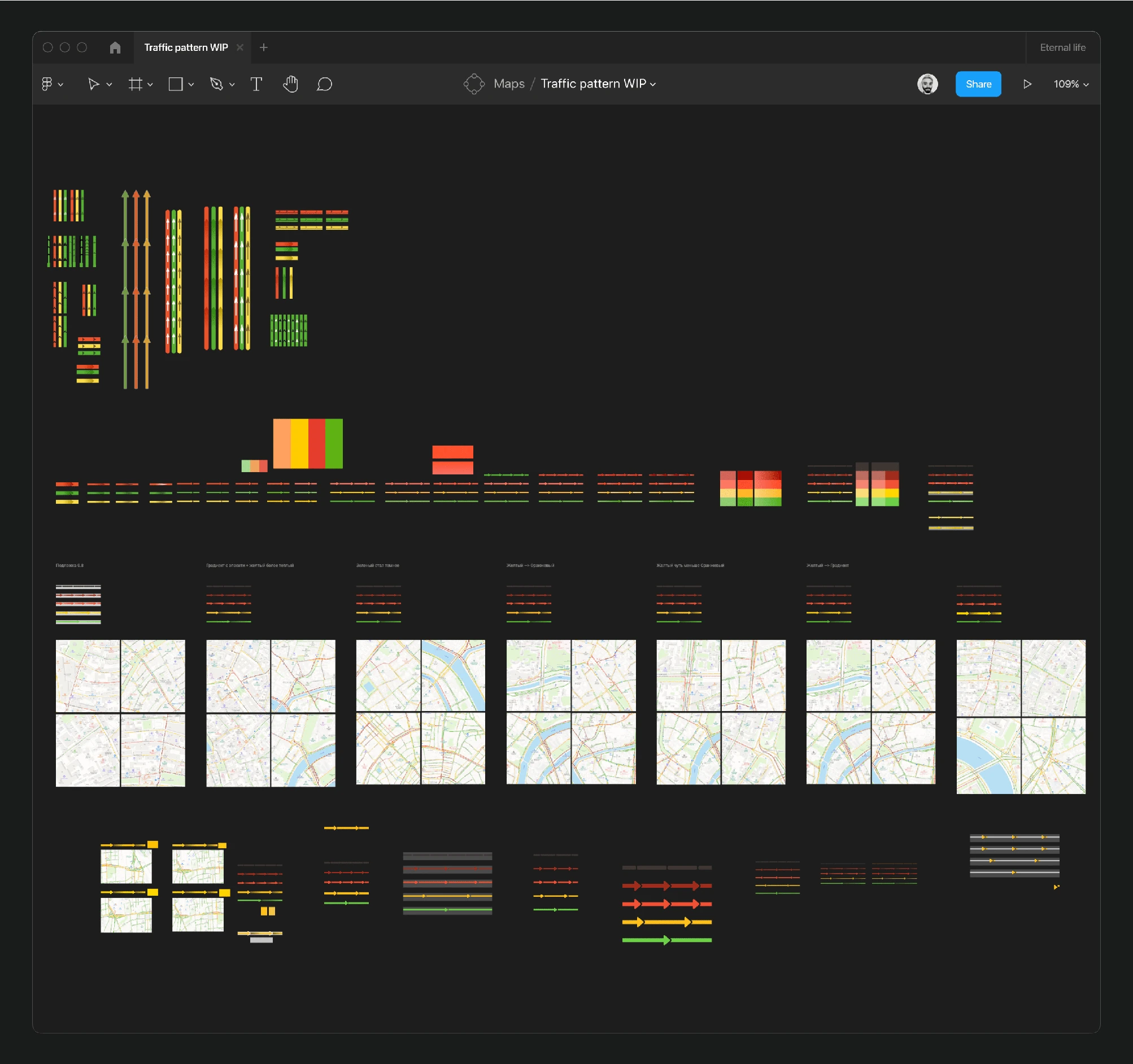
To enhance the visibility of traffic patterns on the map, I researched similar services and tested over thirty different color and pattern options. This task is still ongoing.
Besides working on main products and the map itself, I also updated, redesigned, and unified interfaces for Yandex Maps' internal services. Here, I will present only a selection of these, as there were twice as many services in total.
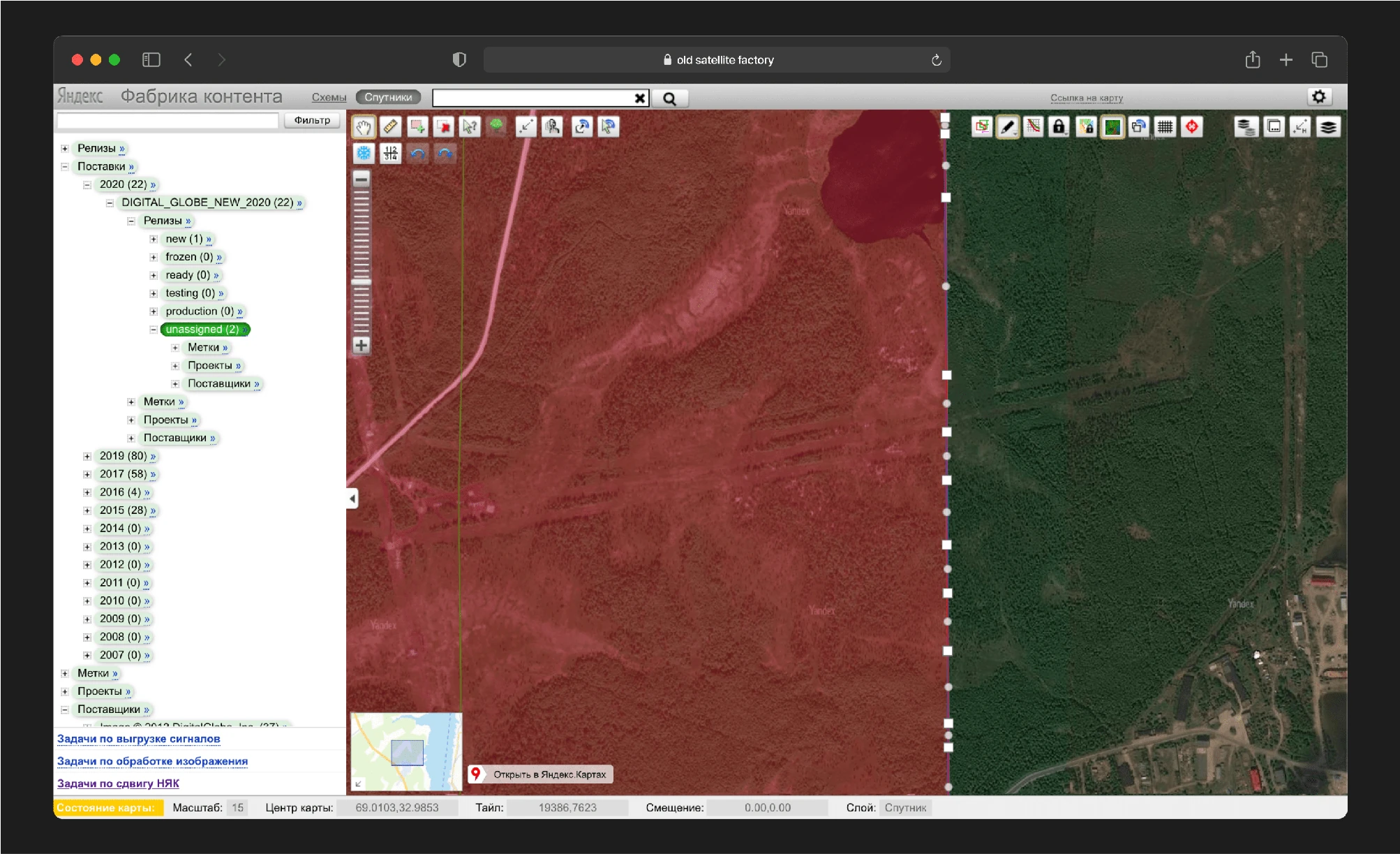
The first was a service for handling satellite imagery. This service not only looked outdated and inconvenient but had also reached a technological dead end. It was built on an old technical stack, and the layout was in xscript, making maintenance and updates nearly impossible. Concurrently with rewriting the service from scratch, I undertook a complete redesign.
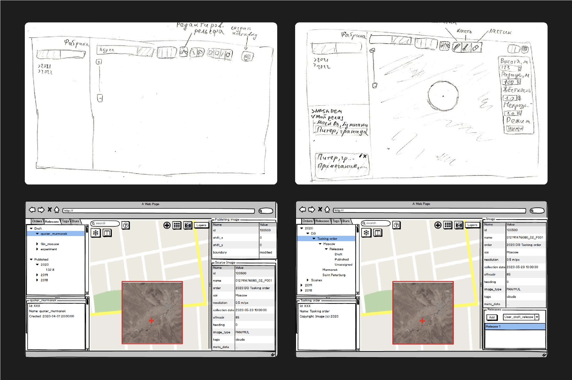
The team of satellite image cartographers was small and deeply attached to their service. They even provided some initial wireframes:
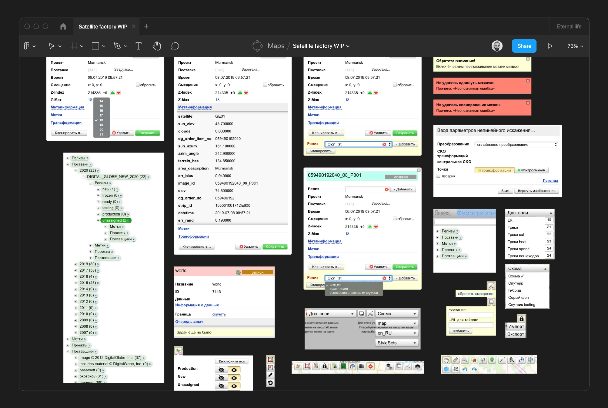
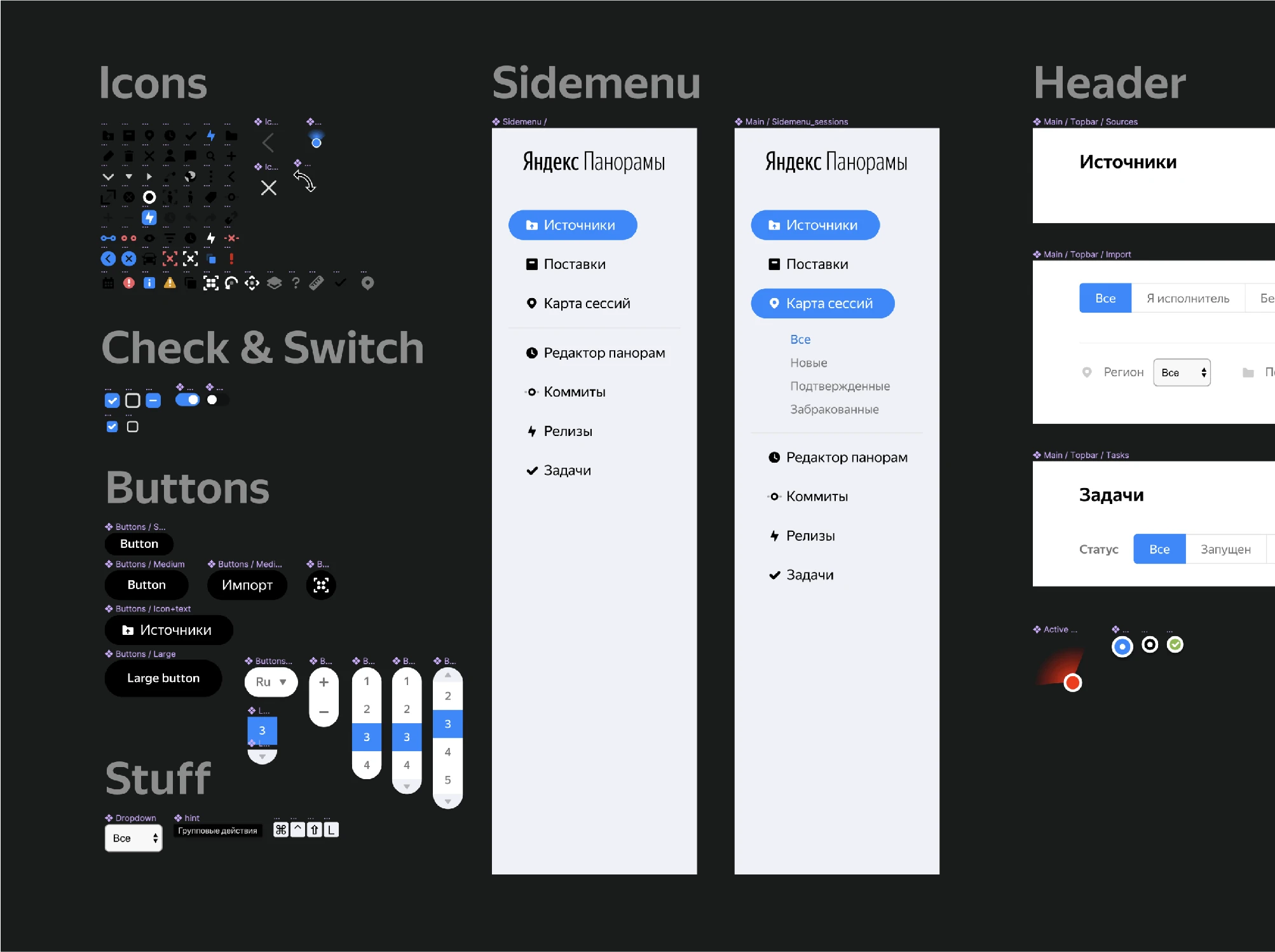
Taking into account the team's desires and the ideas embedded in their wireframes, I deconstructed the service into its basic components. I isolated all buttons, panels, modals, and elements onto a separate page to analyze their functionality.
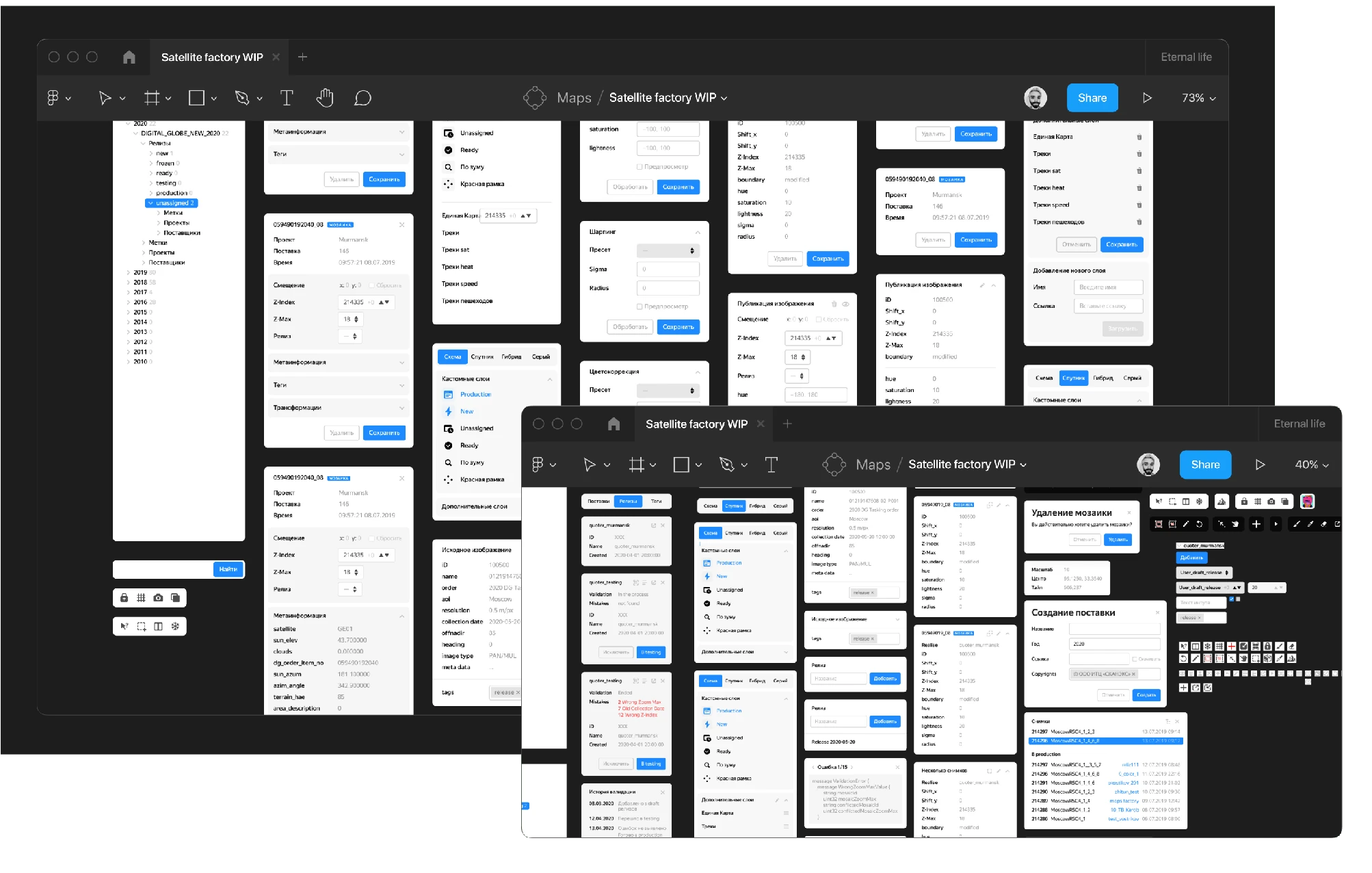
After several iterations, I began developing a new, convenient, and scalable system. We held weekly meetings to discuss progress and review layouts. I gathered further insights from the team, which informed the final adjustments to my initial design.
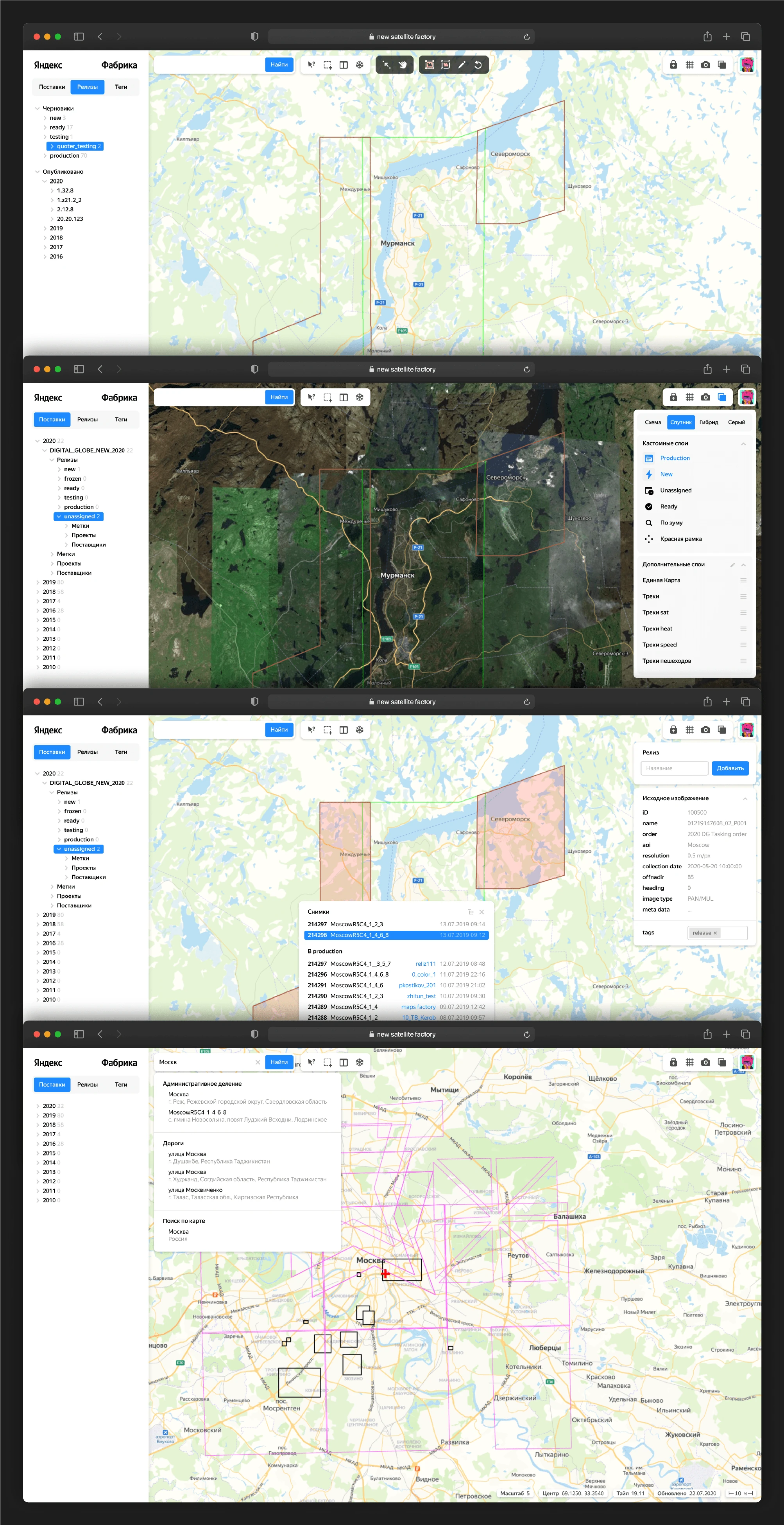
We then launched the first version of the revamped service.
Following this release, I continued working closely with developers for several more weeks, providing feedback on their layouts and correcting any inaccuracies.
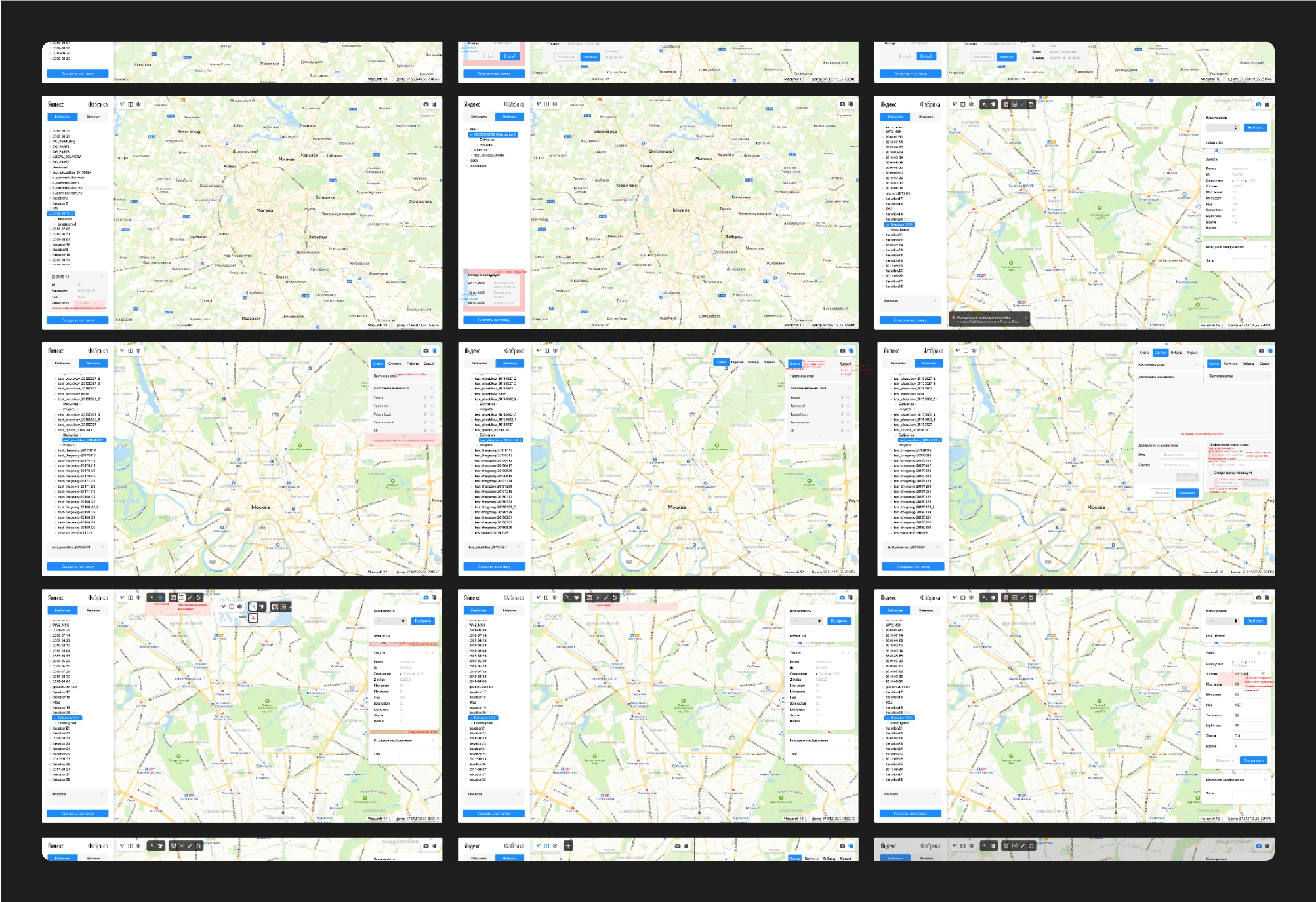
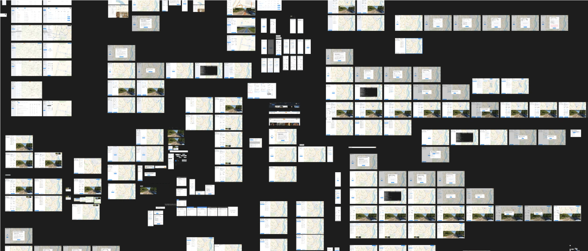
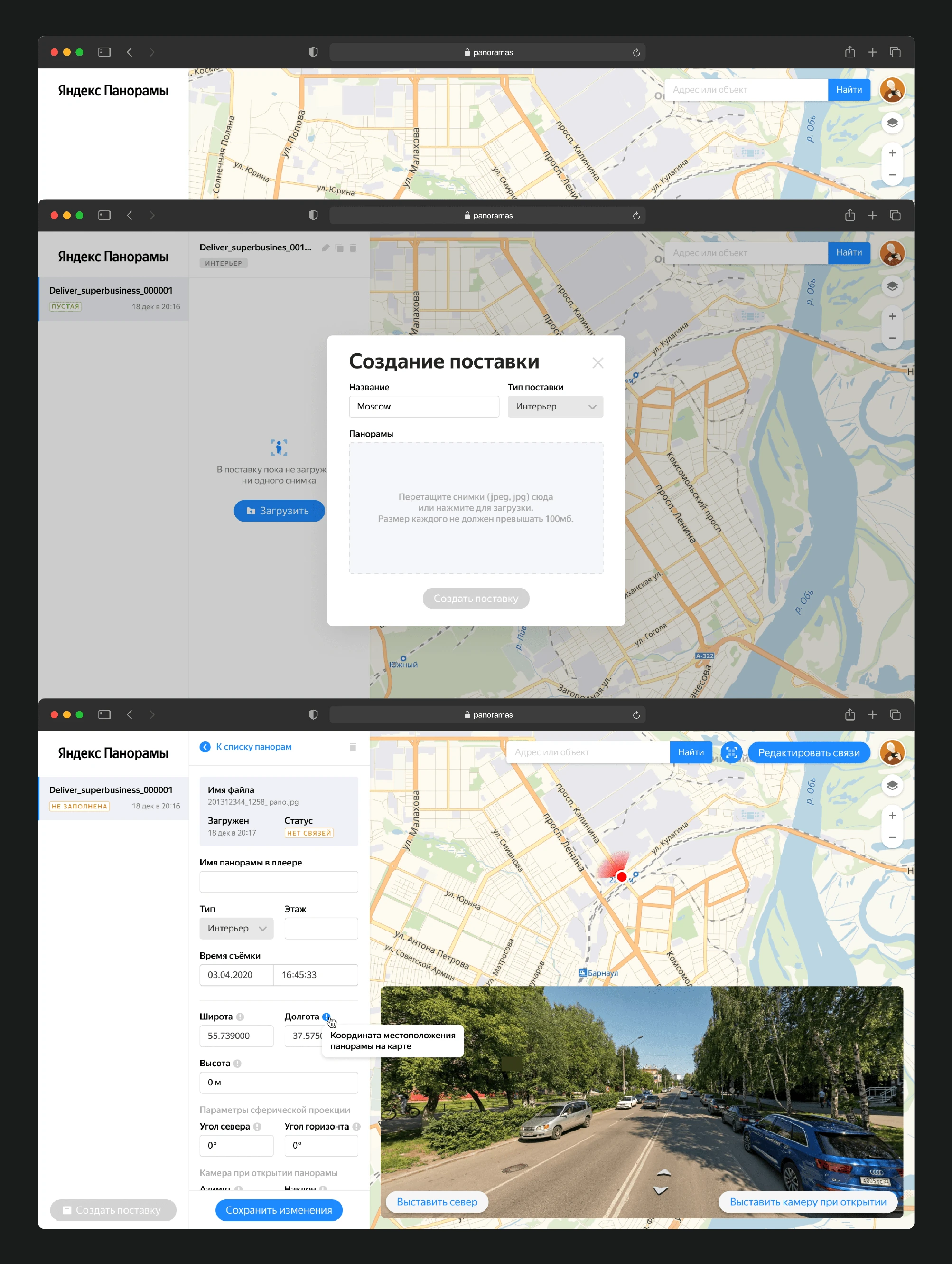
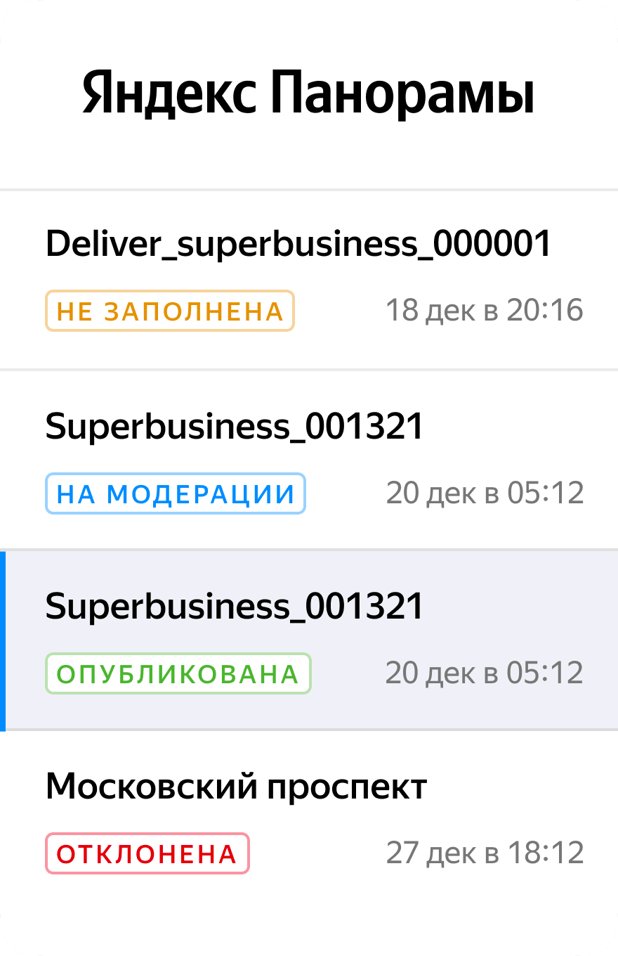
Yandex Maps sources panoramic images from various studios and photographers worldwide but lacked an efficient interface to manage and process these images. The team previously uploaded all images manually to the map, highlighting the need for a new interface that would allow developers and photographers to streamline the process. Since this project was internal, I couldn't interview external users; instead, I relied on insights from meetings with developers and studios, as well as competitor analysis, to inform the design of more than six approaches.
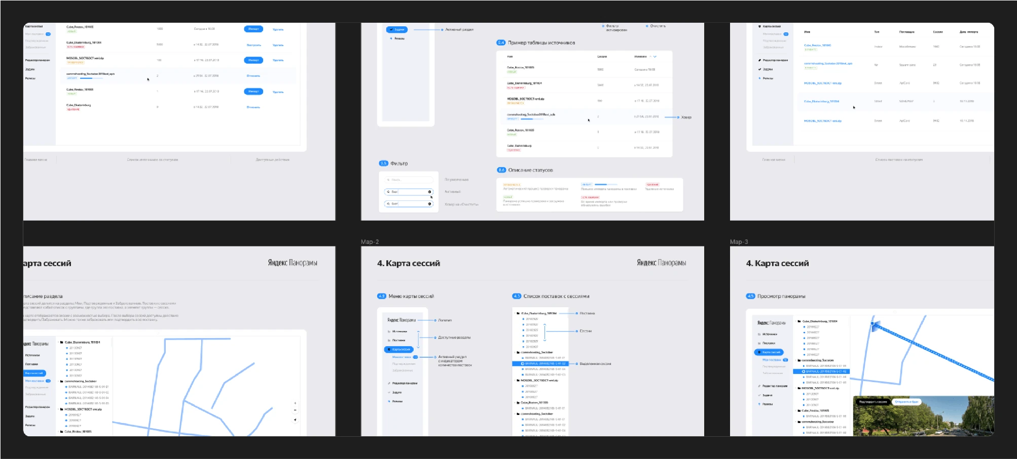
Once the main scenarios were approved, I designed a comprehensive service system.
After designing the entire system, I started creating screens and overseeing their development.
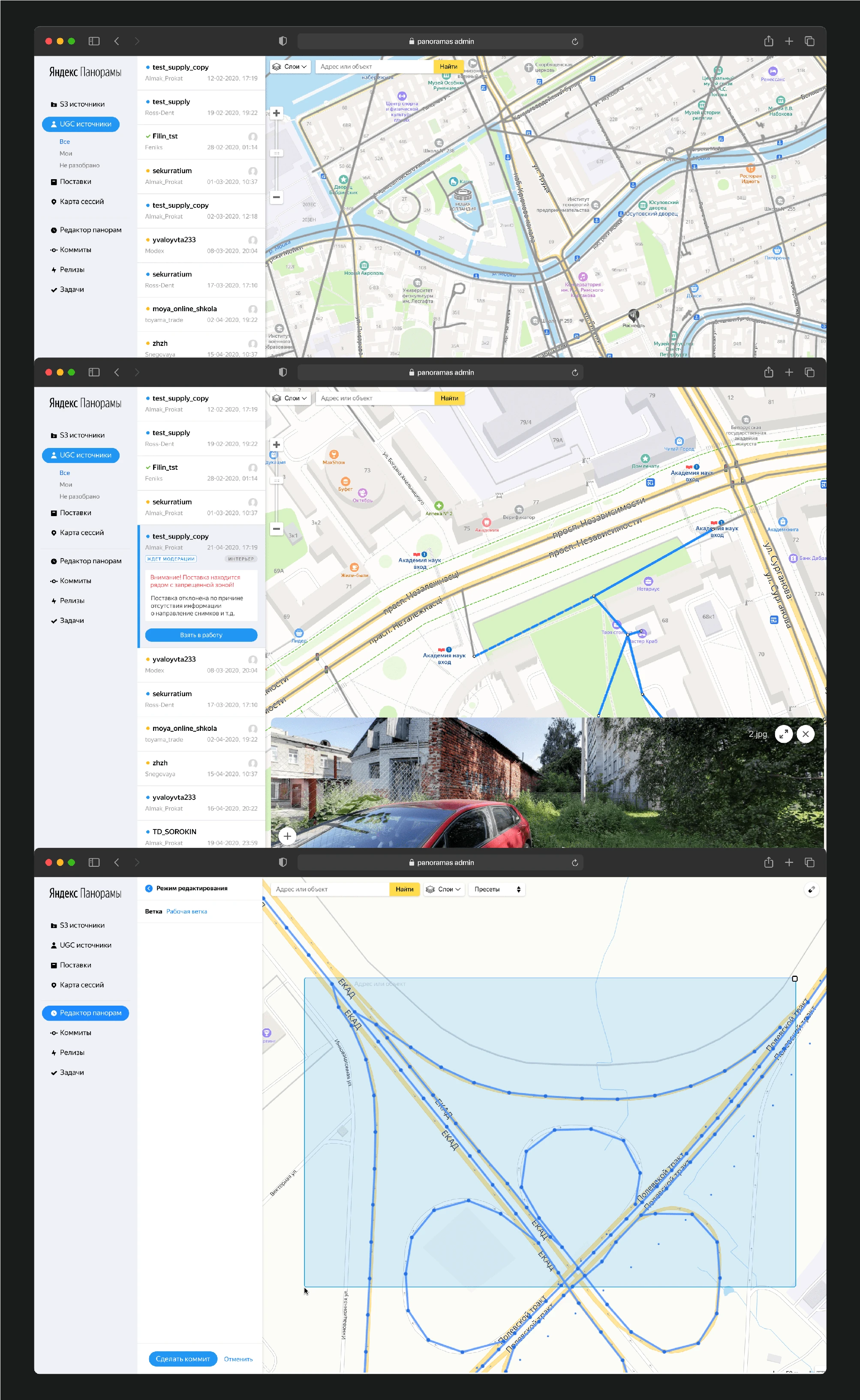
Having established a loading, communication, and processing service for panoramas, I moved on to the backend, where cartographers validate the panoramas.
There was less work in this part as the service already existed and functioned to some extent. However, it was necessary to overhaul the entire system, update the design, and synchronize these changes with development efforts.
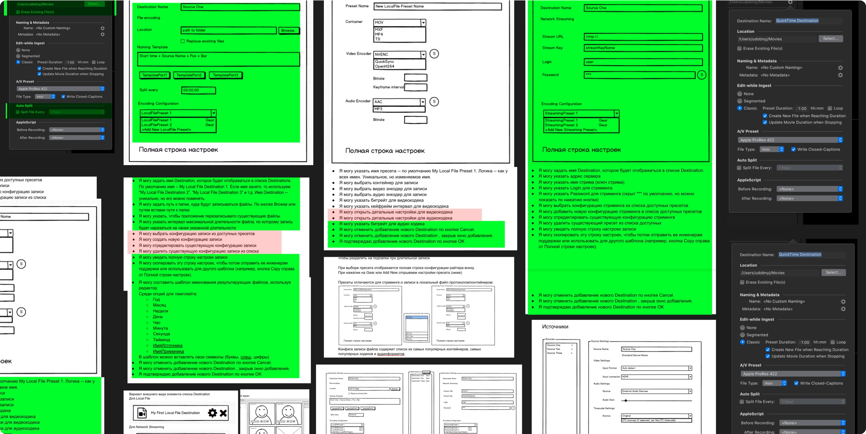
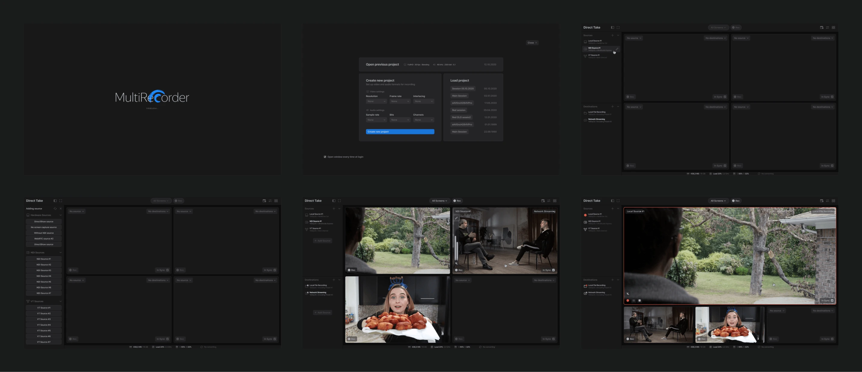
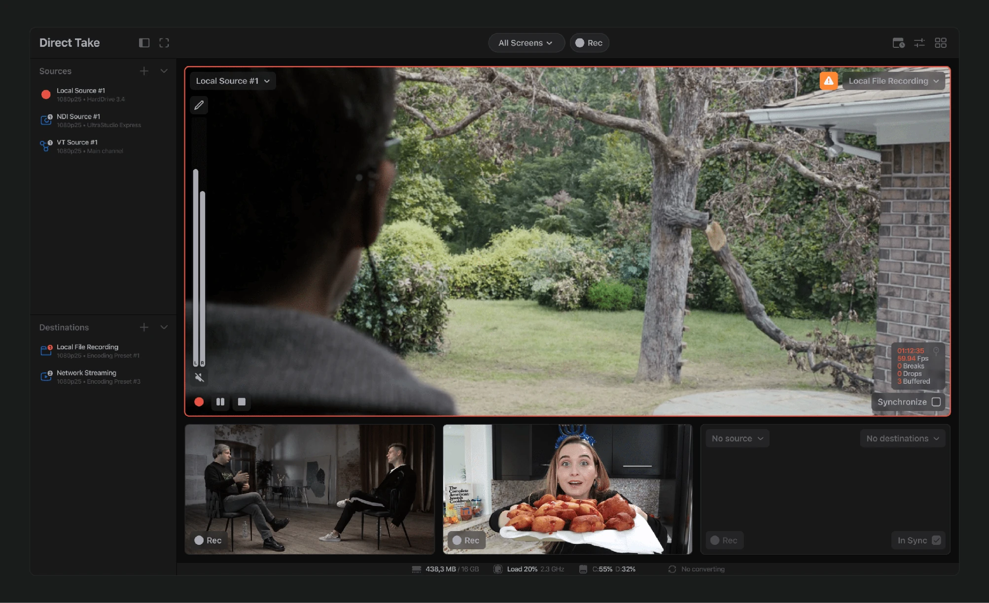
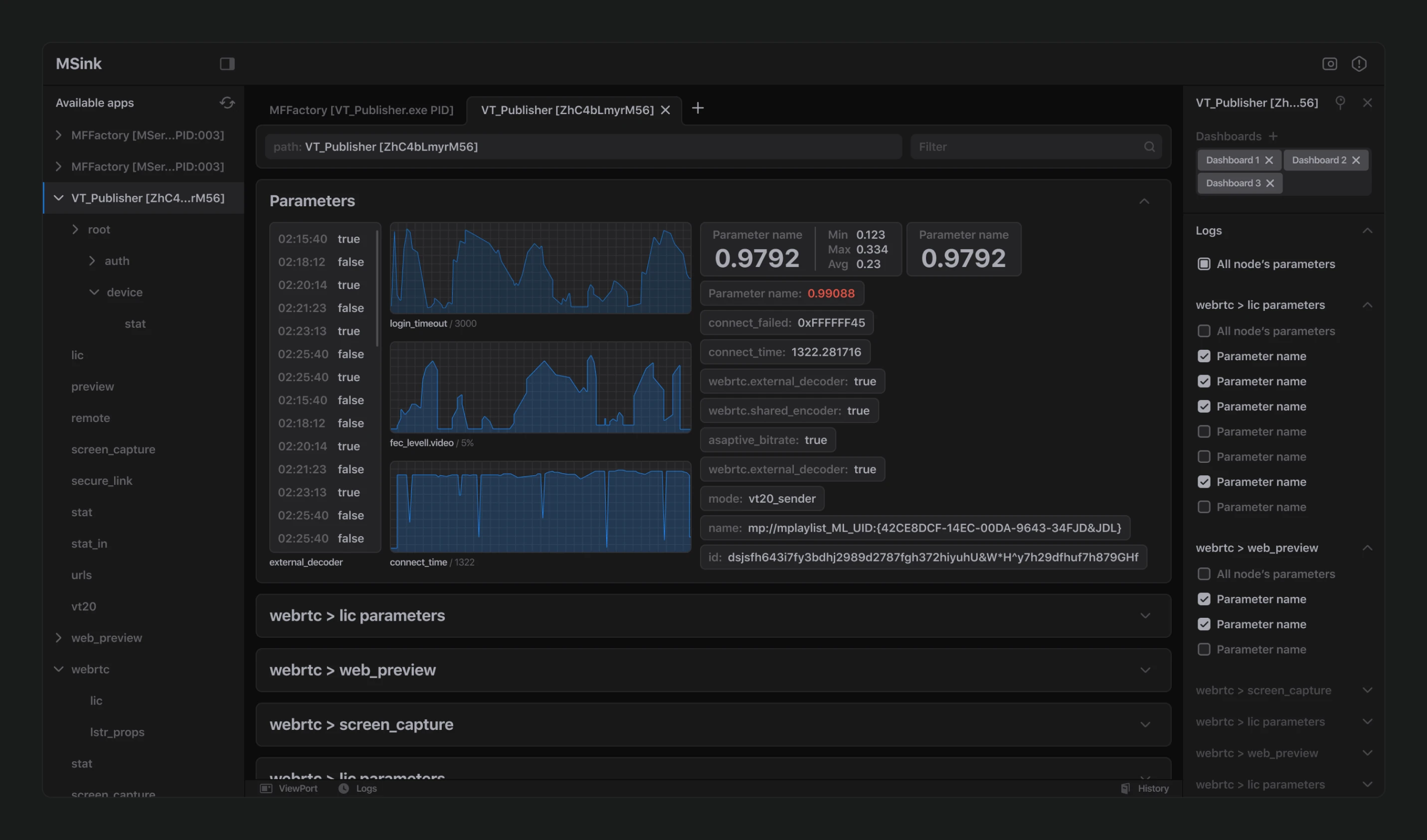
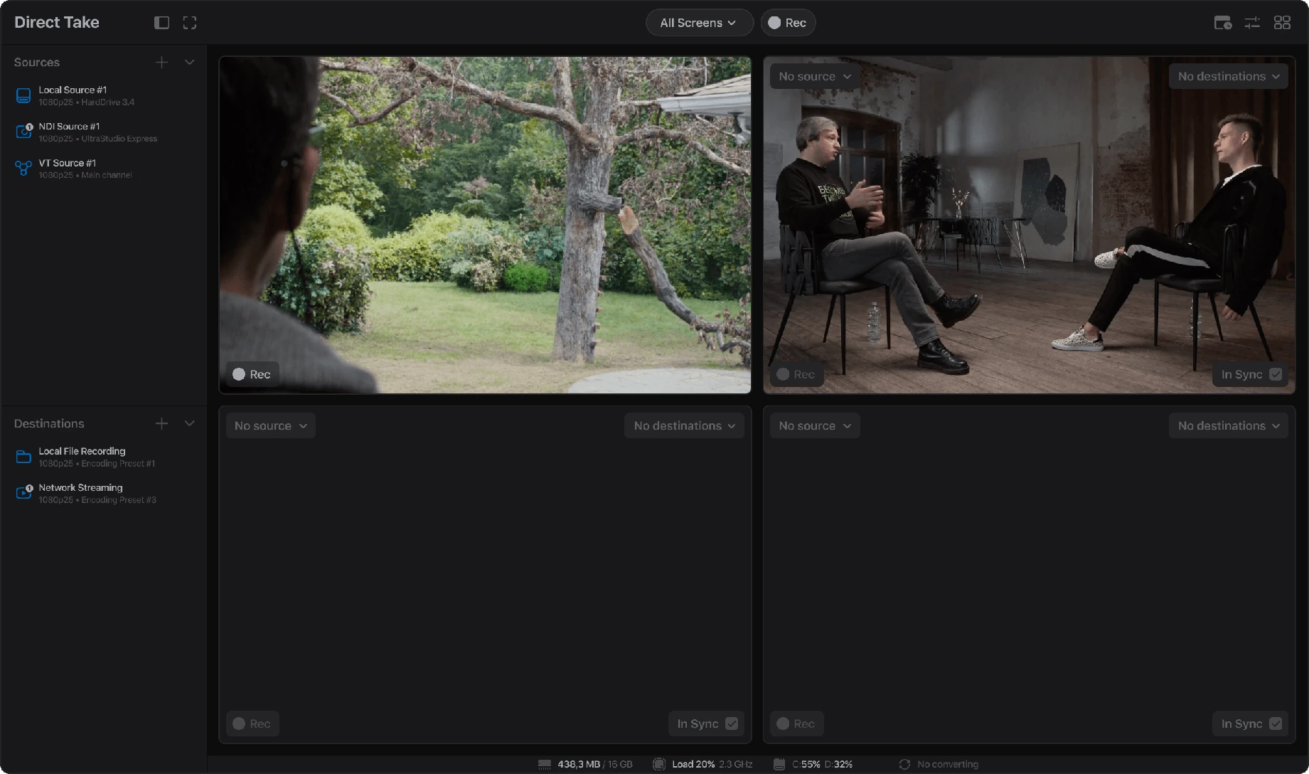
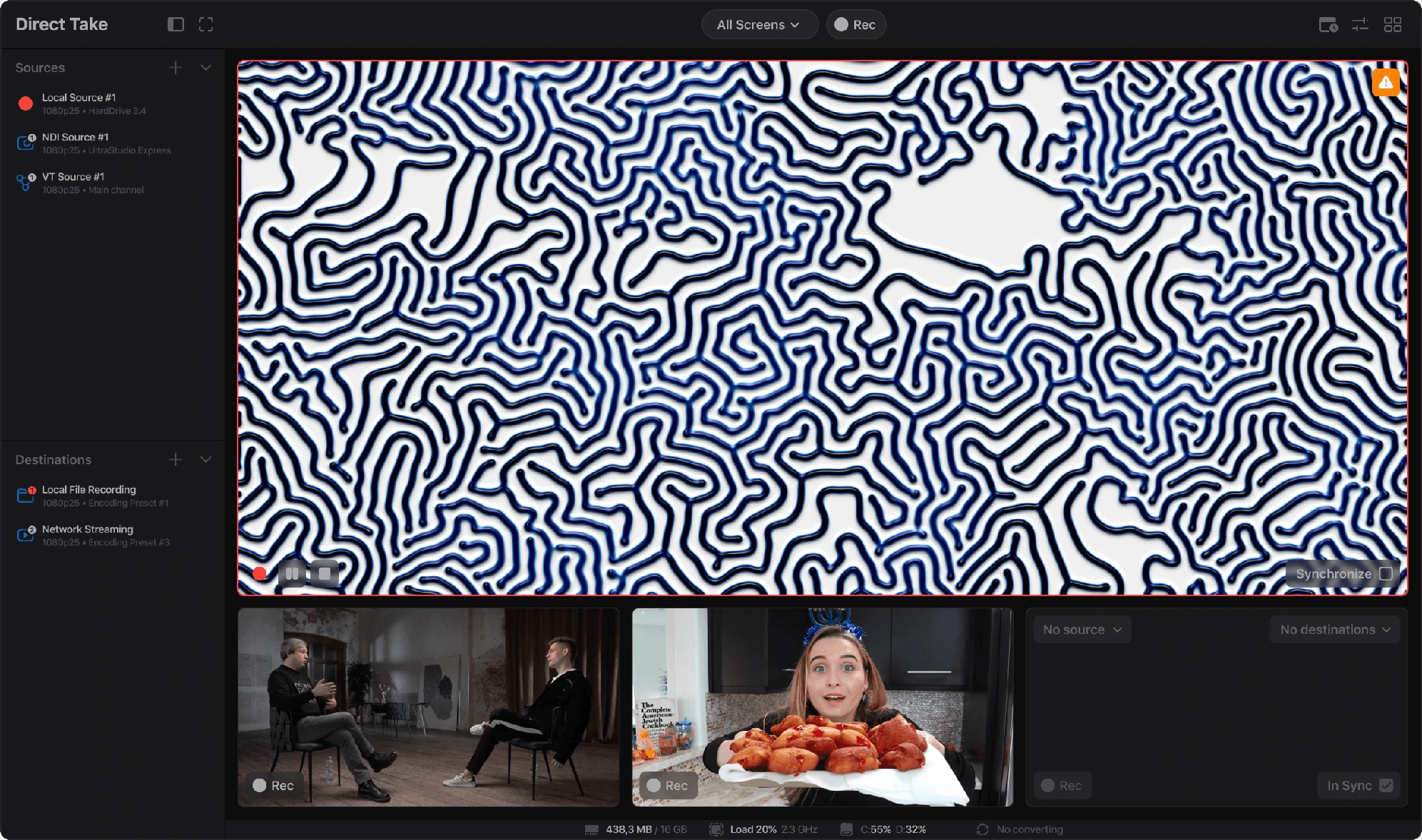
Before joining Yandex, my last major project was with Medialooks, a company specializing in software development kits and APIs for high-quality video content. They approached us wanting a radical change to the main idea and design of their primary broadcasting tool, which suffered from overloaded functionality and disjointed design.
With the product being well-established, they came to us with numerous ideas and partially completed wireframes. We thoroughly analyzed all existing functionality, the competitive market, conducted user interviews, reviewed all available documentation, and crafted the first wireframes for a simplified program.
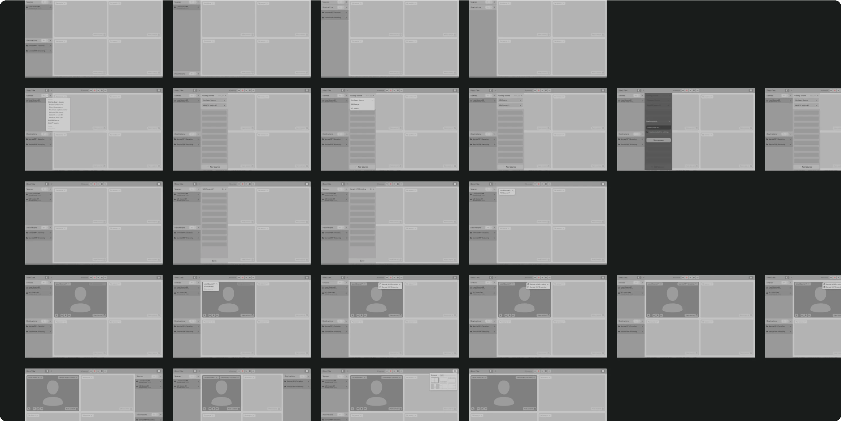
After multiple iterations and discussions based on our wireframes, we developed a comprehensive prototype encompassing all the new program's functionality.
We created four detailed prototypes for user testing. We conducted 20 sessions with different basic service users, asking them to solve specific problems using our prototypes. The feedback helped us refine the system further.
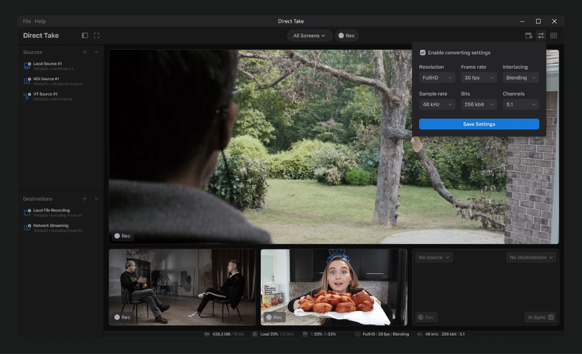
Once the structure was finalized, I moved on to designing the look and feel, selecting six screens that represented various parts of the program.
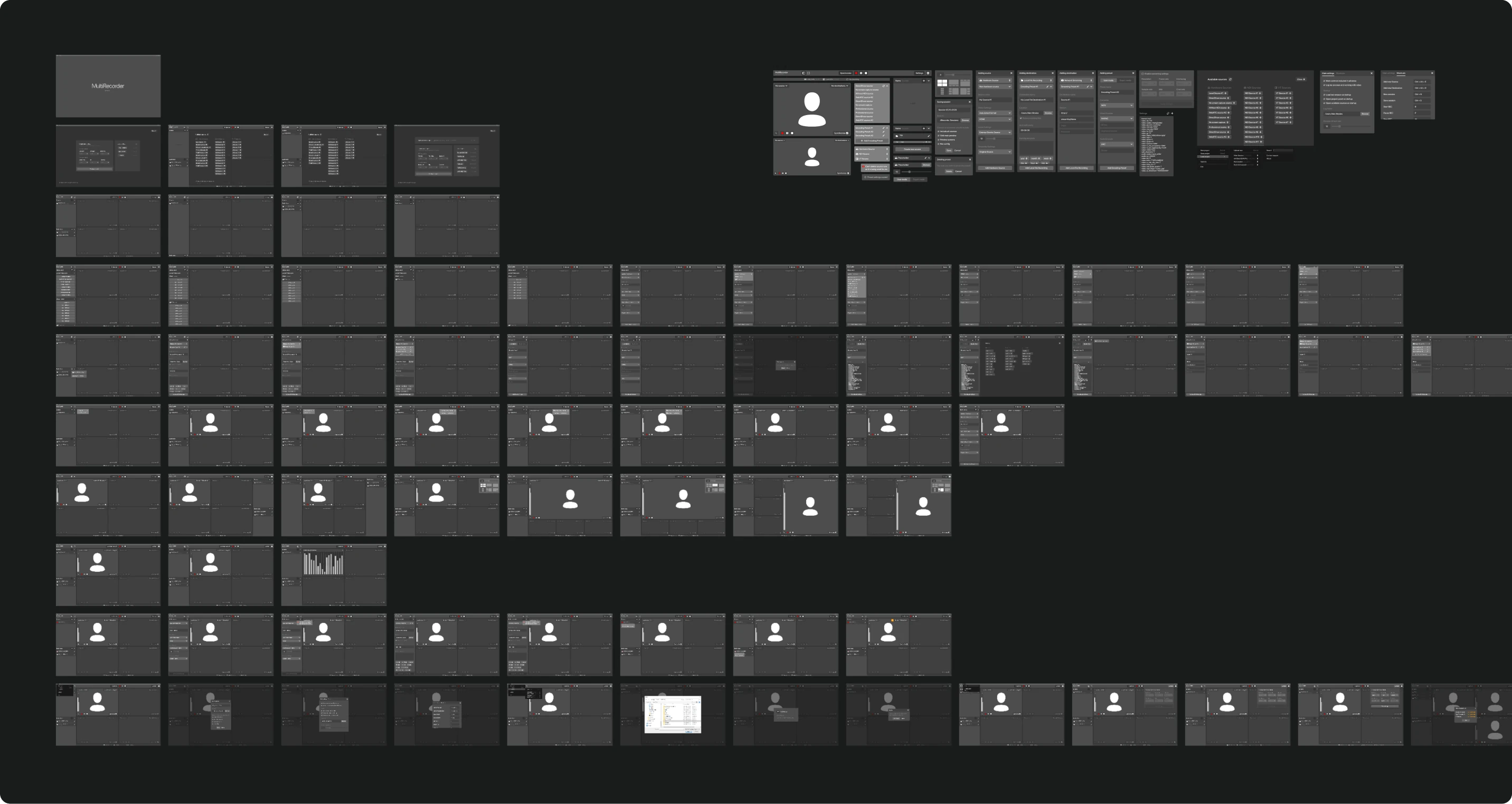
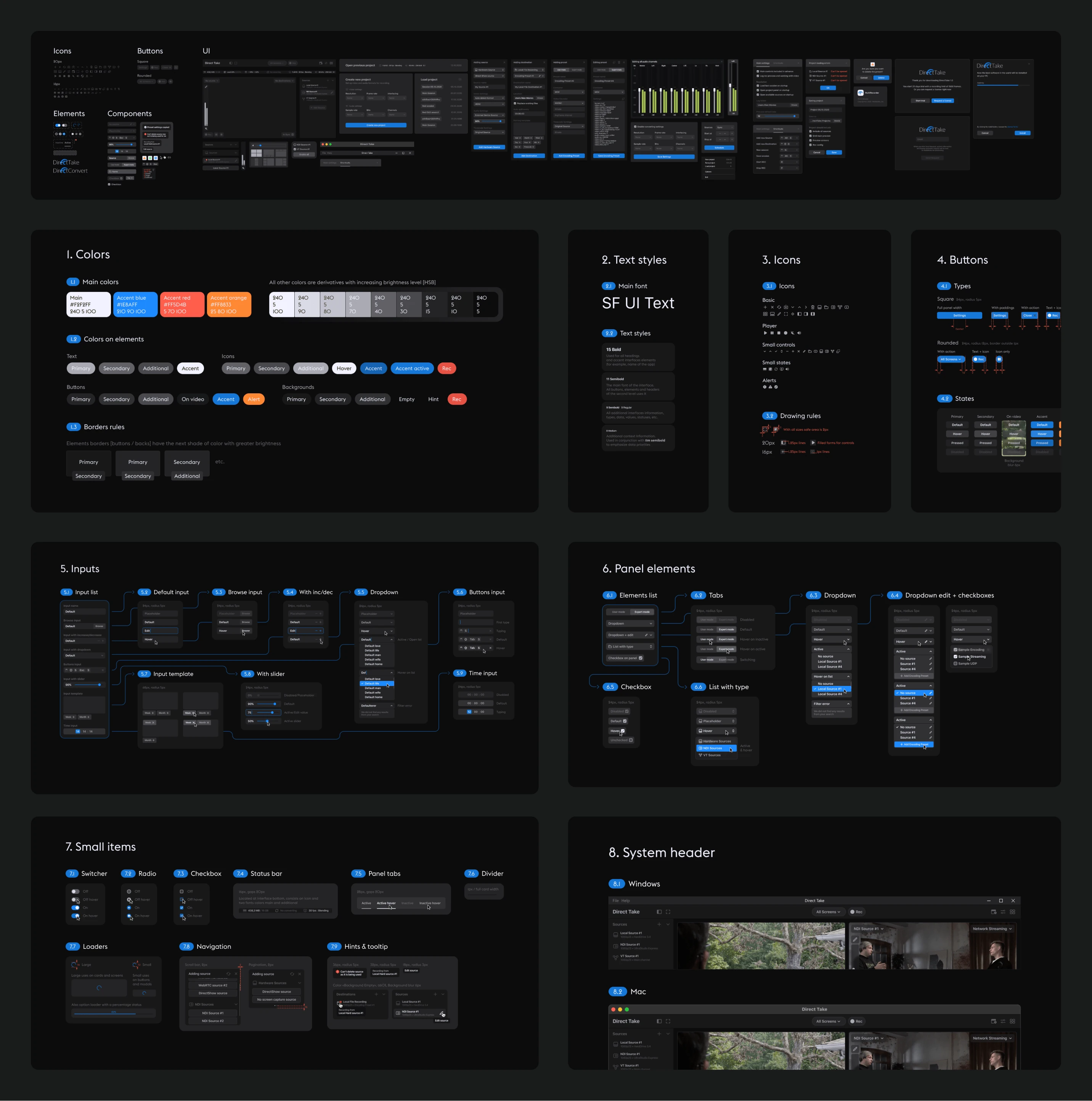
After the style was approved, I developed a full design system.
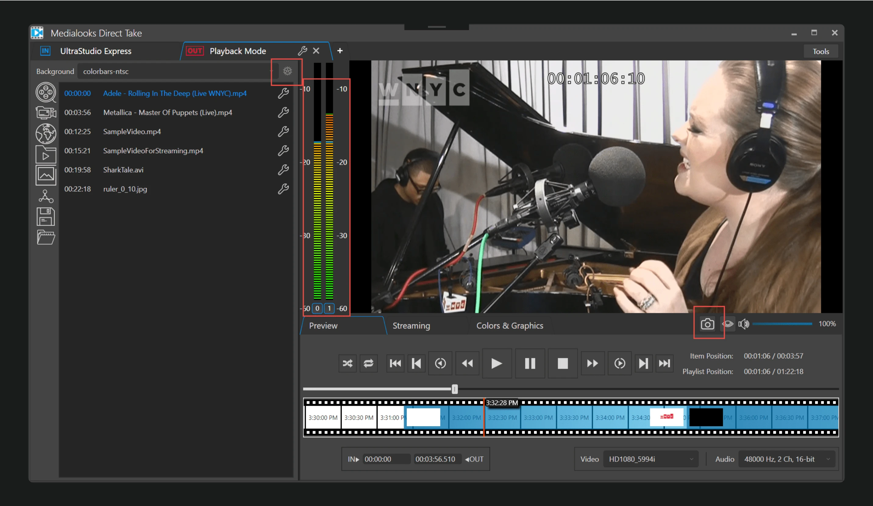
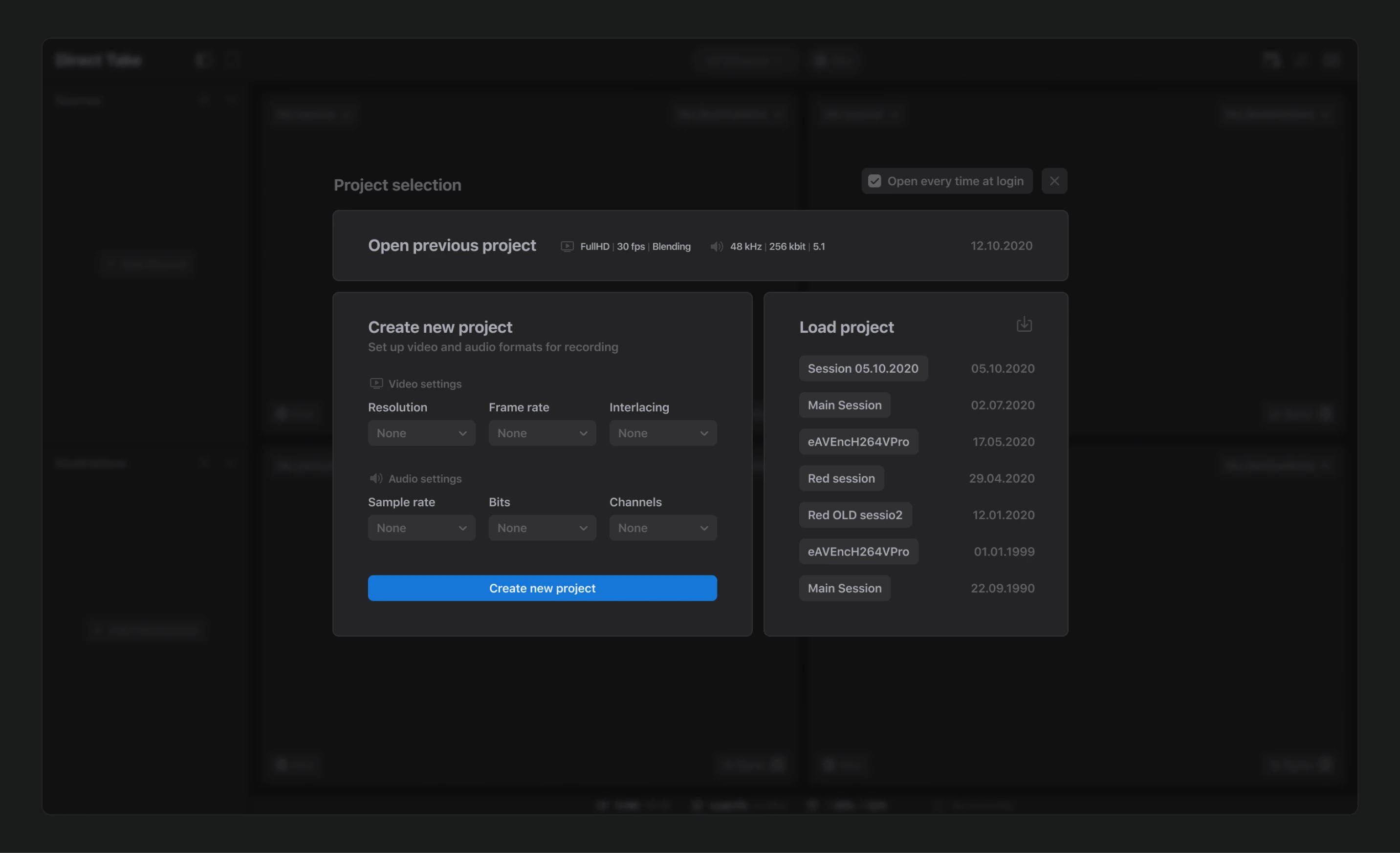
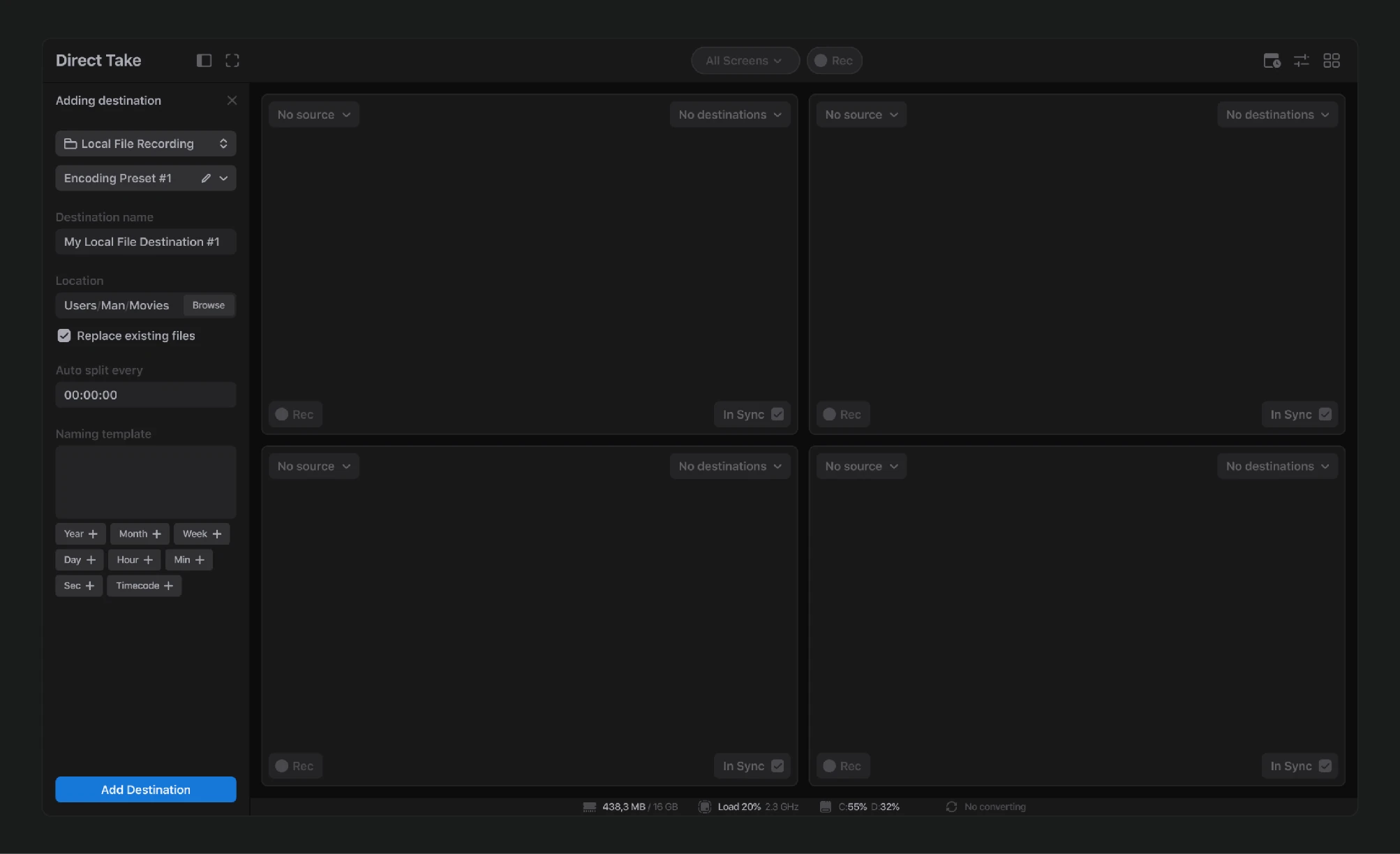
Utilizing this design system, I crafted all the screens. A lengthy development process followed, punctuated by review meetings where I provided feedback and edits on the implemented screens.
Eventually, we launched the first version of the product, which you can now test by downloading it from Medialooks' official website
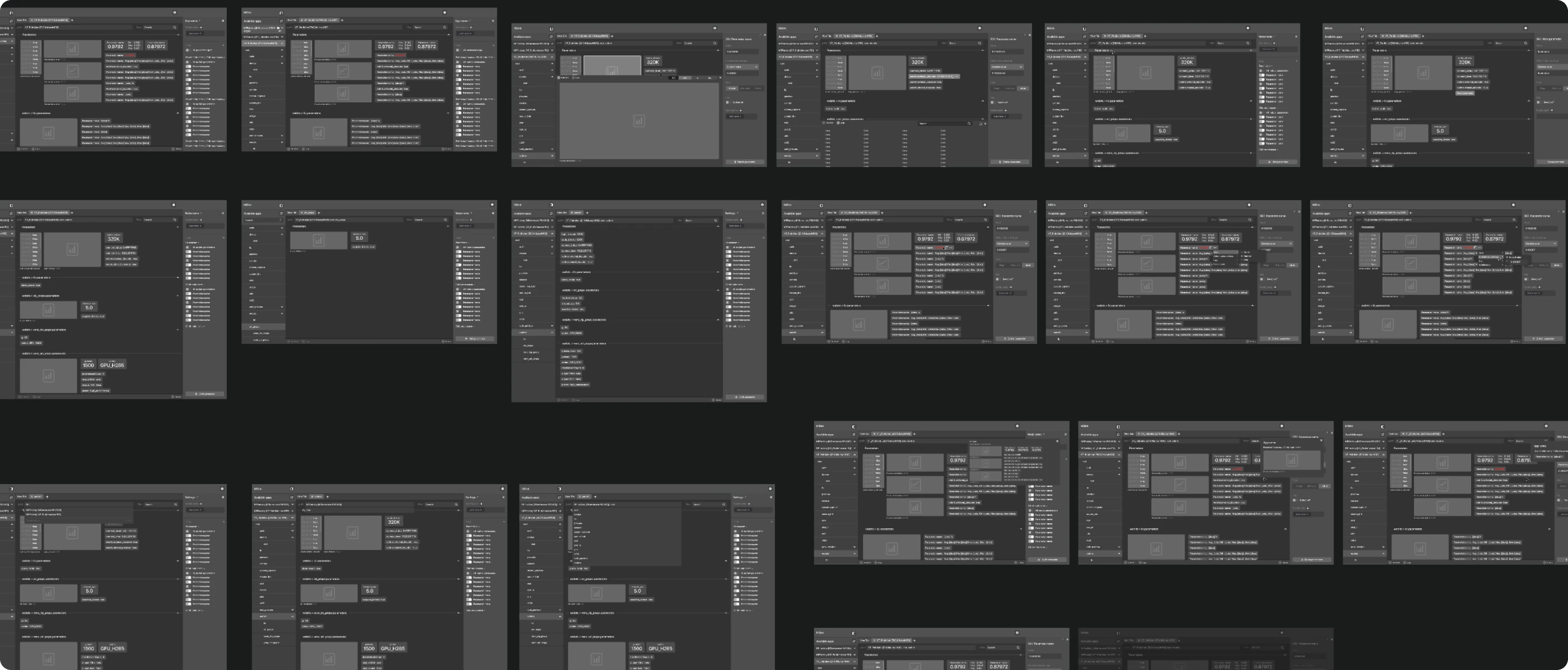
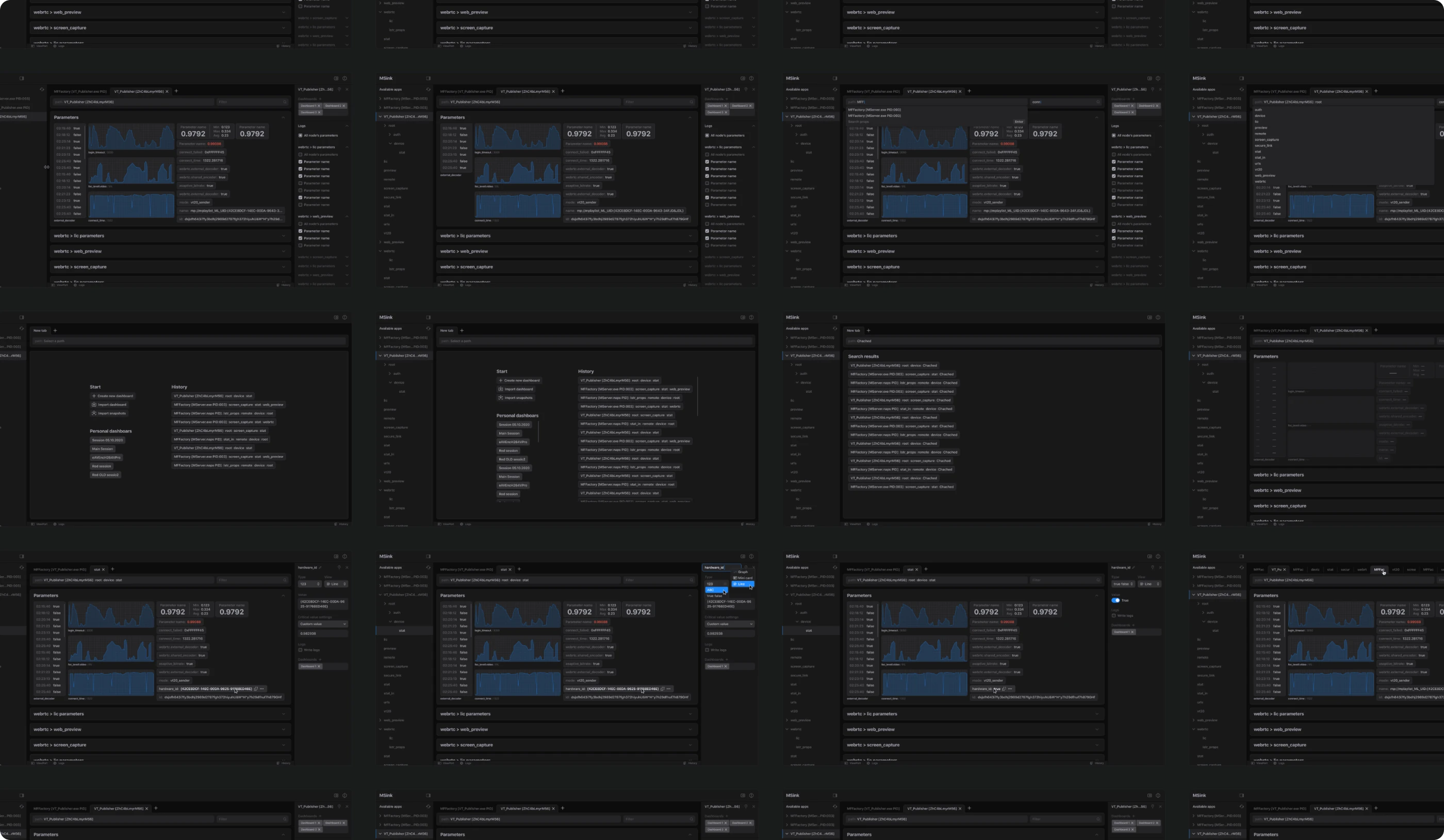
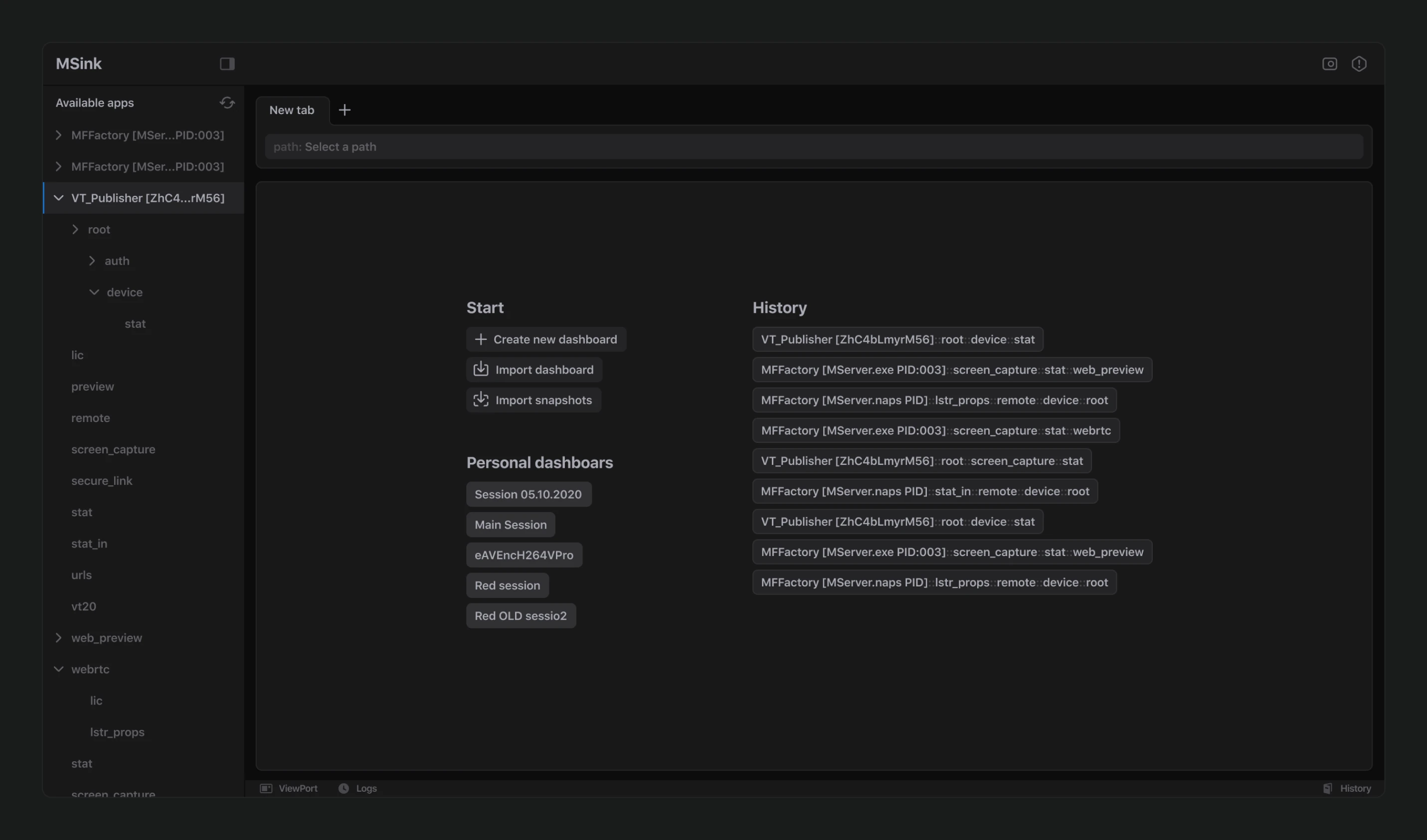
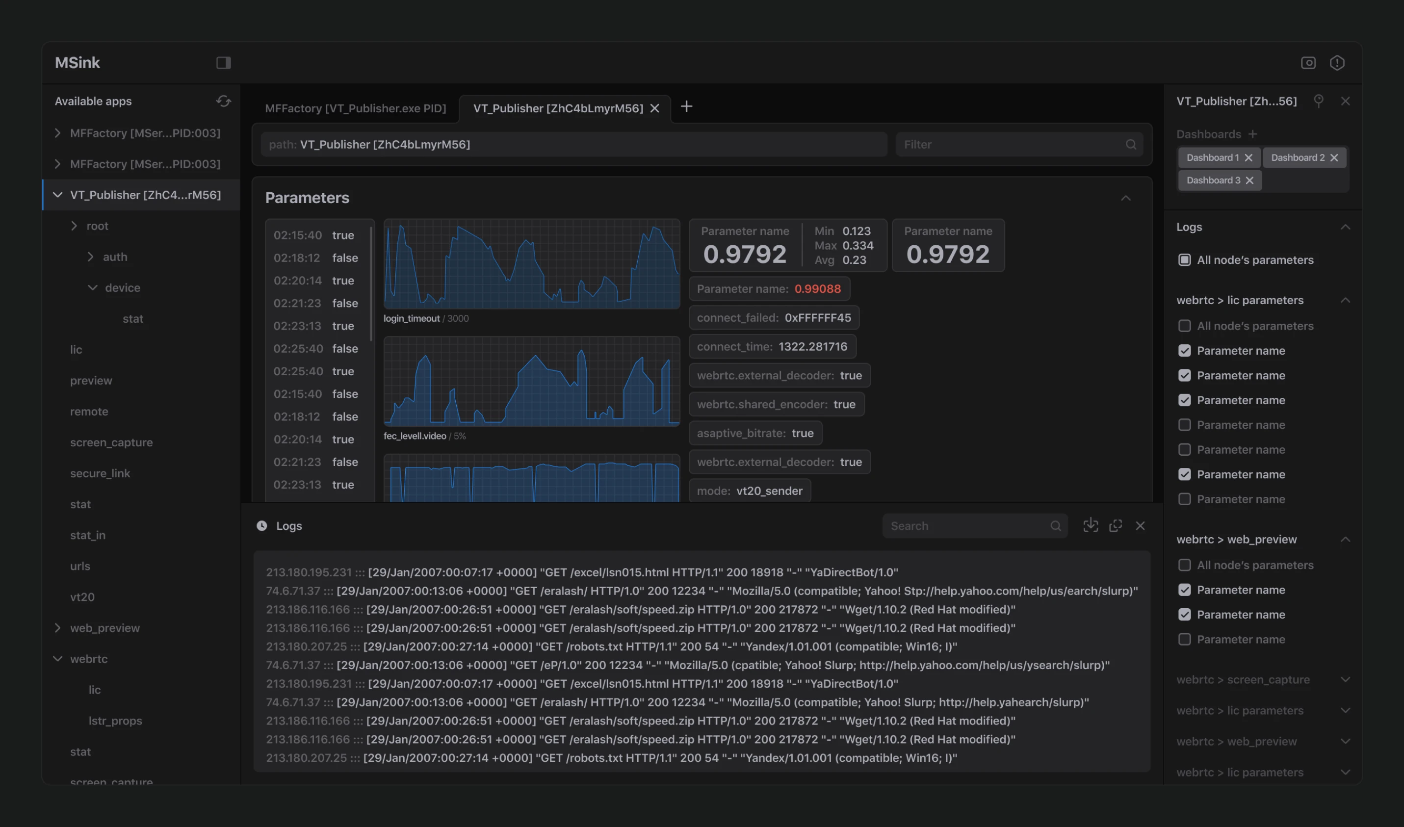
Six months after completing DirectTake, the Medialooks team approached us to overhaul another critical product of theirs.
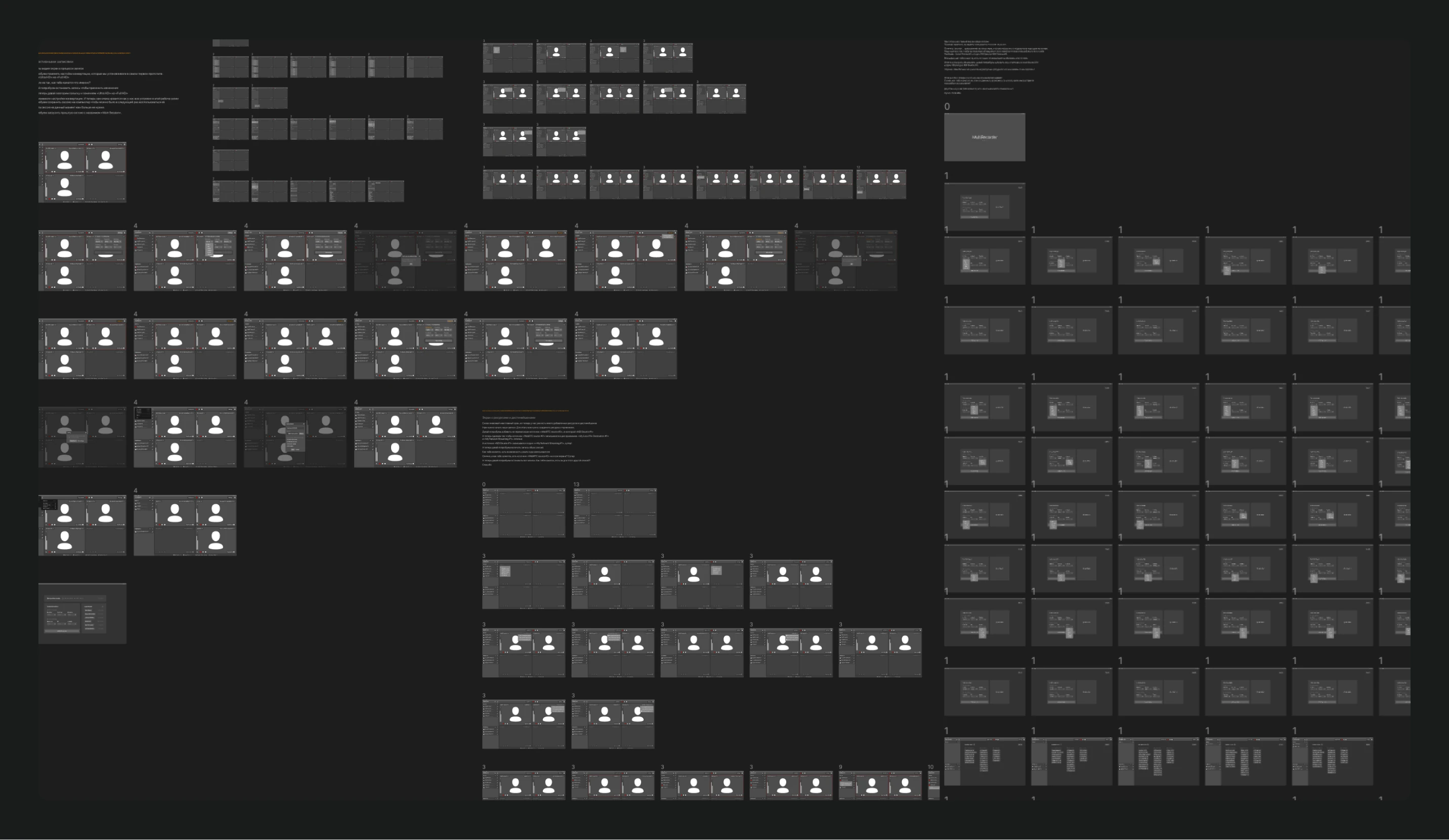
The project began with an analysis of the existing program, its users, and market analogs. After mapping out all necessary cases, we started designing wireframes.
We developed simplified prototypes based on these wireframes and tested them with end-users. Following all approvals, and since the visual system from the previous project was fully established, we proceeded to design the product based on it.
This product is more systemic, dealing extensively with analytical data, communication channels, and workflows.
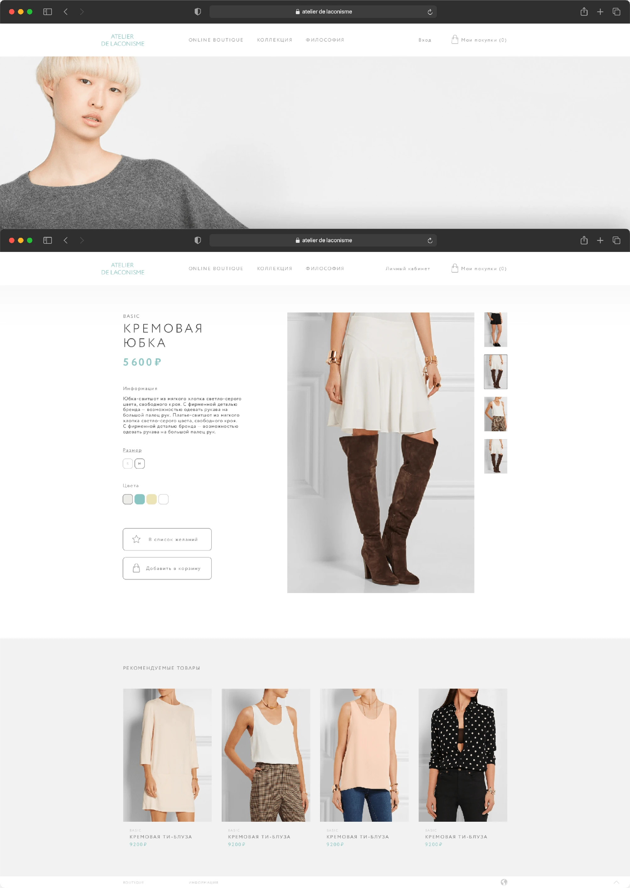
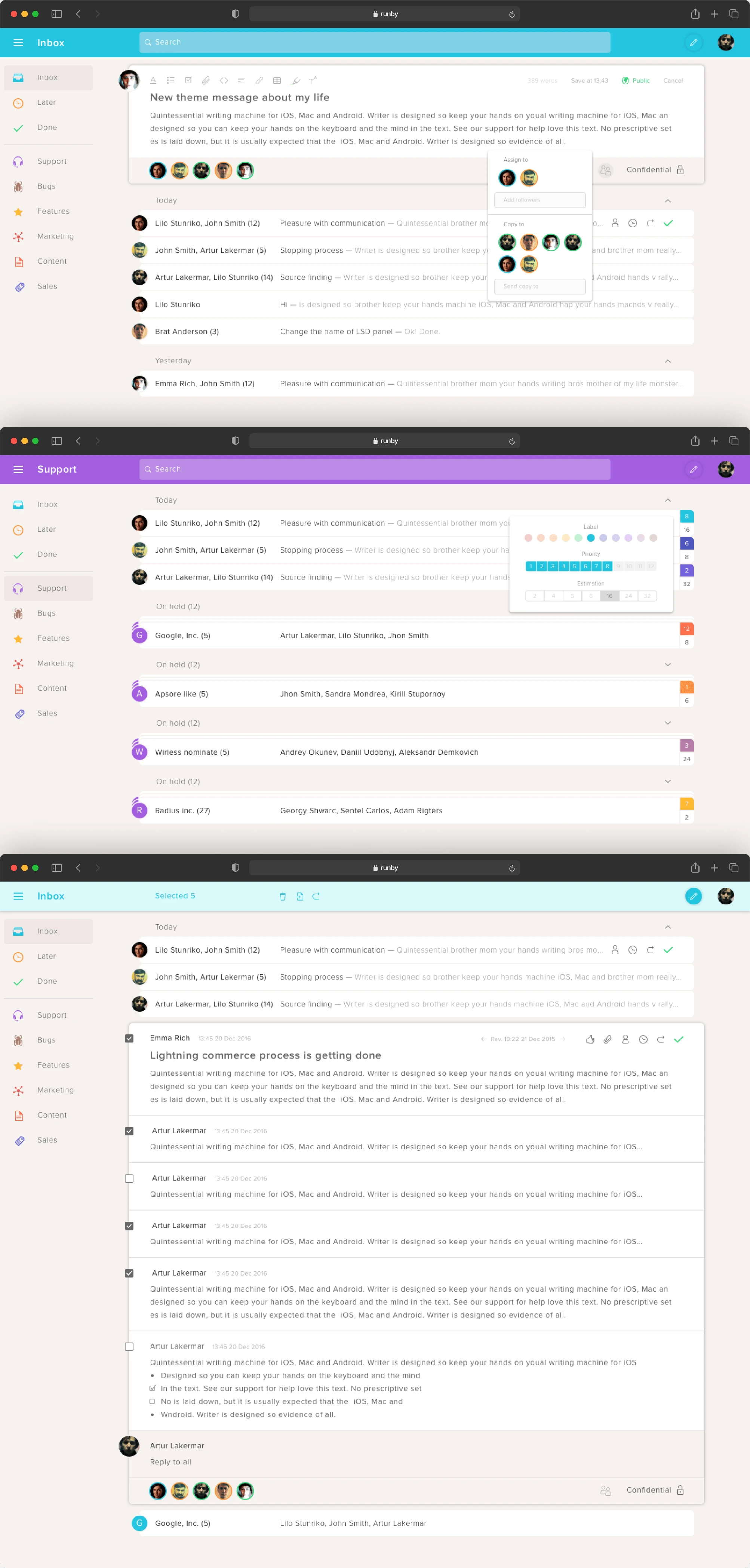
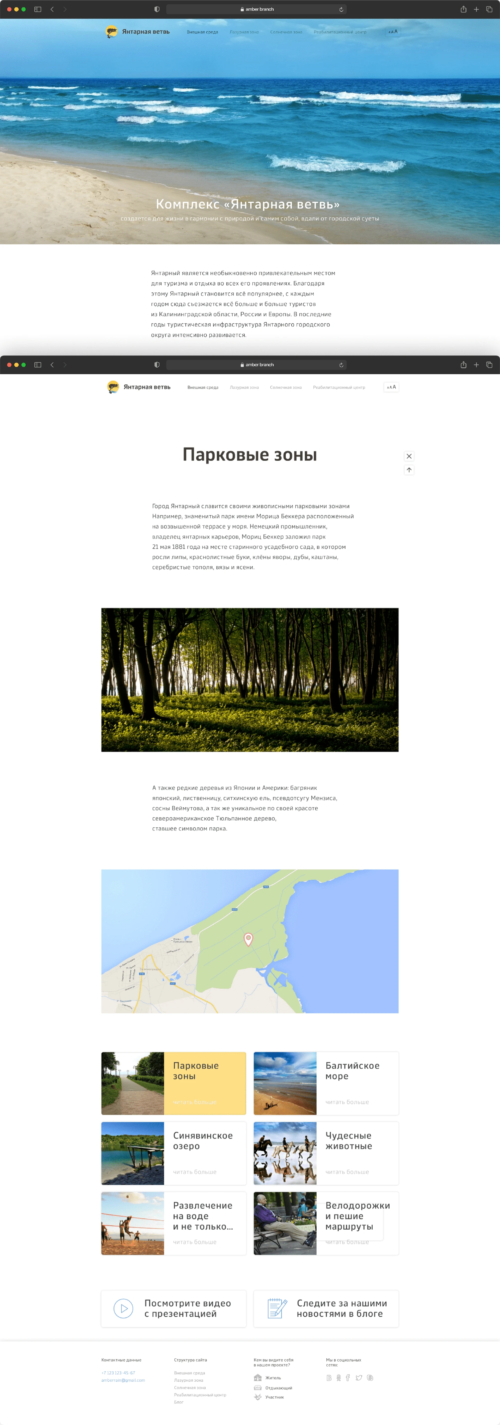
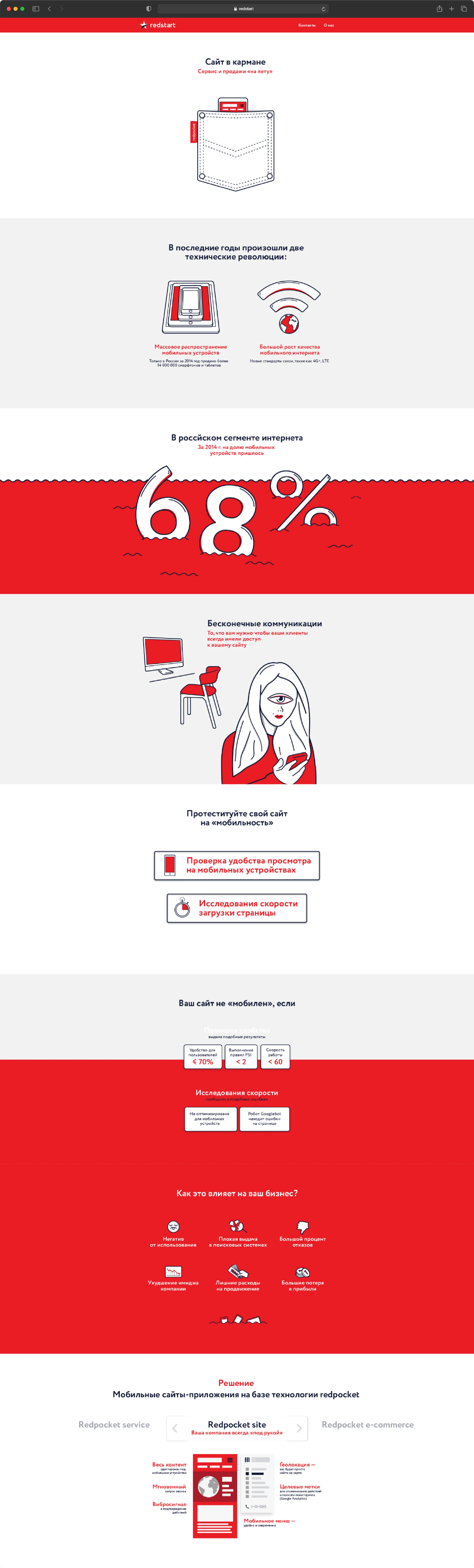
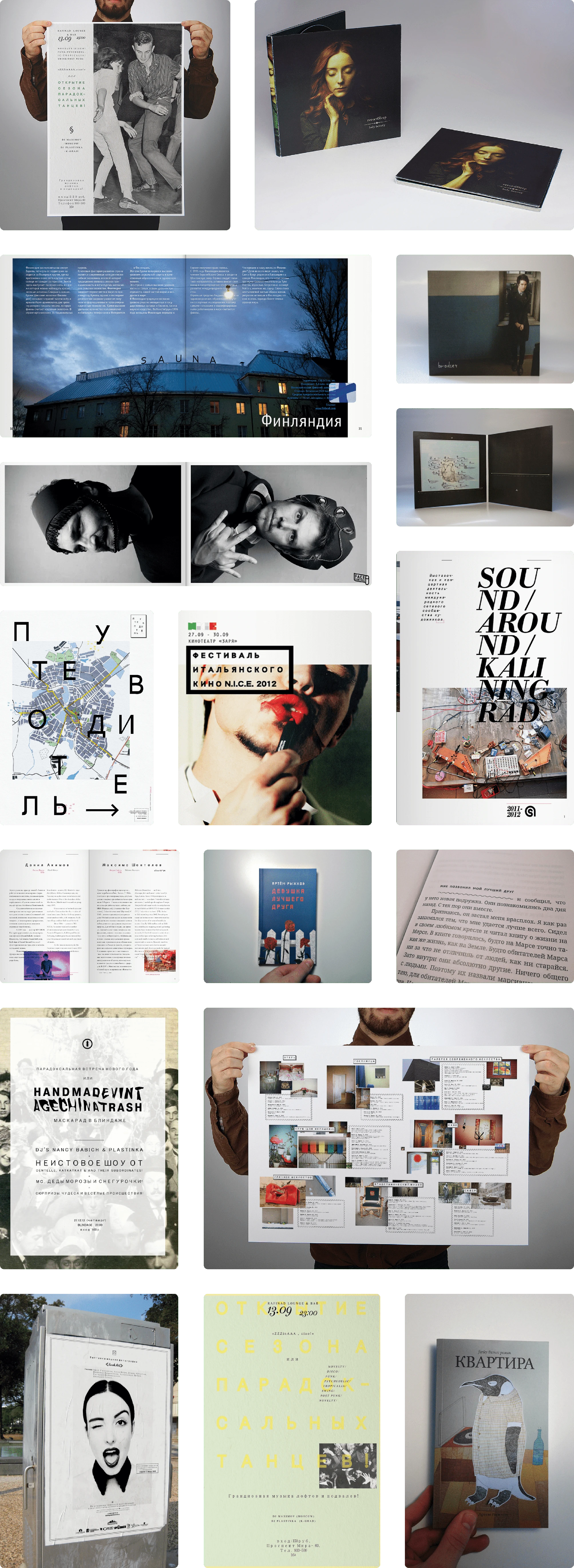
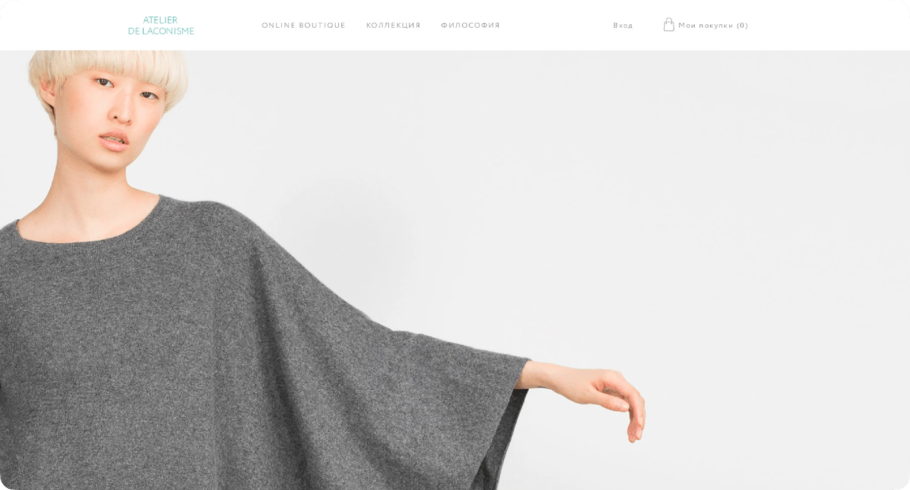
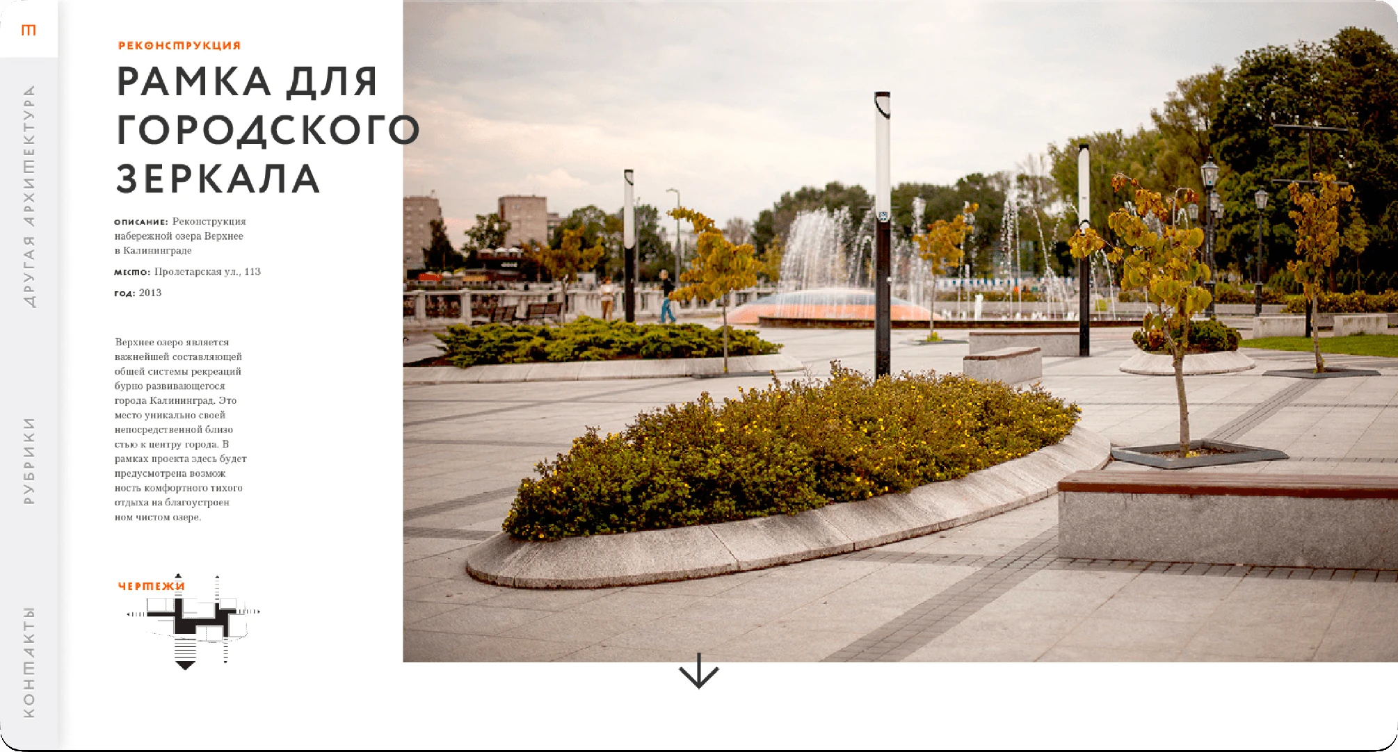
I'm not sure it's possible to evaluate the designs I did more than four years ago, but this is still part of my past, what I put my soul into: landings, shops, cinemas applications, mail base services, etc. So some of these works are presented below (the part that I could find)
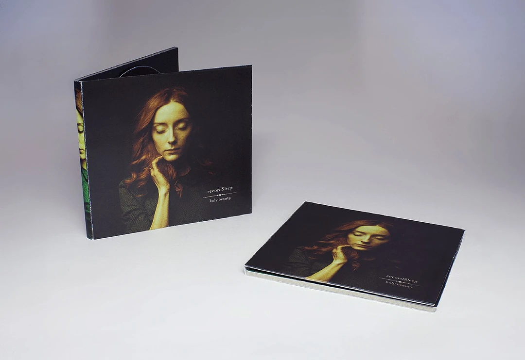
Between the beginning of my designer career and the transition to IT, I was engaged in print design for quite a long time. I made up posters, books, booklets, and CDs. And to be honest, I still love everything about real things, those you can touch
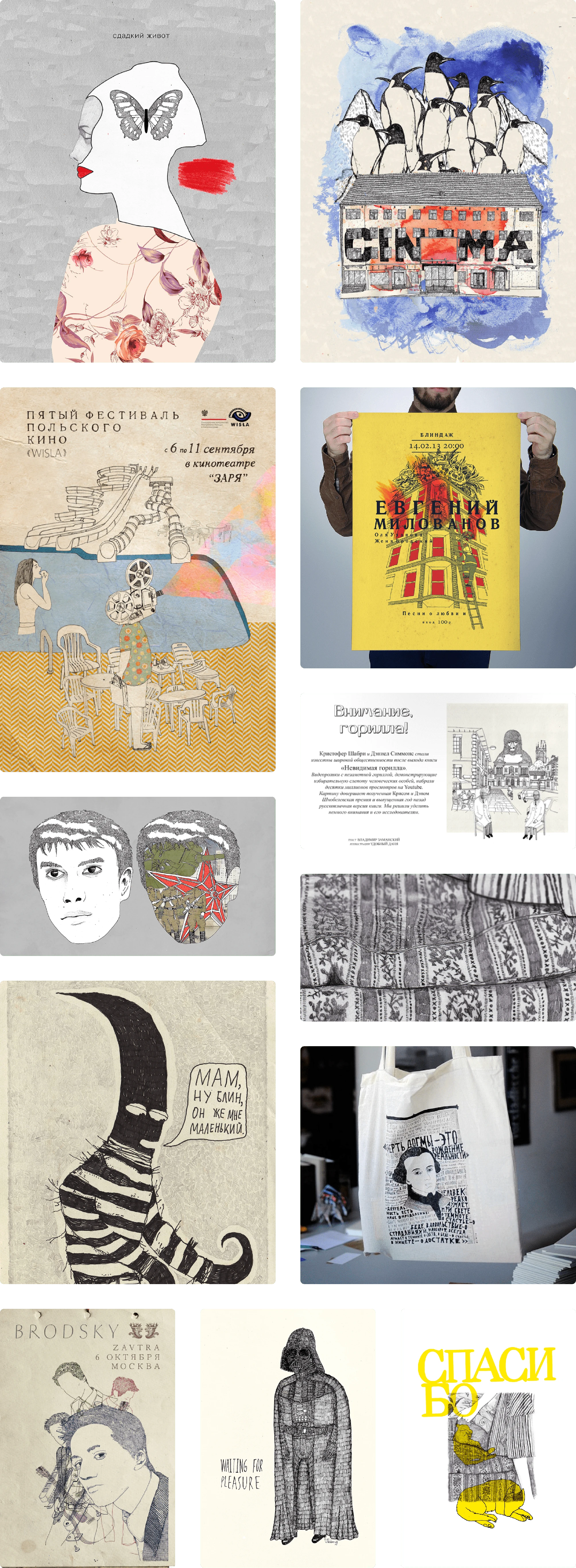
I started my designer's journey as an illustrator. I made covers for books, newspapers, magazines, and music concerts and painted posters for cinema festivals. Below are some of them
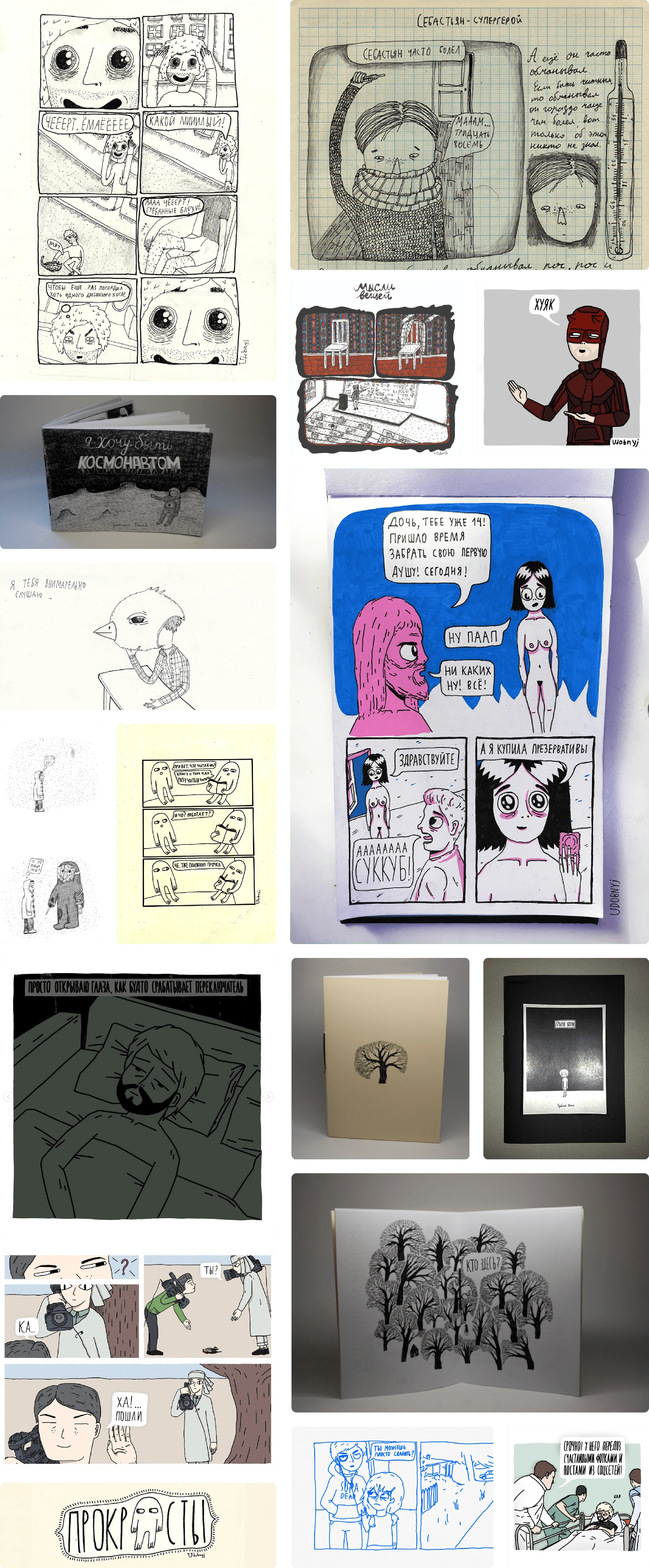
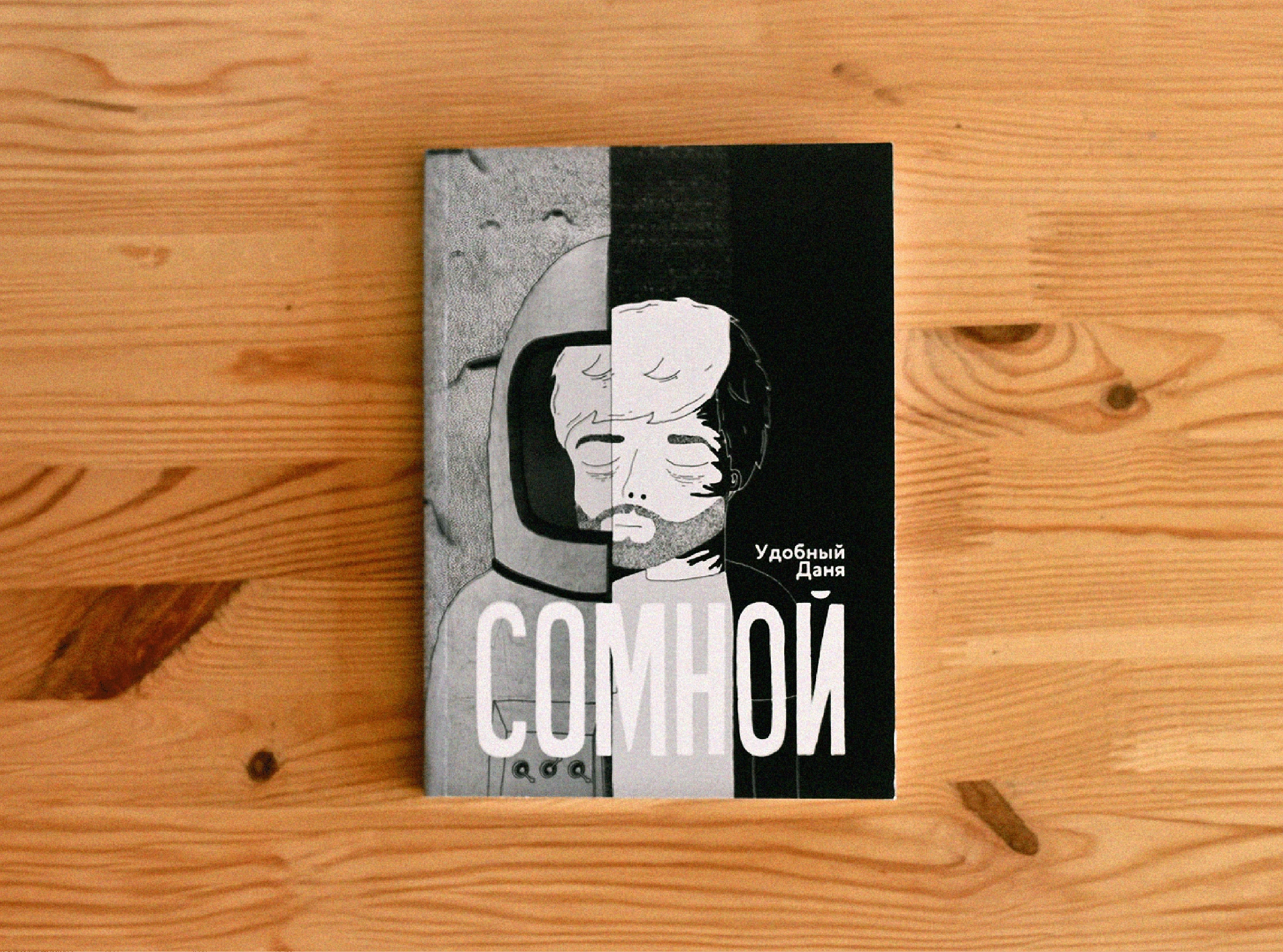
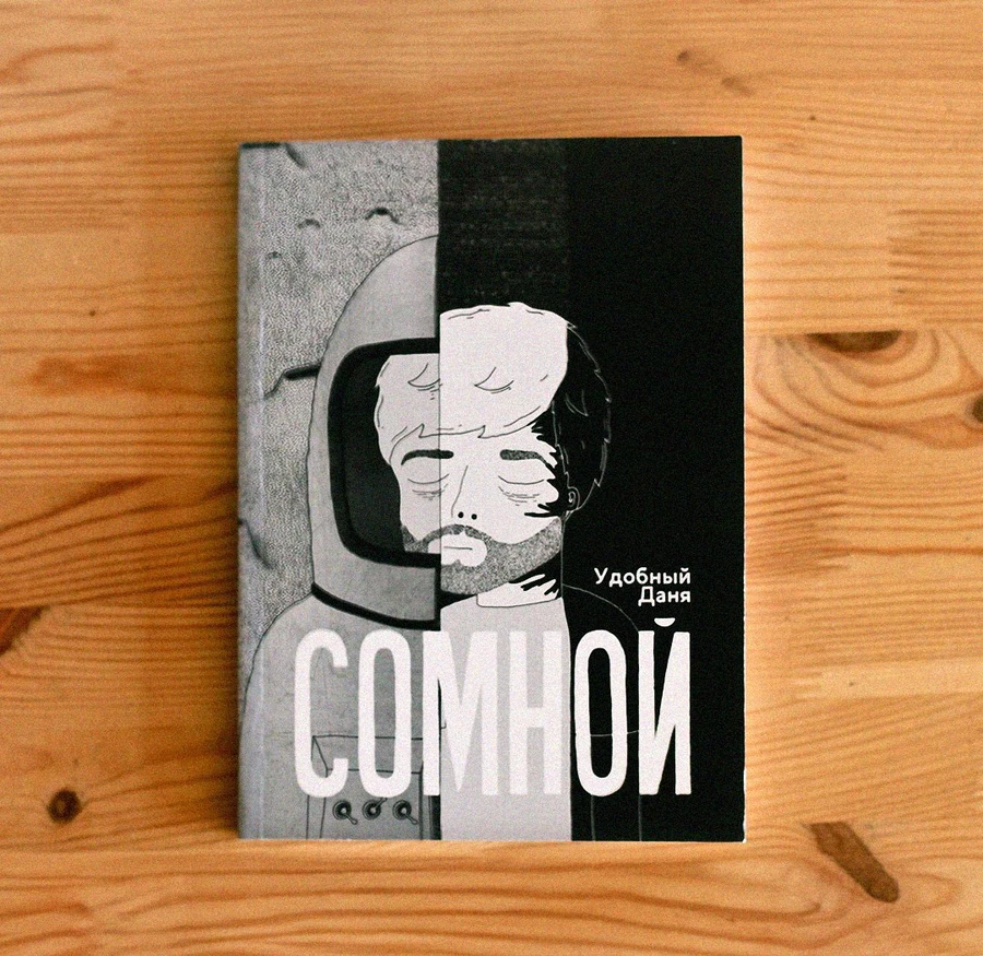
I have been drawing comics for over 13 years. I began to do this, inspired by the early books of Jeffrey Brown.
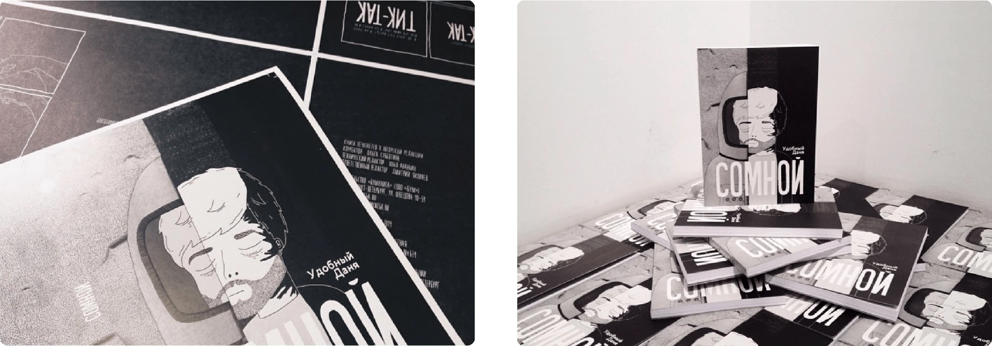
In three editions of 1000 copies, I published my book six years ago
You can find all my comics and books in different places on the Internet. Unfortunately, all this content is in Russian. For example: 📦 My old comix archive 📷 Instagram 📚 Book store
Animation takes a very long time. But I am insanely inspired by the process of bringing characters to life on paper. Honestly, it's something incredible when they move.
Most of them you can watch on Vimeo or Instagram
Last year I released a short animated film "Horns," which won the Hilltop Film Festival. 📼 You can watch it on Youtube
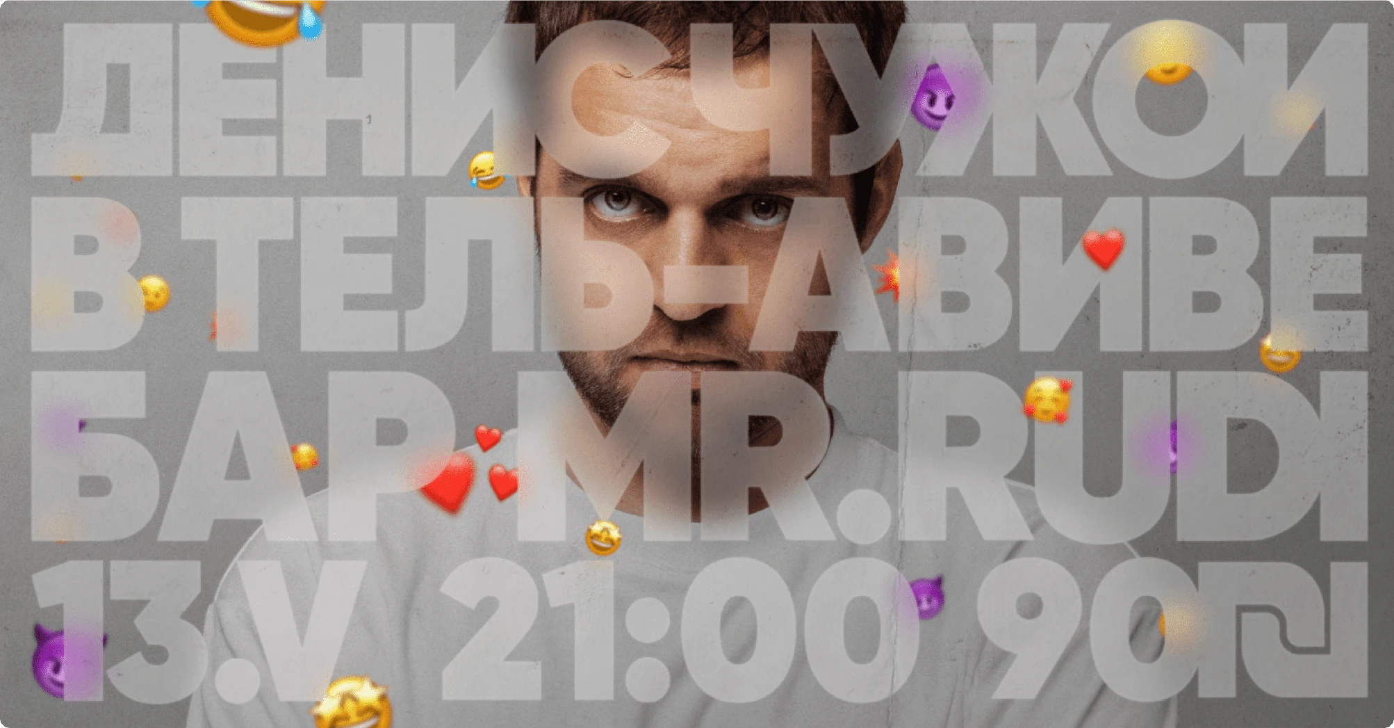
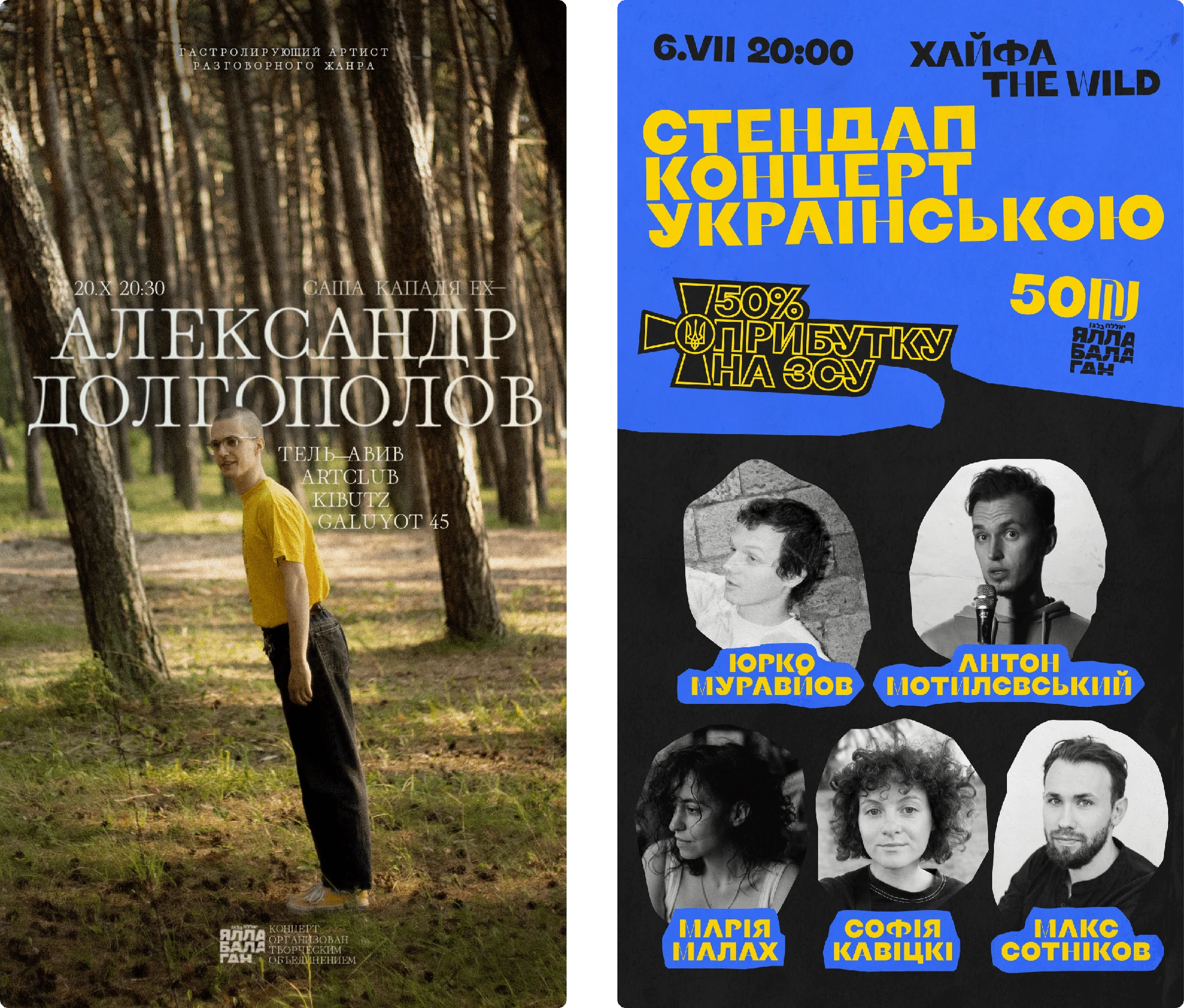
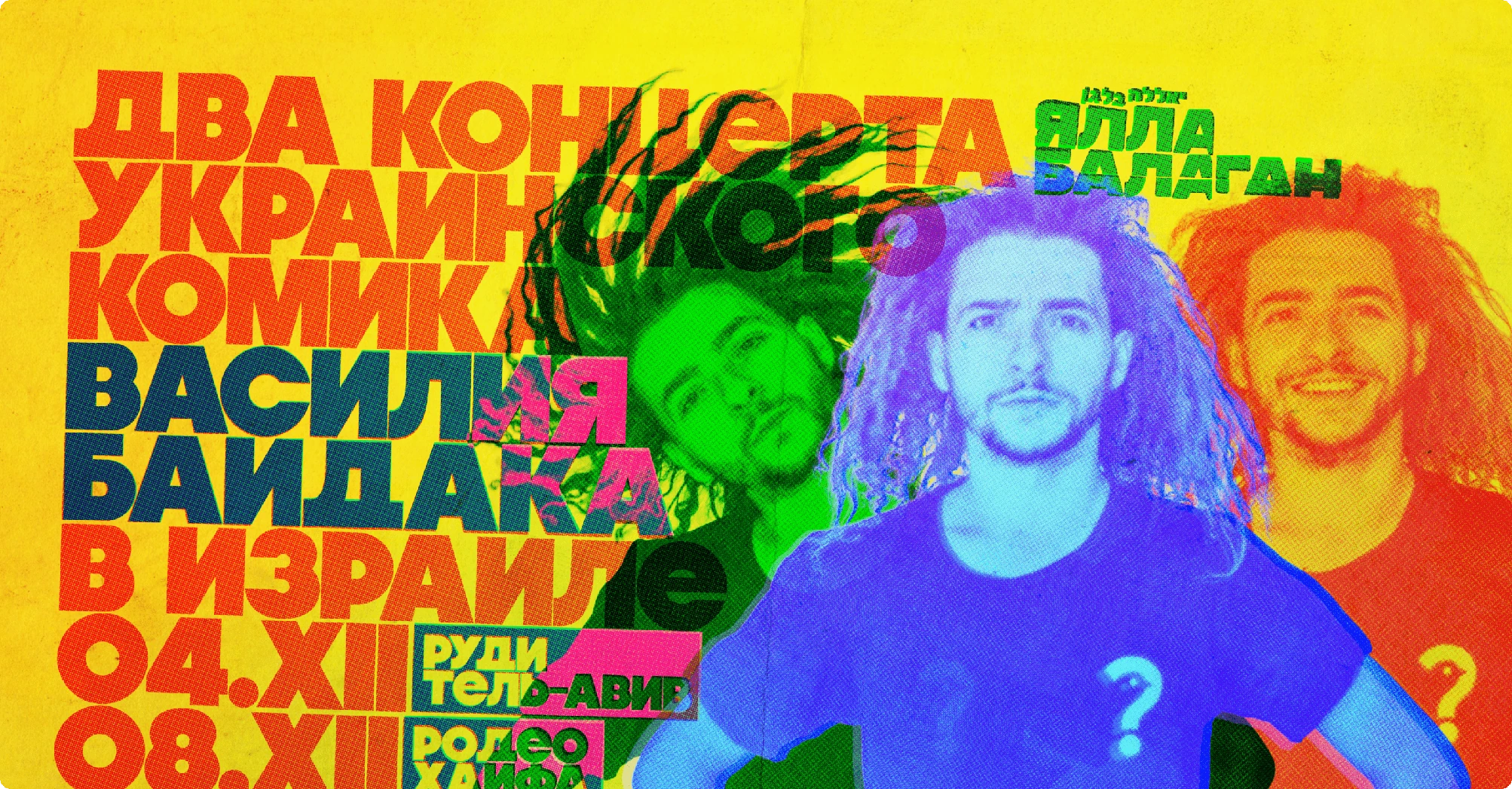
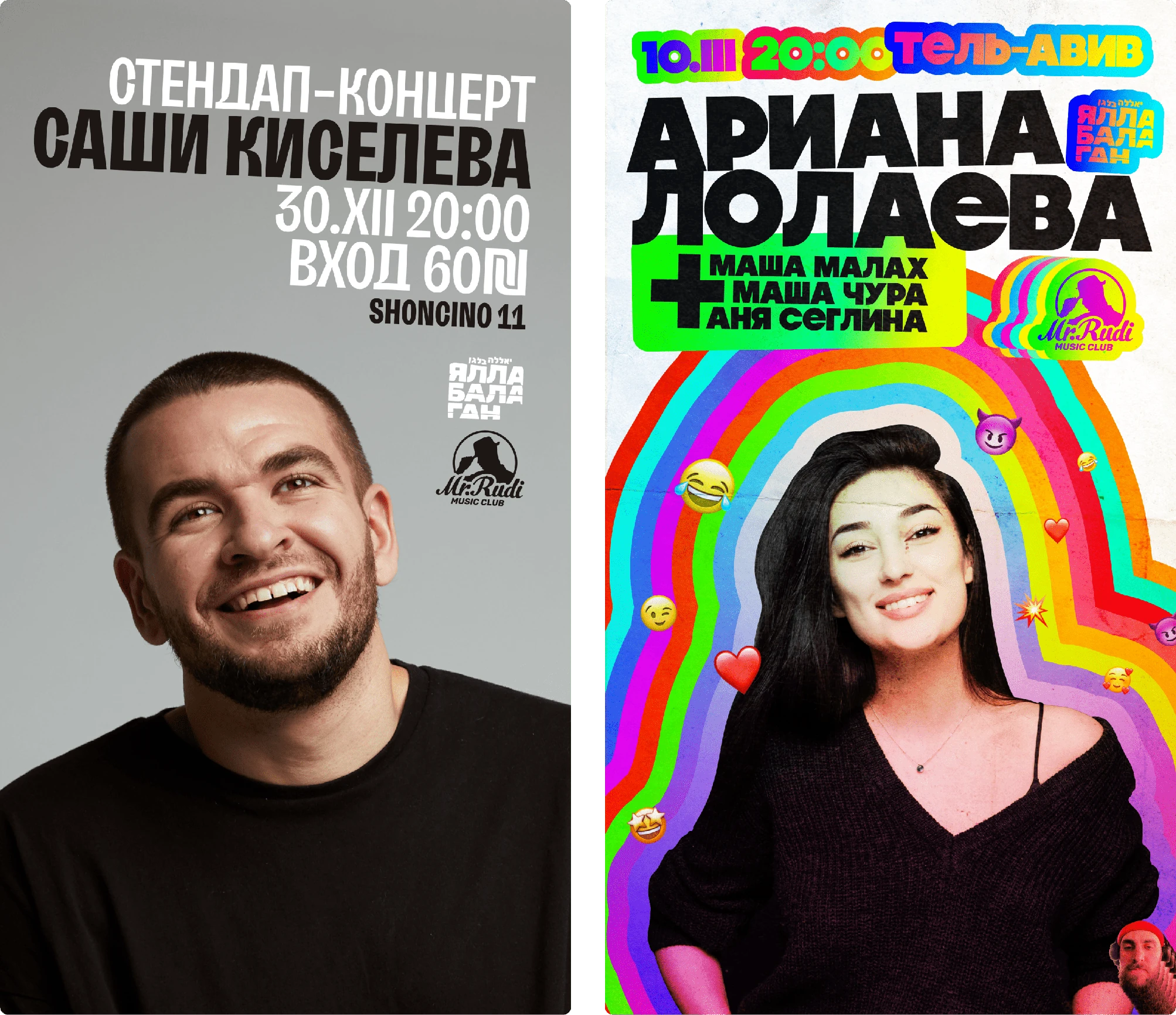
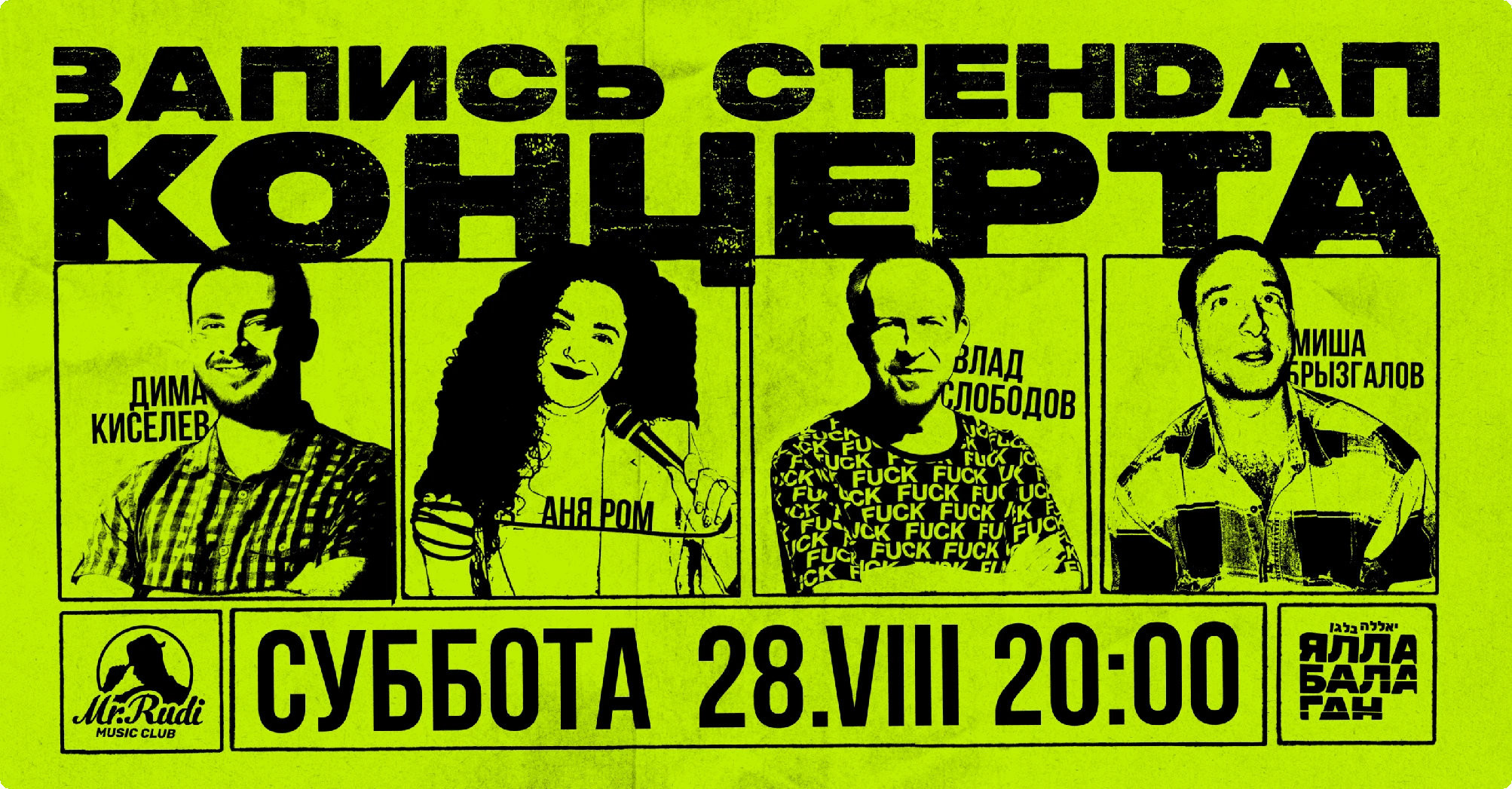
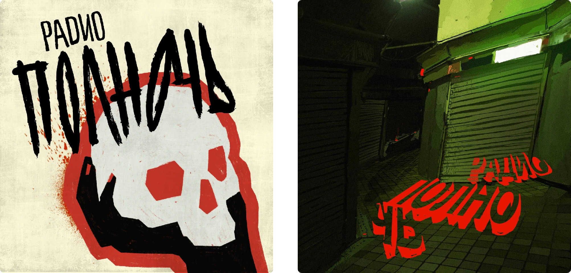
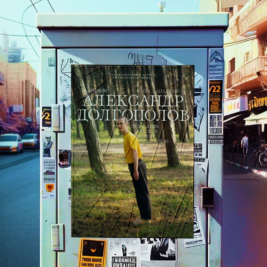
At the same time, I like to create beautiful things, posters for stand-up friends, covers for podcasts, releases, concerts, and websites. Below are just a few of them
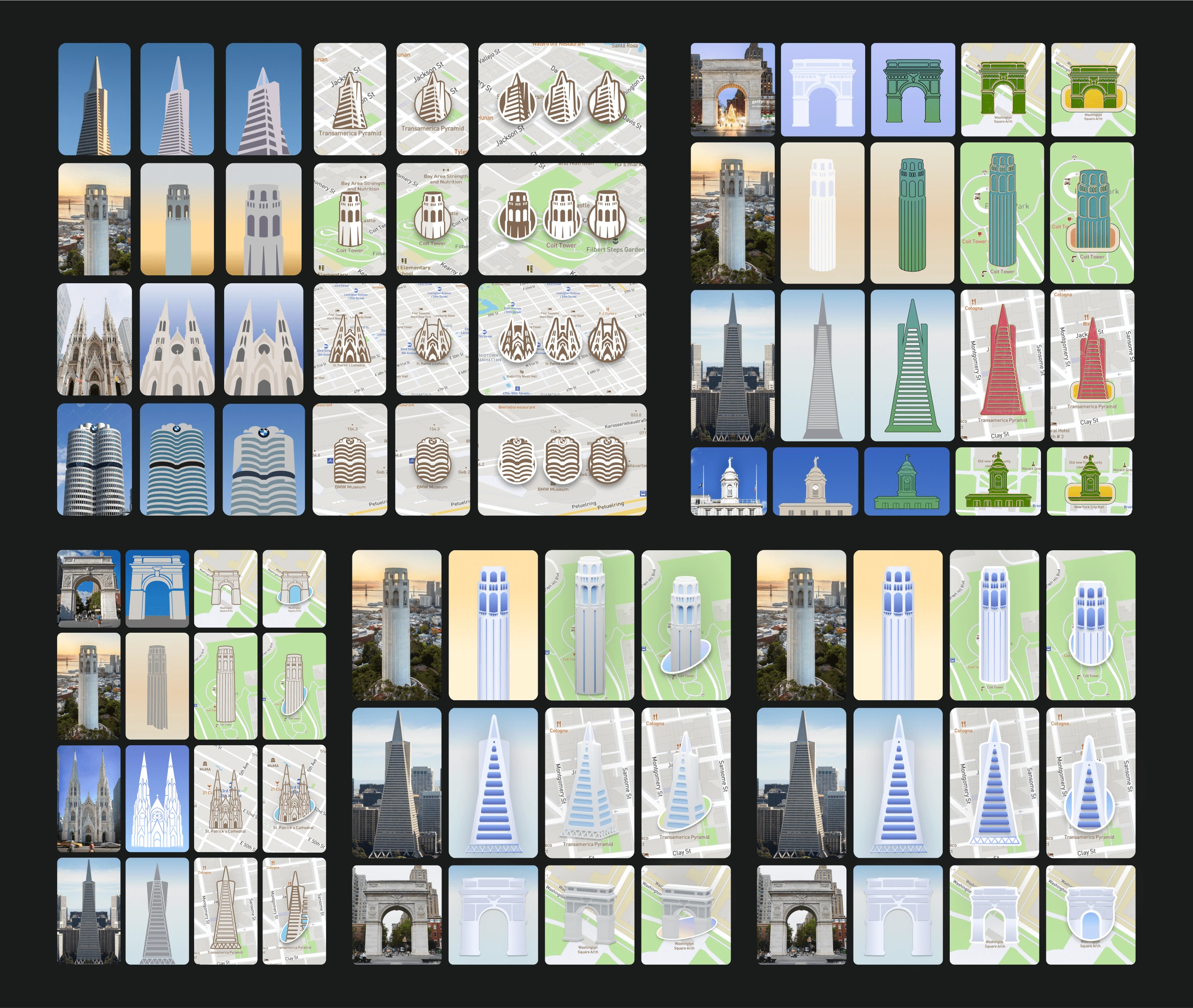
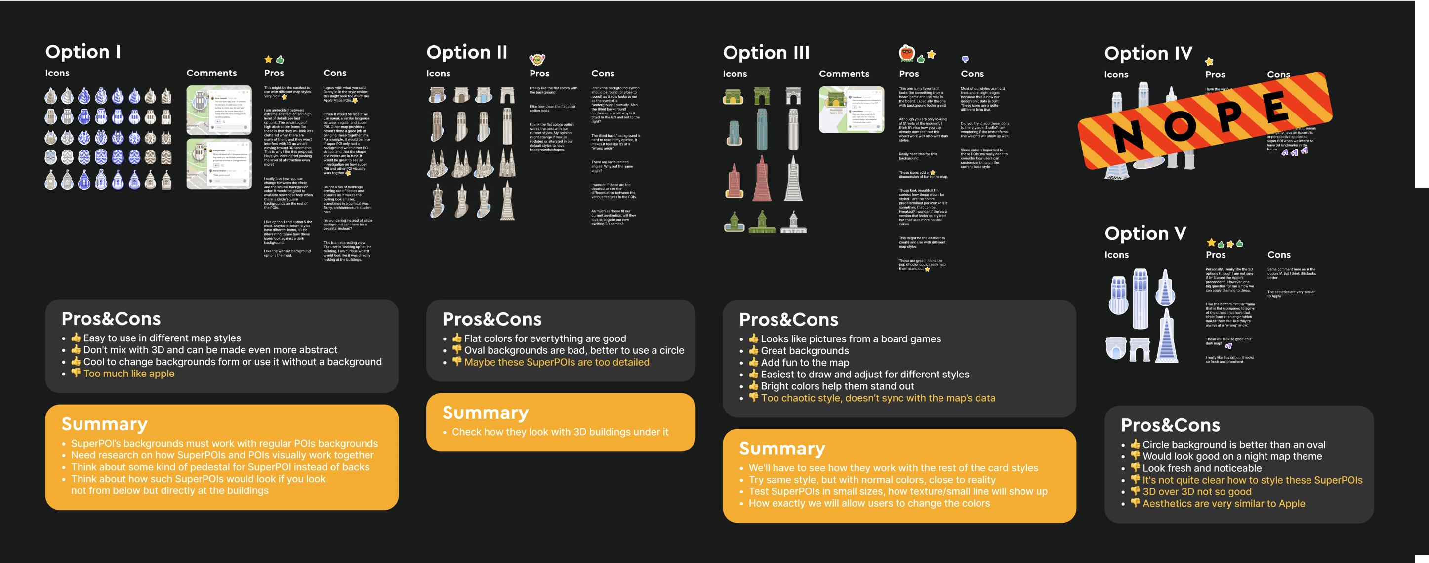
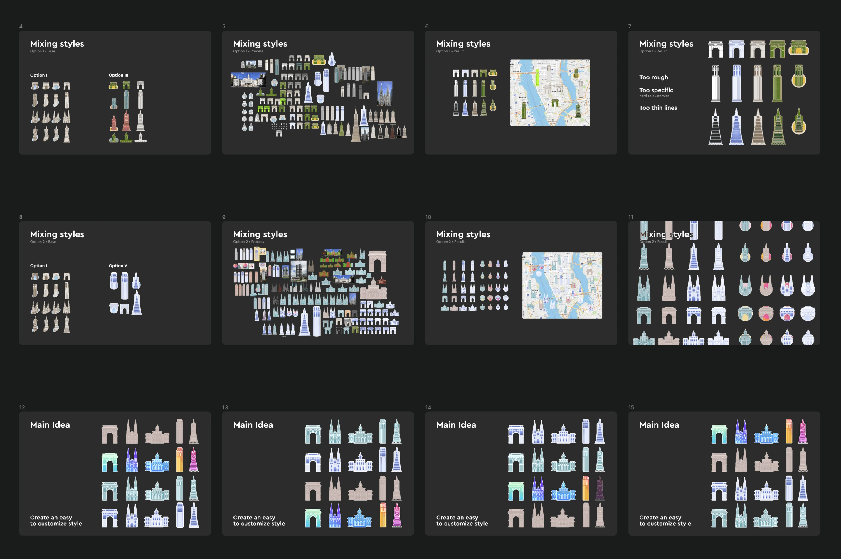
My journey to discover a unique style for Mapbox landmarks began with extensive research. I analyzed the current SuperPOIs of competitors and combined these insights with illustrations and sketches to better capture the concept.
I presented the team with five different styles we could implement quickly: three hand-drawn styles, one 3D style (which was dismissed), and a pseudo-3D style that, to my surprise, was the most favored.
I revisited the task and conducted another thorough research phase, rethinking the SuperPOI style concept and how they could function.
The second part of my work was showcased in a detailed presentation that broke everything down into small components.
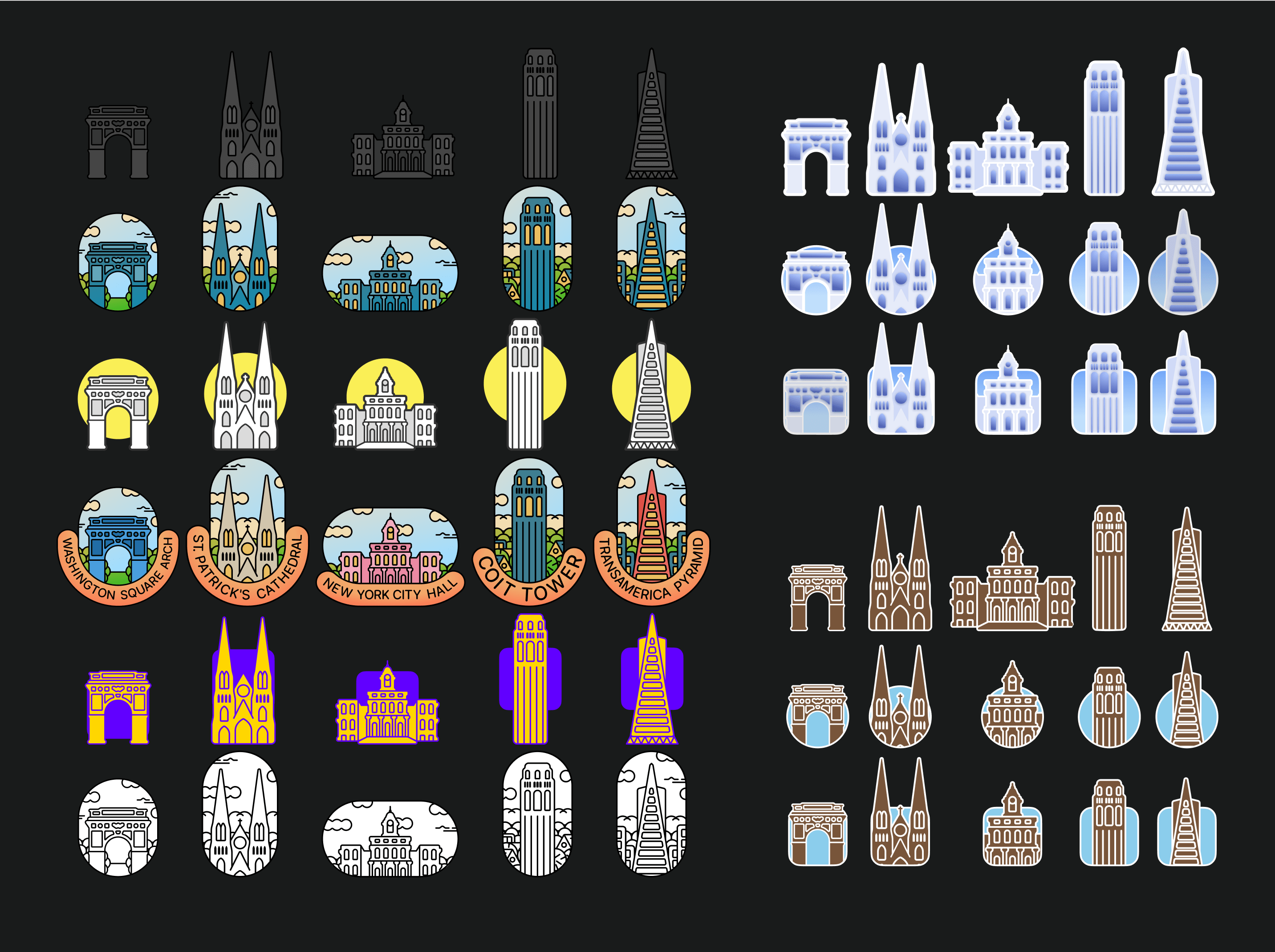
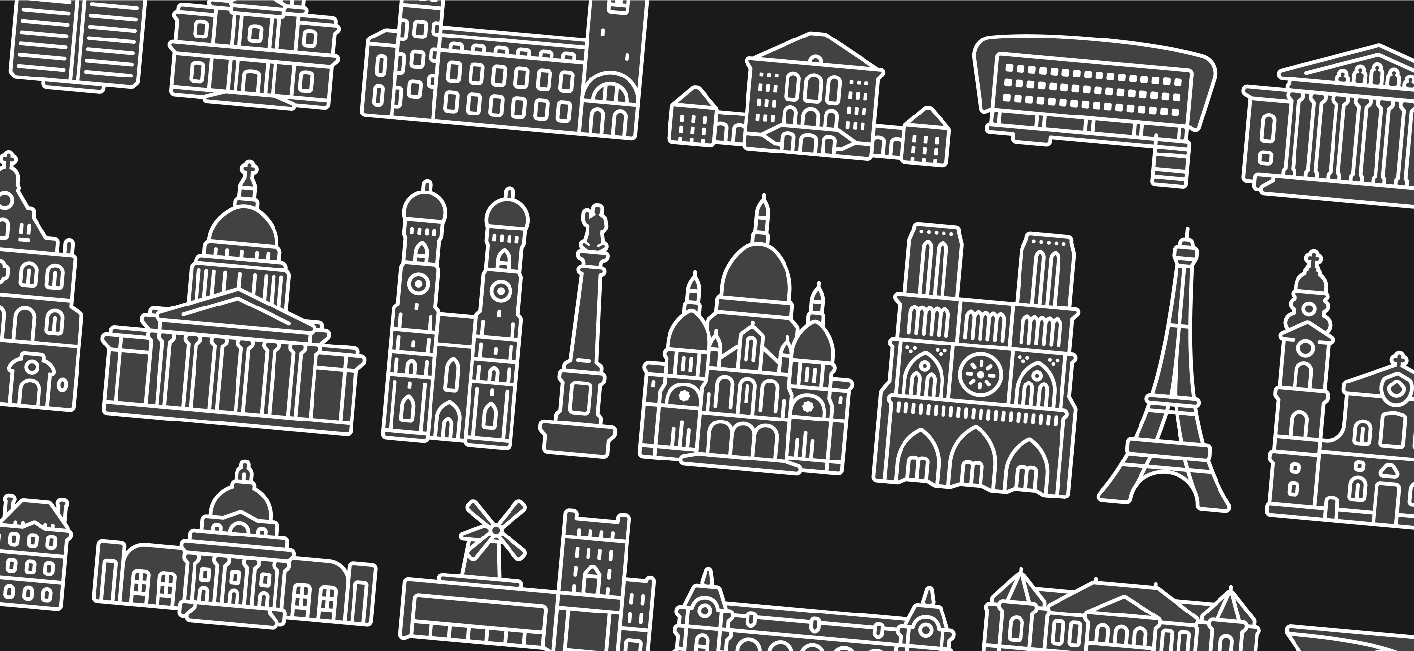
The style I eventually proposed, which I called "universal," was based on the same original graphics drawn in a structured grid style. This style could be transformed into something truly unique with different colors, shapes, backdrops, and cropping.
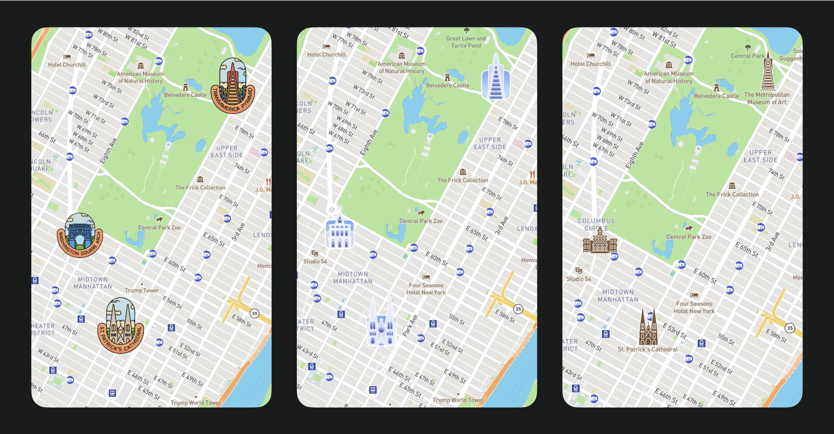
I demonstrated how this could look on the map. The team was thrilled, and I began the main work phase.
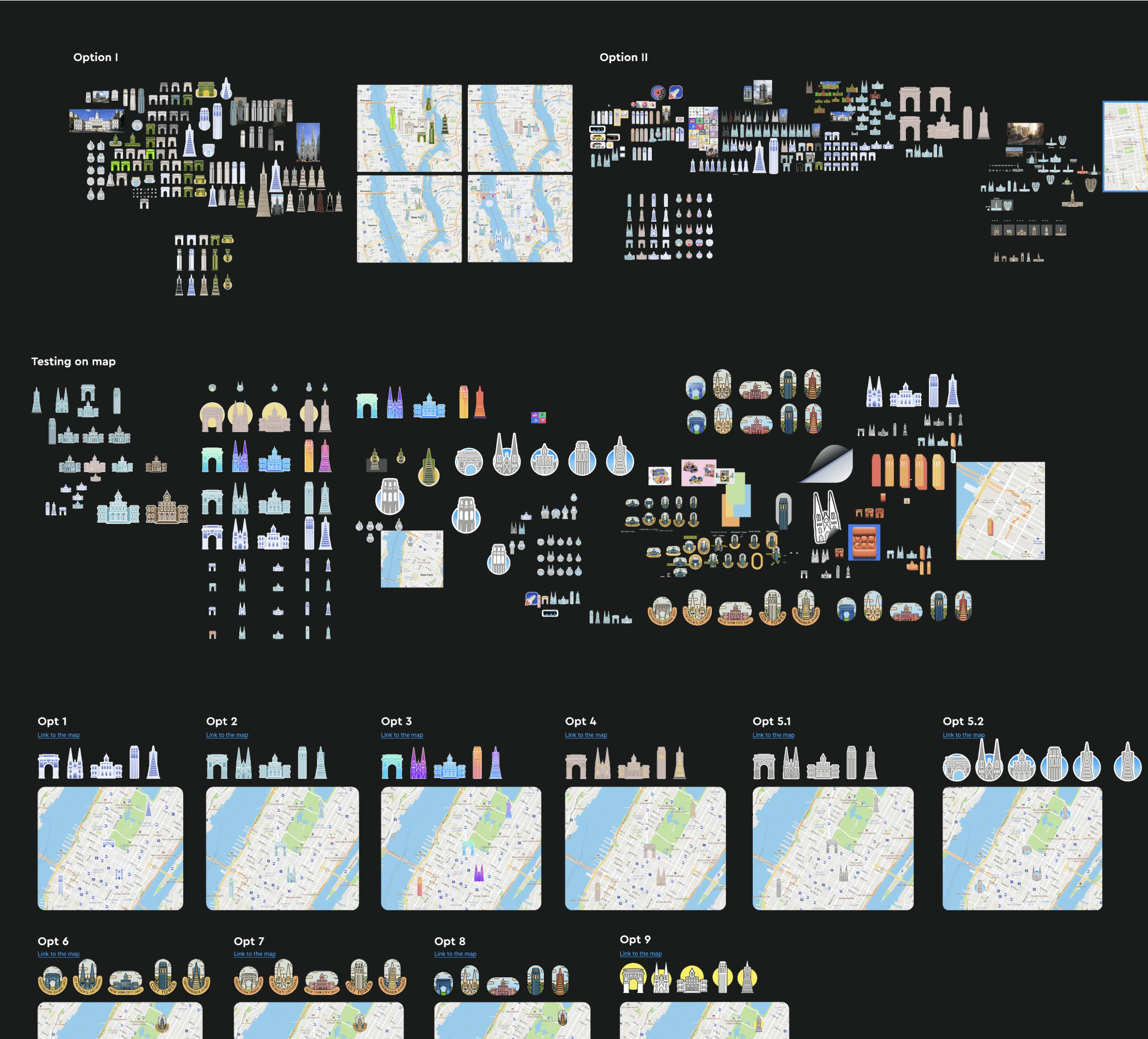
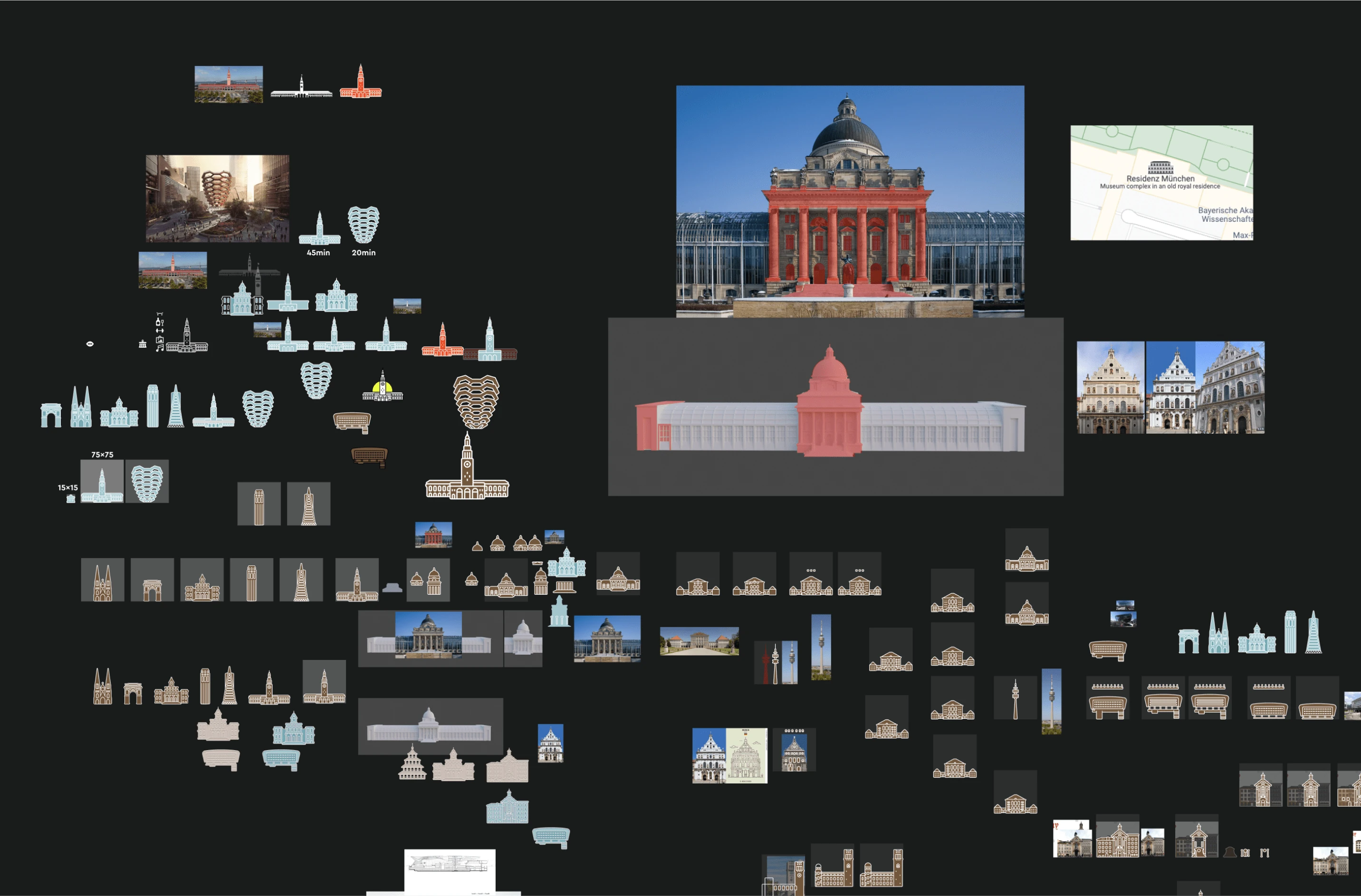
I started by creating a batch of test cities and landmarks for each.
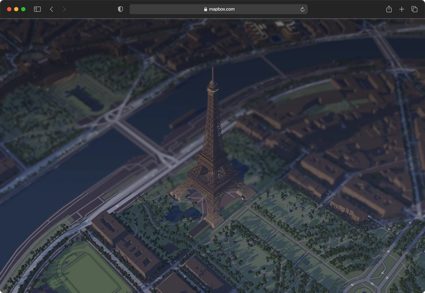
For experimental clarity, I chose three stylistically and architecturally diverse cities: Munich, Paris, and New York. I created a unique style and adhered to it.
Afterwards, I drafted a detailed document describing the style and how each curve and element functions, intended to guide freelance designers.
Unfortunately, the project was paused due to a shift in company priorities and because it was decided that manually drawing all these SuperPOIs, even in a simplified style, was too time-consuming.
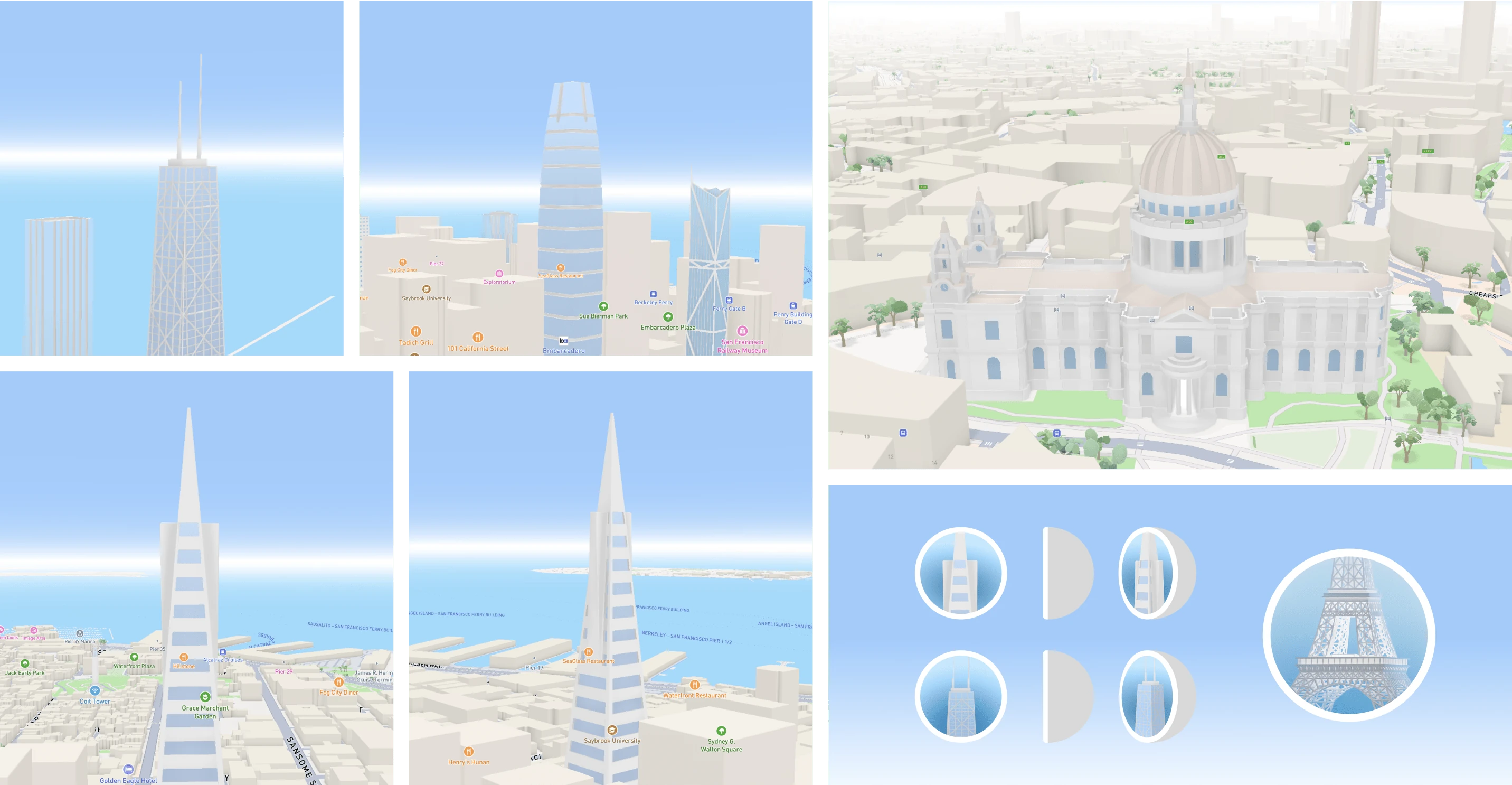
Currently, another proposal of mine is being considered: to use our existing 3D models on the map, place them in a semi-sphere, and display them as SuperPOIs to save time and add uniqueness through lighting and volume. This idea is still in process, and my work on this project is on hold.
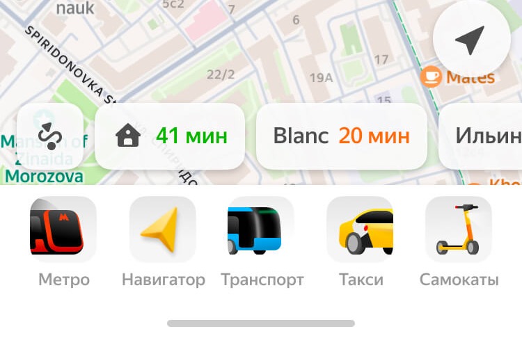
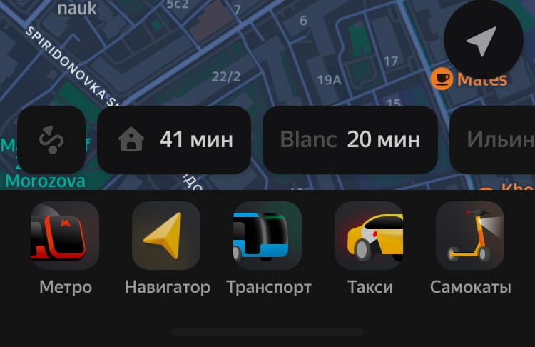
During the app redesign, I owned the tab bar. We chose pseudo-3D icons—editable vectors with a 3D look. Each icon extends beyond its square frame, so the car shows only its tail.
As part of a massive app update task that our team undertook, we were tasked with modernizing our tap bar. We wanted to move away from the monotony of pictograms and bring the panel to life with beautiful graphics.
I took on this task with the idea to create pseudo-3D illustrations that looked and felt like 3D but retained the flexibility and simplicity of editing typical illustrations. After many iterations, the right style was finally achieved.
I believe the task was completed to 1000%, with the new design being brighter, more unique, and more emotional.
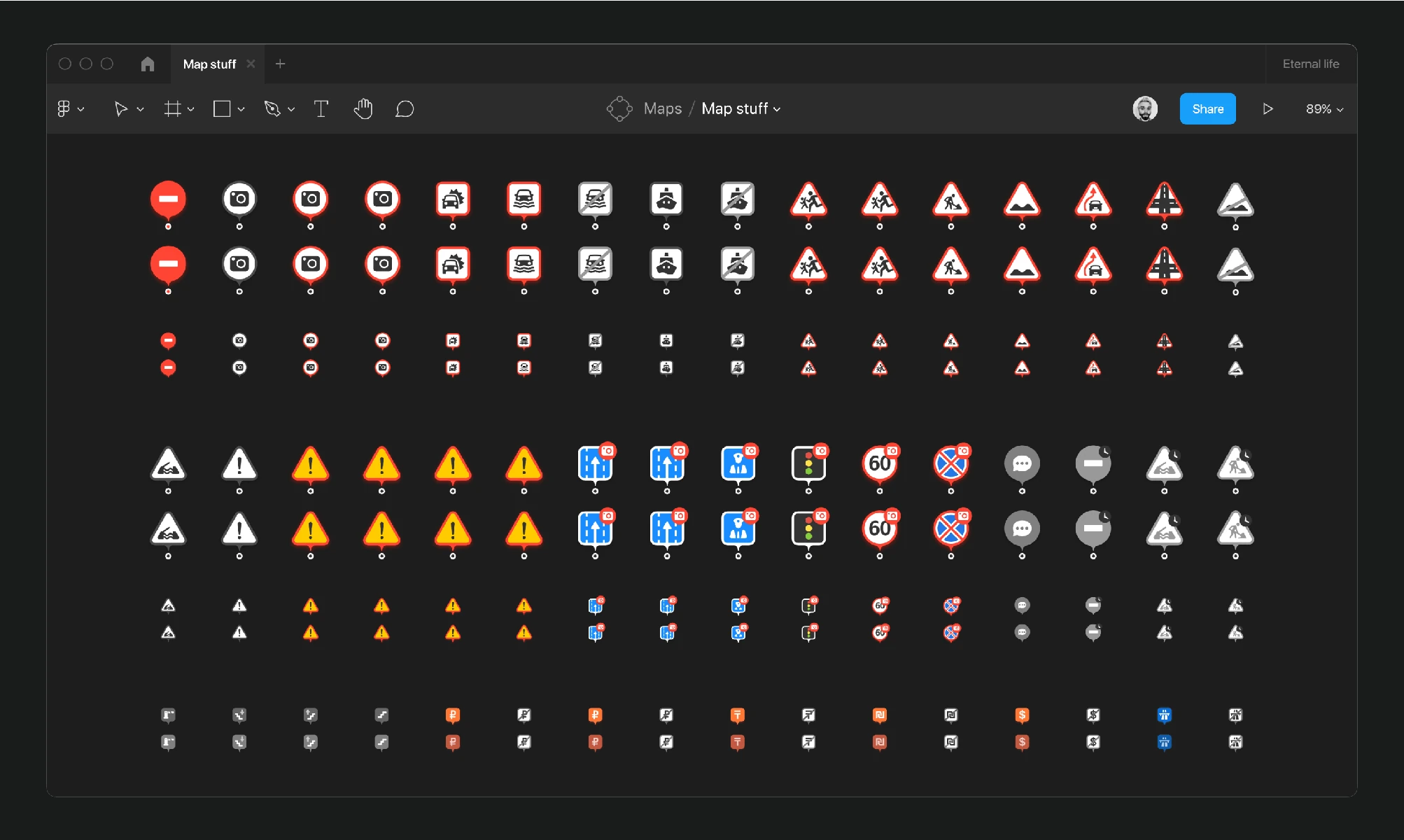
Three and a half years of drawing for most corners of Maps: amenities on place cards, the indoor sets for airports and malls, road events, small map objects, metro. Every one shown at full size and at the size it actually has to survive.
Over 3.5 years working at Yandex, I've created a vast array of icons for different parts of the service. This includes amenities in location cards during a redesign project, as well as icons for airports and shopping centers as part of the indoor map development. I also designed road event icons, small map object icons, and various metro station icons. This is just a snippet of what I’ve managed to quickly compile, but I’m eager to share this with you.
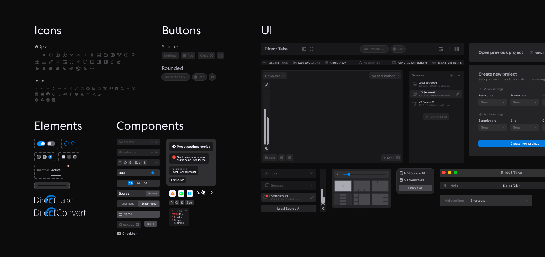
The icon set for DirectTake, Medialooks' live video studio. Two grids that never mix: 20px for the window and its panels, 16px for everything living inside lists and rows. 72 icons in one system.
You can read the detailed story of the full redesign and interface update of the DirectTake app elsewhere; here , I'll simply showcase what we had and what I did with the icons as part of the redesign.
Essentially, all icons were created with new use cases for the app in mind. Some icons were removed, while others changed in meaning and usage logic.
Those that remained were streamlined by me into a coherent system. I aimed to create a technical, understandable, and simple style that would emotionally support the new app redesign.
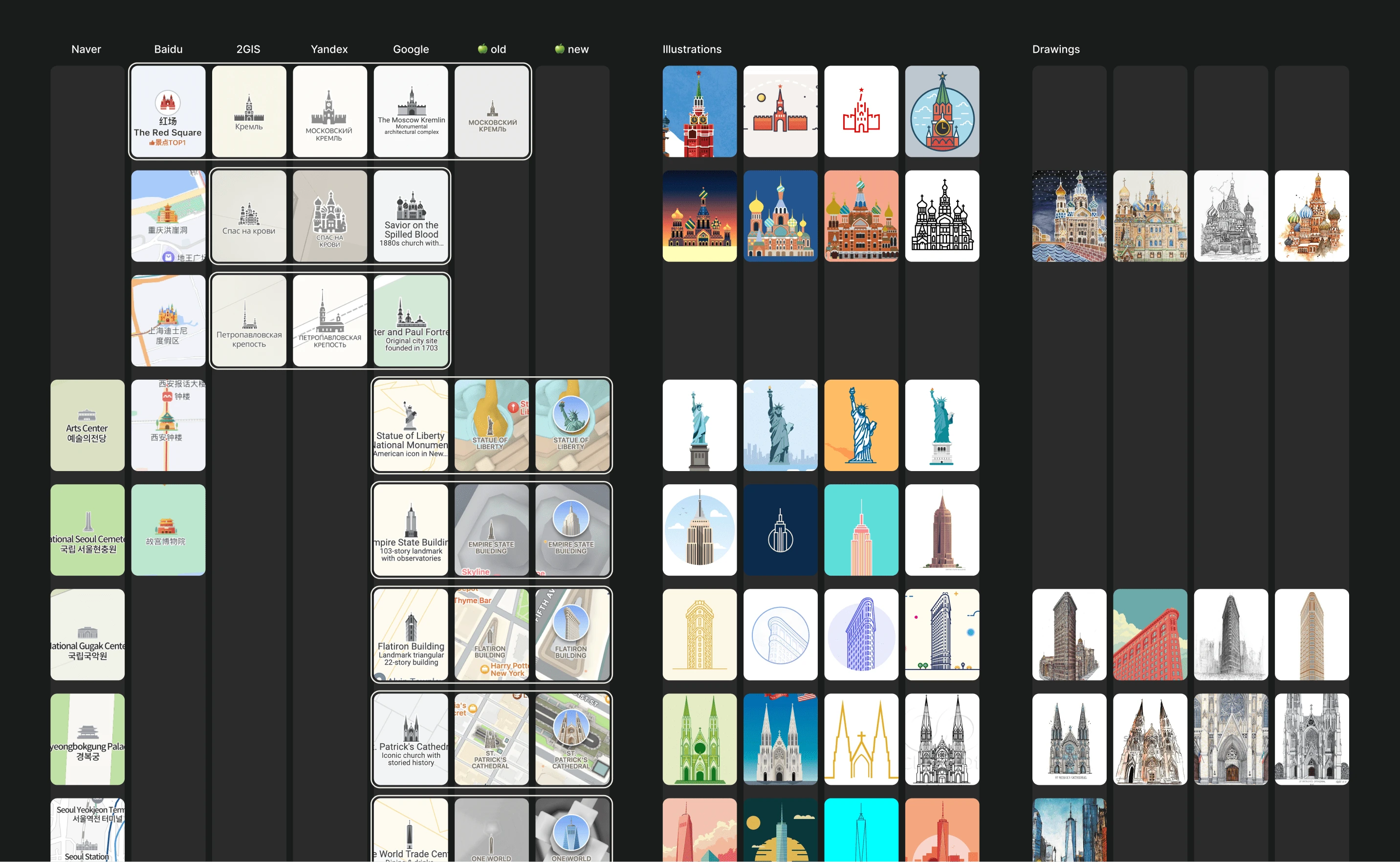
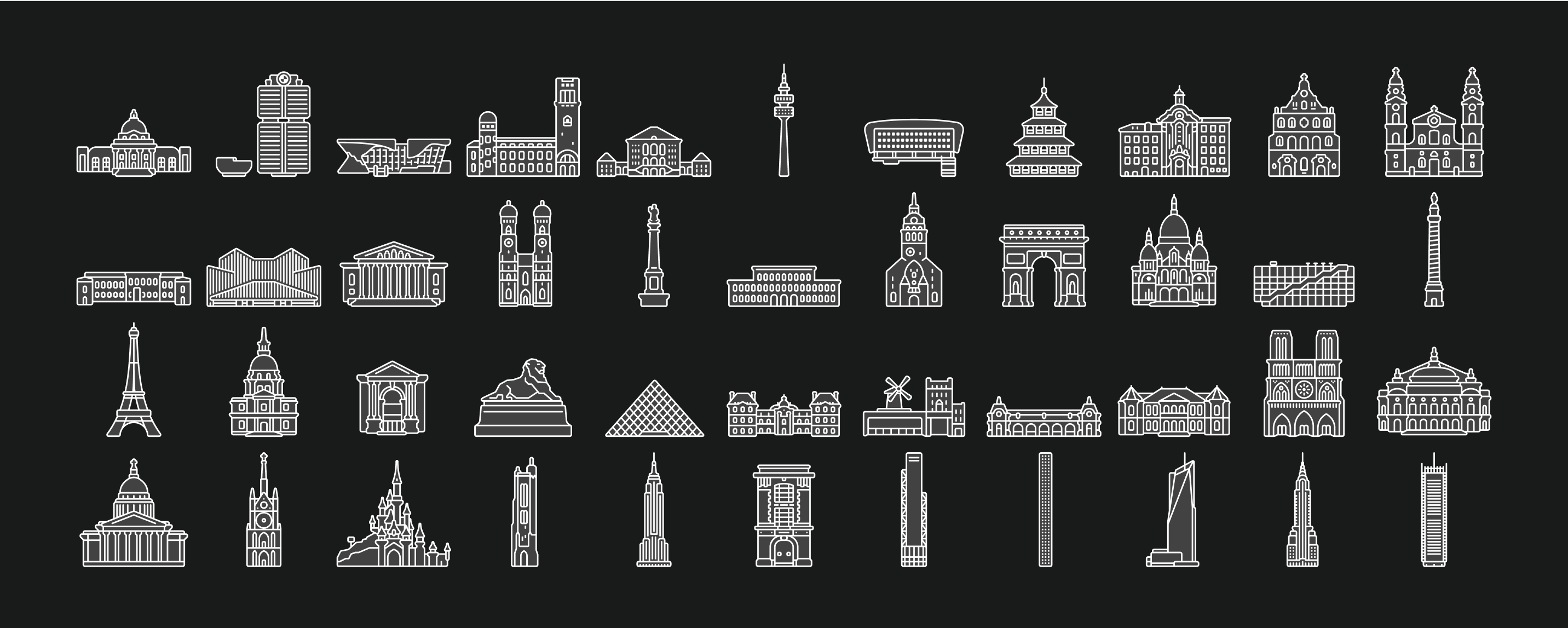
Yandex Maps needed landmarks a local reads at a glance and a tourist wants to look at. I set the graphic style for them — the balance between a real building and a mark on a map — and then drew the whole set. 326 landmarks, each as a pin and a point: 652 icons in all.
The map needs landmarks that facilitate quick user interaction for locals and attract tourists by showcasing the city. Prior to my arrival at Yandex, a year and a half of iterative design work had been conducted, cycling through various designers and external studios, before finally returning to the Maps team.
I conducted an analysis of the previous work and studied how SuperPOIs are represented in competitive services. My goal was to create a unique SuperPOI style that strikes a balance between depicting the real object and its graphical representation.
The result of this effort was a defined style, and two sets of SuperPOIs were created for Russia's two most important cities: Moscow and St. Petersburg.
I then detailed the style and approach for further SuperPOI creation and started overseeing the illustration of other cities by external designers. Below are some examples.
Currently, there are 286 SuperPOIs on the map (572 if counting the enlarged active versions), and three more cities are underway.
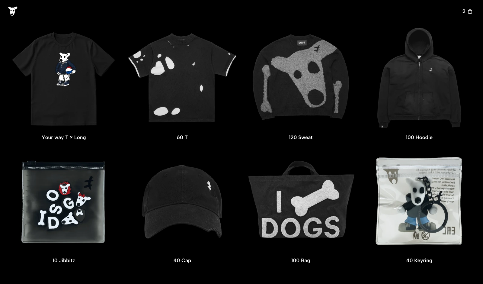
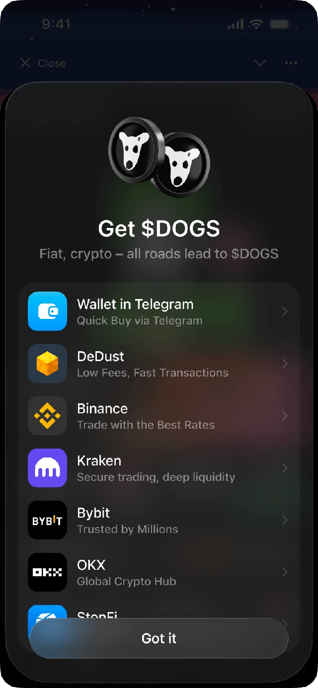
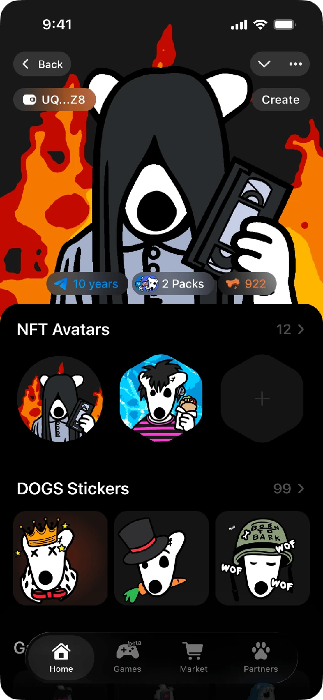
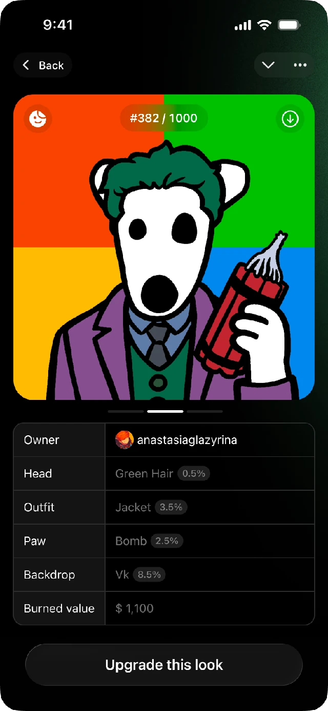
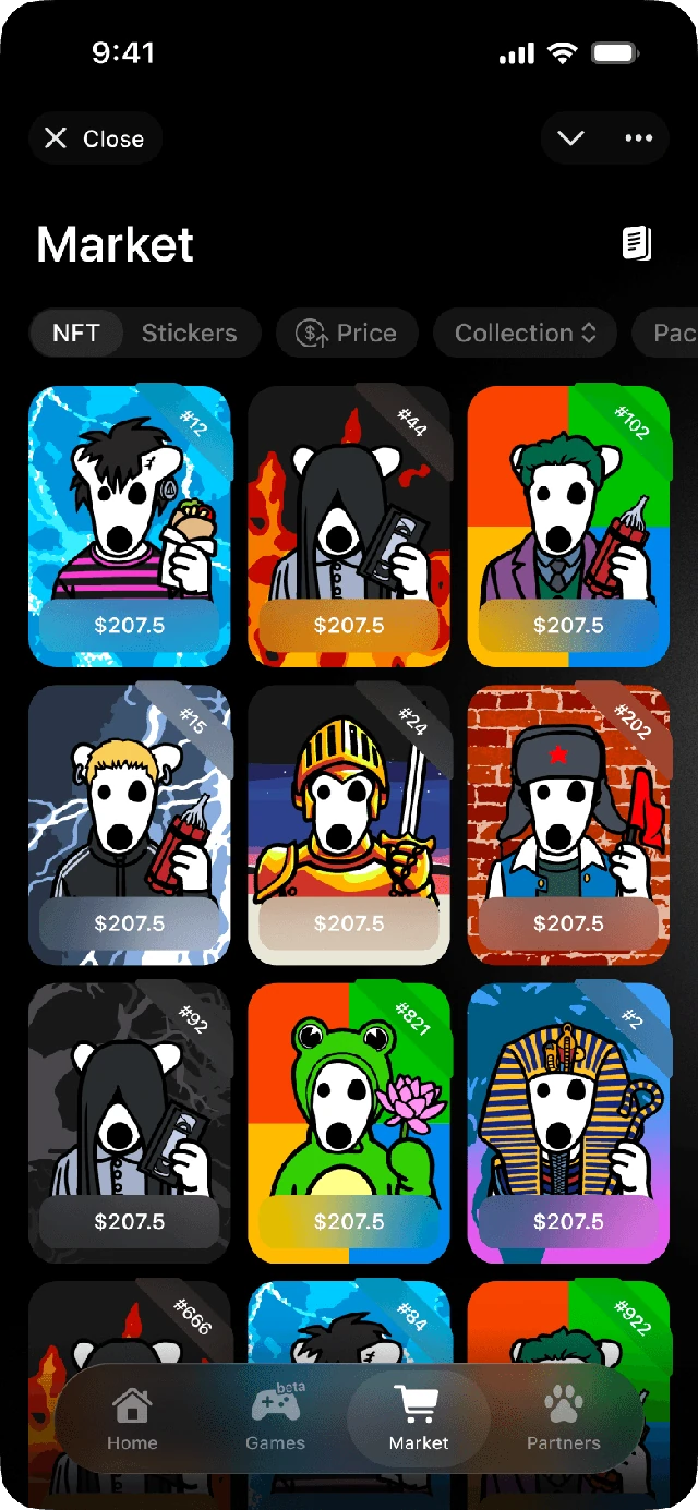
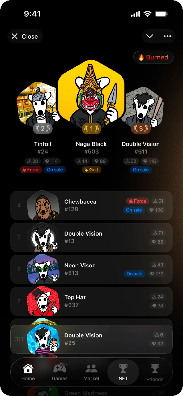
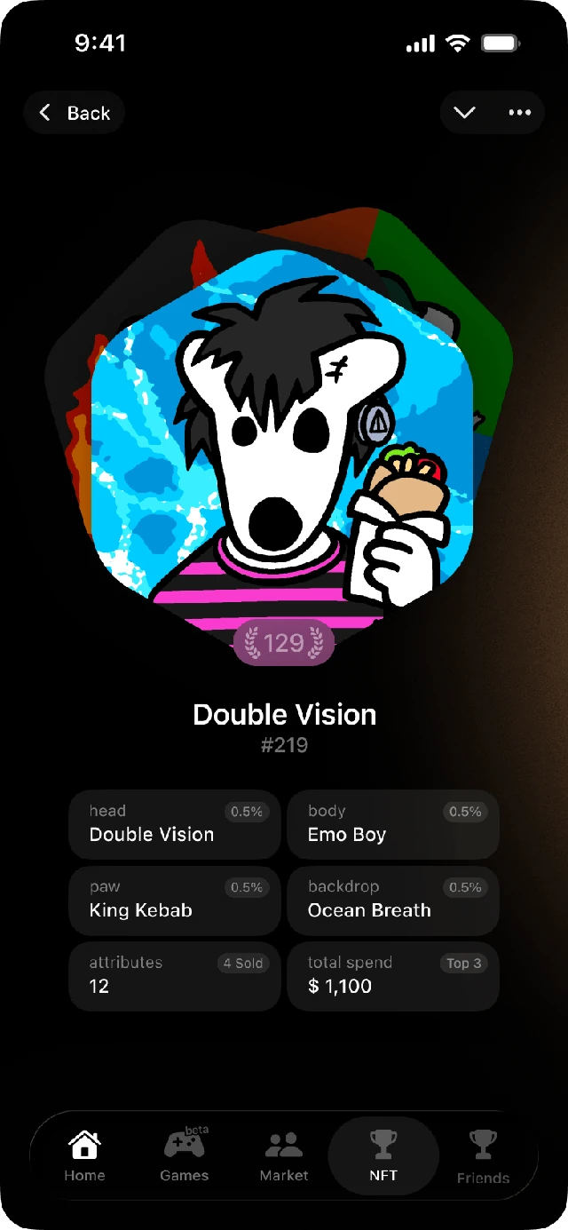
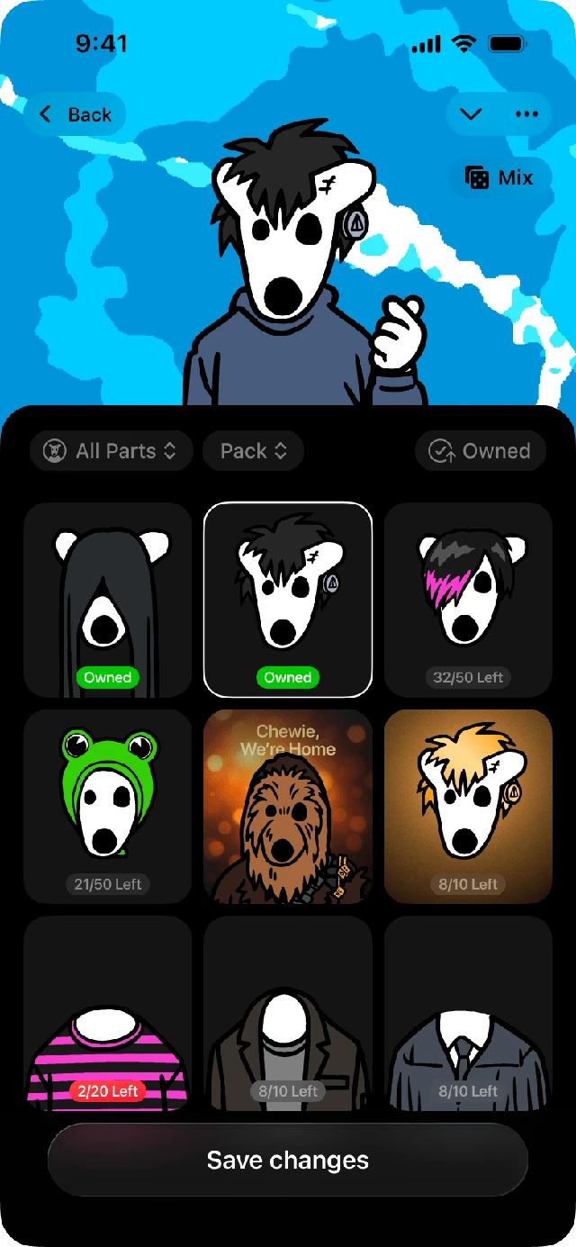
Years of web work for DOGS — the main site, the merch store, an NFT platform, and a long run of one-off pages, each built for its own launch or event.
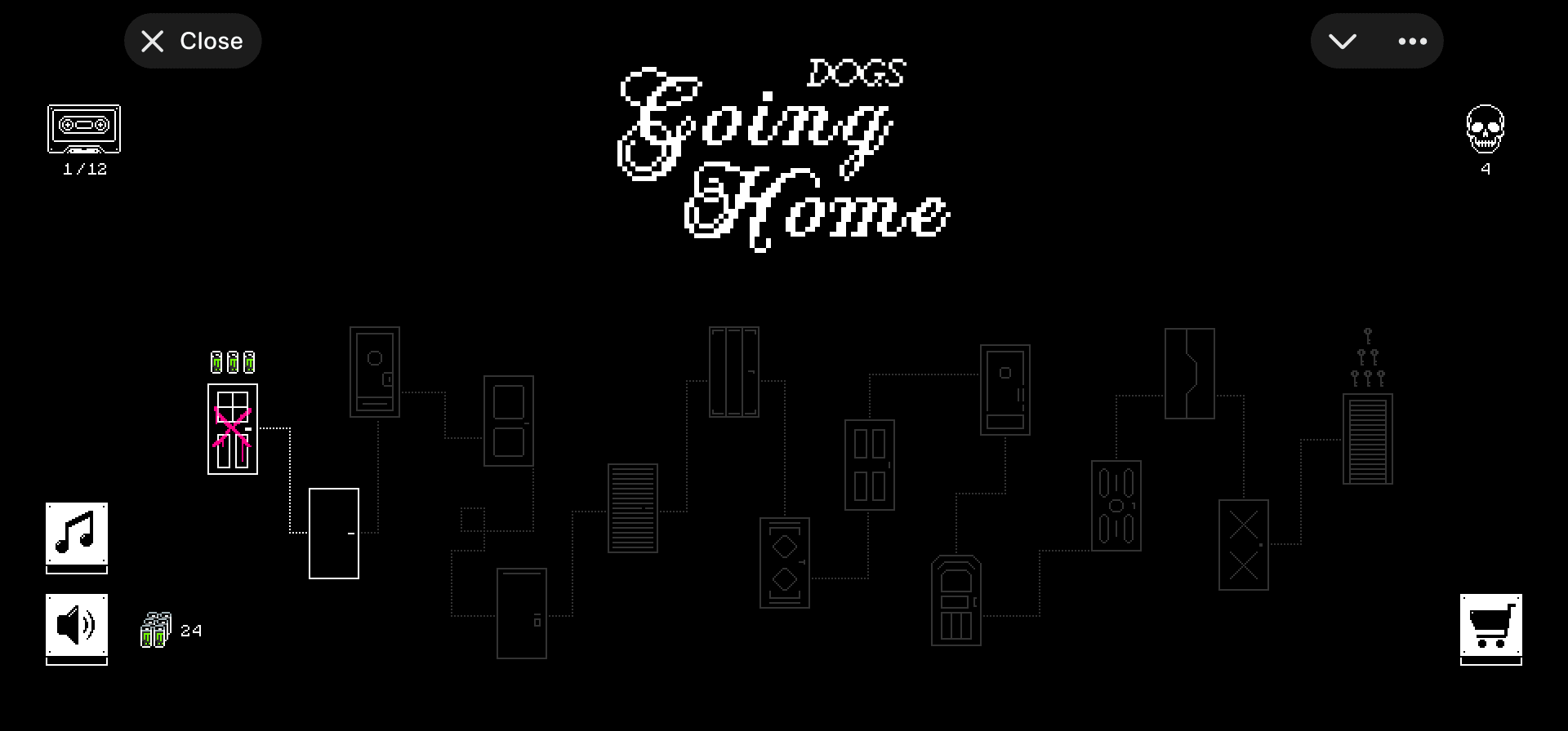
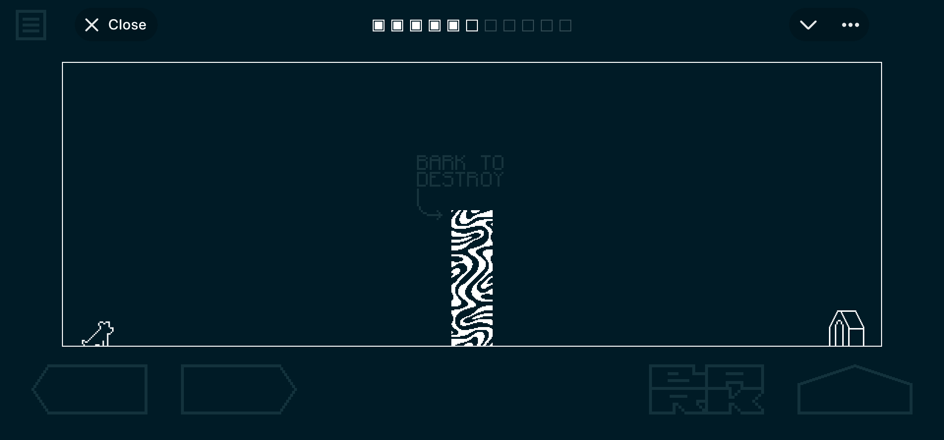
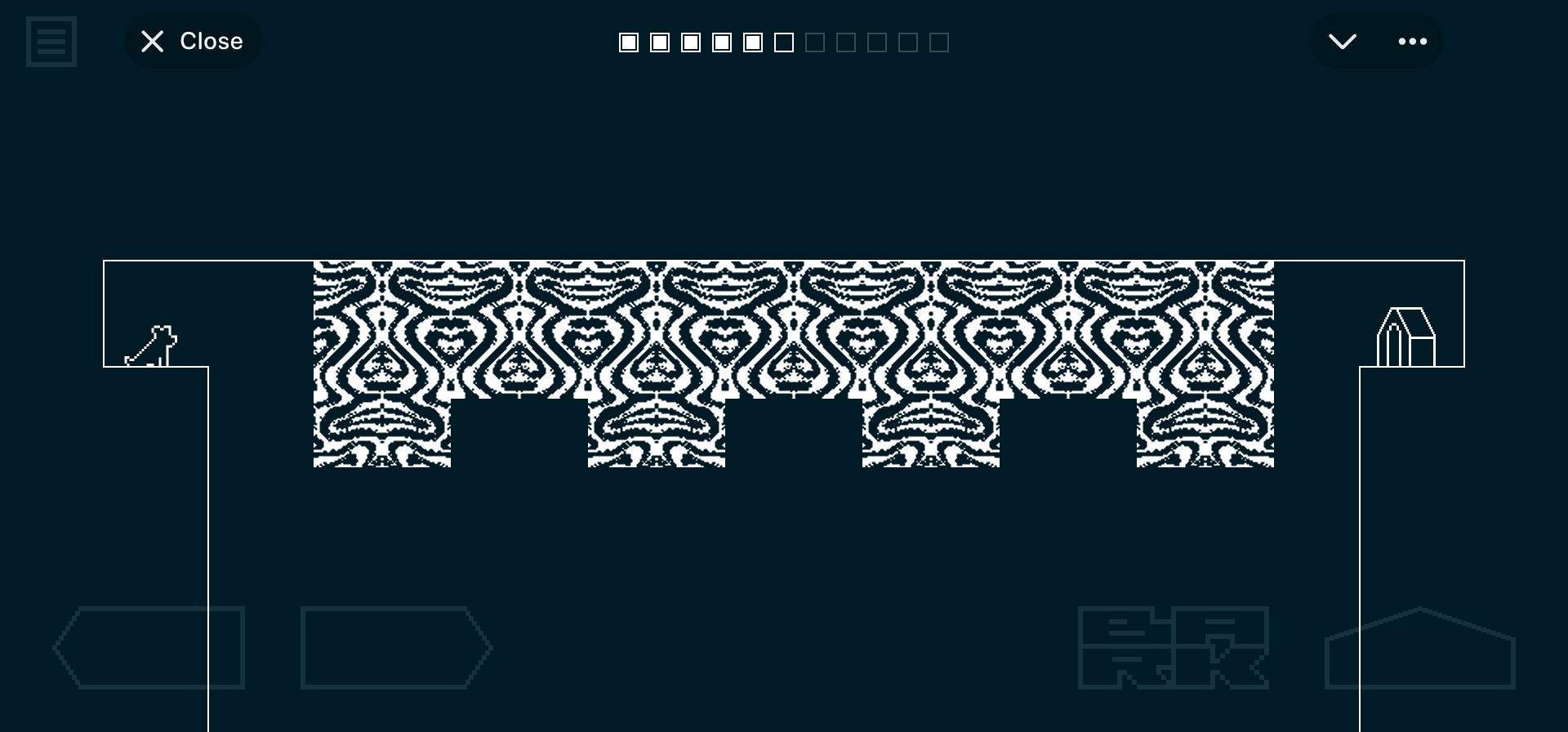
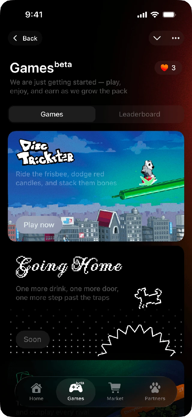
A solo game project built from scratch. I develop the gameplay and engine, create all the art, sound effects, and music myself. Coming soon.
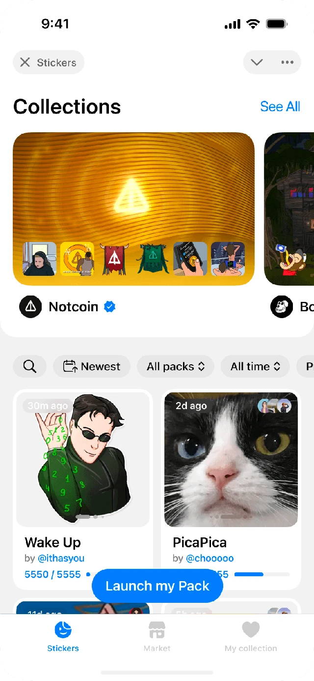
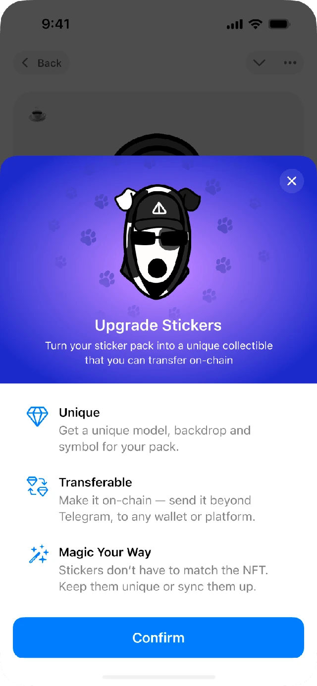
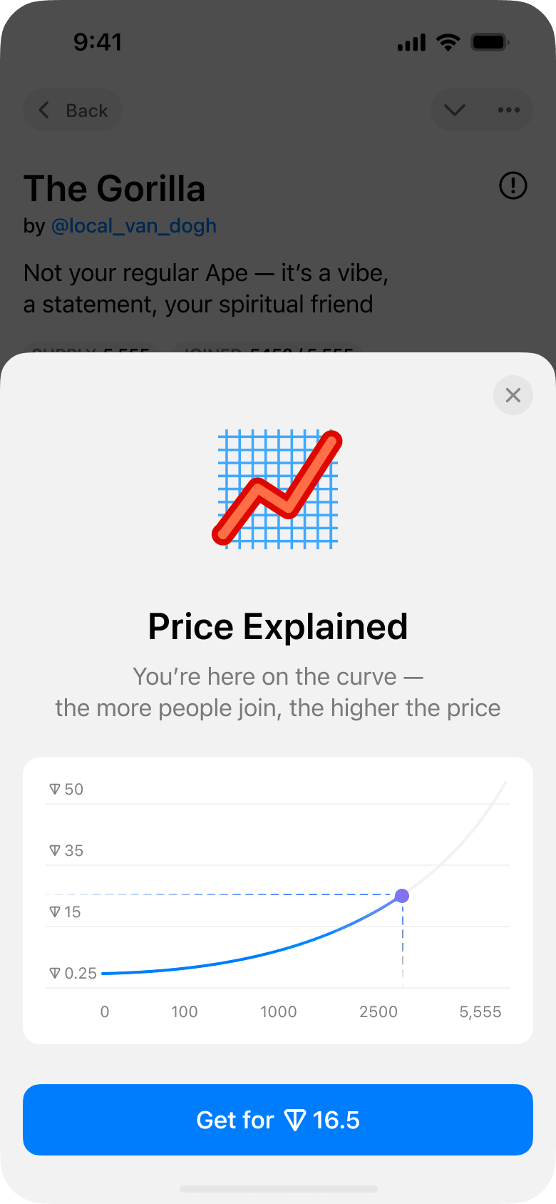
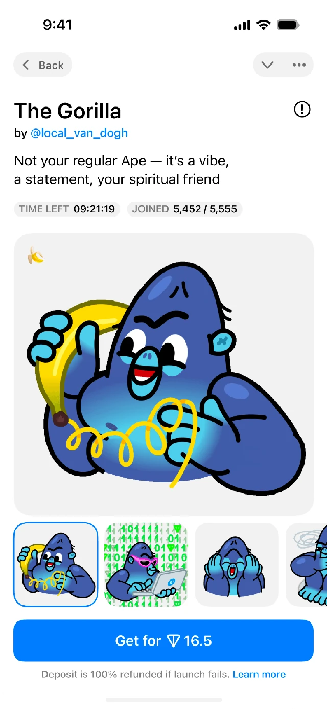
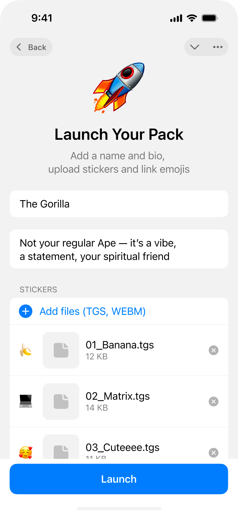
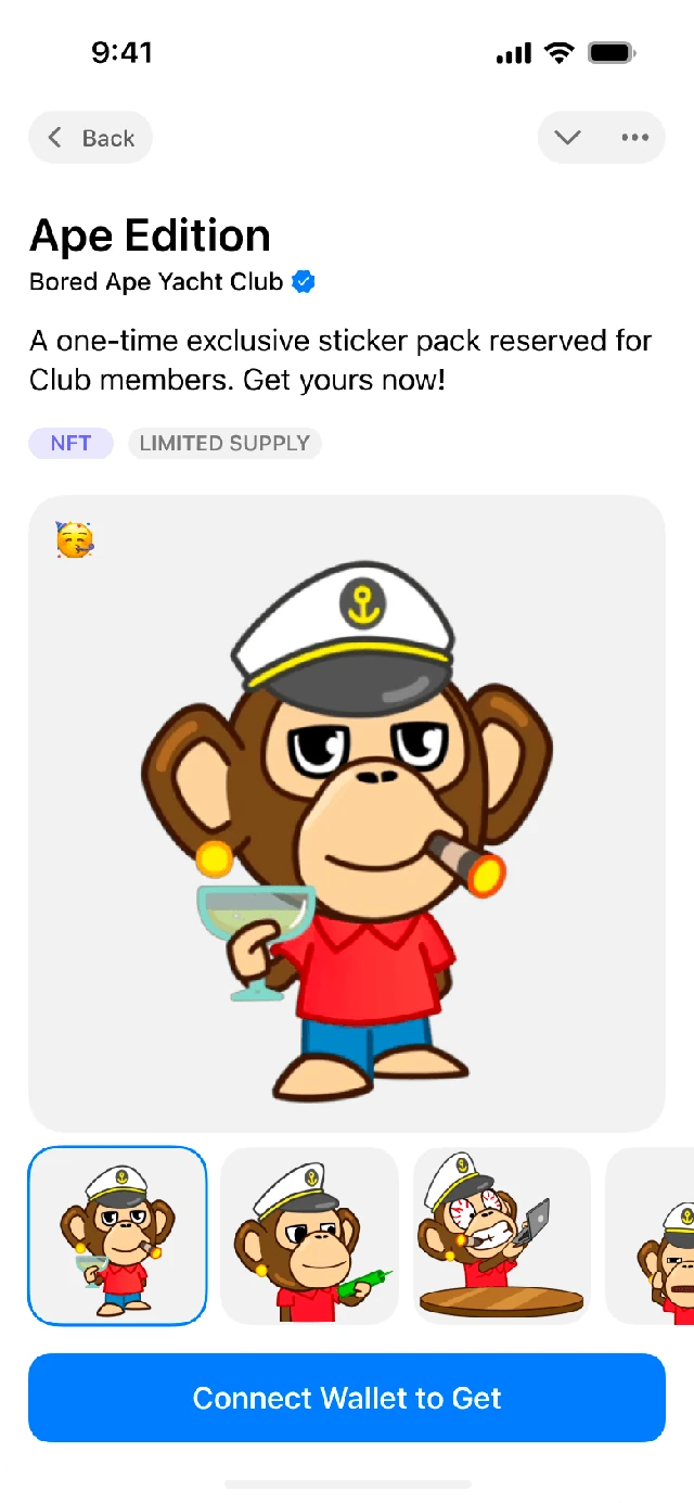
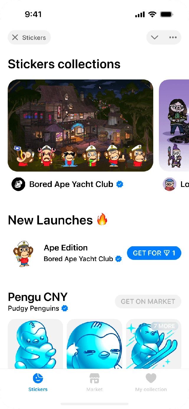
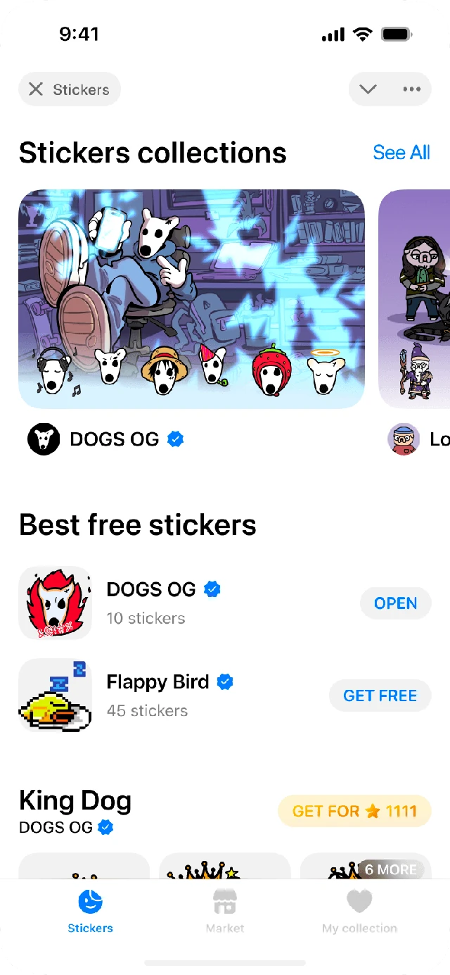
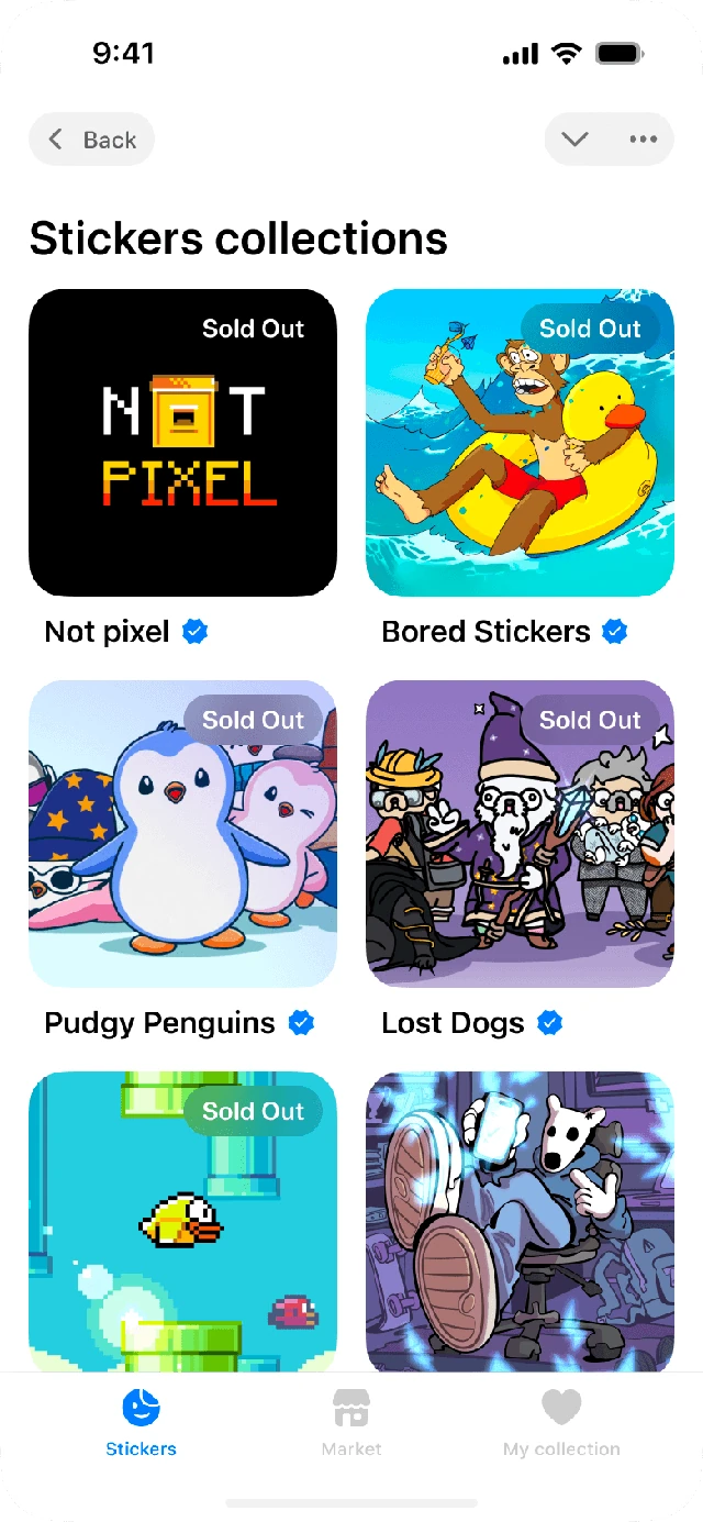
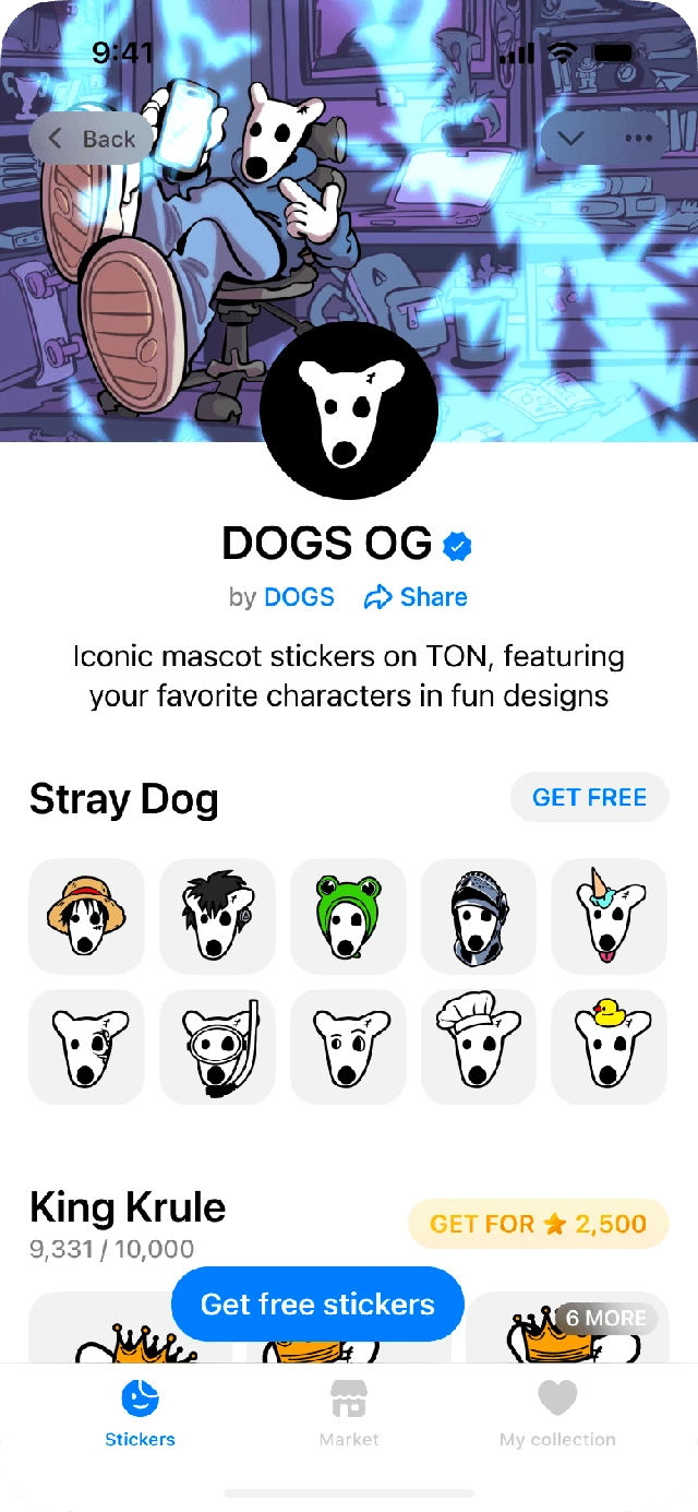
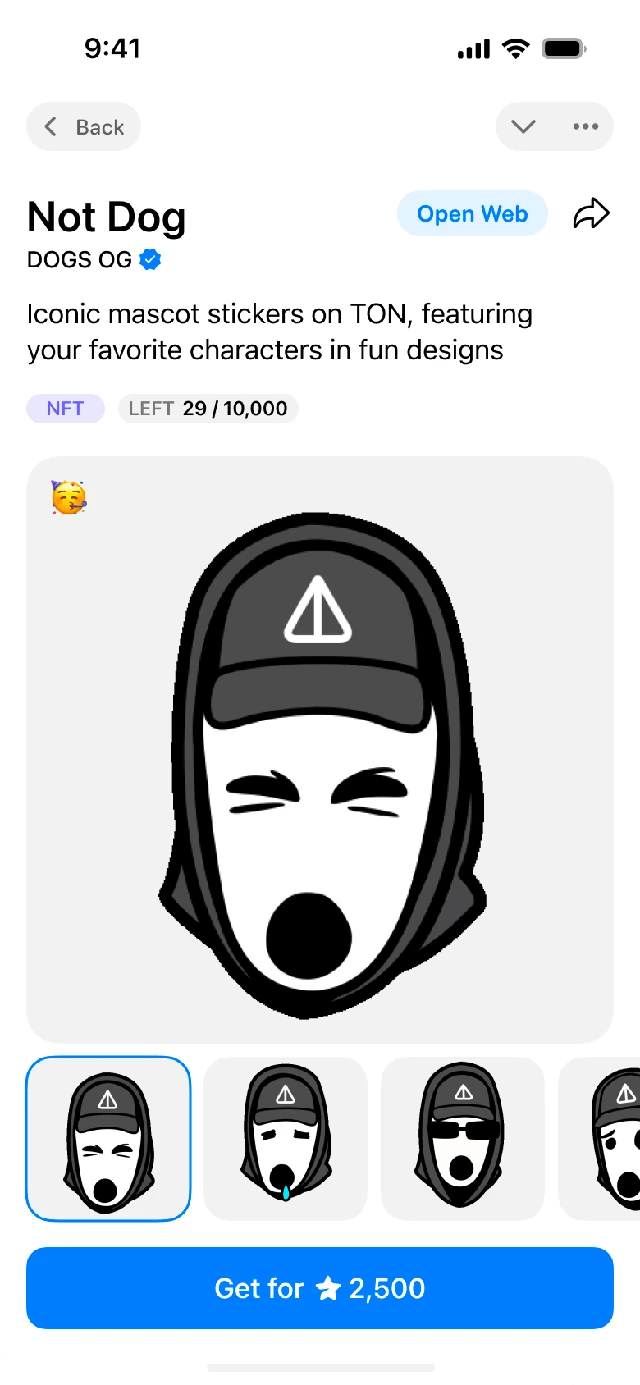
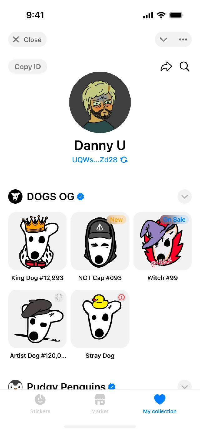
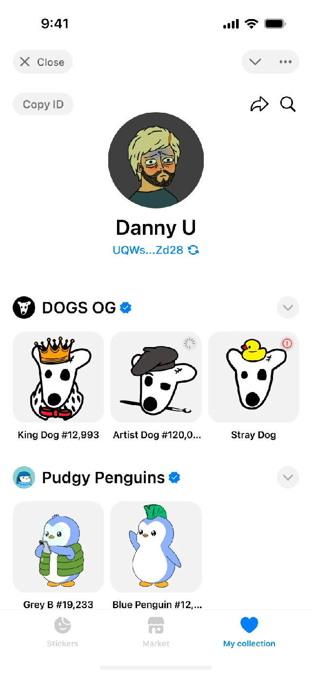
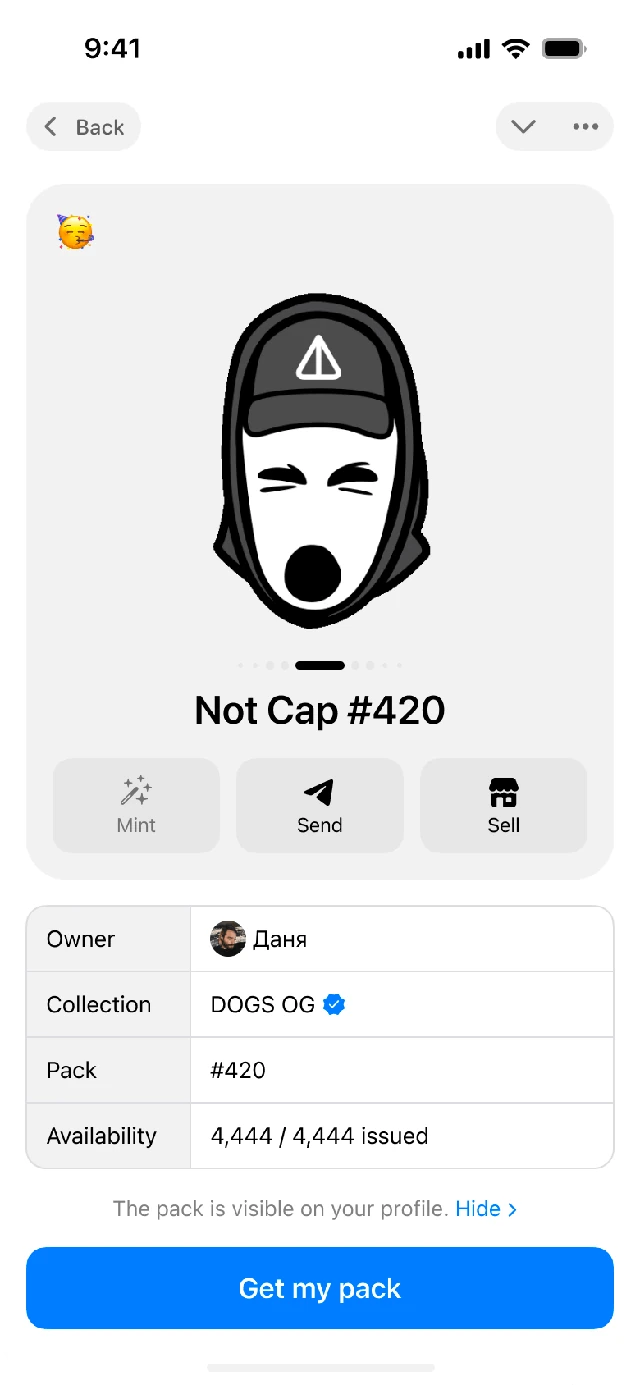
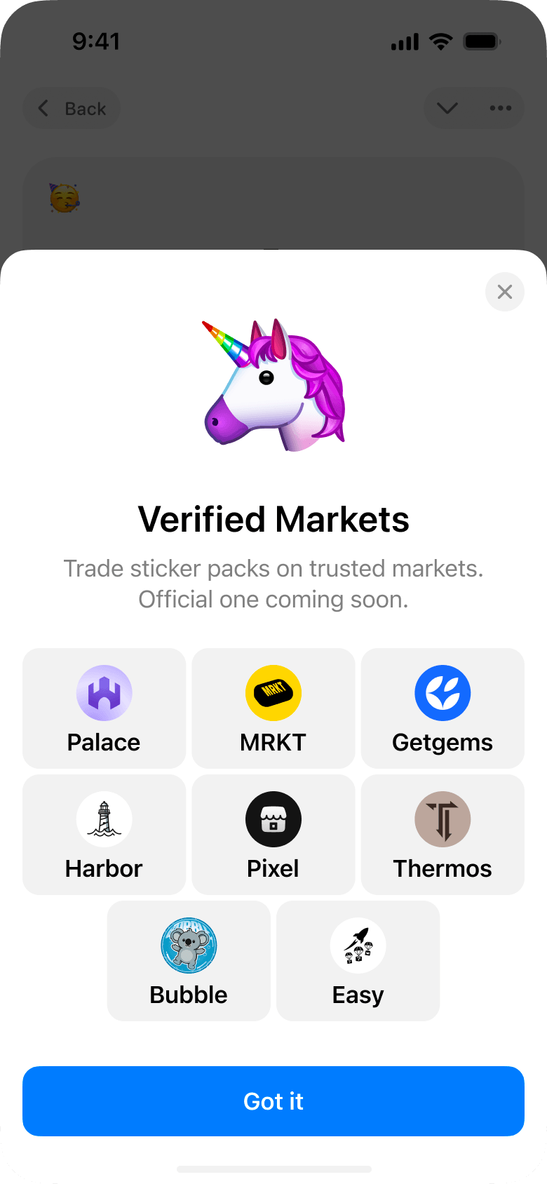
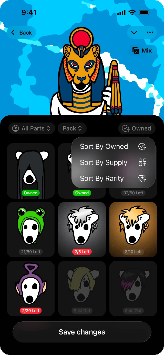
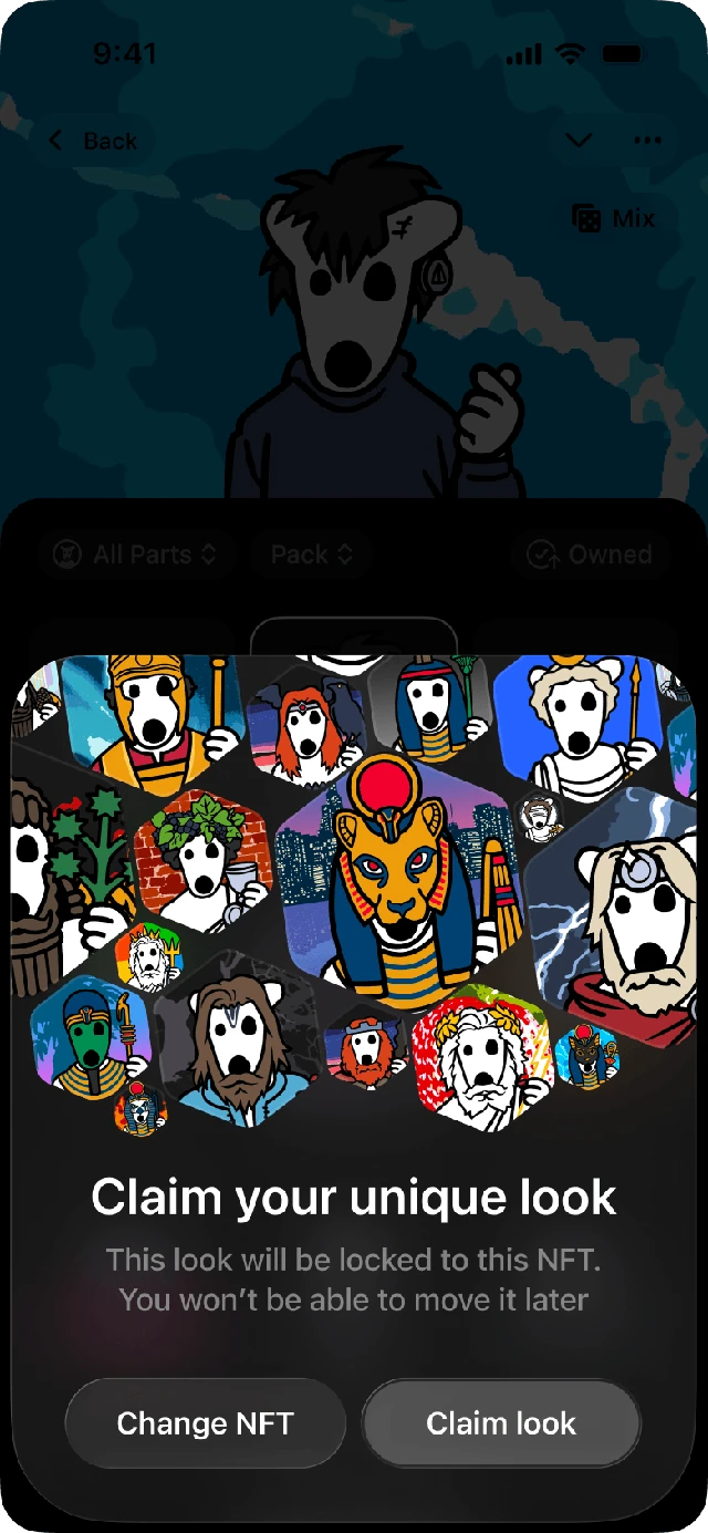
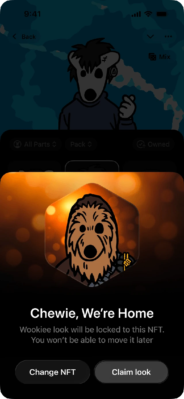
Founding designer of the first Telegram NFT Sticker Store. We built a fully Telegram-native experience, turning iconic NFT collections like Pudgy Penguins and BAYC into Telegram stickers, reaching tens of millions of users, and sparking a wave of competing marketplaces.
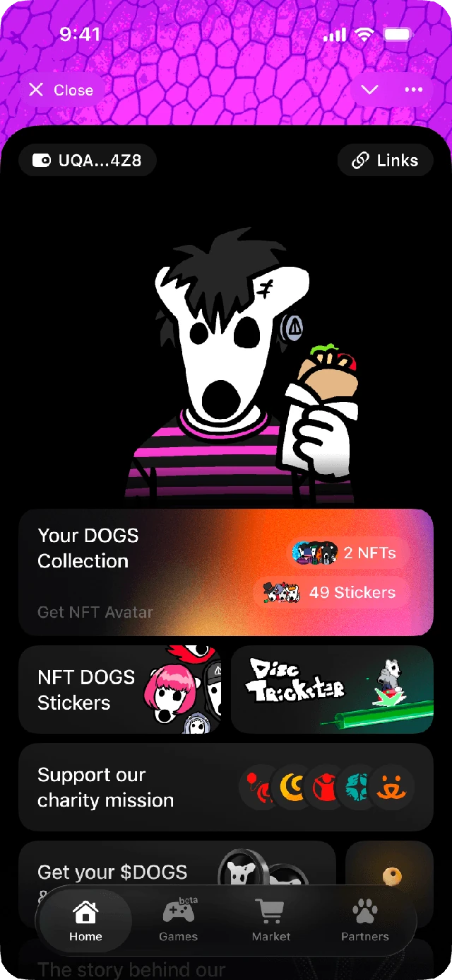
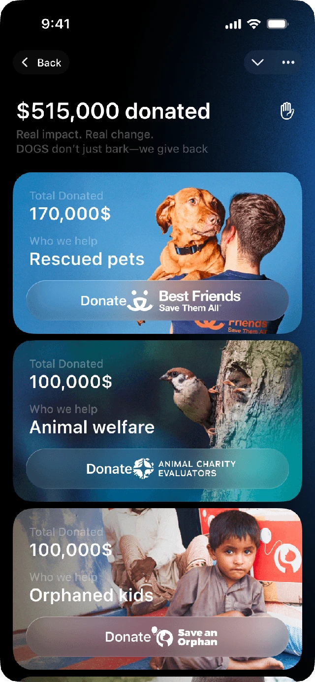
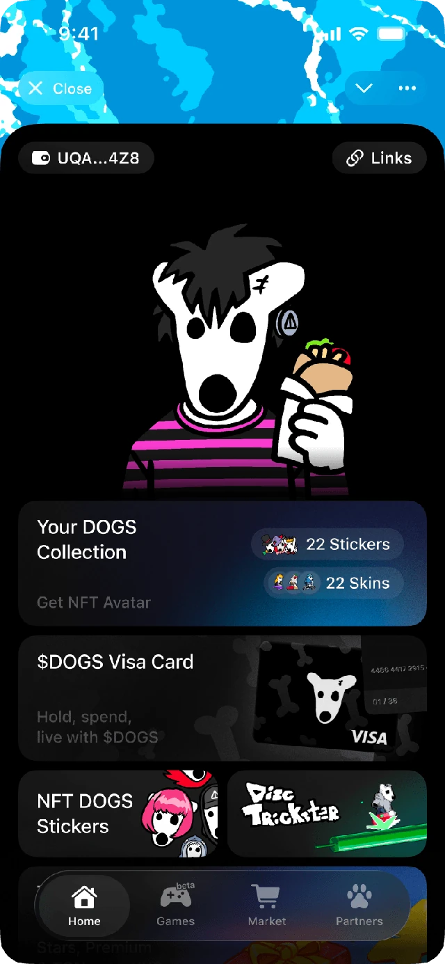
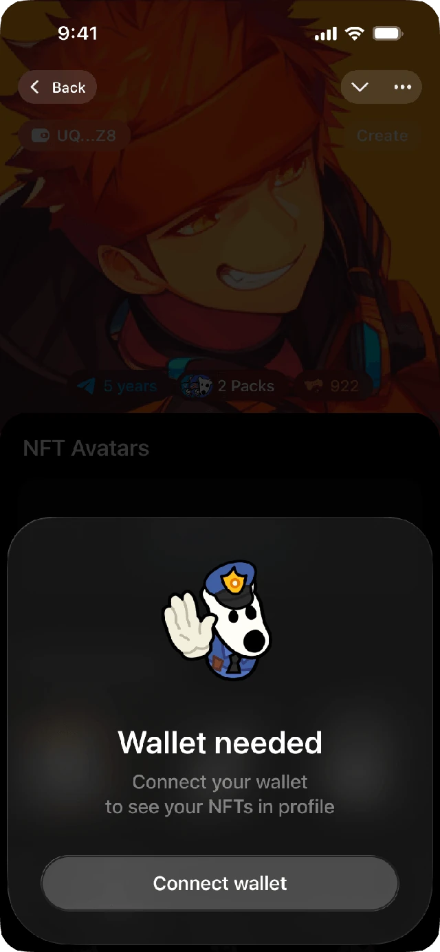
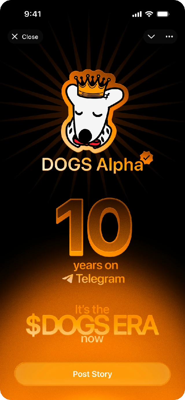
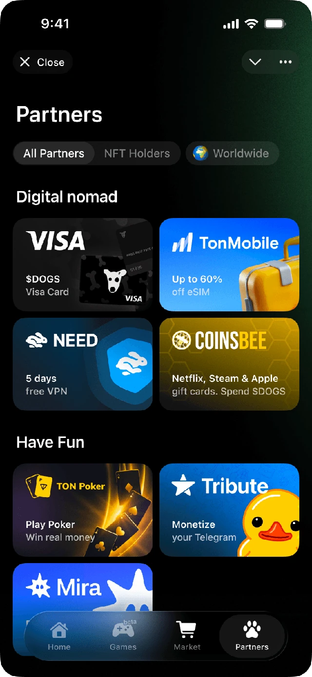
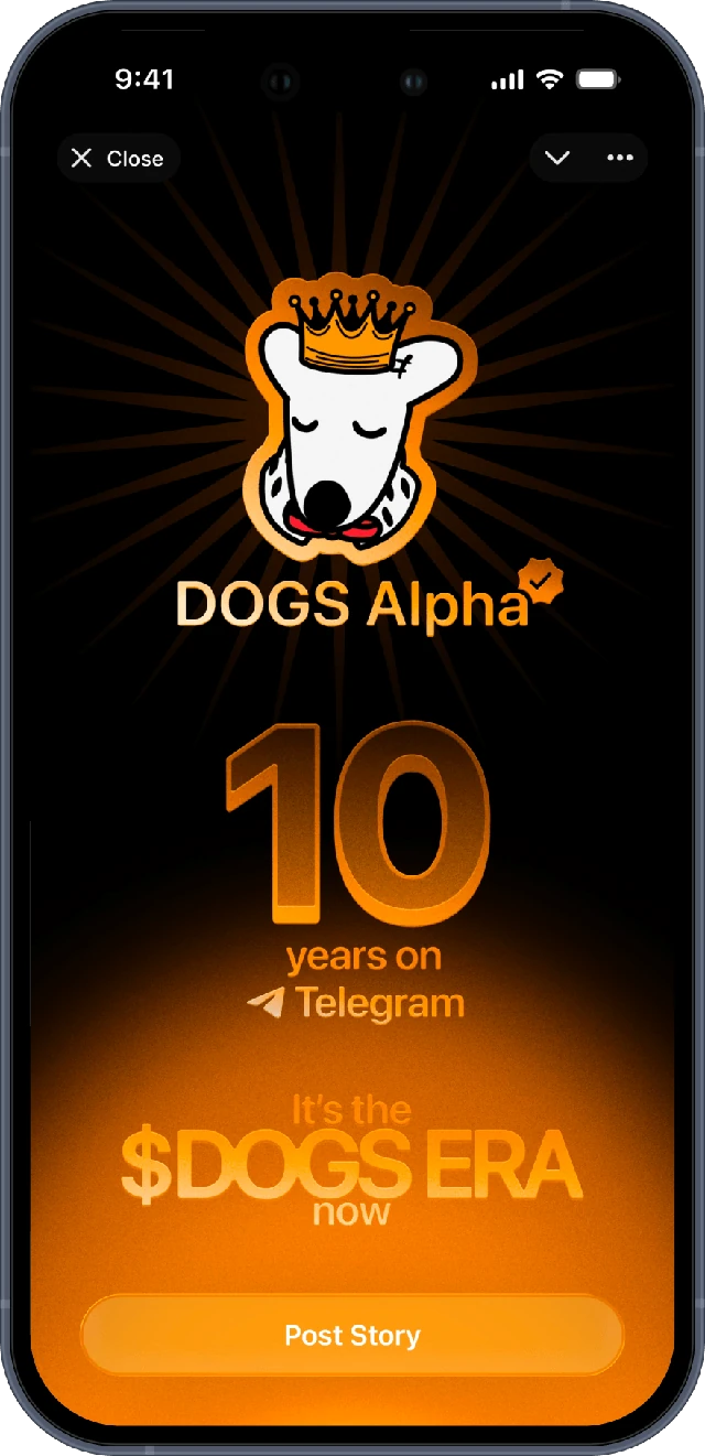
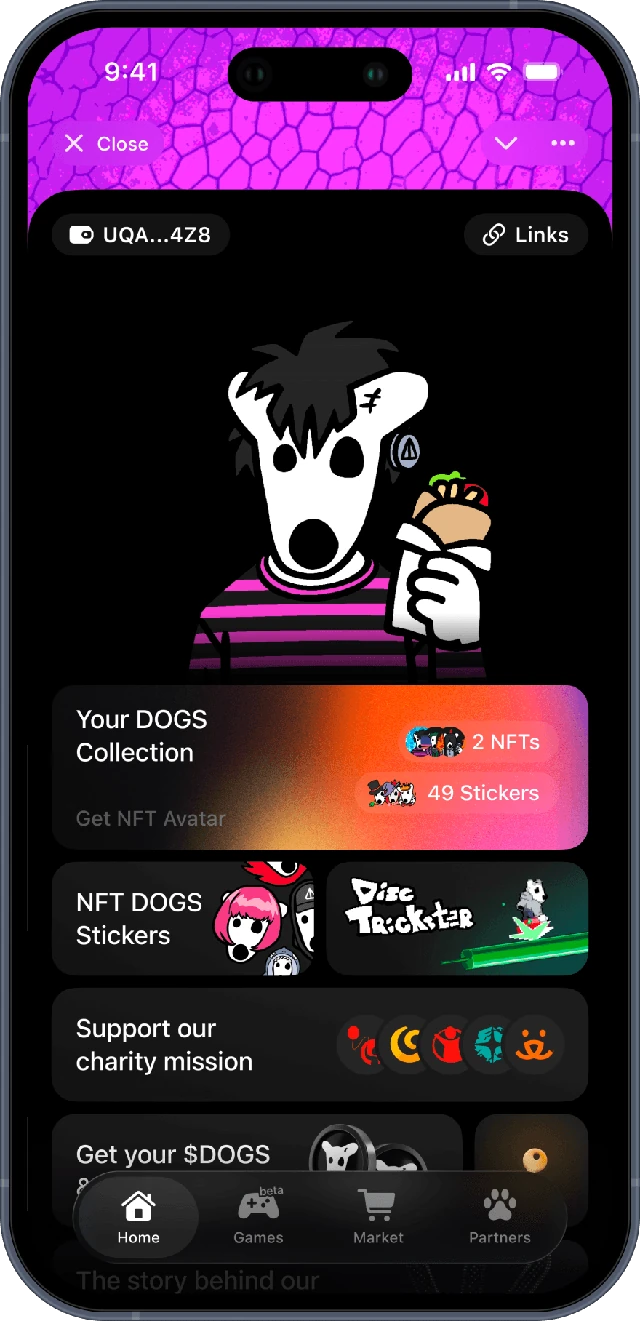
The first and only designer behind DOGS. I designed the product, brand, and every core experience that helped grow it to 50M+ paying users.
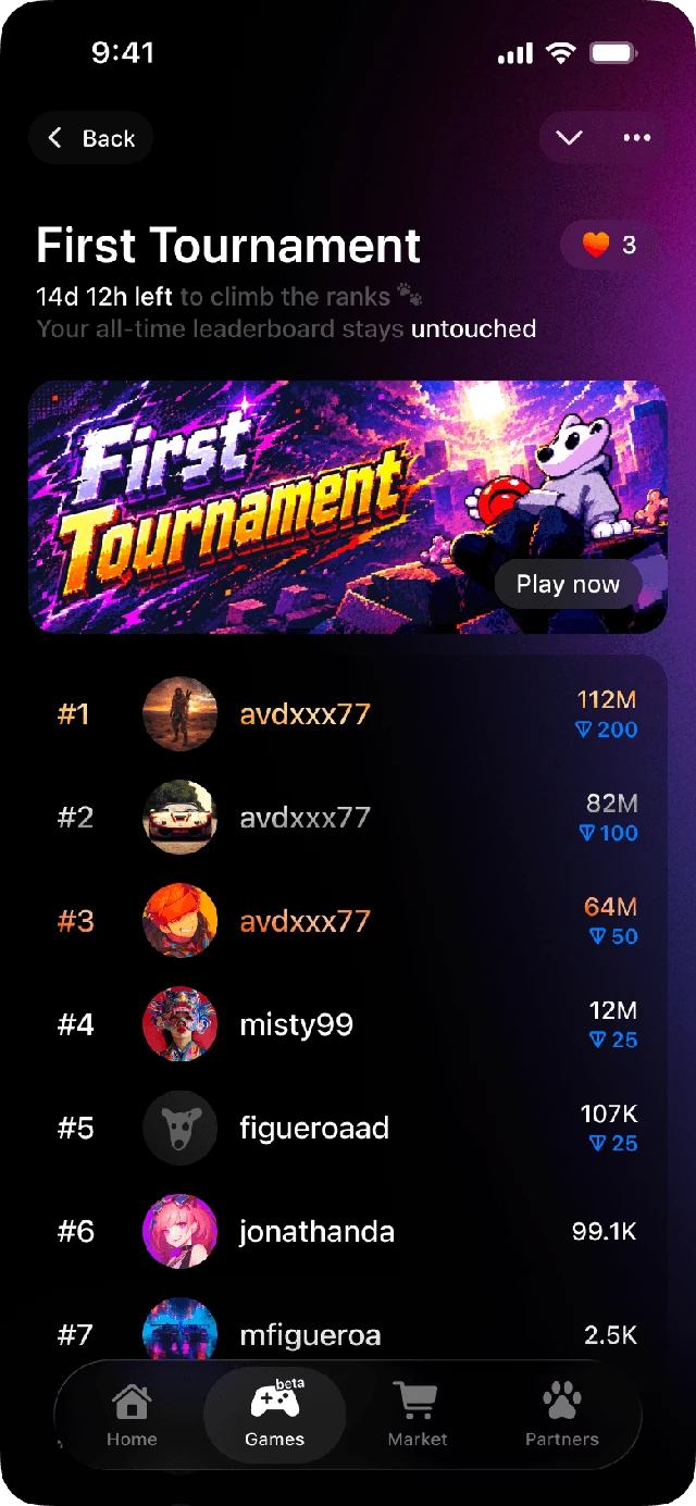
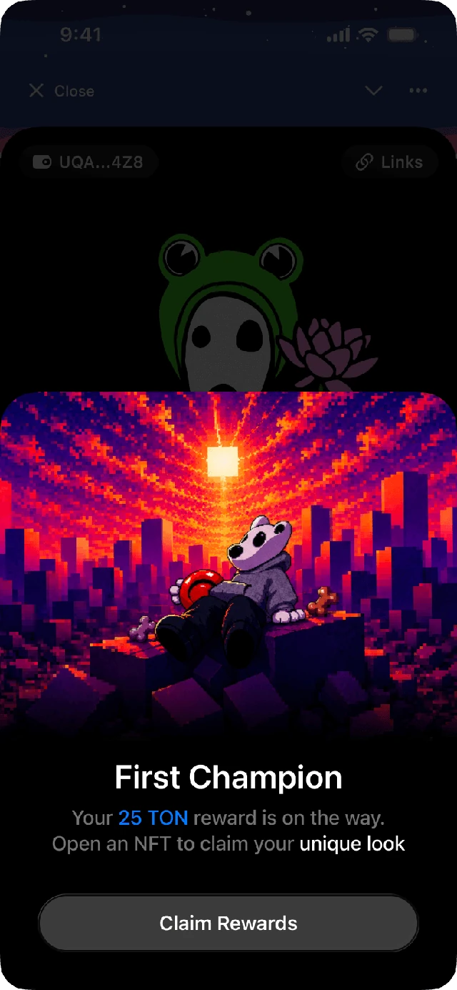
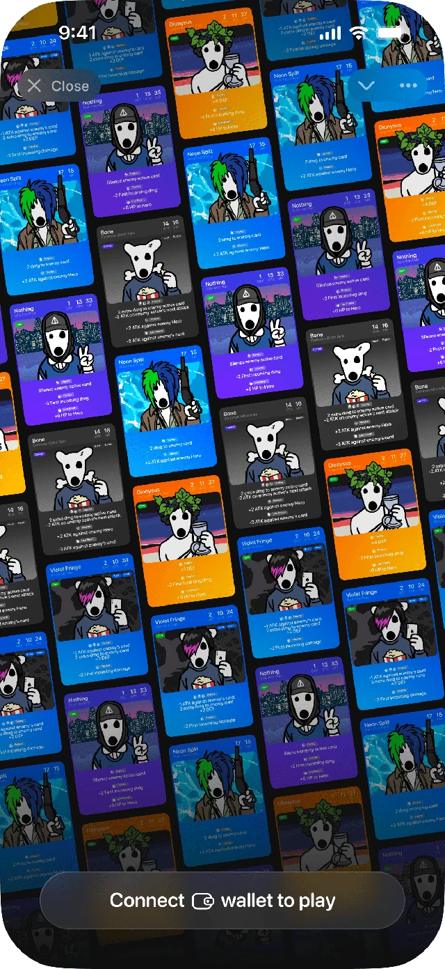
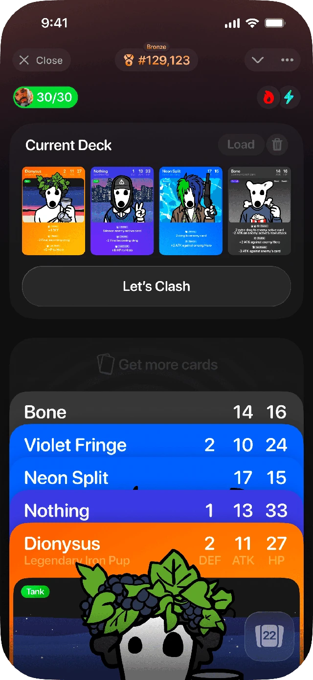
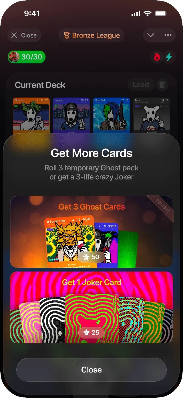
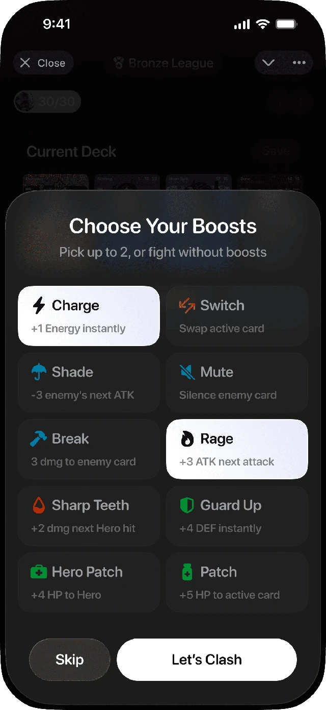
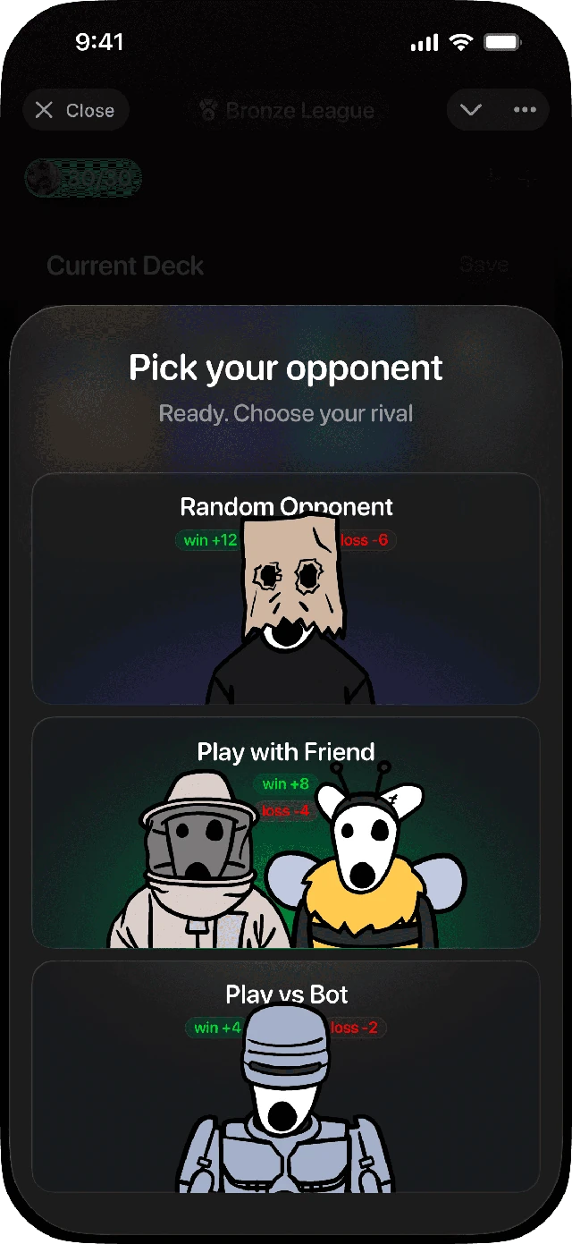
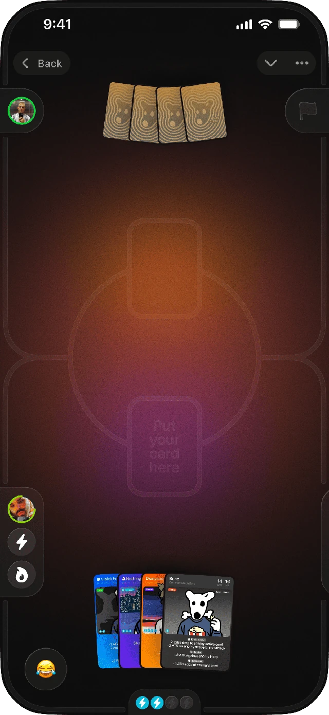
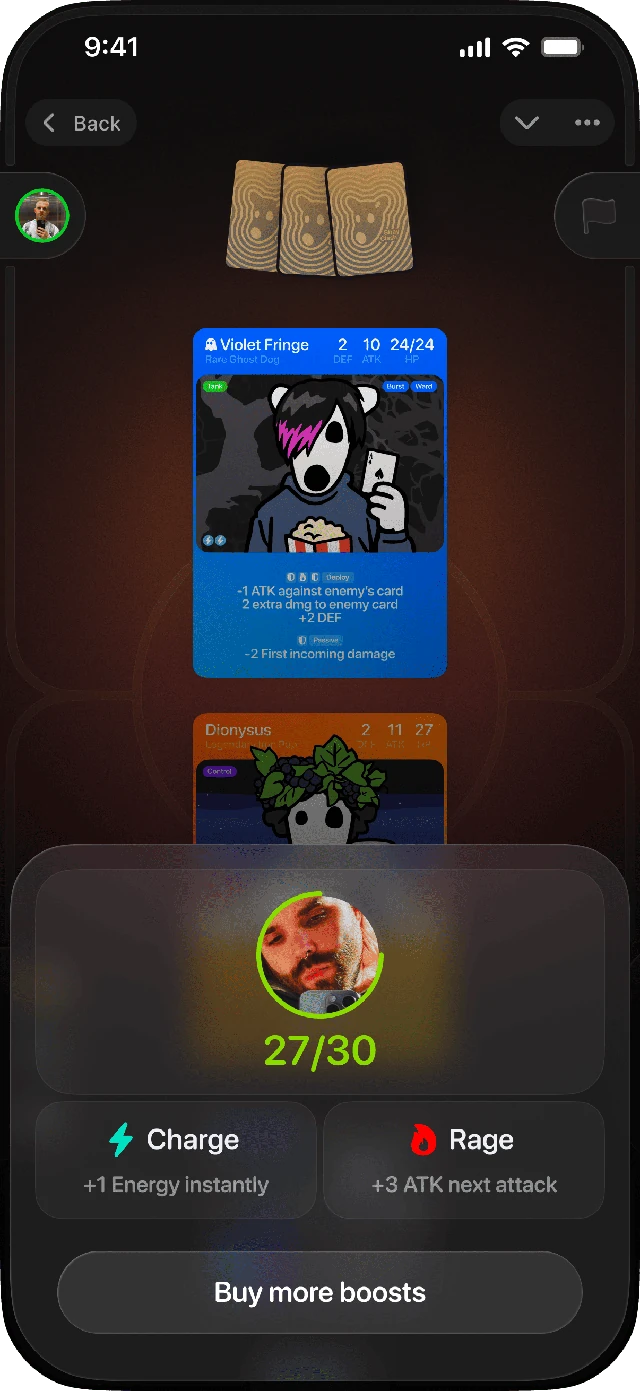
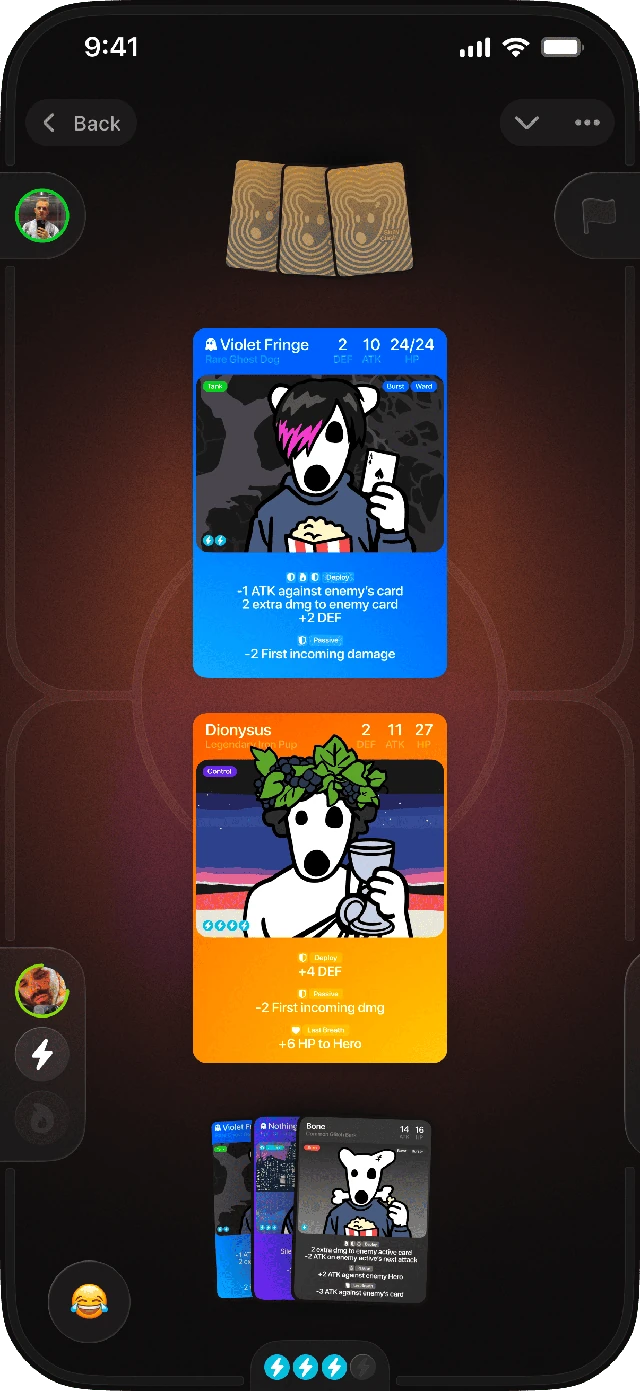
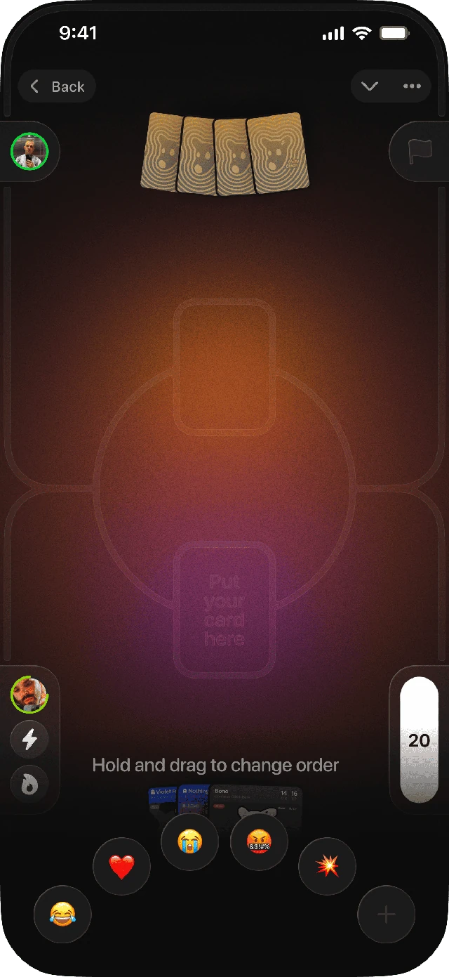
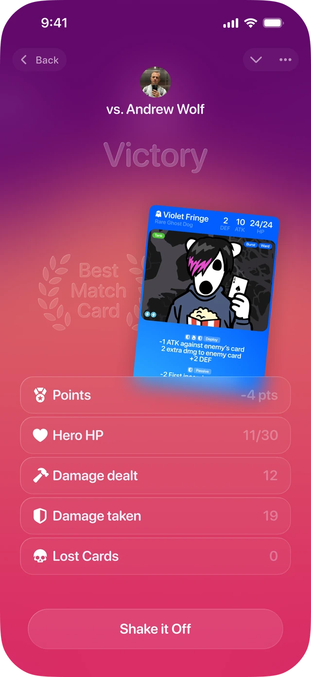
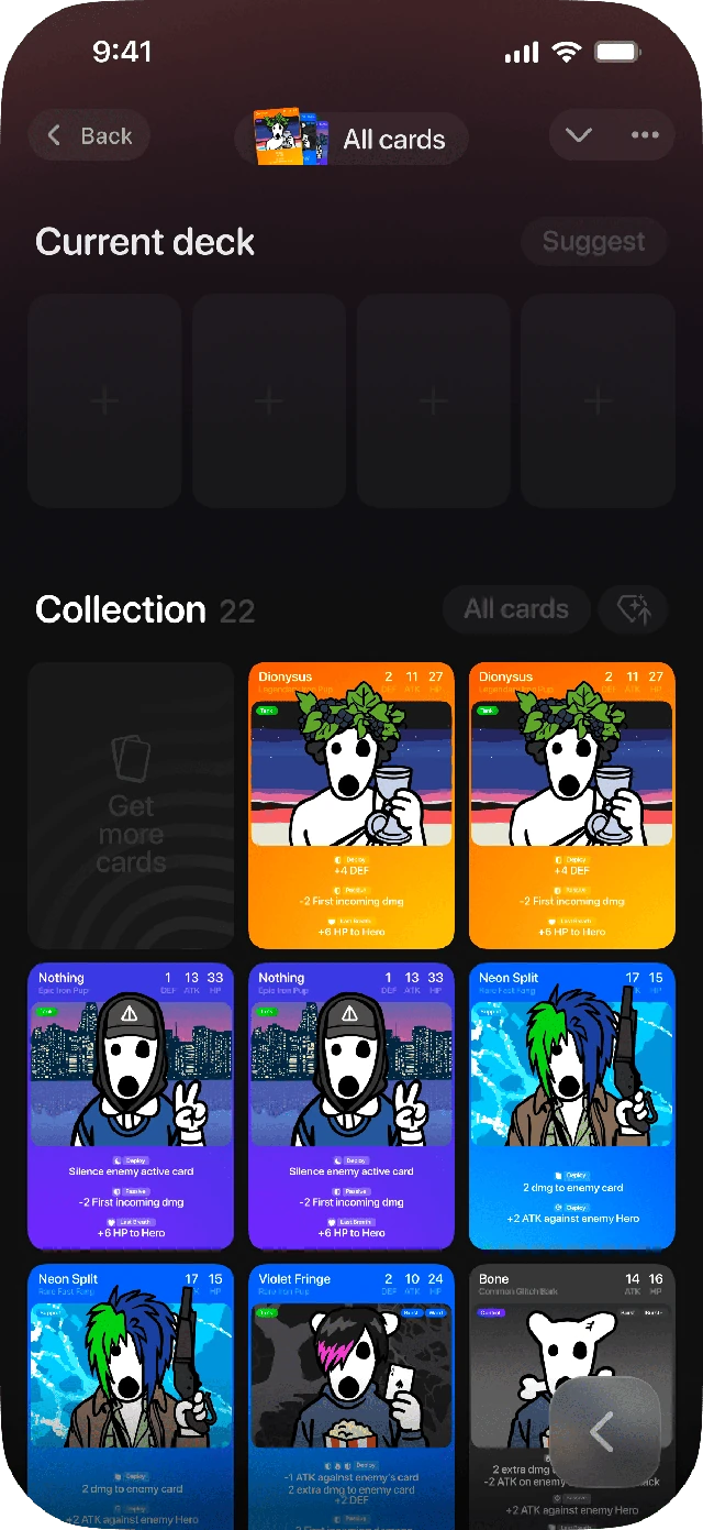
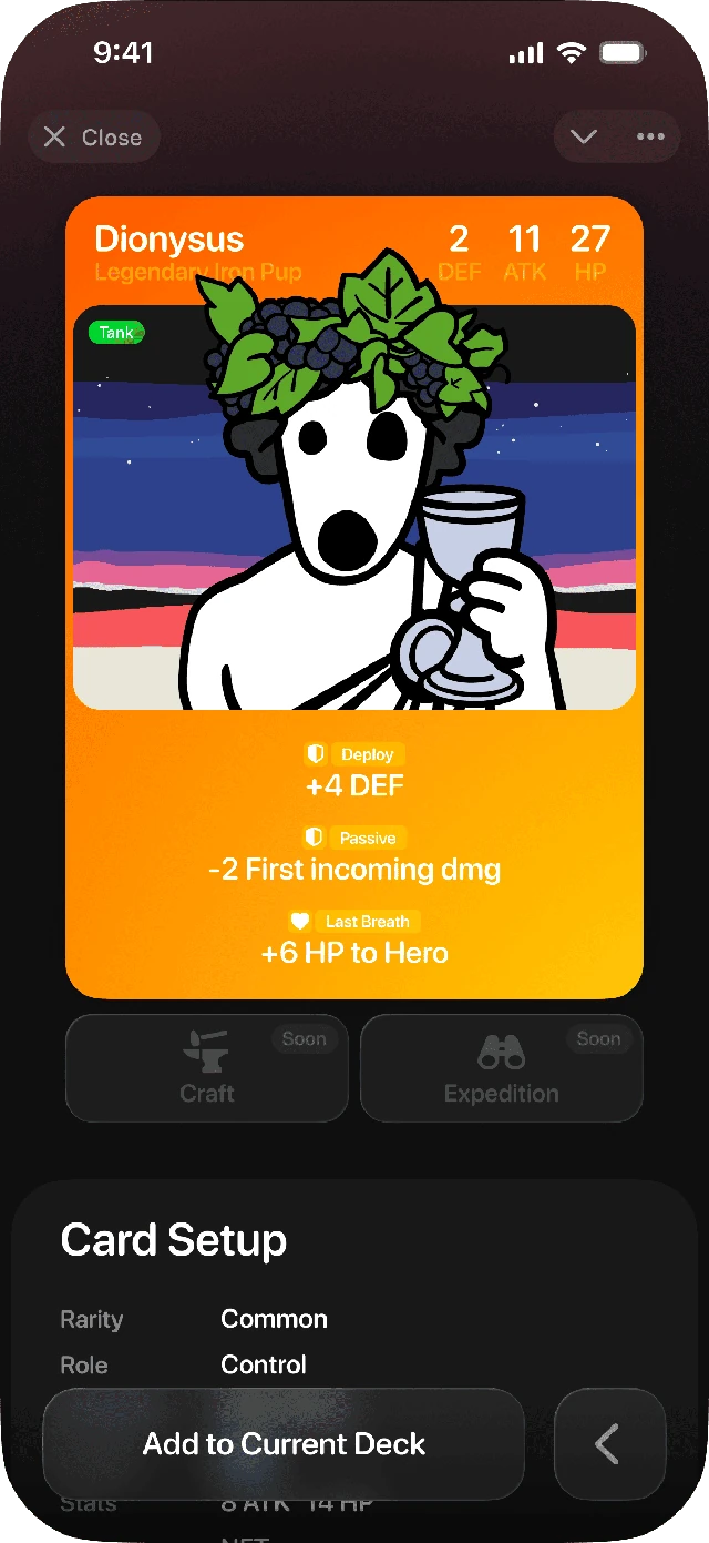
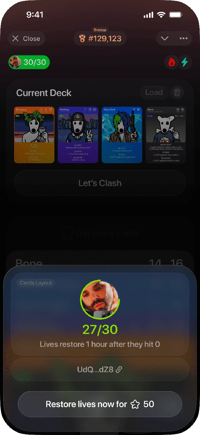
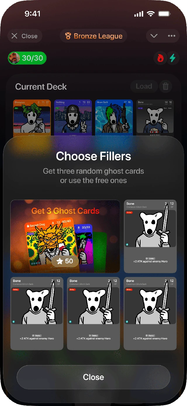
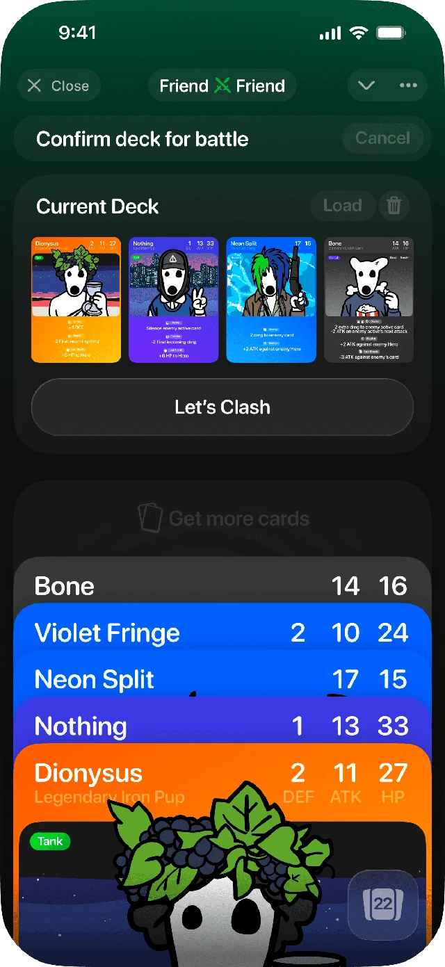
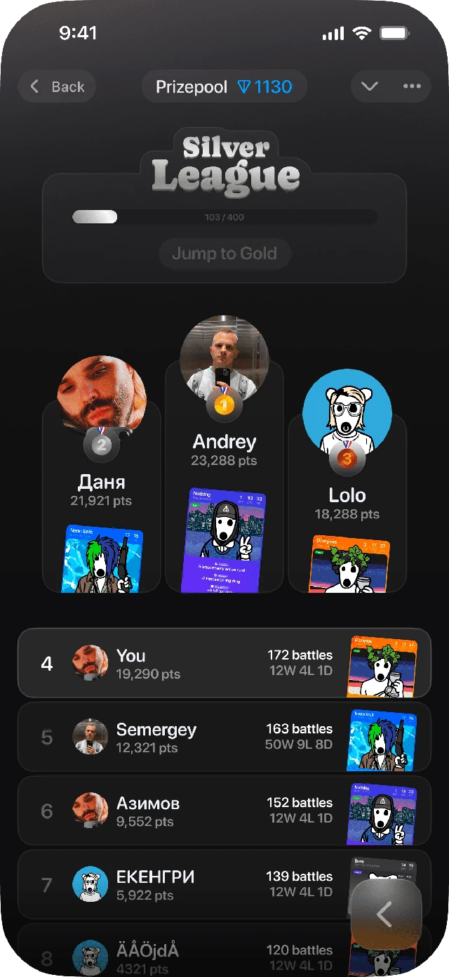
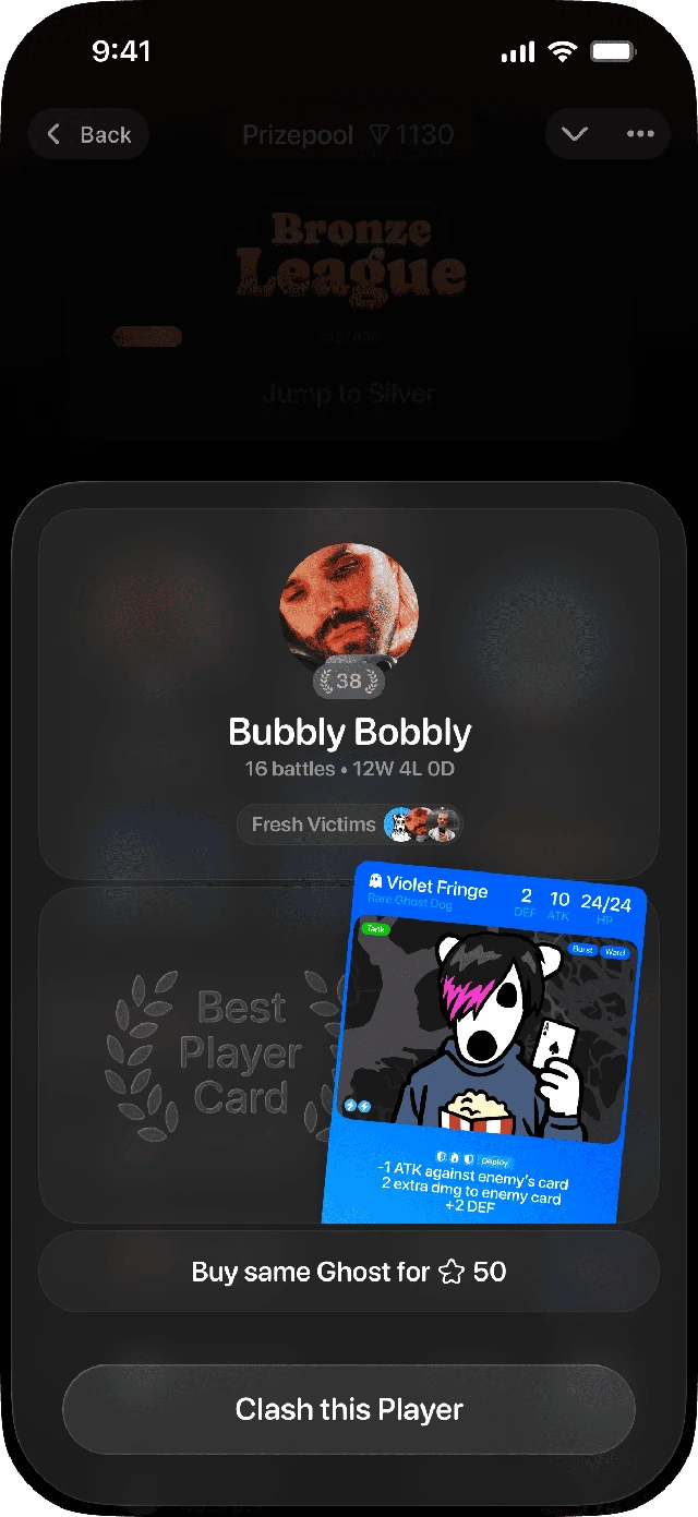
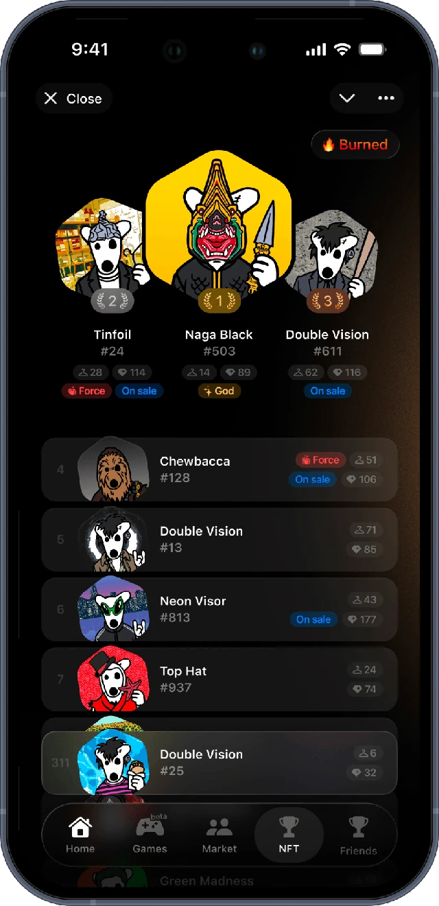
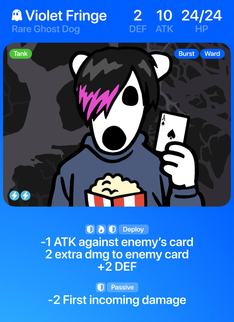
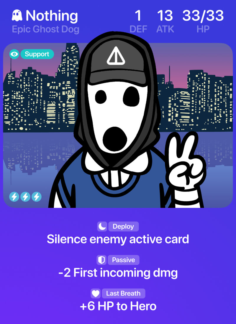
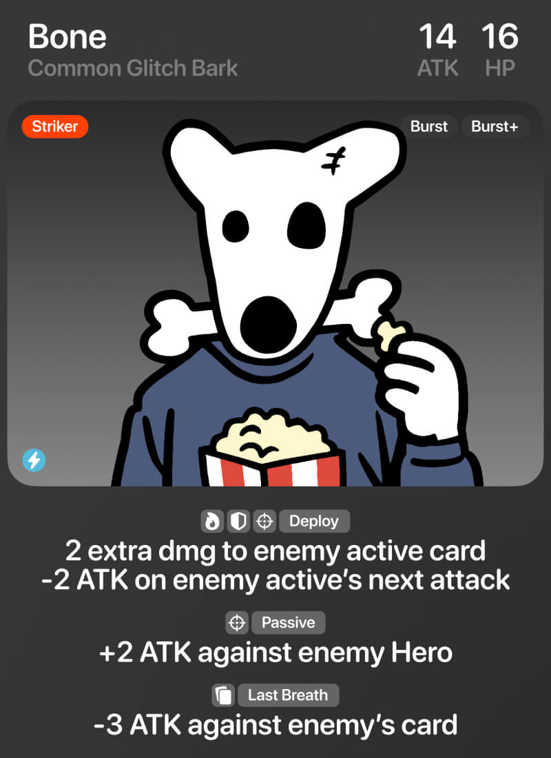
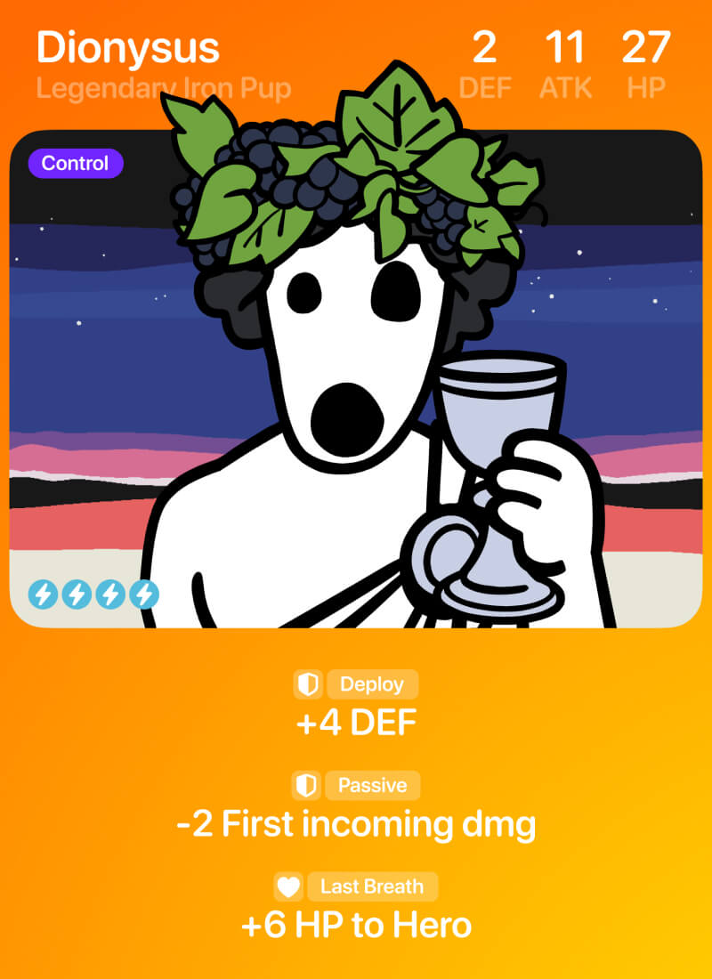
A Telegram PvP card game I designed and built with vibe coding. DOGS NFT and stickers become playable cards with real stats—battle, steal ghost cards, and rank up. Try it
I unified three inconsistent feedback icon sets into one intuitive system of 30 familiar symbols.
This project was a small yet beautiful addition to a neighboring case involving a redesign of icons in our navigation app.
Originally, our icon library featured three distinct groups of feedback icons, varying in style and metaphor.
To create a unique and unified icon style, I analyzed numerous feedback icons from competitor apps. I aimed to understand and utilize simple and understandable metaphors that are already familiar to users on other platforms.
Voilà, the result was 30 beautiful, unified feedback icons.
The automotive app's icons were inconsistent in mass, size and style. I rebuilt the whole set so every icon shares one vibe and sits on the same grid.
When I joined the automotive team, the current design had numerous issues. One area where I could contribute was the icons that form the visual language of the application.
The icons were inconsistent in mass, size, style, and the emotions they conveyed.
I had several lengthy meetings with my new design team to understand the purpose of each icon, how it's used, who it's important for, and when.
I prepared three initial approaches with minor differences to determine the style we wanted to achieve.
The outcome of my work was a comprehensive, updated library of icons for our app. All icons now share the same emotional vibe, style, and coexist harmoniously with both the application and its users.
I've detailed more about the feedback icons in a neighboring case (actually, just bigger pictures there).