Dash Library Update
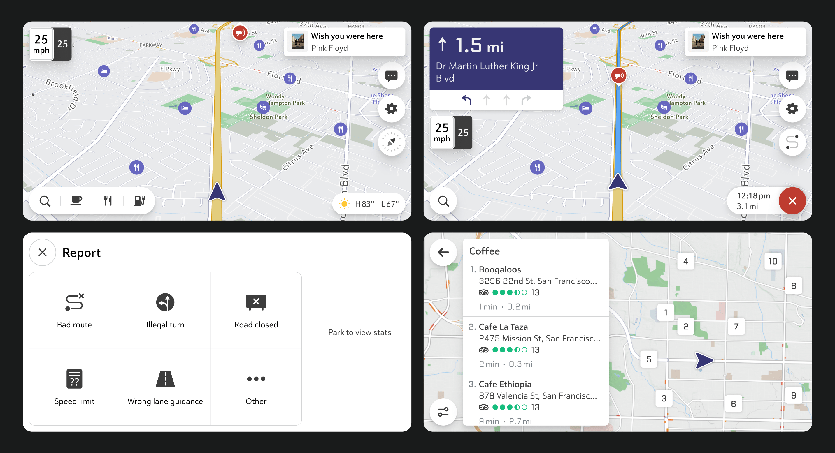
When I joined the automotive team, the current design had numerous issues. One area where I could contribute was the icons that form the visual language of the application.

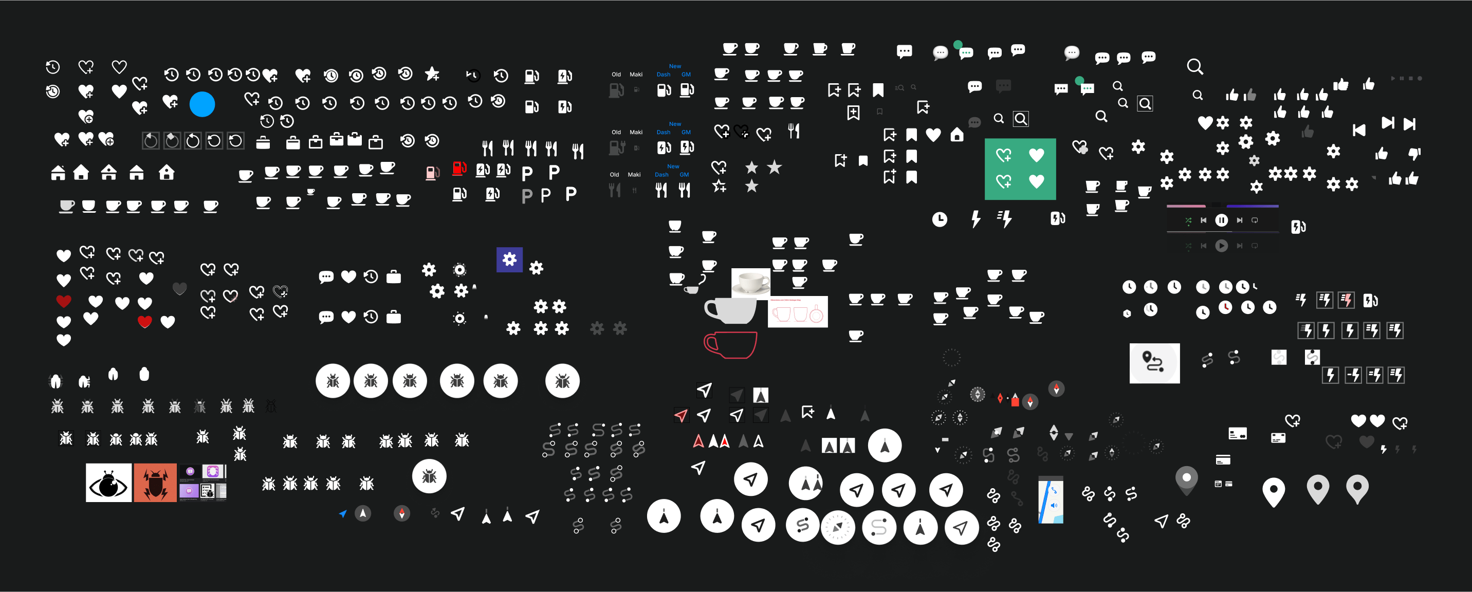
The icons were inconsistent in mass, size, style, and the emotions they conveyed.

I had several lengthy meetings with my new design team to understand the purpose of each icon, how it's used, who it's important for, and when.

I prepared three initial approaches with minor differences to determine the style we wanted to achieve.

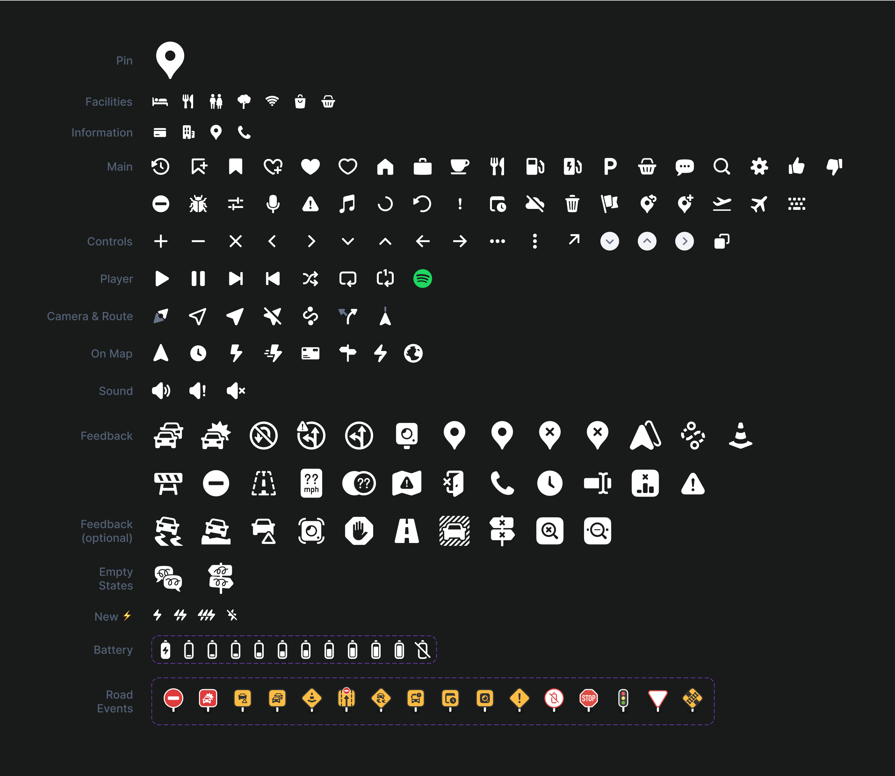
The outcome of my work was a comprehensive, updated library of icons for our app. All icons now share the same emotional vibe, style, and coexist harmoniously with both the application and its users.

I've detailed more about the feedback icons in a neighboring case (actually, just bigger pictures there).