Finding a Unique Style for Map Landmarks
My journey to discover a unique style for Mapbox landmarks began with extensive research. I analyzed the current SuperPOIs of competitors and combined these insights with illustrations and sketches to better capture the concept.
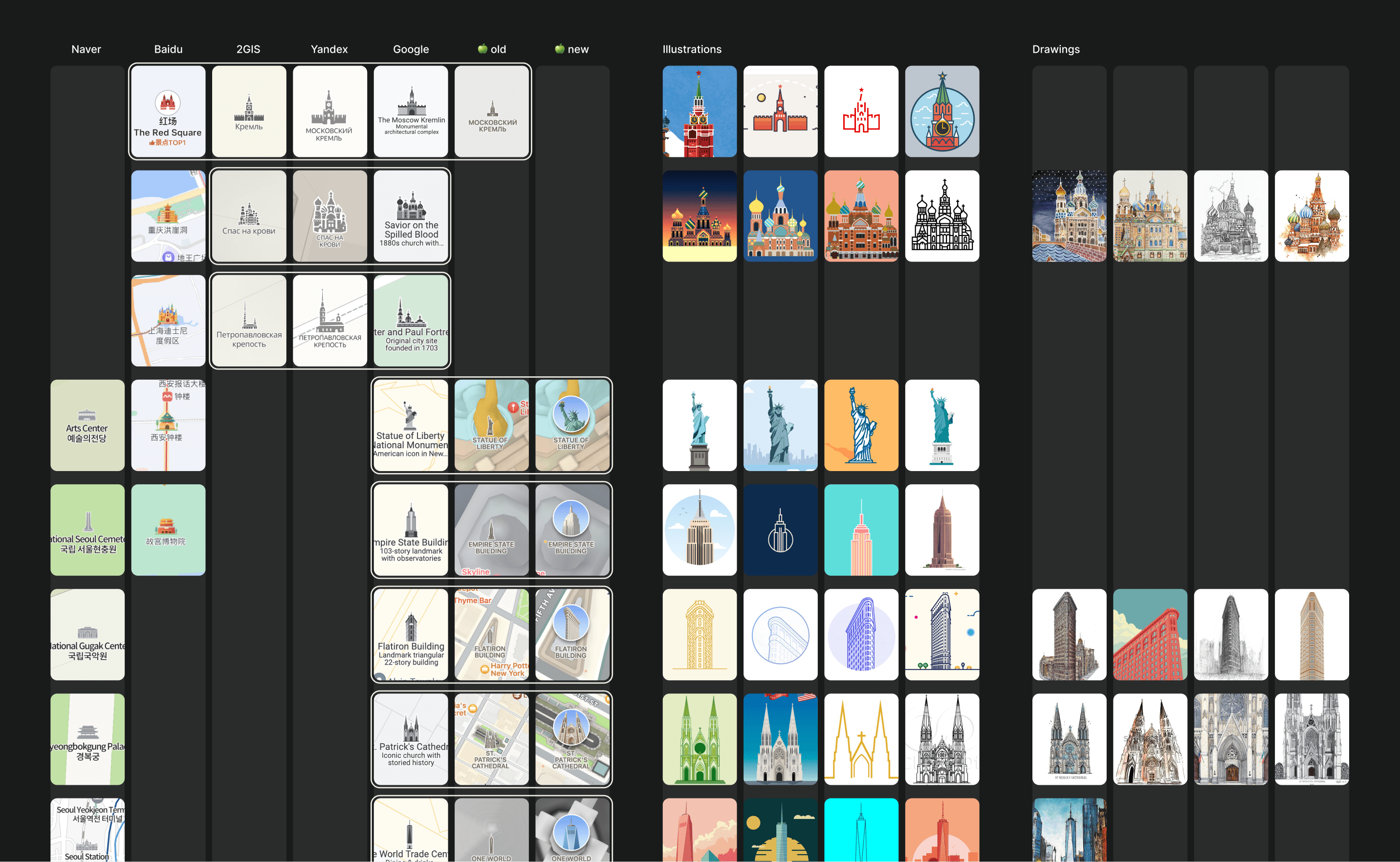
I presented the team with five different styles we could implement quickly: three hand-drawn styles, one 3D style (which was dismissed), and a pseudo-3D style that, to my surprise, was the most favored.
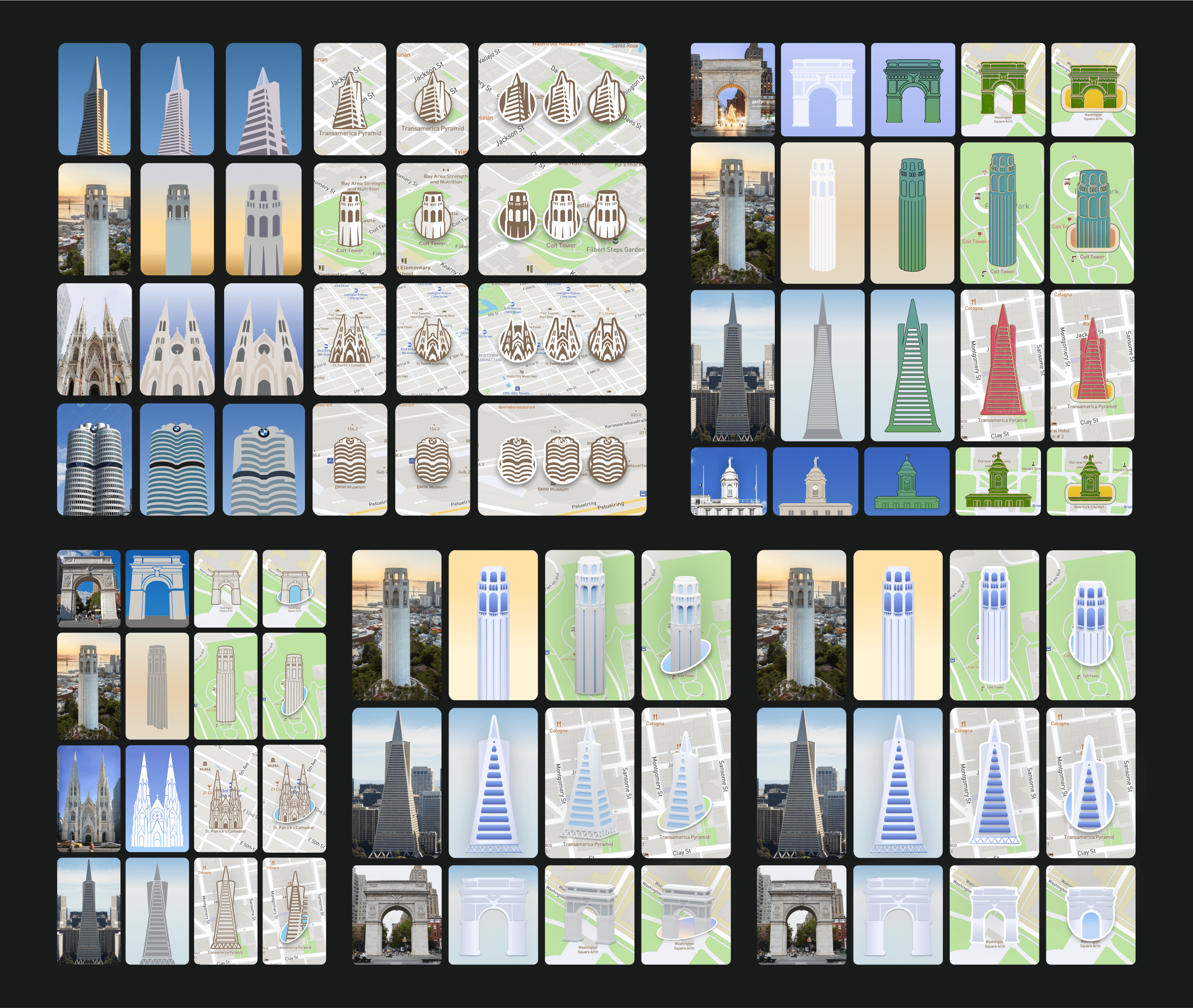
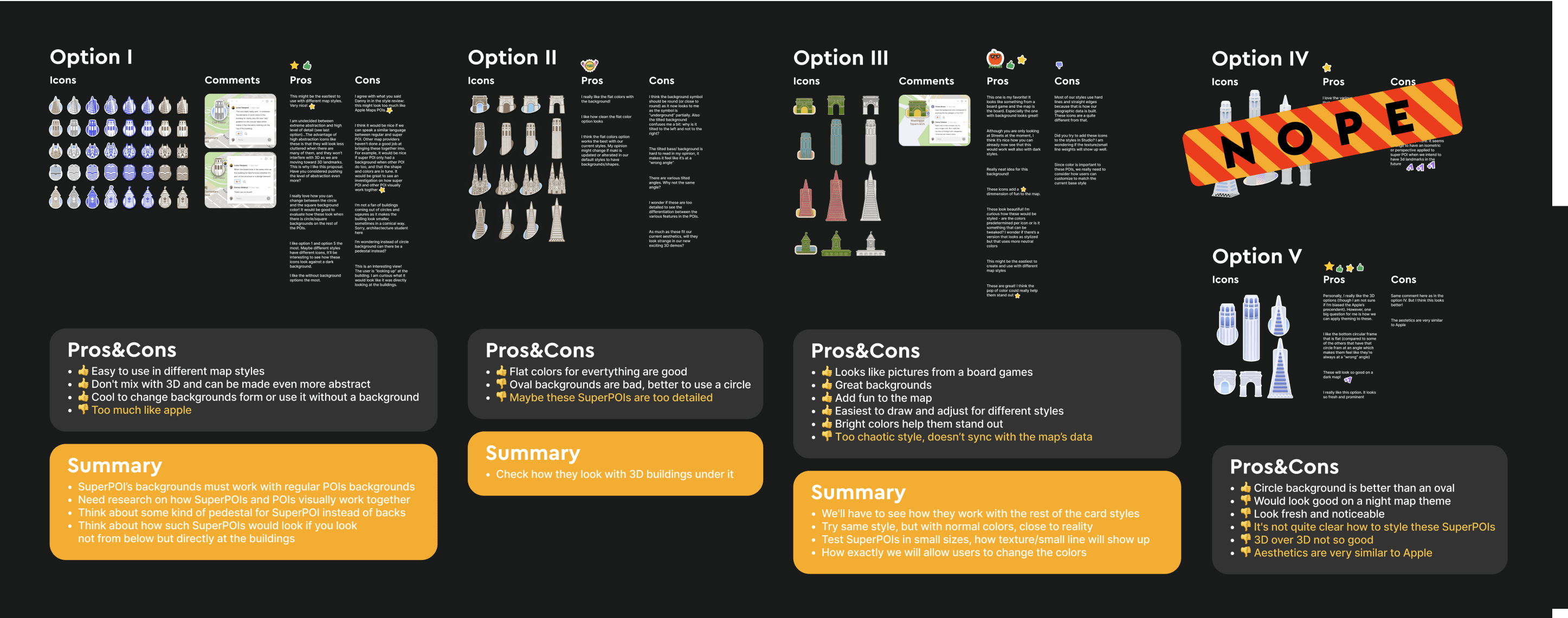
I revisited the task and conducted another thorough research phase, rethinking the SuperPOI style concept and how they could function.
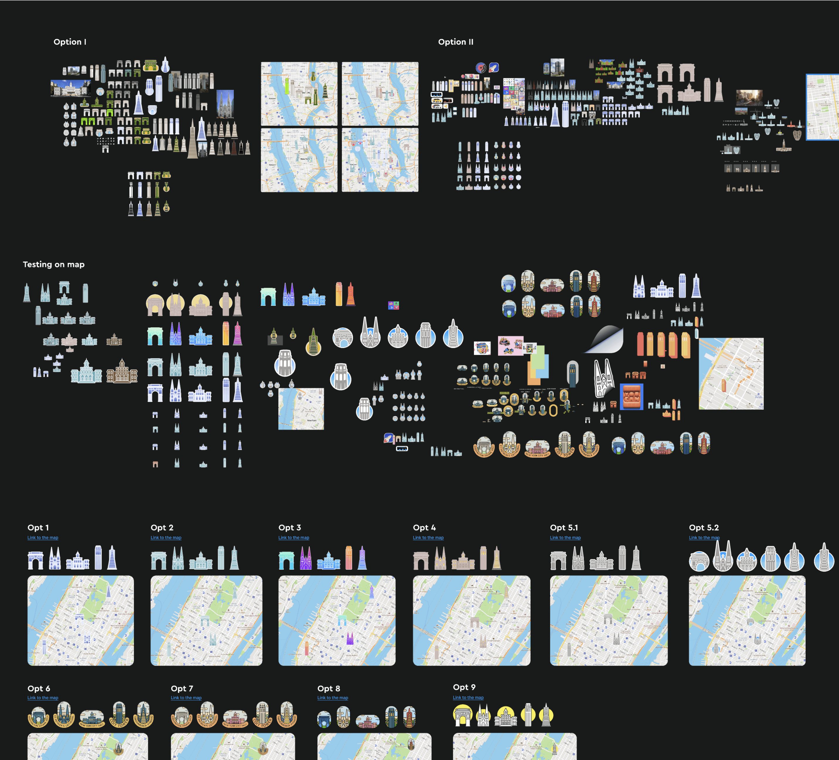
The second part of my work was showcased in a detailed presentation that broke everything down into small components.
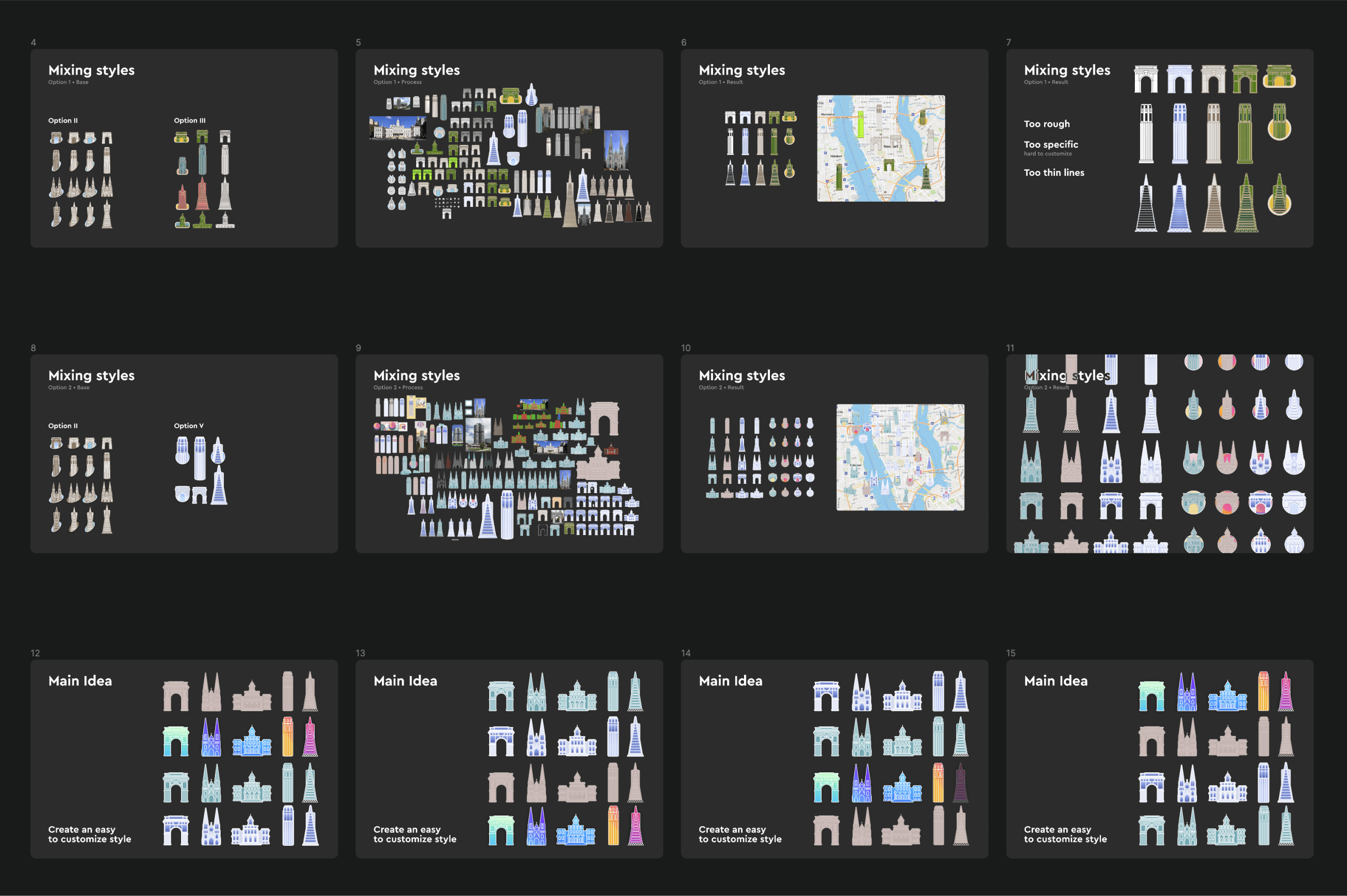
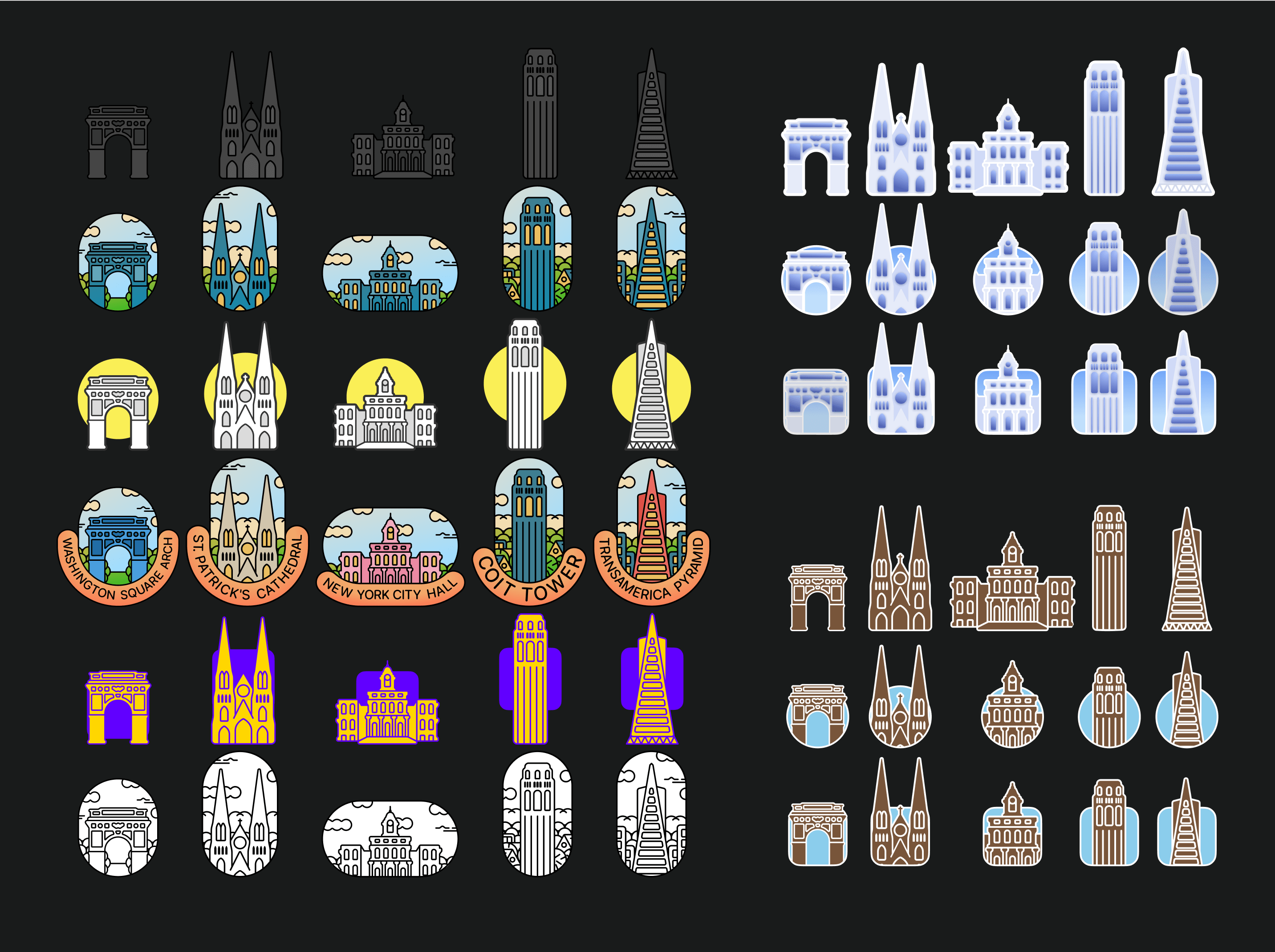
The style I eventually proposed, which I called "universal," was based on the same original graphics drawn in a structured grid style. This style could be transformed into something truly unique with different colors, shapes, backdrops, and cropping.
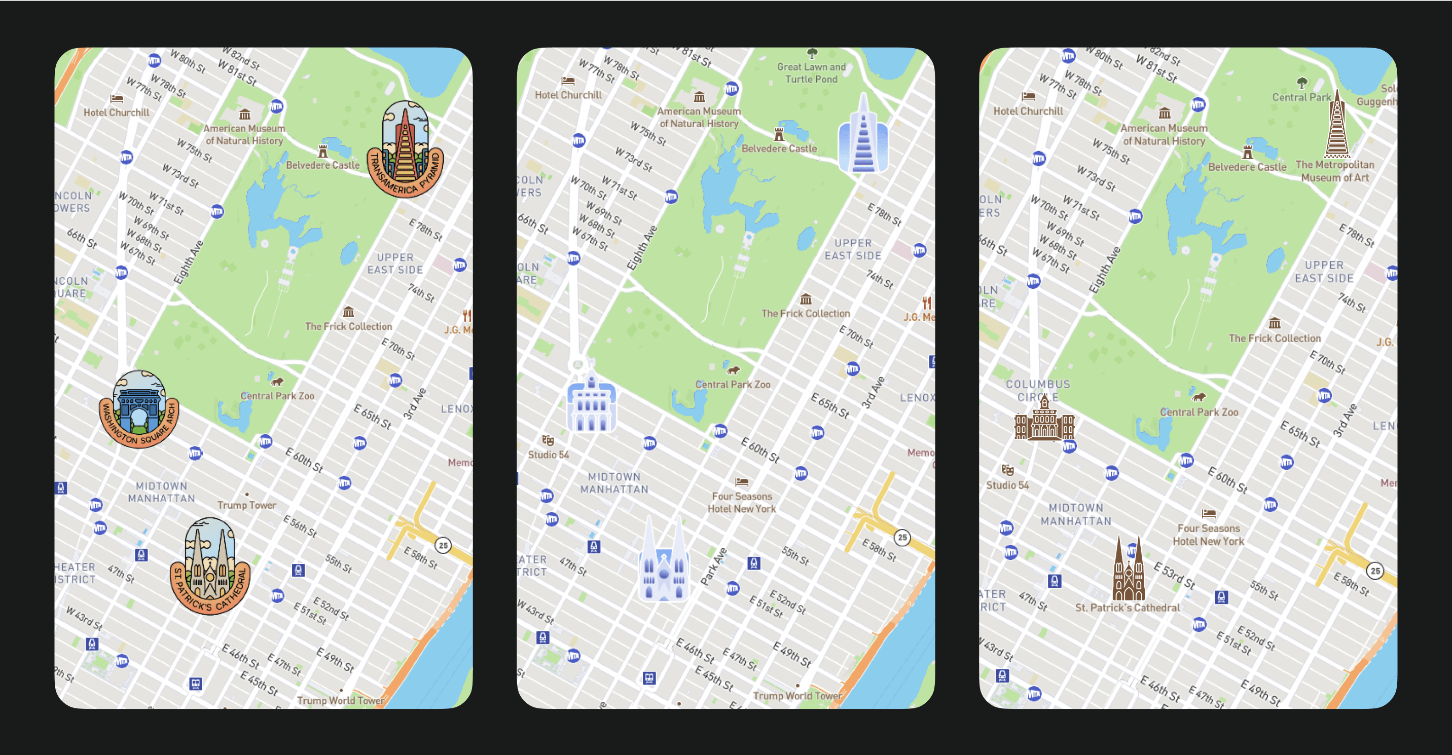
I demonstrated how this could look on the map. The team was thrilled, and I began the main work phase.
I started by creating a batch of test cities and landmarks for each.
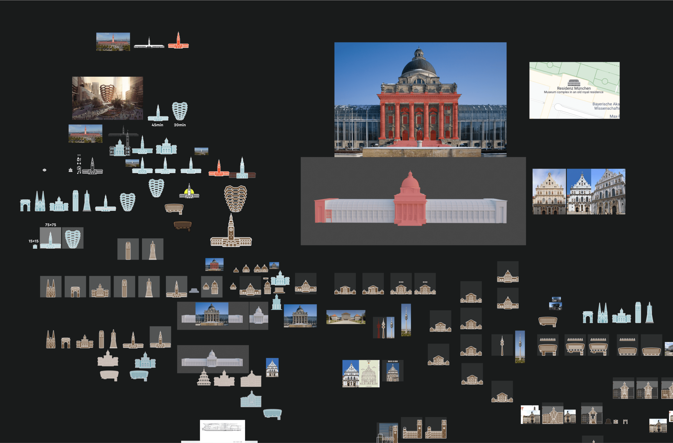
For experimental clarity, I chose three stylistically and architecturally diverse cities: Munich, Paris, and New York. I created a unique style and adhered to it.
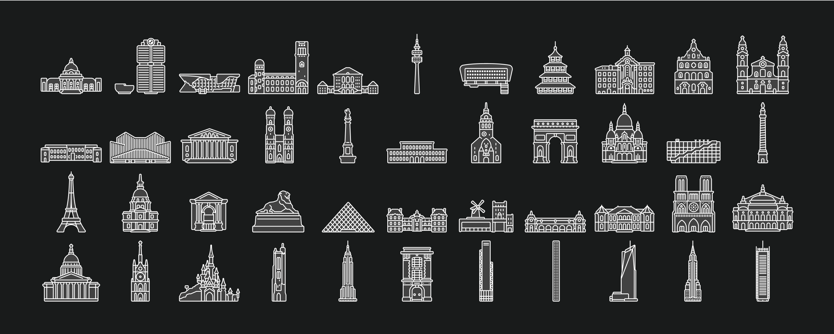
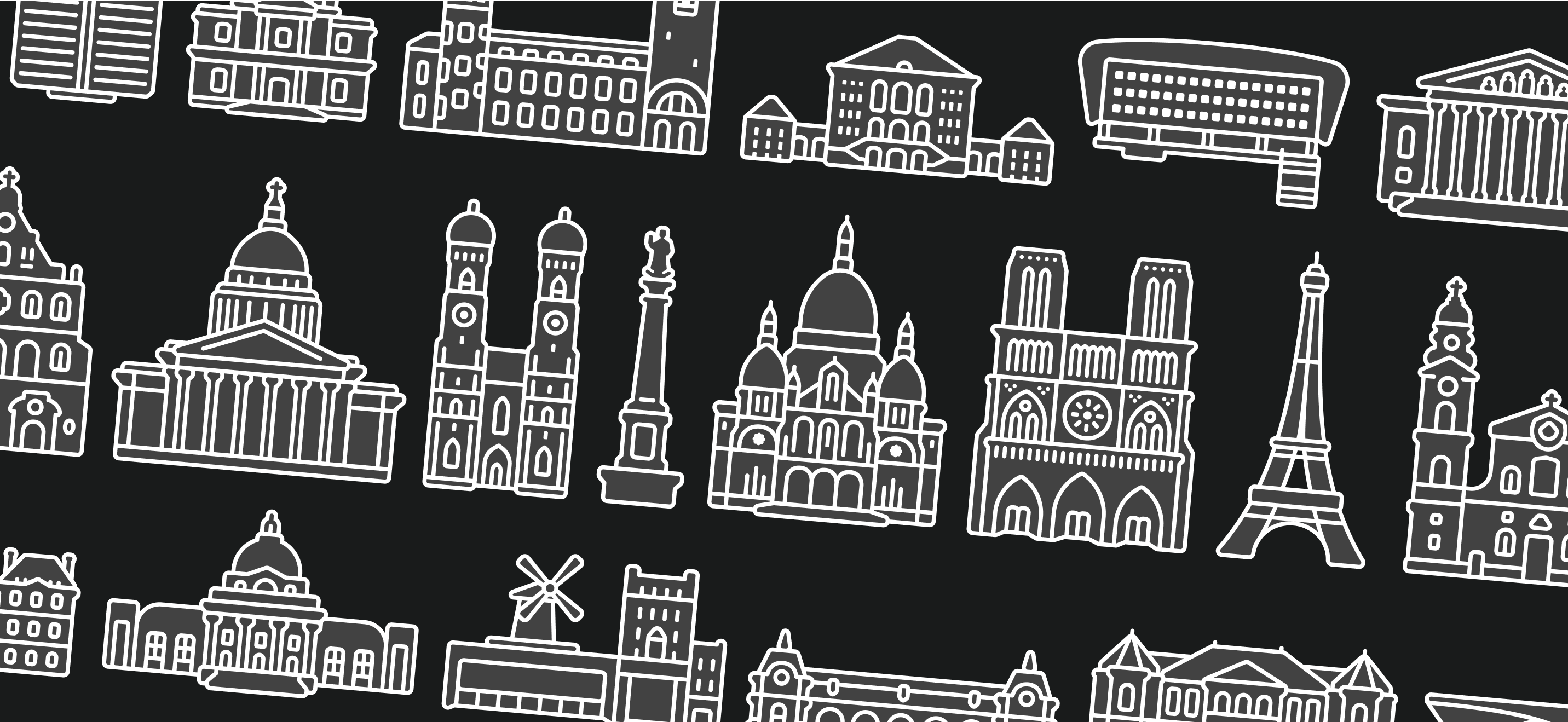
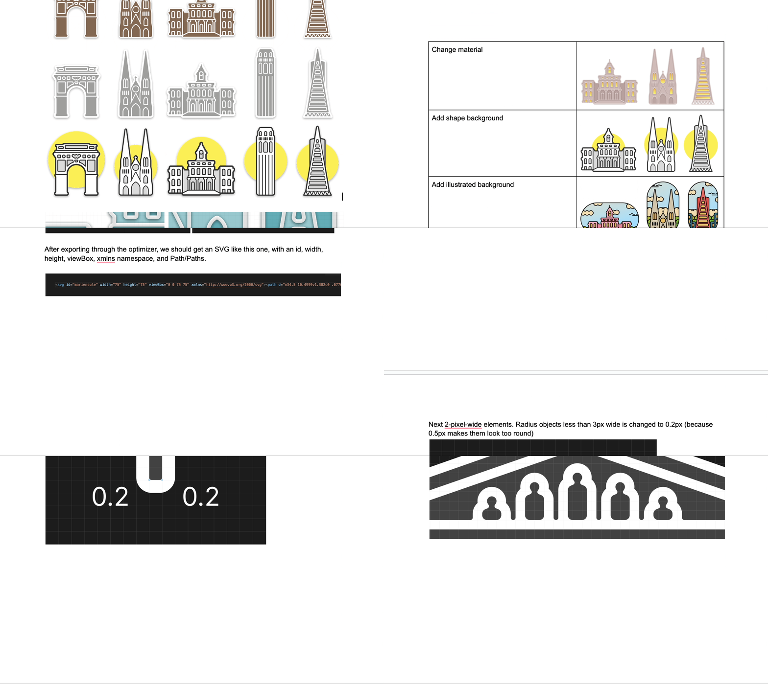
Afterwards, I drafted a detailed document describing the style and how each curve and element functions, intended to guide freelance designers.
Unfortunately, the project was paused due to a shift in company priorities and because it was decided that manually drawing all these SuperPOIs, even in a simplified style, was too time-consuming.
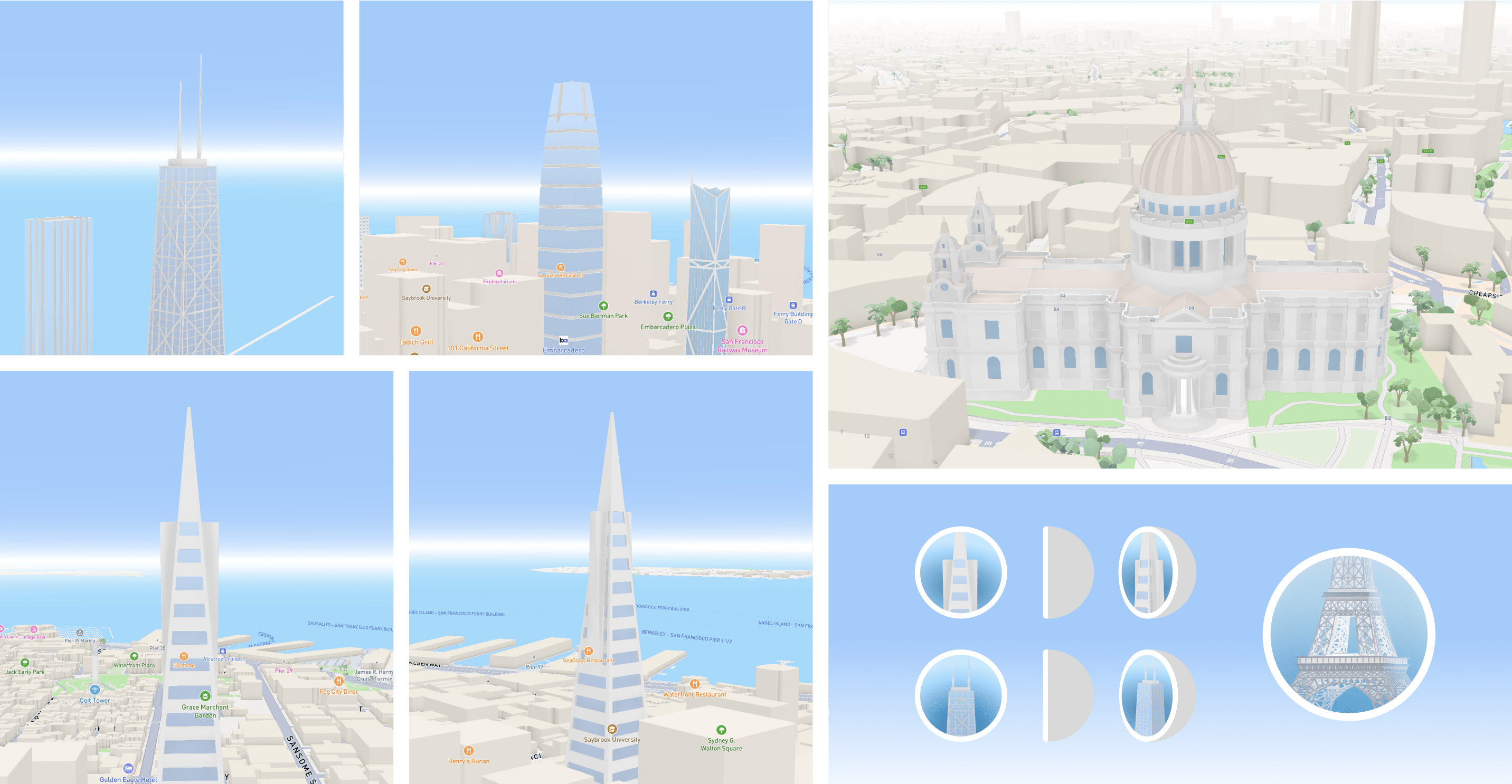
Currently, another proposal of mine is being considered: to use our existing 3D models on the map, place them in a semi-sphere, and display them as SuperPOIs to save time and add uniqueness through lighting and volume. This idea is still in process, and my work on this project is on hold.
