Highway Shields Story
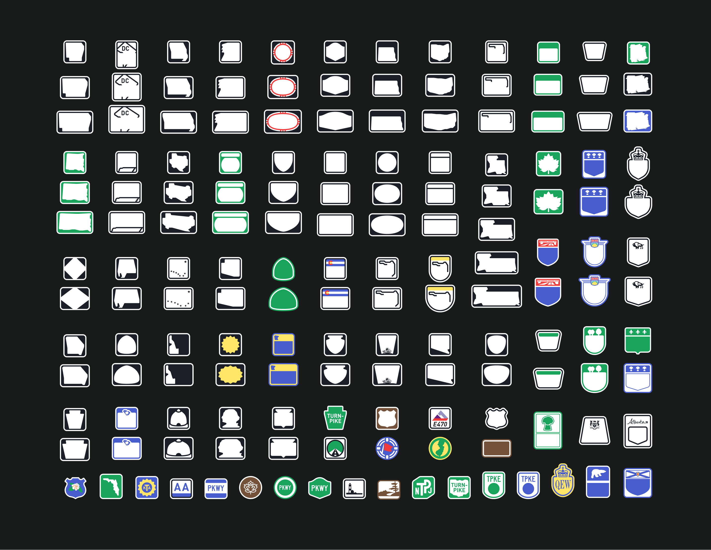
BMW approached us with a request to fill their maps with unique highway shields, aiming to differentiate from the uniform look of Google Maps. I'll start with a spoiler and show the results for all American and Canadian shields for your full enjoyment.
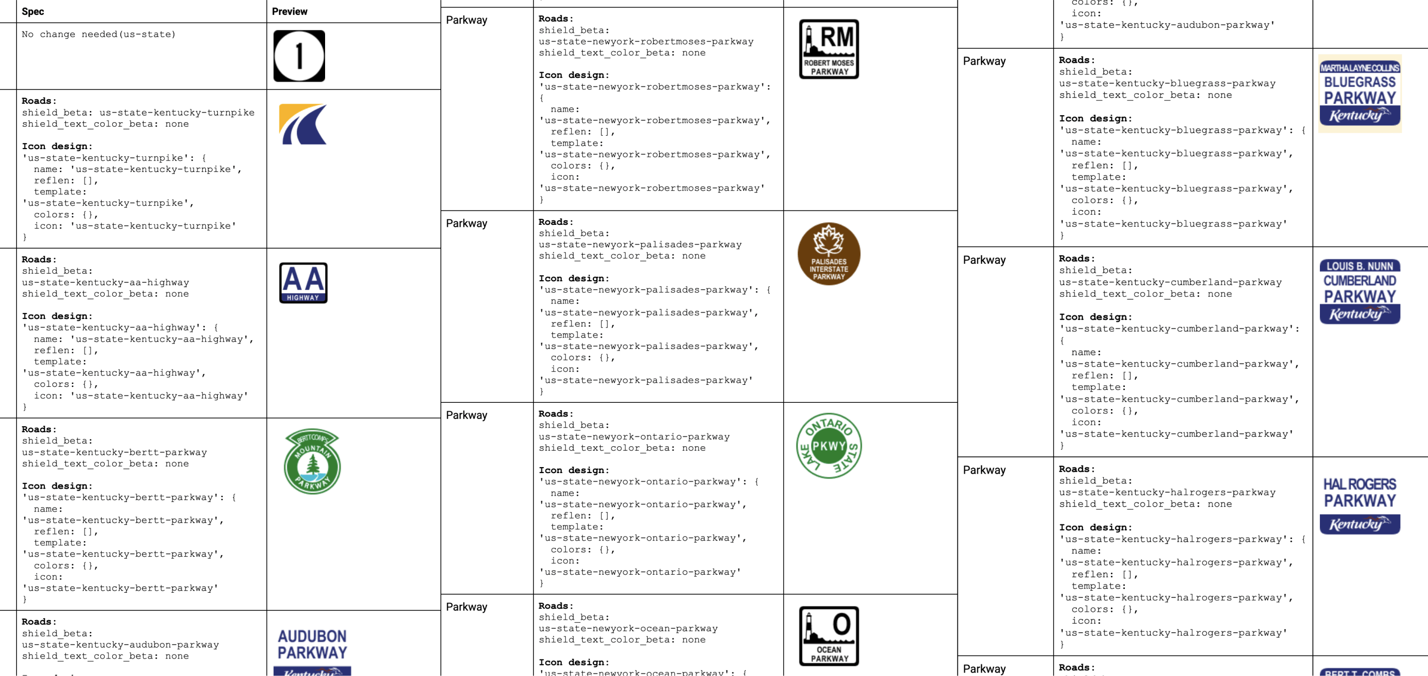
I asked our developers to prepare a document with road data and references we intended to use.
Next, I conducted extensive research comparing current real-life signs with those of competitors and those listed on Wikipedia. Based on this analysis, I created the first set of highway shields.
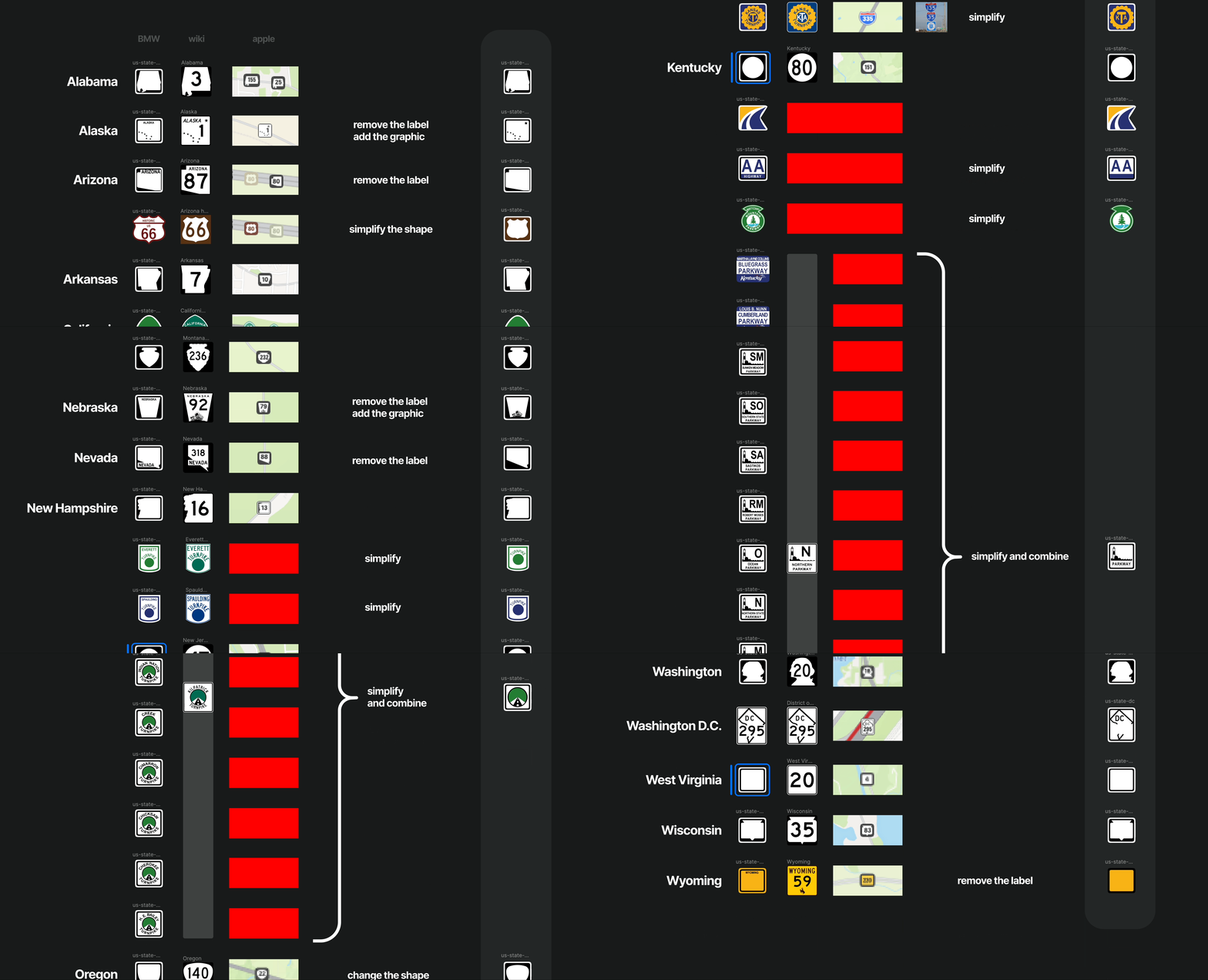
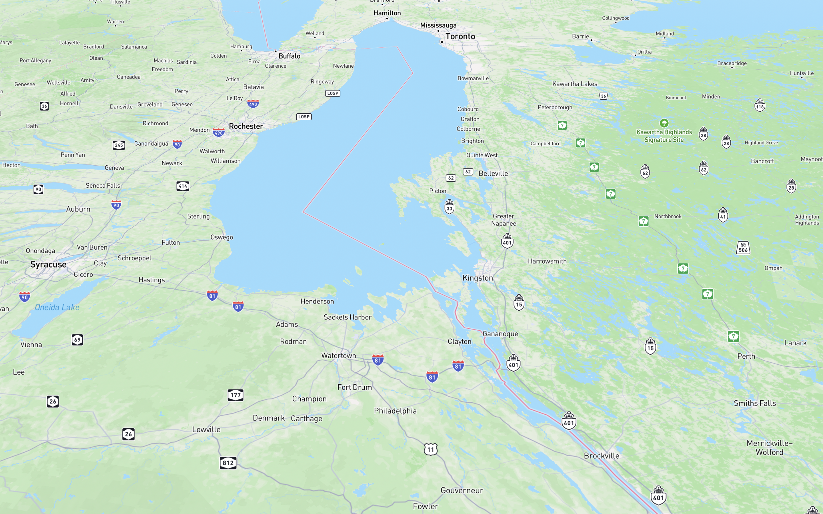
We tested these on the map and noticed that not all looked perfect—texts were cramped or shifted at different scales, to the left, right, up, or down.
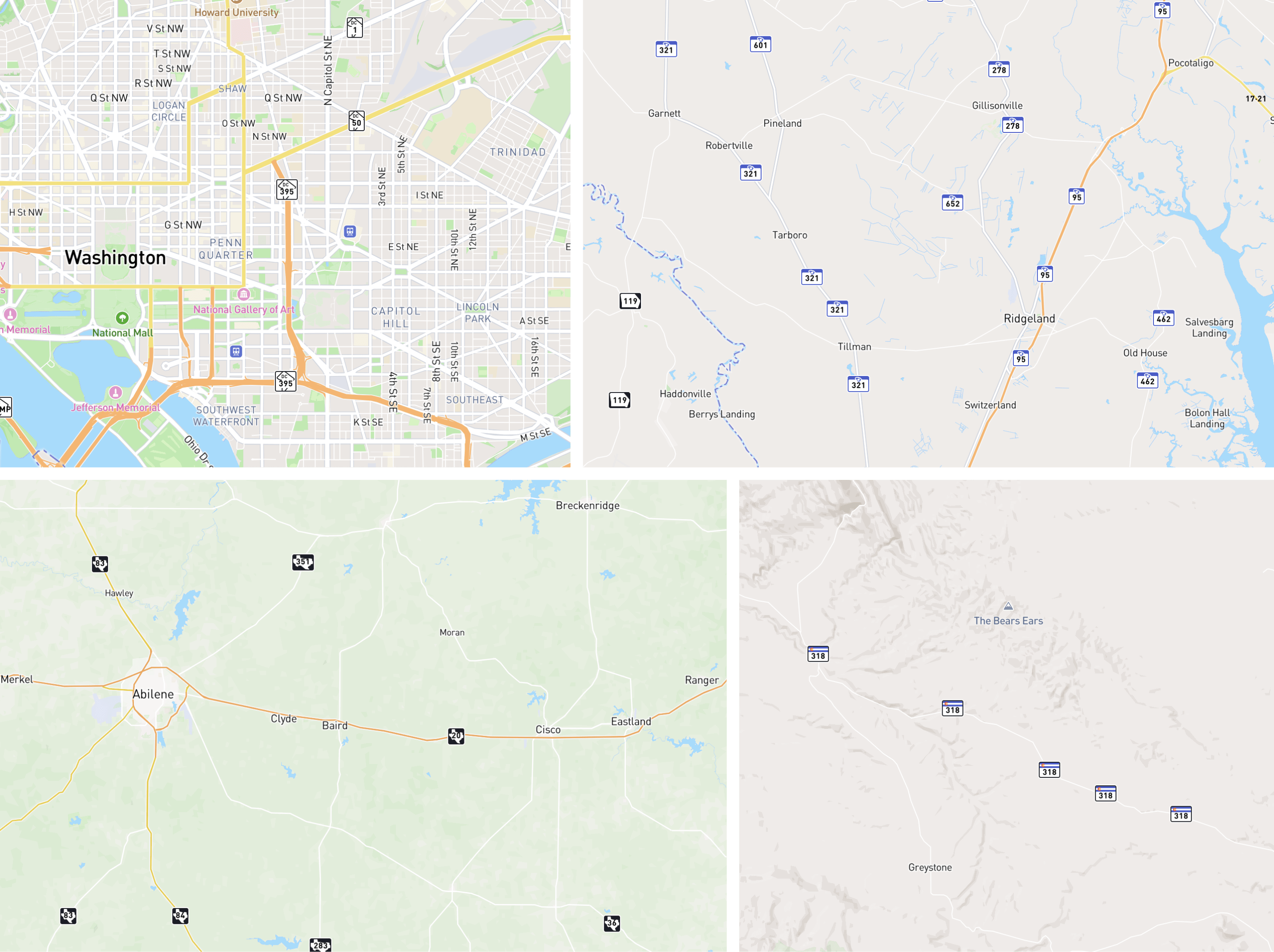
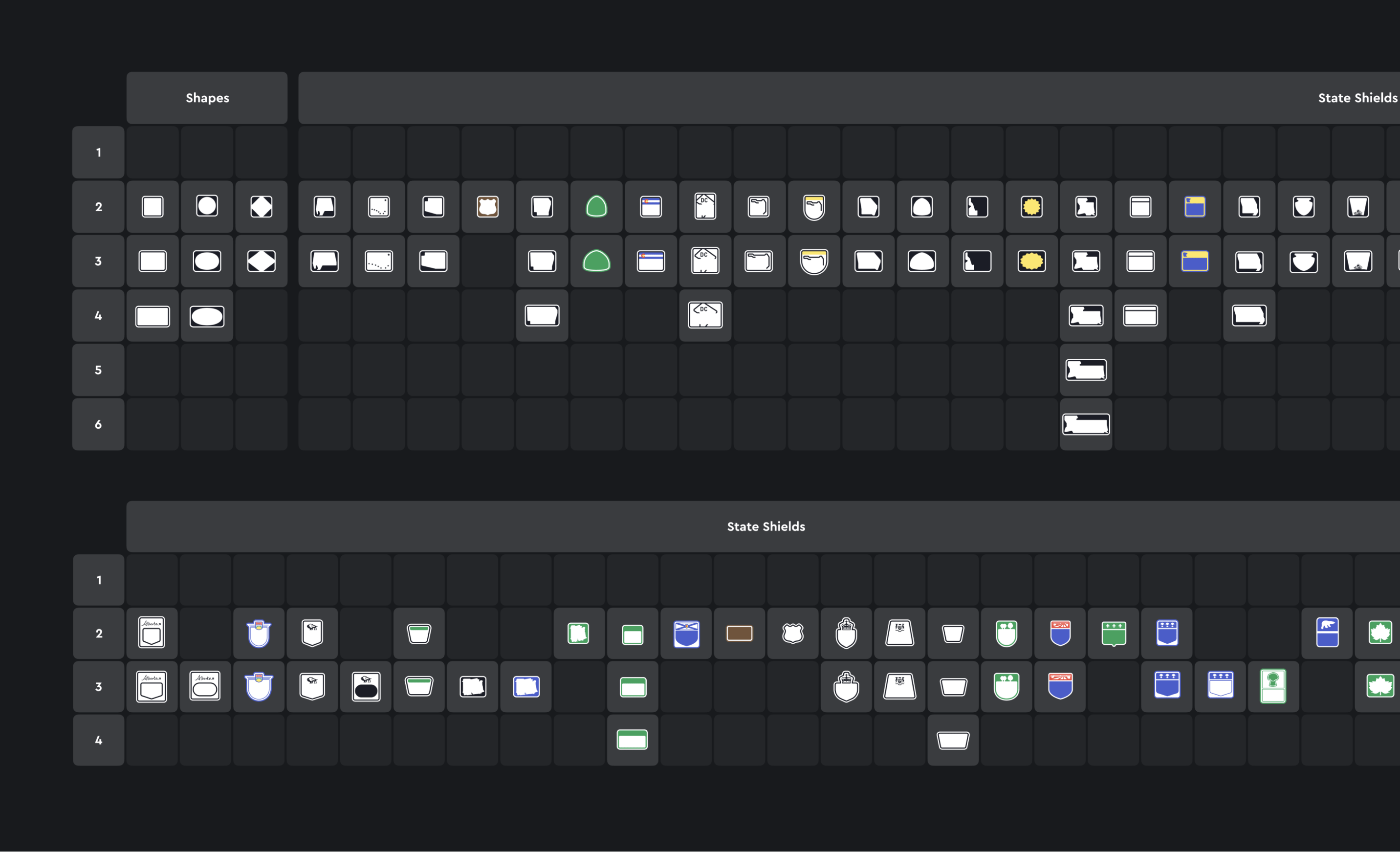
Further iterations were quite meditative. I adjusted incorrectly sized or proportioned shields, uploaded them to the map, scrutinized them closely, took screenshots of the errors, and repeated the process.
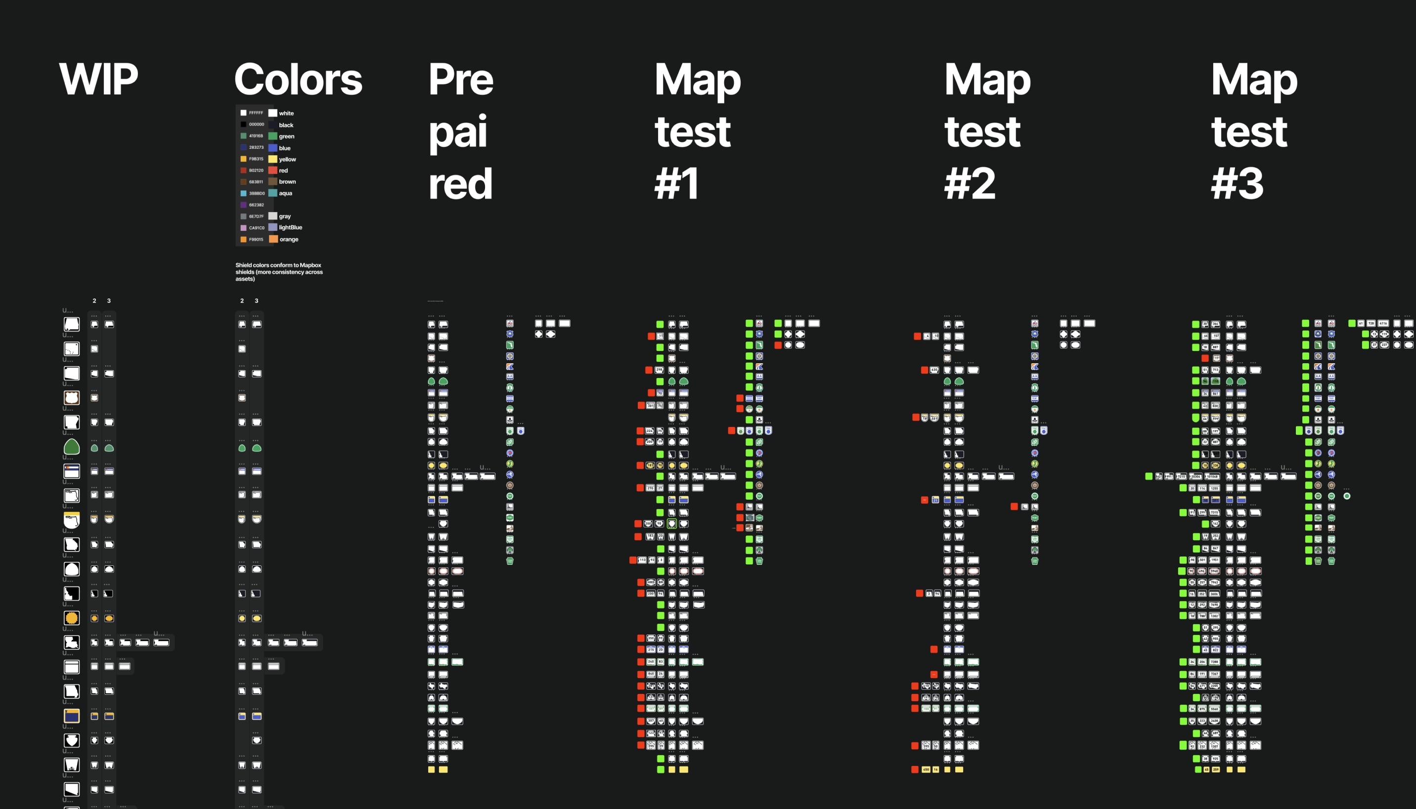
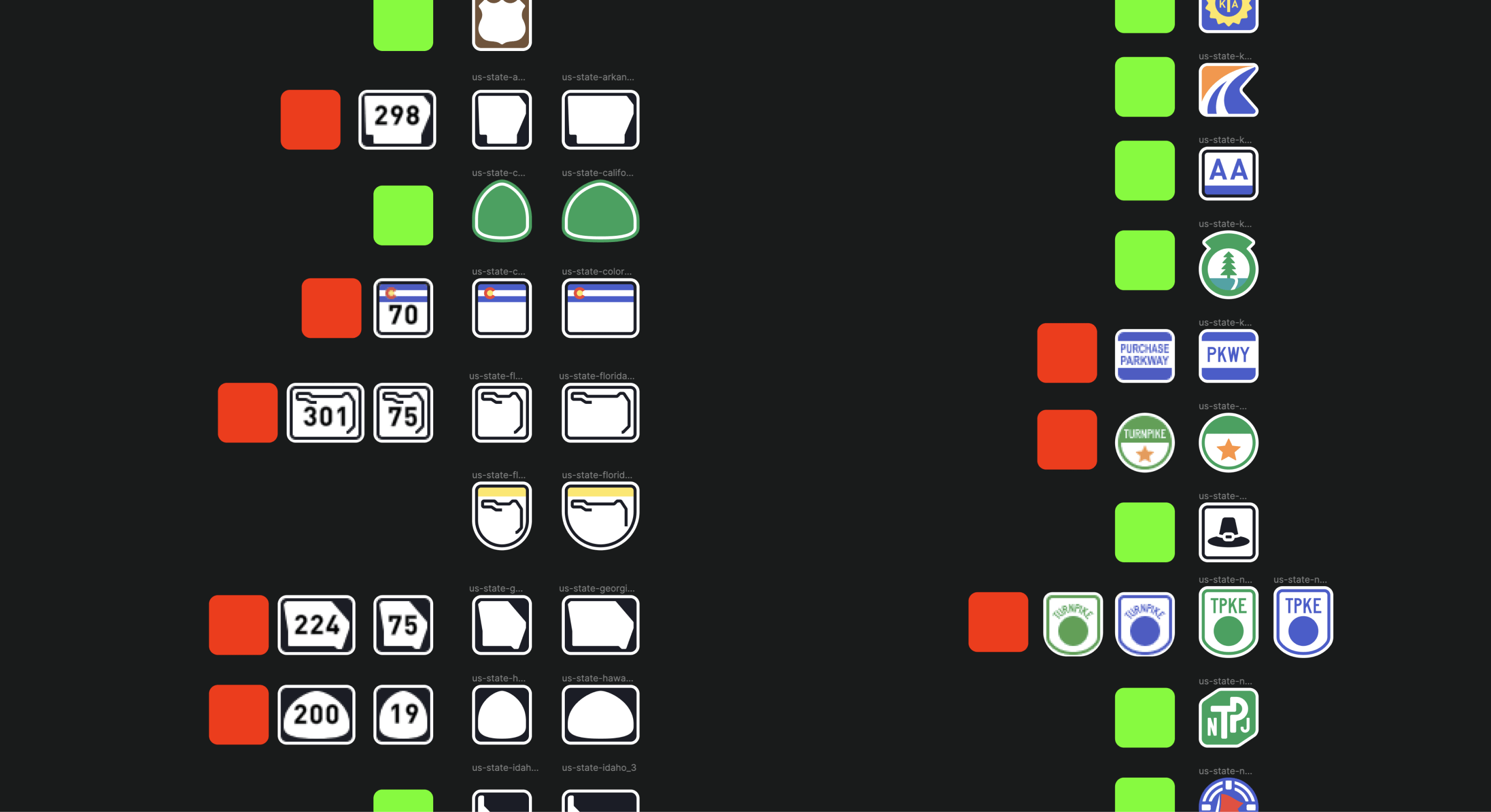
Ultimately, I completed the perfect first batch of American signs. BMW was thrilled.
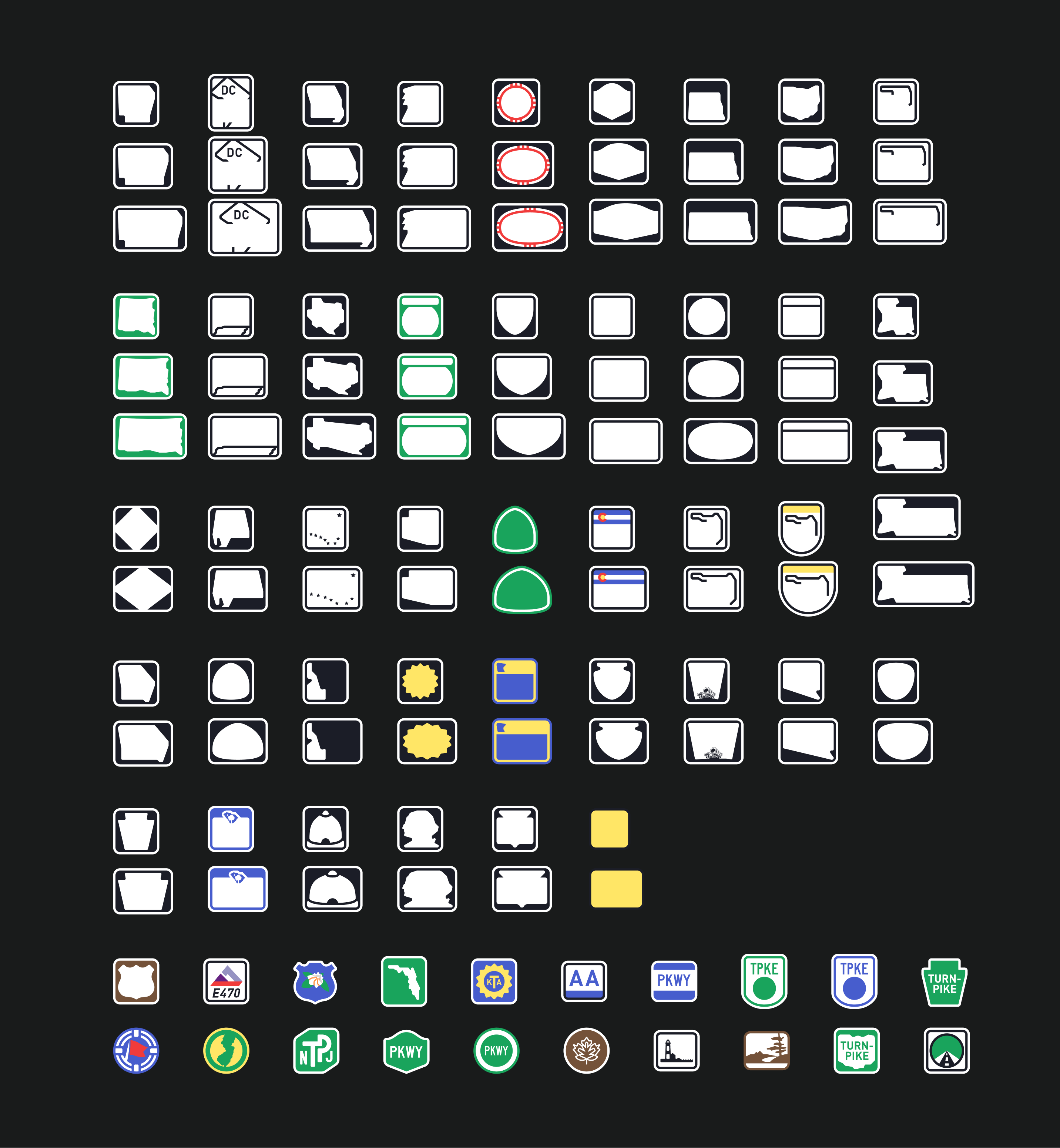
Six months later, BMW returned with a request to expand the unique signage to Canada. Similar work was conducted with Canadian signs.
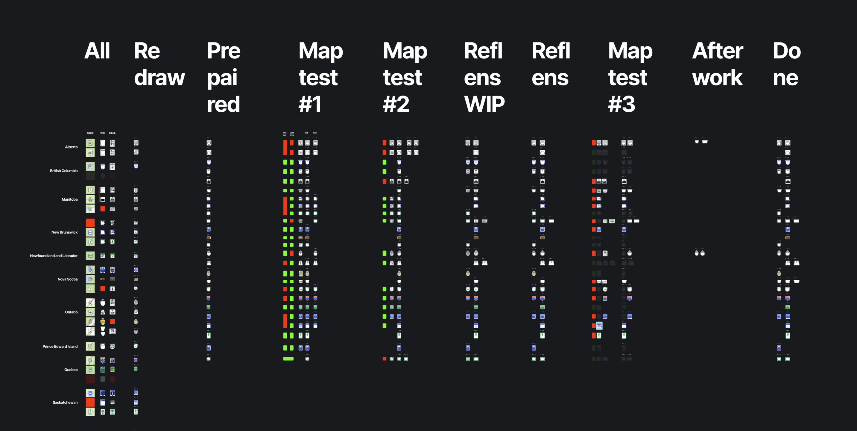
The result of my work is a map now filled with unique, realistic signs, and a wonderful library for designers where everyone can find what they need.
