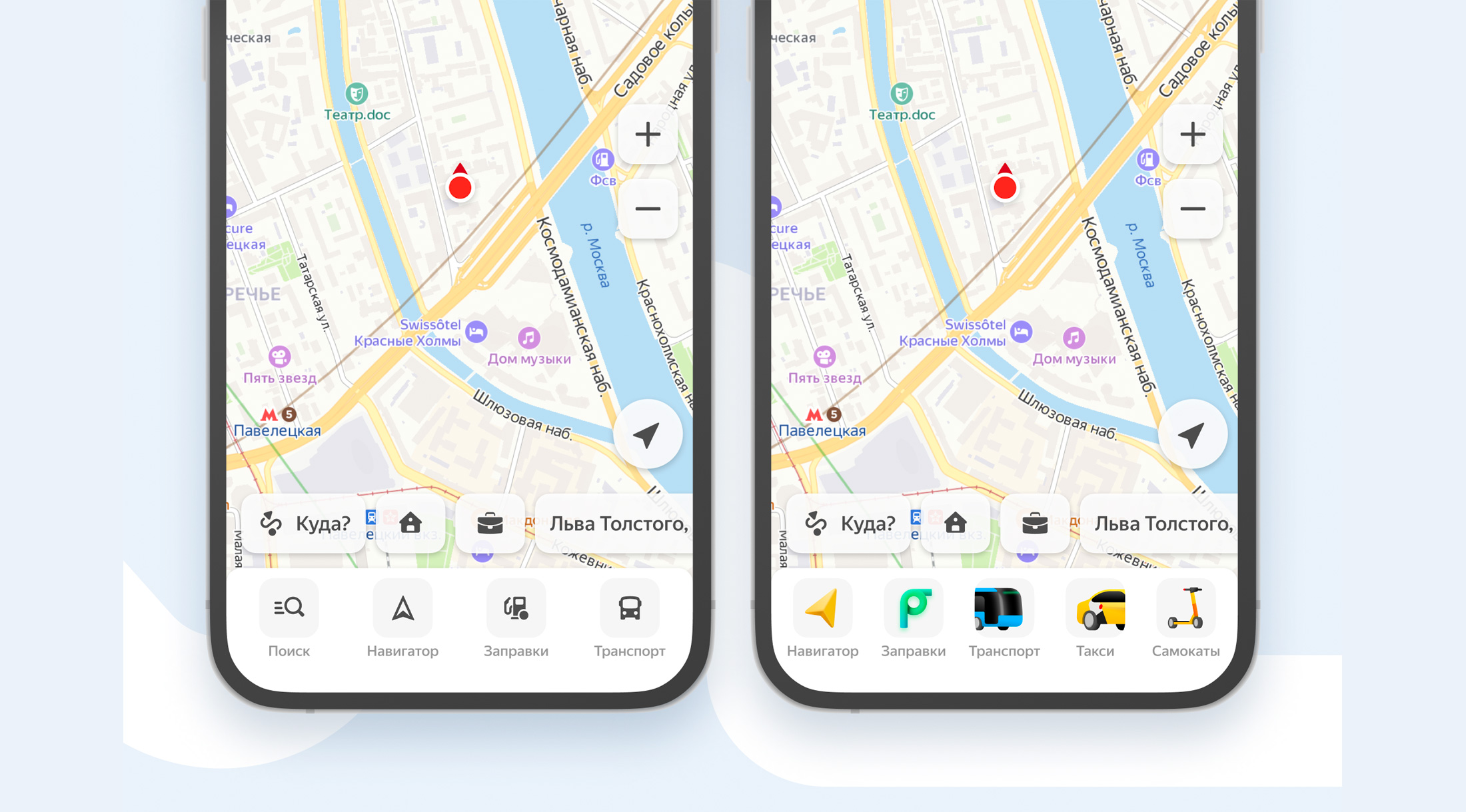
Menu Icon Update
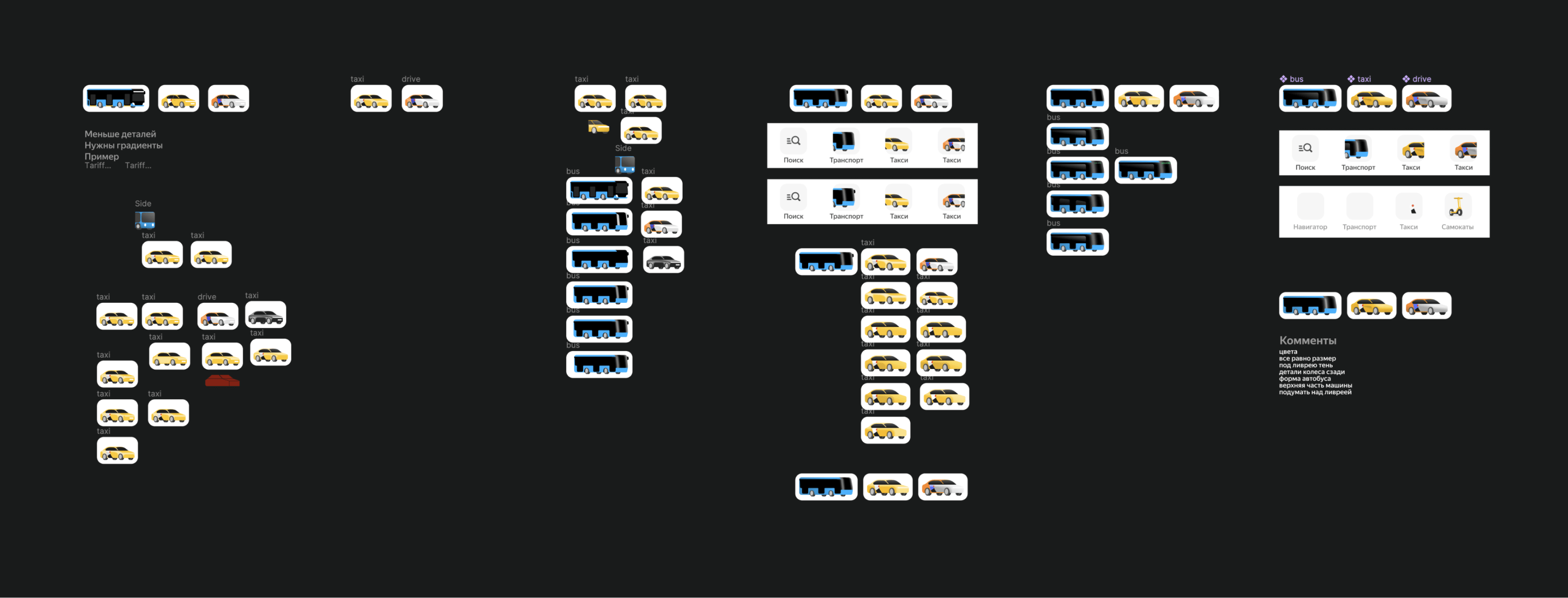
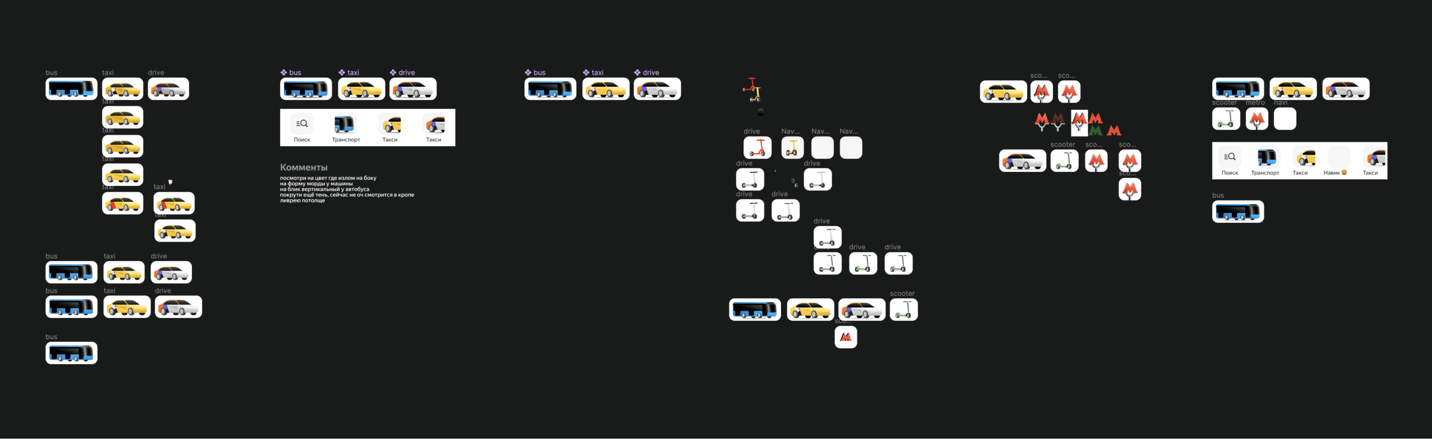
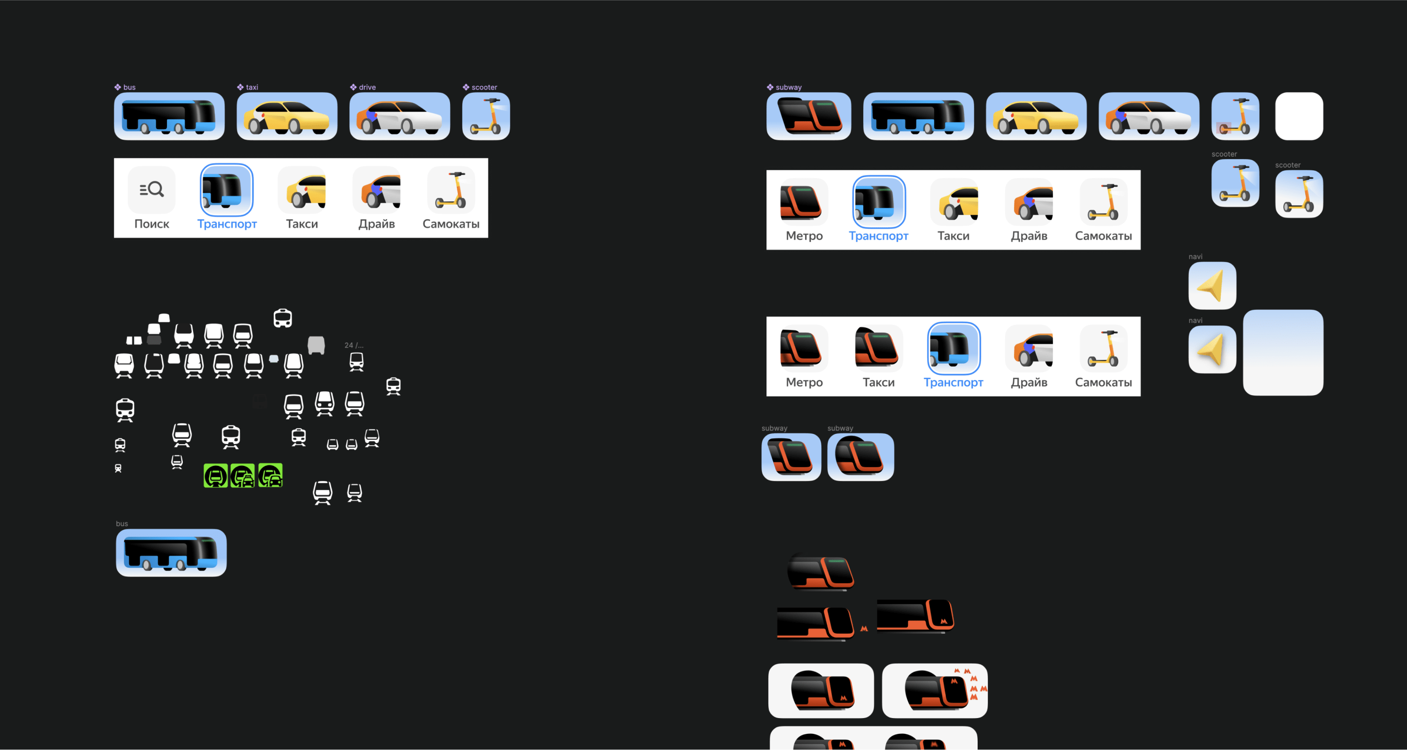
As part of a massive app update task that our team undertook, we were tasked with modernizing our tap bar. We wanted to move away from the monotony of pictograms and bring the panel to life with beautiful graphics.
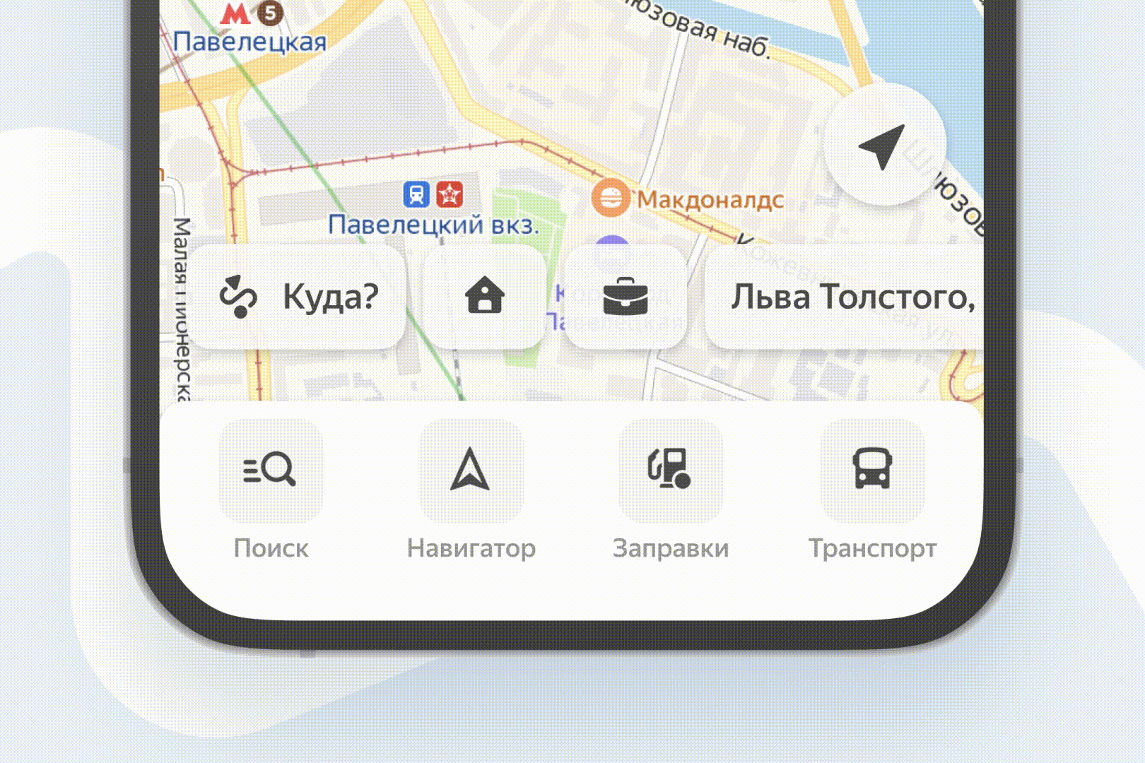
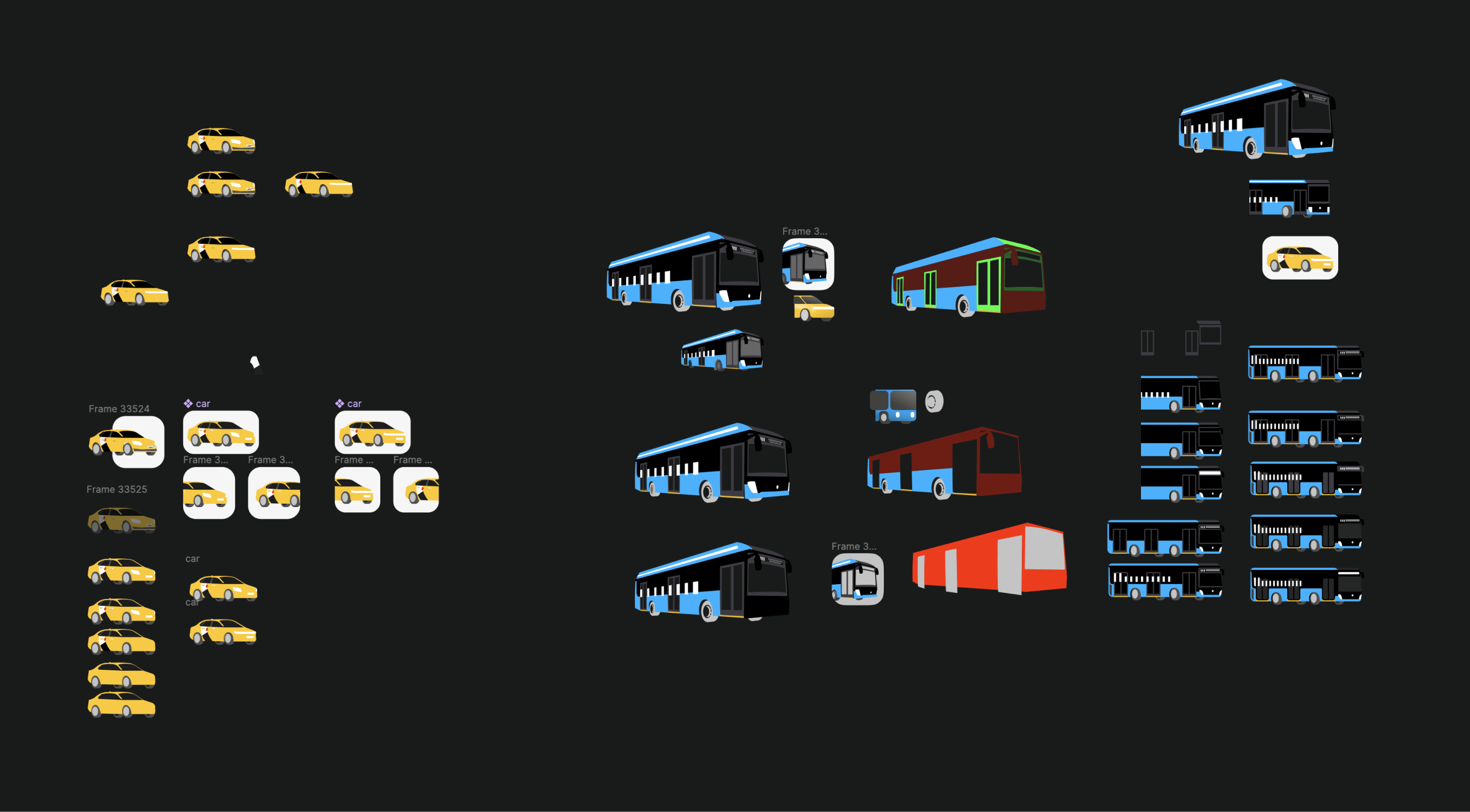
I took on this task with the idea to create pseudo-3D illustrations that looked and felt like 3D but retained the flexibility and simplicity of editing typical illustrations. After many iterations, the right style was finally achieved.
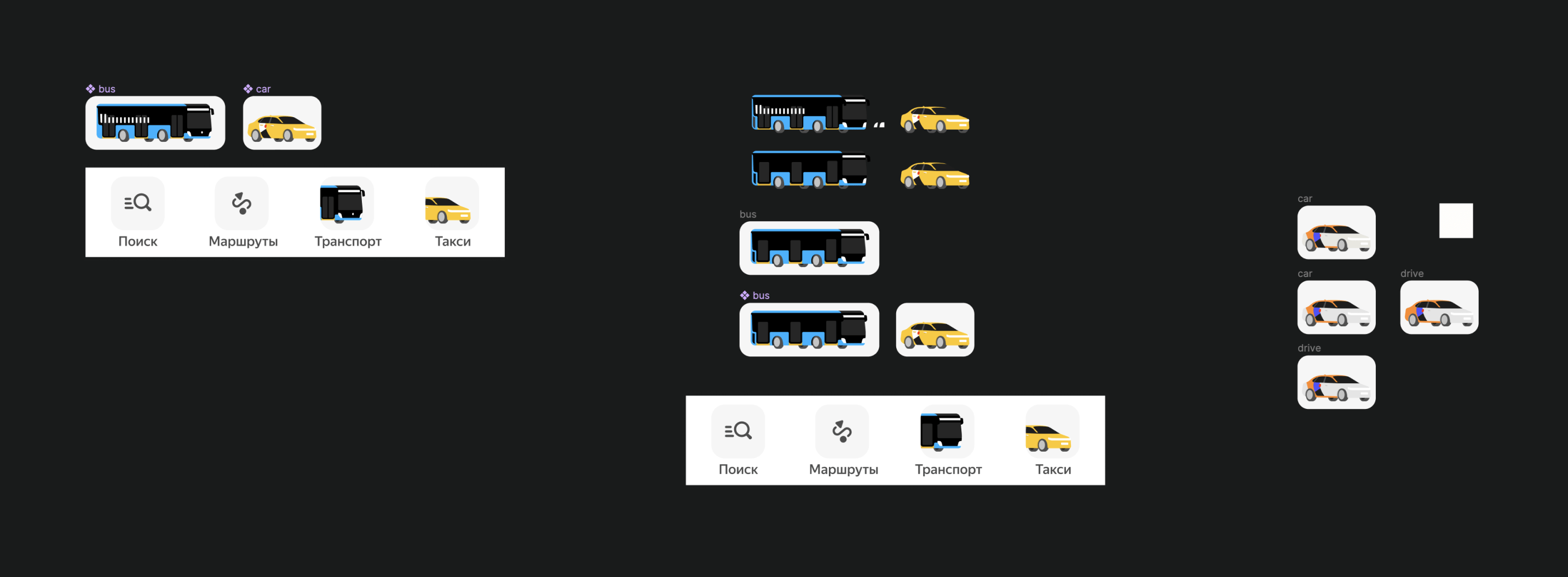

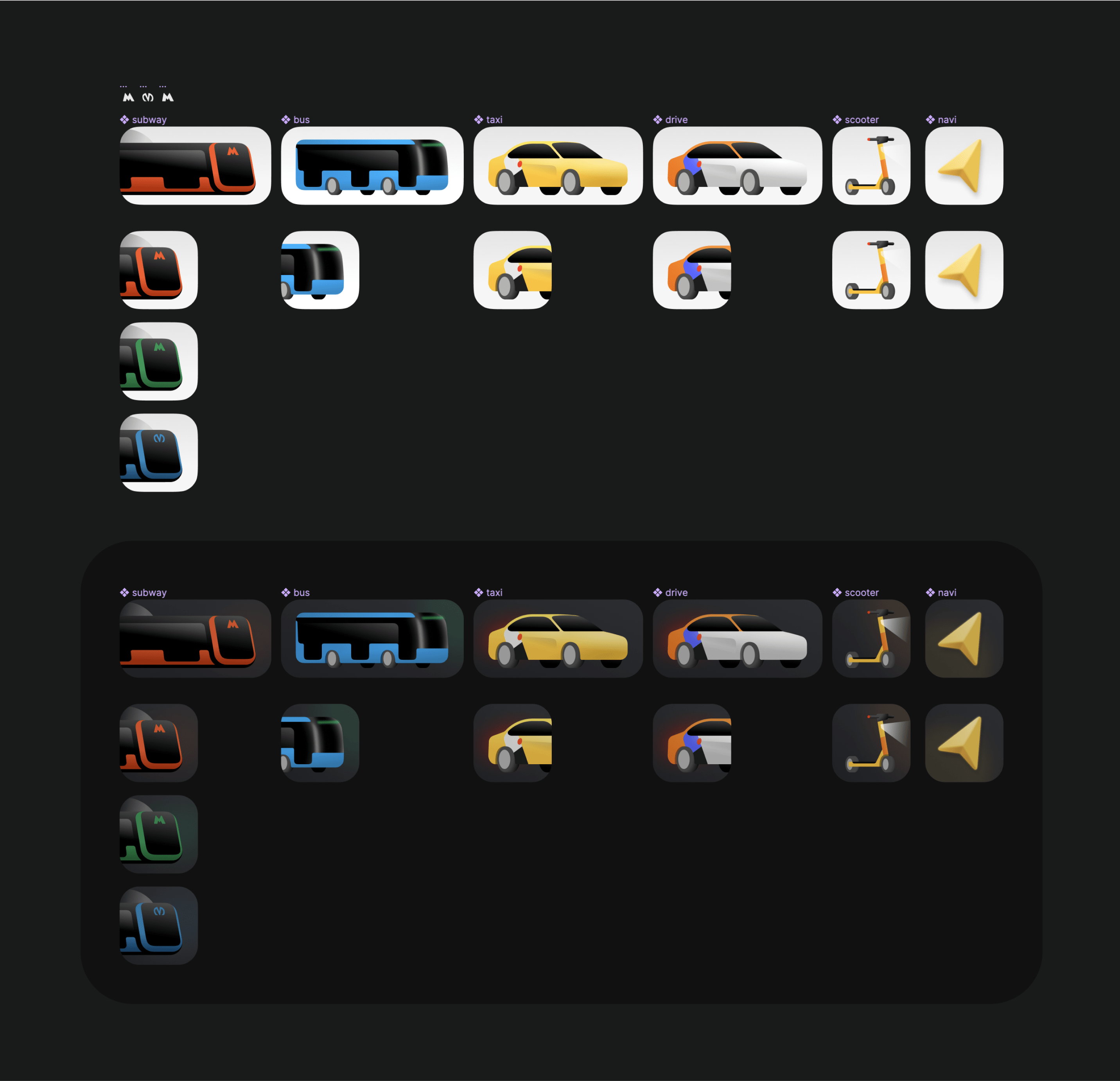
I believe the task was completed to 1000%, with the new design being brighter, more unique, and more emotional.