Yandex Maps Redesign
As part of both the product and cartography teams, I fully participated in the massive redesign effort of Yandex Maps. Here, I cover only a portion of this story but aim to highlight various points of my involvement in the process.
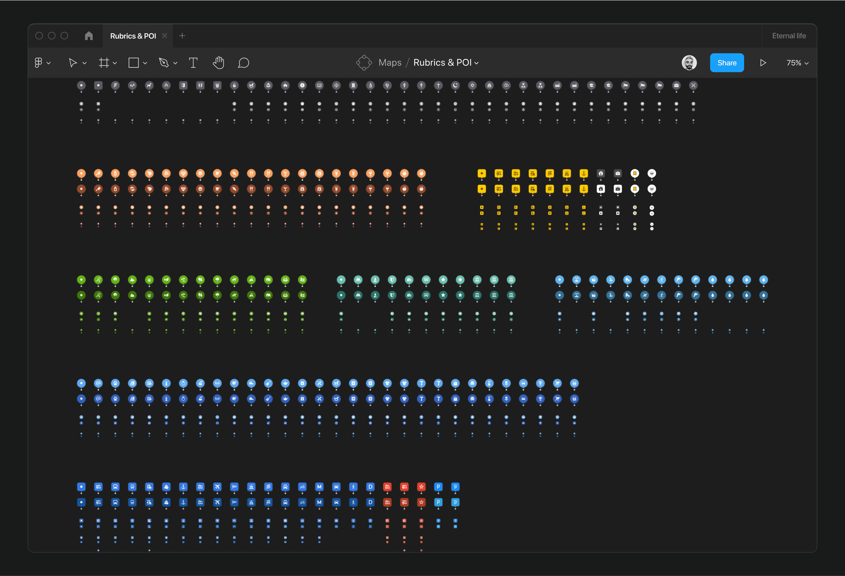
A major focus was the complete overhaul of the POI logic on the map—adjusting their number, colors, and graphic metaphors, which were previously excessive and unclear.
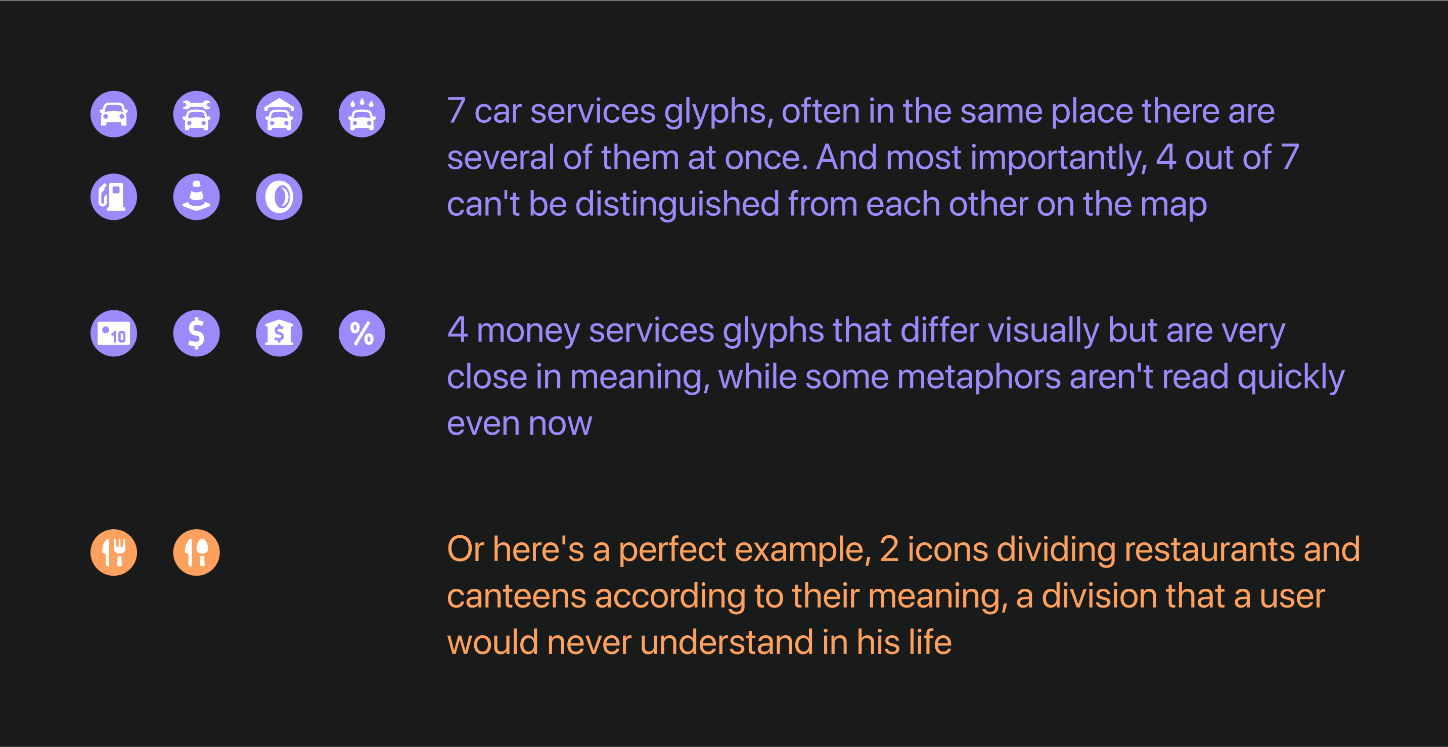
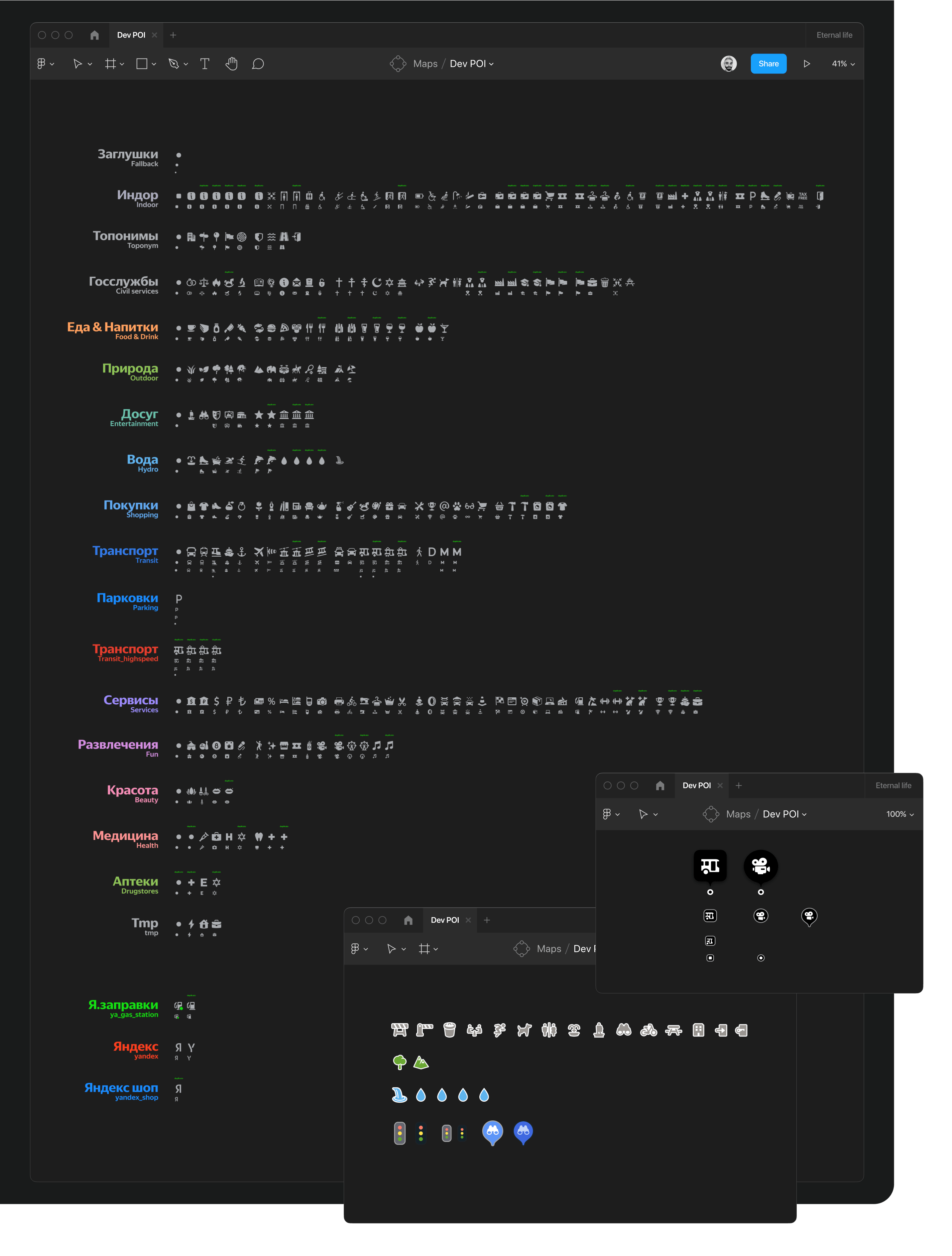
I addressed these issues by performing a detailed analysis of the existing rubrics system. I methodically reviewed thousands of rubrics, assigning appropriate glyphs and fallbacks for each group to ensure a common metaphor if new categories appeared or specific ones failed to load.

After two stages of simplification, from the initial 224 glyphs, only 75 remained. These included:

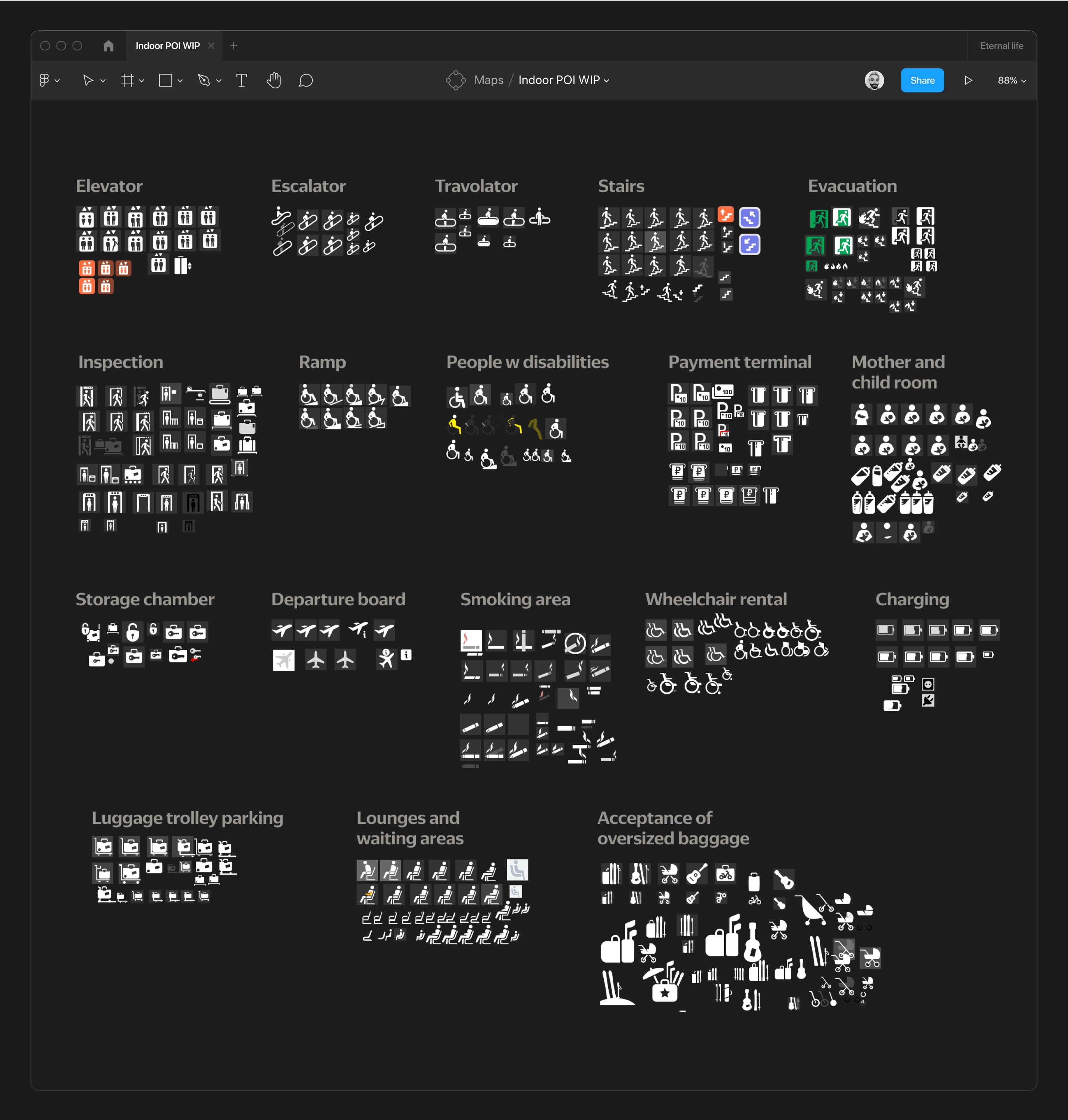
Concurrently, while reducing glyphs, work was also being done on the Indoor layer, introducing 18 new glyphs after extensive research on indoor mapping solutions from neighboring services. However, only 15 of these glyphs were implemented on the map.

The refined selection left only necessary and understandable metaphors: 9 rubrics, 90 POIs. While the system has significantly improved, there’s always room for further enhancement.

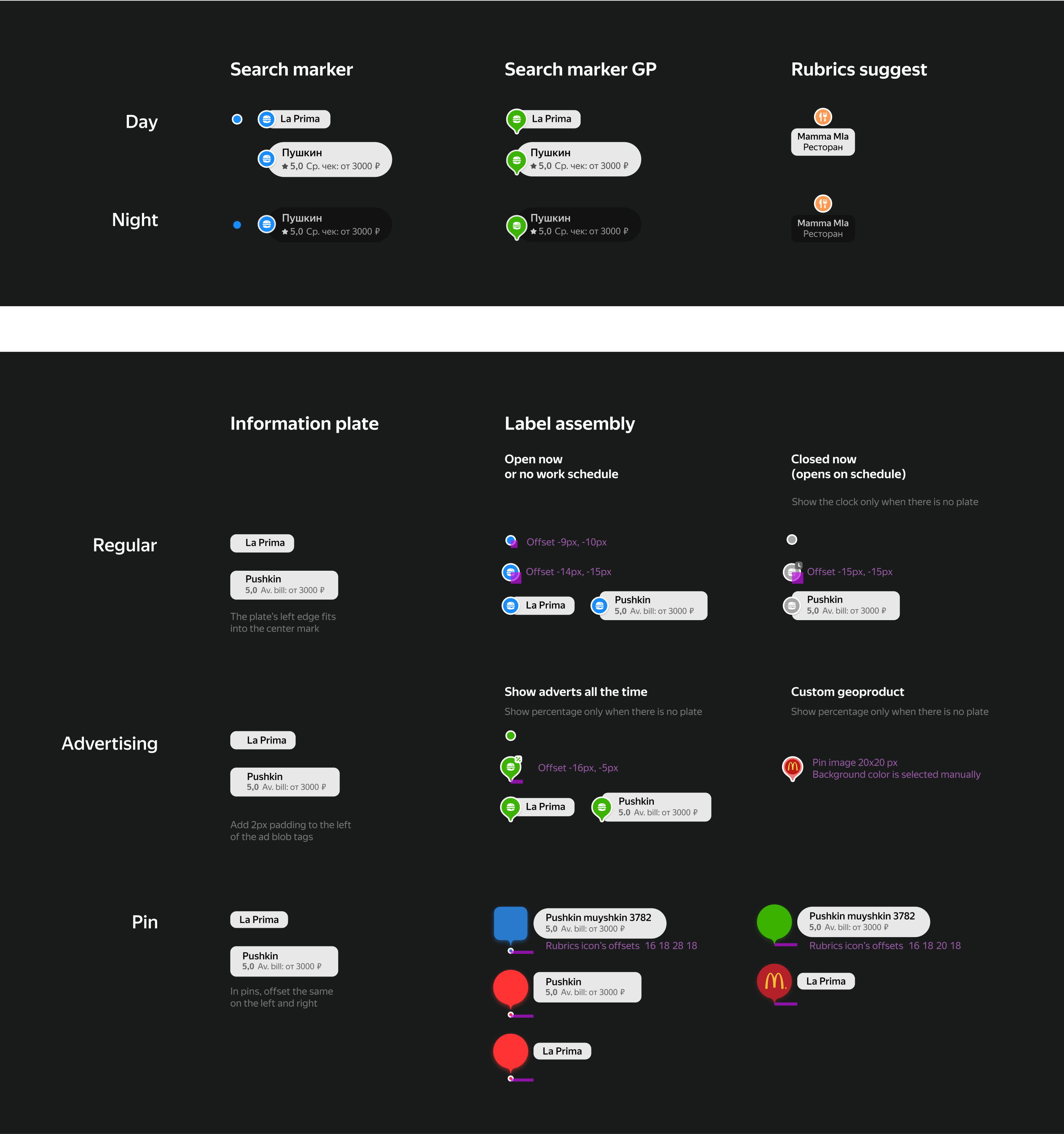
Alongside the POI tasks, I worked on organizing search POIs, including their connections to advertising and their appearance during day and night transitions.

Export automation
Previously, there was no system for exporting data to the map—everything was manually uploaded by designers with each build. A more convenient and upgradable system was essential.

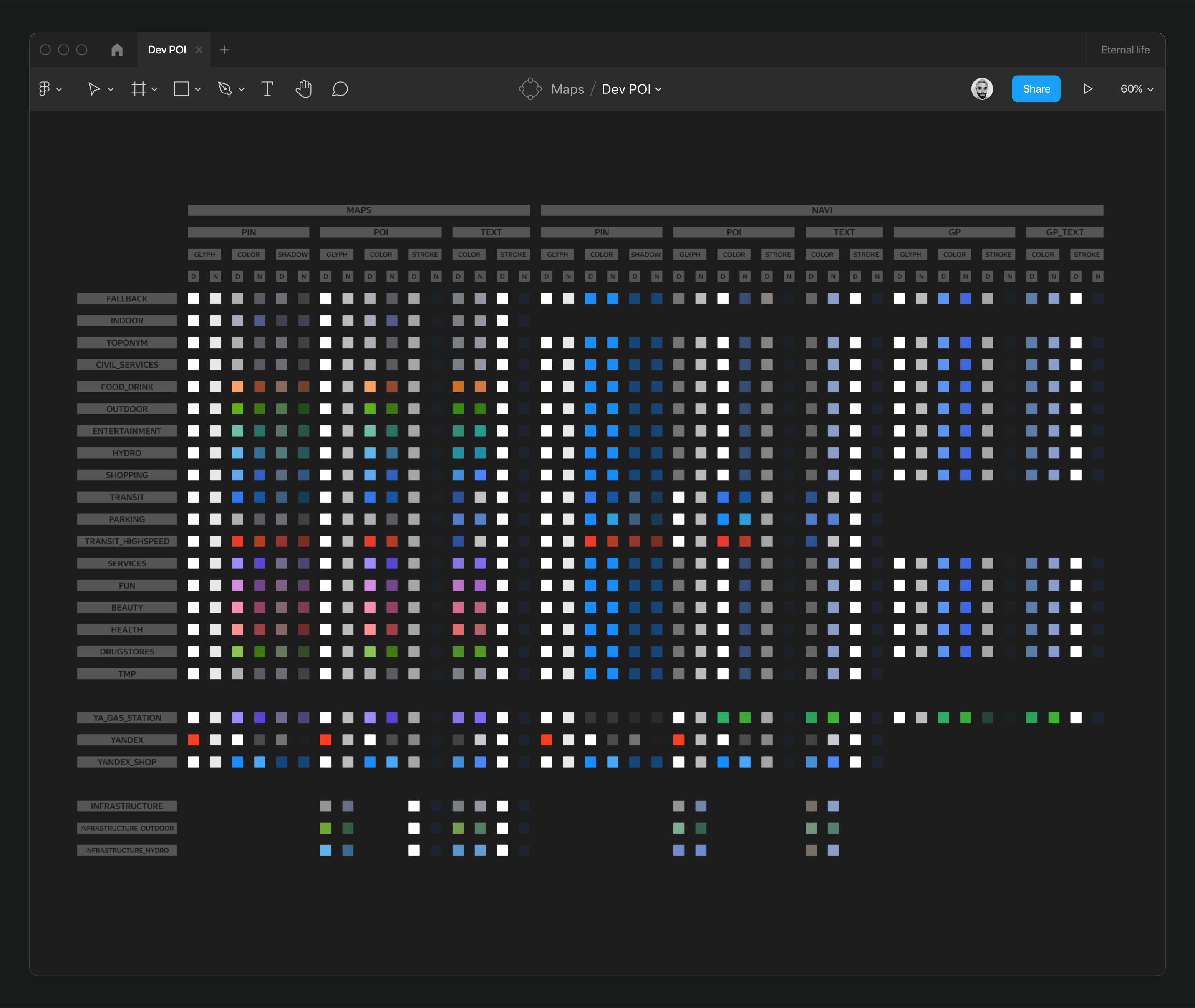
I started by compiling the main file from which all Pins and POIs were uploaded. I organized all glyphs and duplicates by rubrics, aligned them by style and weight, and categorized infrastructure facilities. I broke down Pins and POIs into components for direct export and compiled an extensive color table for maps and the navigator as an additional service.
A significant focus was on the metro system, involving unique subway POIs, Pins, exits, pathways, and lines, with optimizations including automatic linking of metro glyphs and entrance numbering.

The final export phase included unloading items like parking badges, transport events, and other minor map details.


Small tasks & Underlays
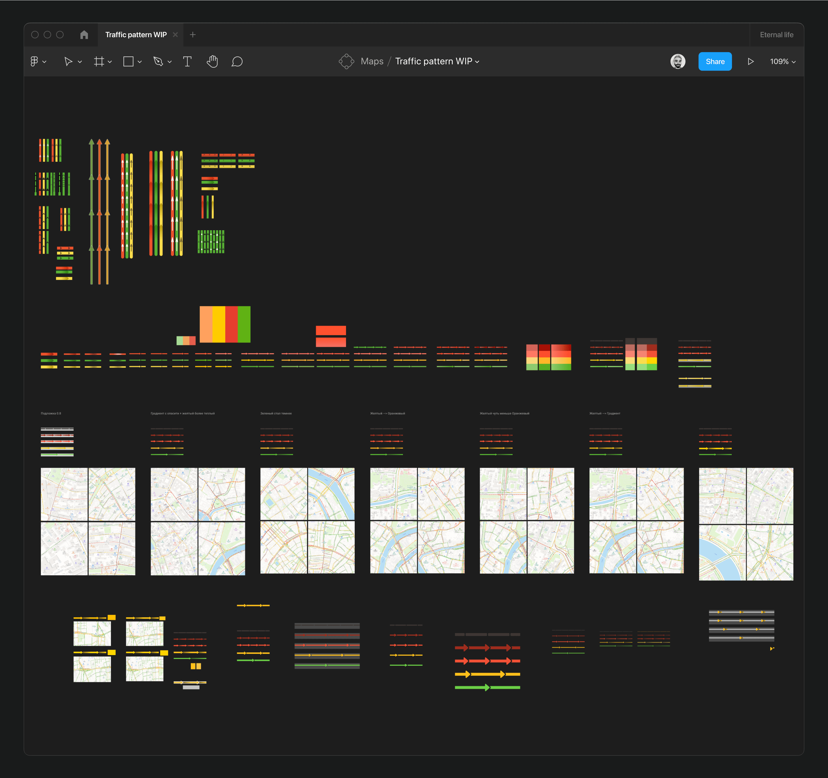
Numerous small tasks aimed to enhance the map included updating various events, background elements, and traffic styles—each important but not overly time-consuming. Here are some examples:
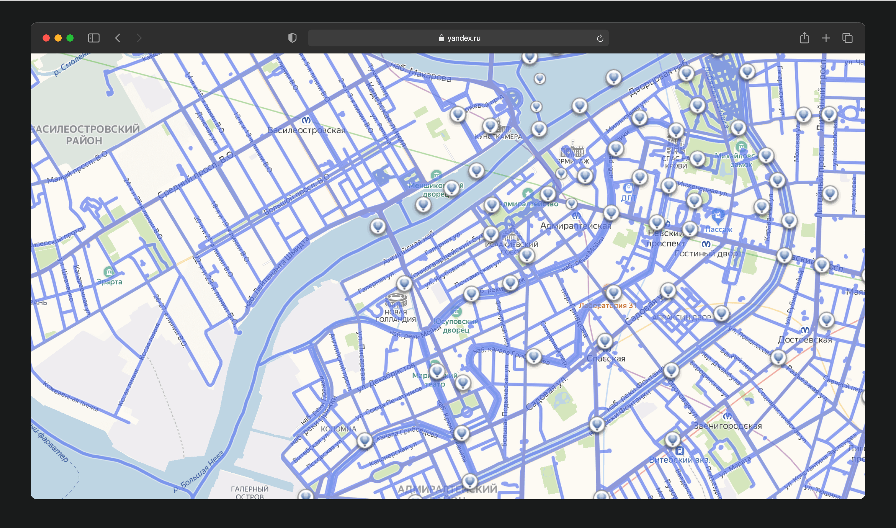
The panoramic layer was topped with an aerial layer that had not been updated for a long time and appeared outdated. I refreshed the glyph myself.

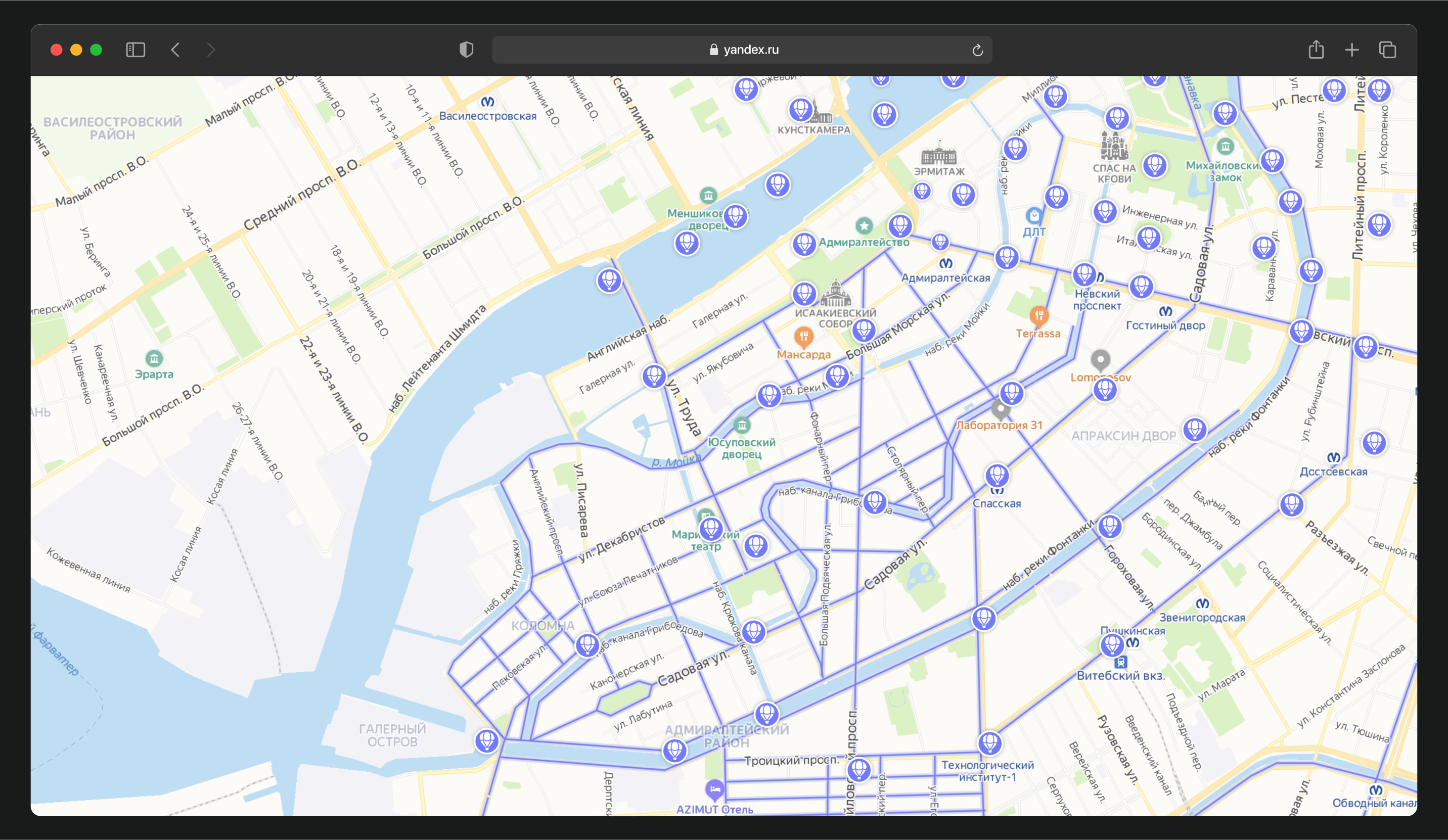
Over two years, we executed two Christmas tree projects. Initially, my team of cartographers and I replaced all park glyphs with Christmas trees during the holidays. Last year, we placed large 3D Christmas trees in city squares.


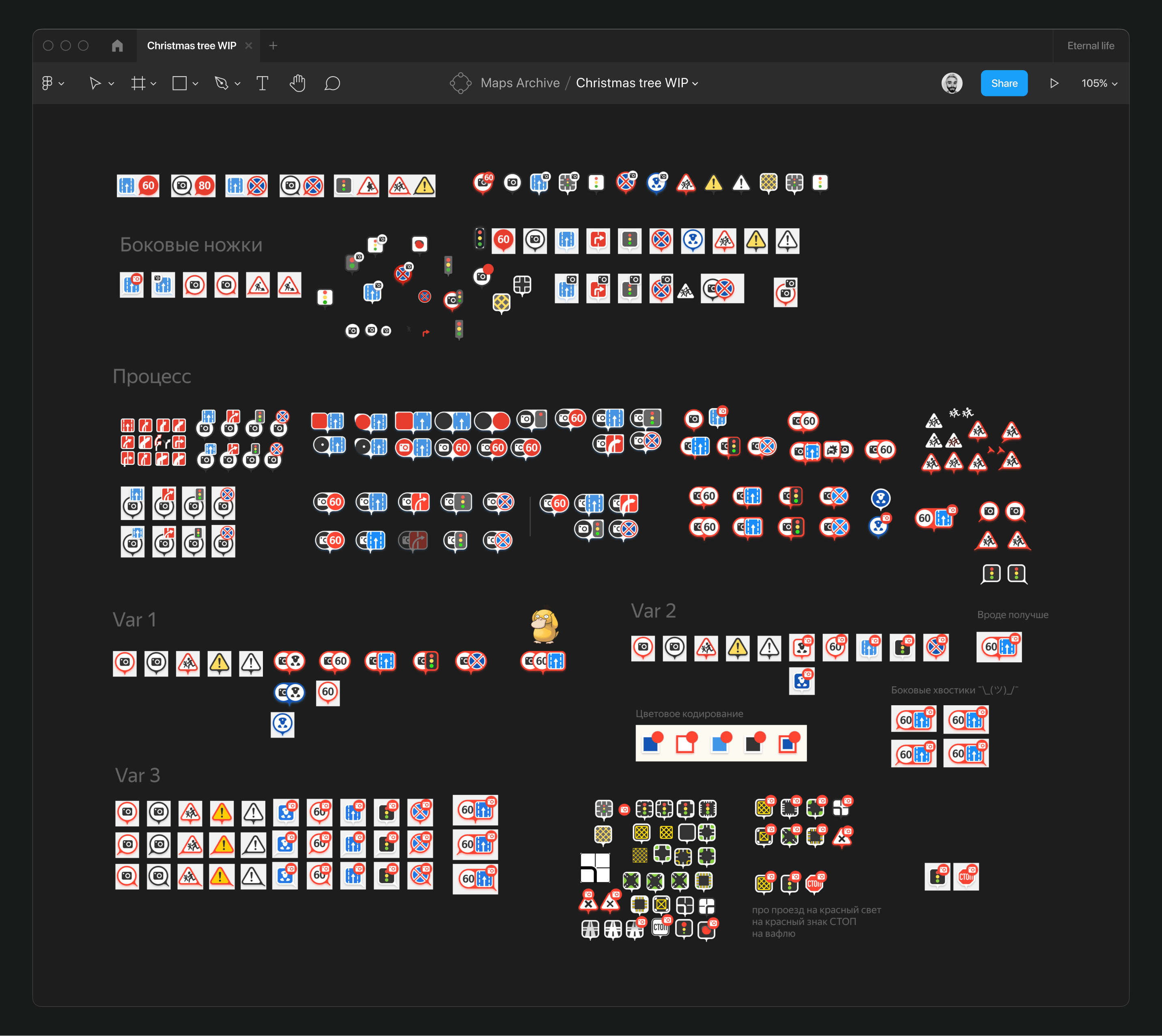
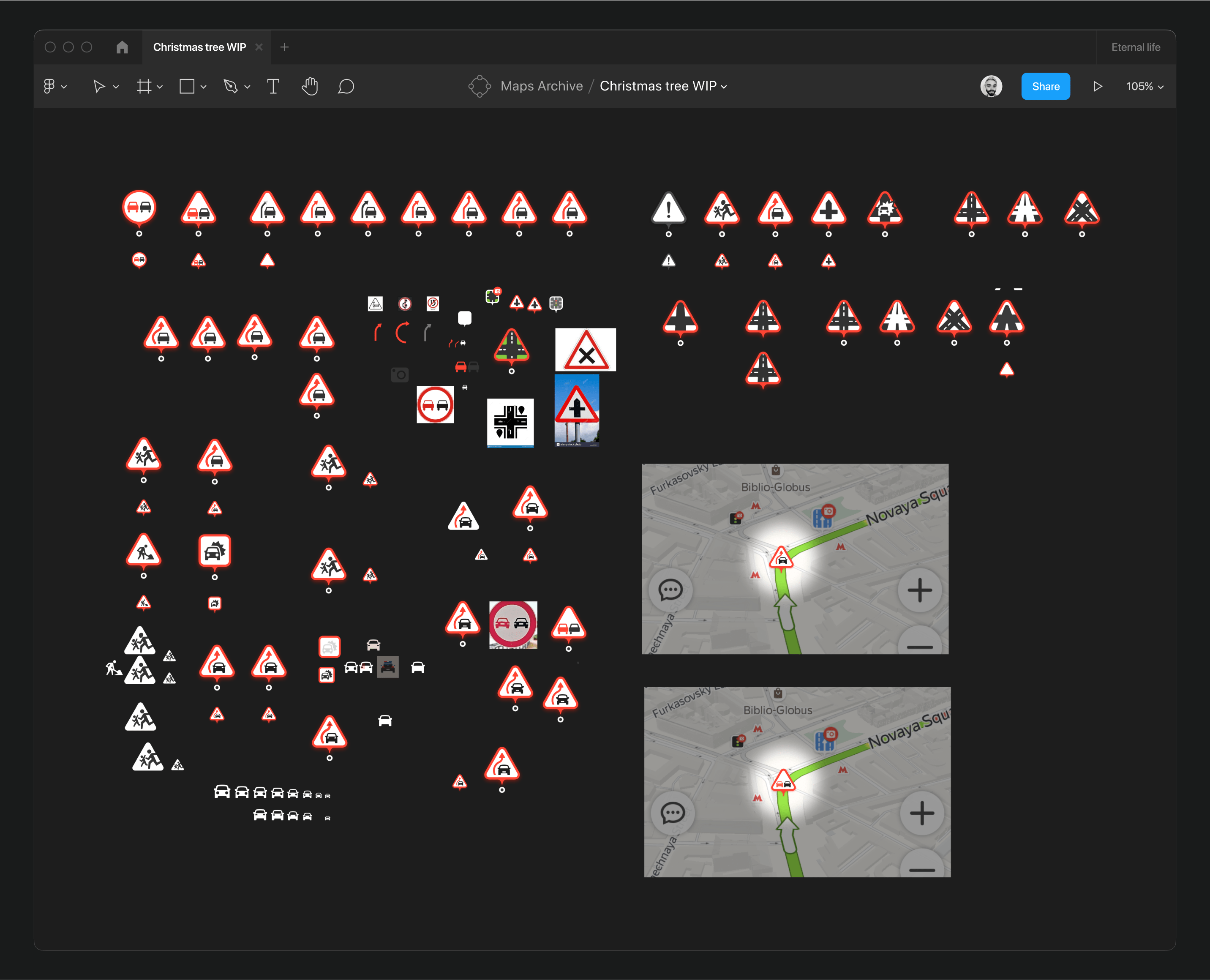
Throughout my tenure, I designed numerous road signs for the map, considering their display logic along routes.
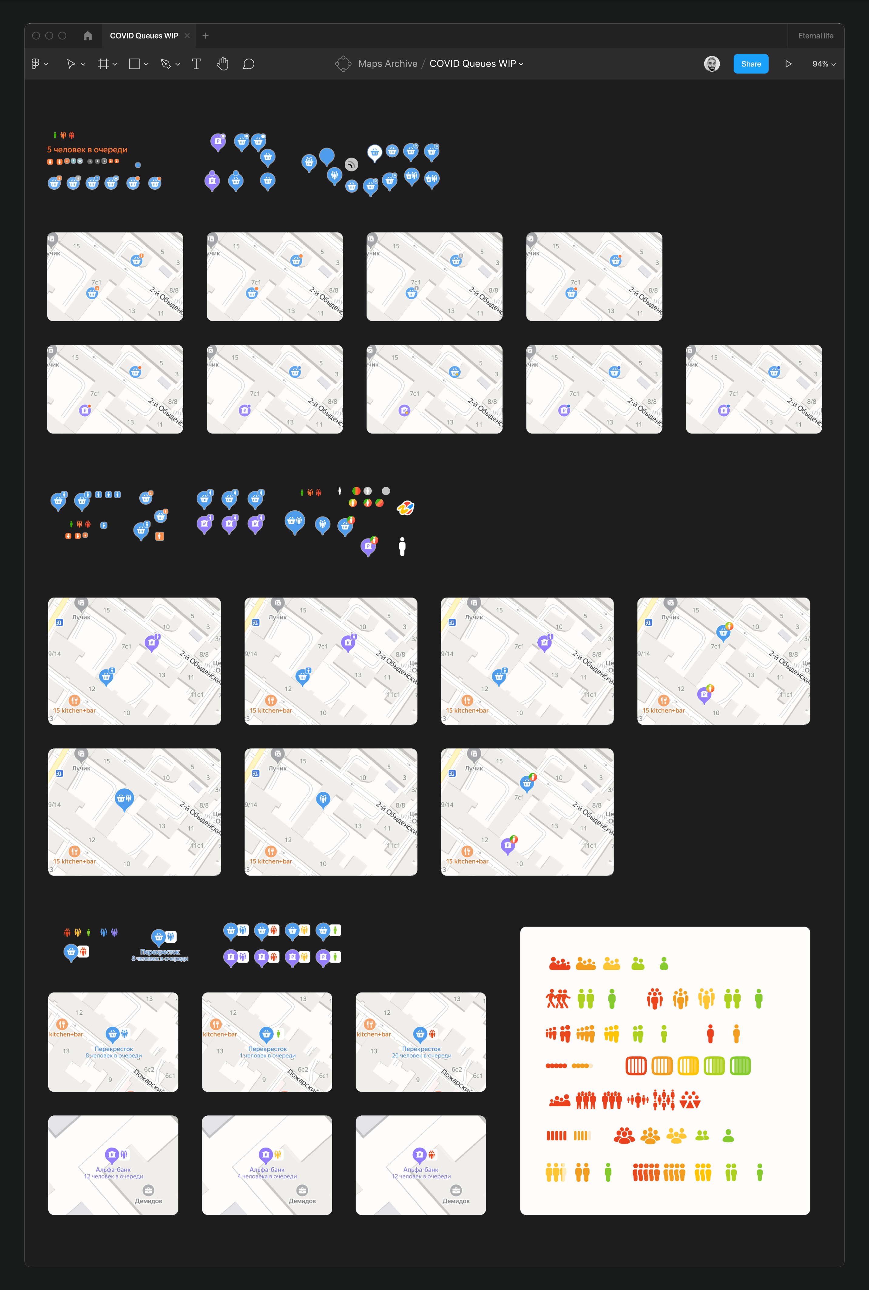
During the coronavirus pandemic, as part of an assistance project, we displayed queues at locations to help users assess the safety of visiting. I devised the visual representation for this.

To enhance the visibility of traffic patterns on the map, I researched similar services and tested over thirty different color and pattern options. This task is still ongoing.
