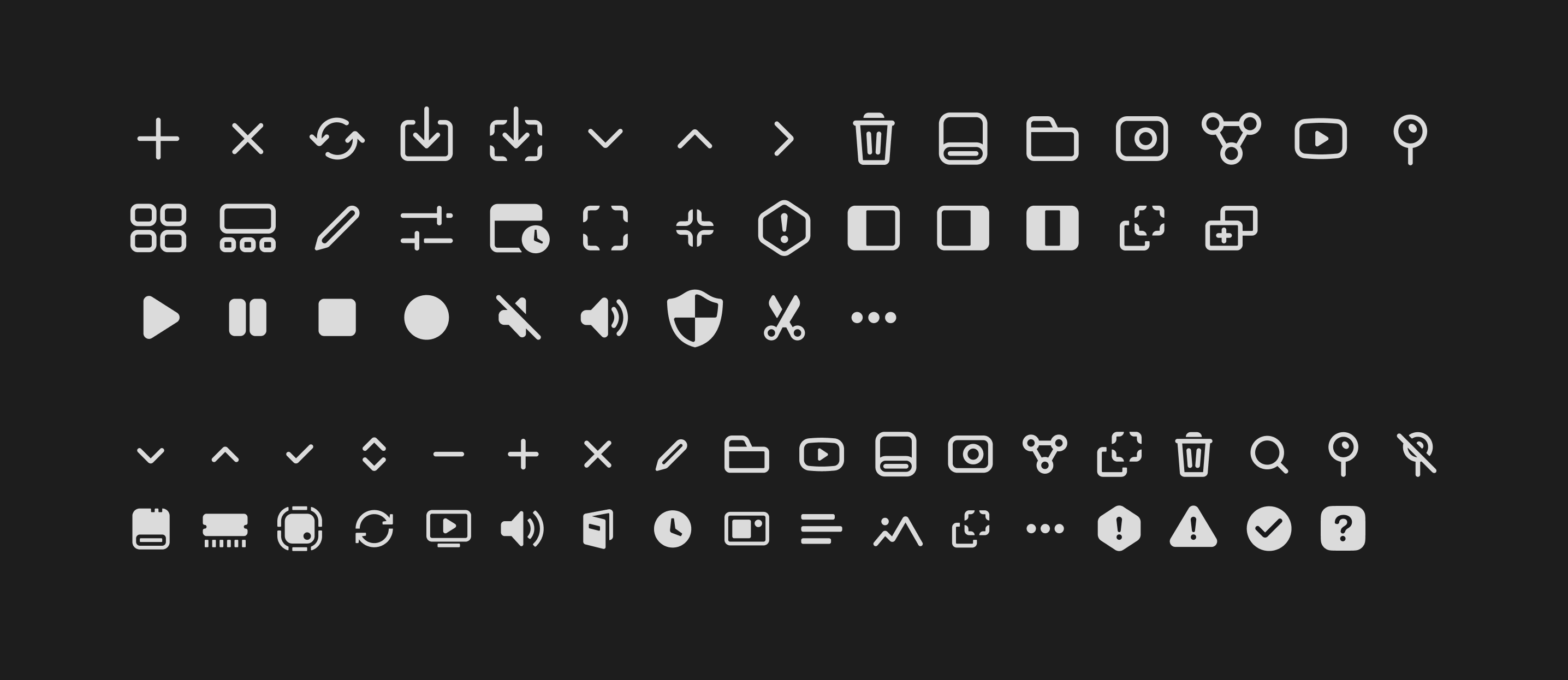
Icons for DirectTake
You can read the detailed story of the full redesign and interface update of the DirectTake app elsewhere; here , I'll simply showcase what we had and what I did with the icons as part of the redesign.
Essentially, all icons were created with new use cases for the app in mind. Some icons were removed, while others changed in meaning and usage logic.
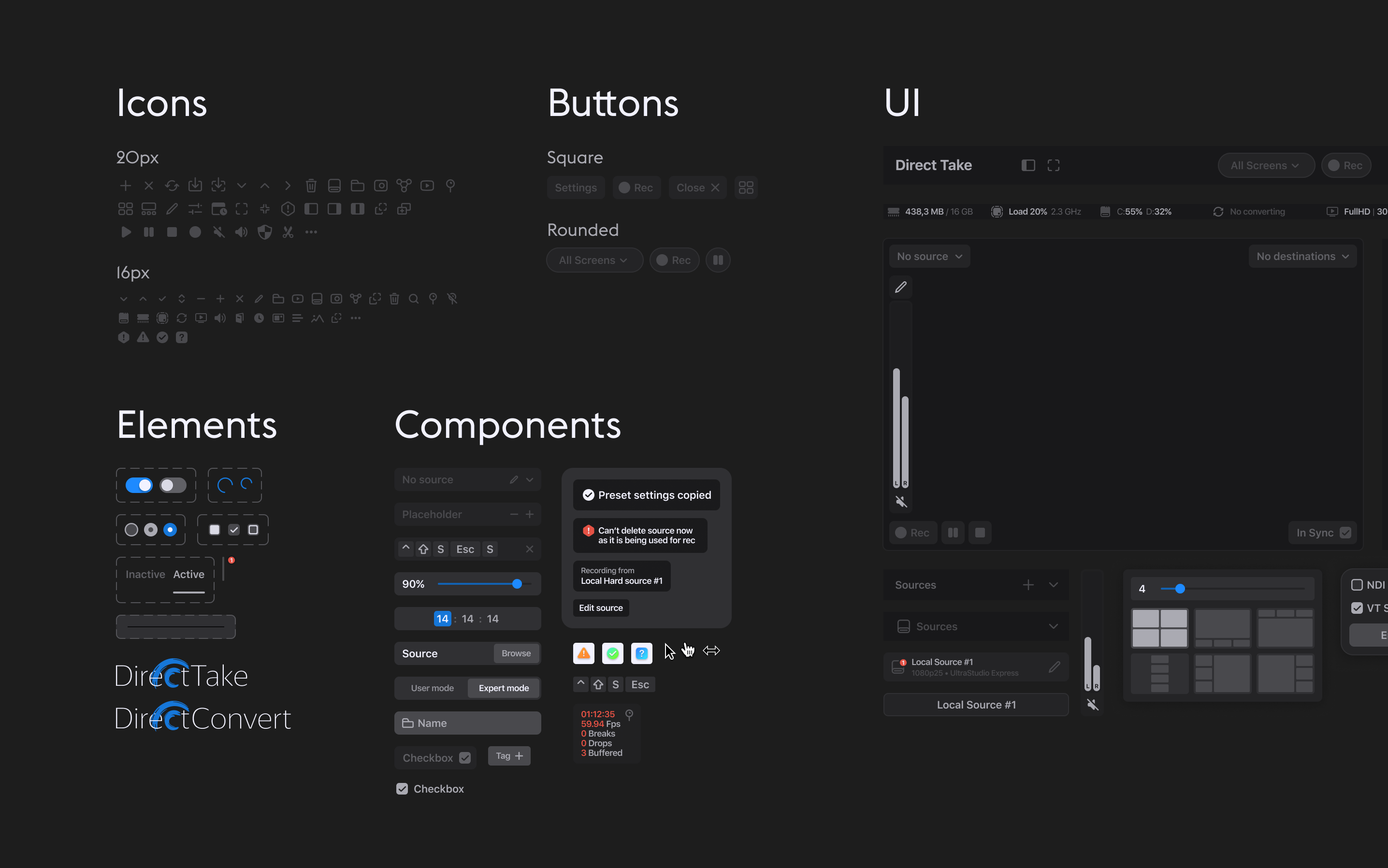
Those that remained were streamlined by me into a coherent system. I aimed to create a technical, understandable, and simple style that would emotionally support the new app redesign.